# 2021年医疗展厅设计 / 呈现科技现代审美且有温度的空间设计与规划 - ID: 438 - URL: https://www.stoyard.com/works/438 - English URL: https://www.stoyard.com/en/works/438 - Year: 2021 - Cover: https://static.glabcms.stoyard.com/stoyard/project/cover/20260904/ji35vhl9ezb.jpg - Categories: 行业领域:医疗仪器,医药健康, 服务内容:展览展示(Exhibition & Spatial Design) - English Categories: Type of industry field:Biotech,Healthcare, Service Content:Exhibition & Spatial Design - Author: STOYARD - English Author: STOYARD - Publish: 2026-09-04 - Editor: STOYARD BEIJING ## 中文主体 ### 项目简介 我们为 AccuMedical 提供展厅空间设计服务,将其医疗科技品牌语言延伸至线下空间体验。围绕“专业、精密、创新”的品牌特质,从空间概念、视觉风格、动线规划、品牌展示到产品呈现进行整体设计,通过极简结构、透明材质与光环境塑造具有未来感的医疗科技空间,在有限的展览场景中强化品牌识别与产品展示效率。 服务内容: 空间概念设计 / 展厅视觉设计 / 品牌空间延展 / 展示动线规划 / 产品展示设计 / 数字屏幕内容规划 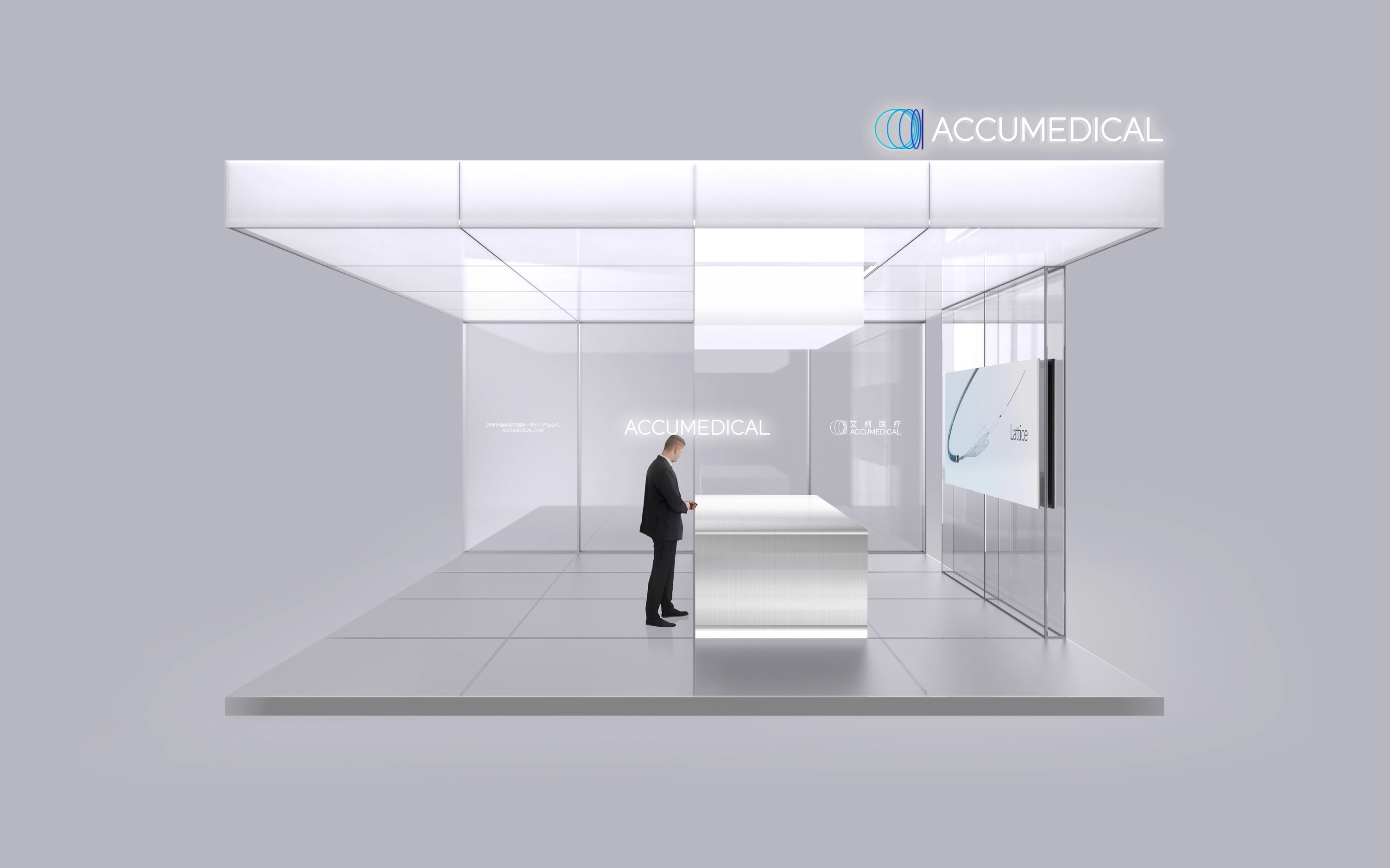 本方案以“纯净、专业、轻盈”为核心设计理念,通过大面积白色、半透明材质与柔和光环境,构建一个具有未来感的医疗科技空间。整体空间尽可能减少复杂的装饰语言,让建筑体块、光线与品牌本身成为视觉主体,传递 AccuMedical 理性、精准、可信赖的品牌气质。 顶部采用连续的白色发光体块形成具有识别度的空间边界,如同一座悬浮于展台之上的“光盒”。半透明墙面与镜面、玻璃材质相互结合,在保持空间开放性的同时营造出轻盈、洁净的层次感。中心接待台以极简几何形态处理,与顶部光体形成上下呼应,使空间视觉中心更加稳定。 整体灯光避免传统展会空间中过度强烈的商业照明,而采用均匀、柔和、无明显光源感的环境光,强化医疗空间应有的洁净感与高级感。品牌 Logo、产品屏幕及核心信息被有意识地留白,使观众进入展位后能够迅速识别品牌,并将注意力集中到核心产品与技术内容上。 这一方案更接近高端医疗实验室、科技旗舰店与国际品牌展厅的视觉语言,弱化传统展台感,突出 AccuMedical 作为创新医疗科技企业的专业形象。整体气质克制、现代,适合强调企业品牌实力、国际化形象以及高端医疗产品的展示。 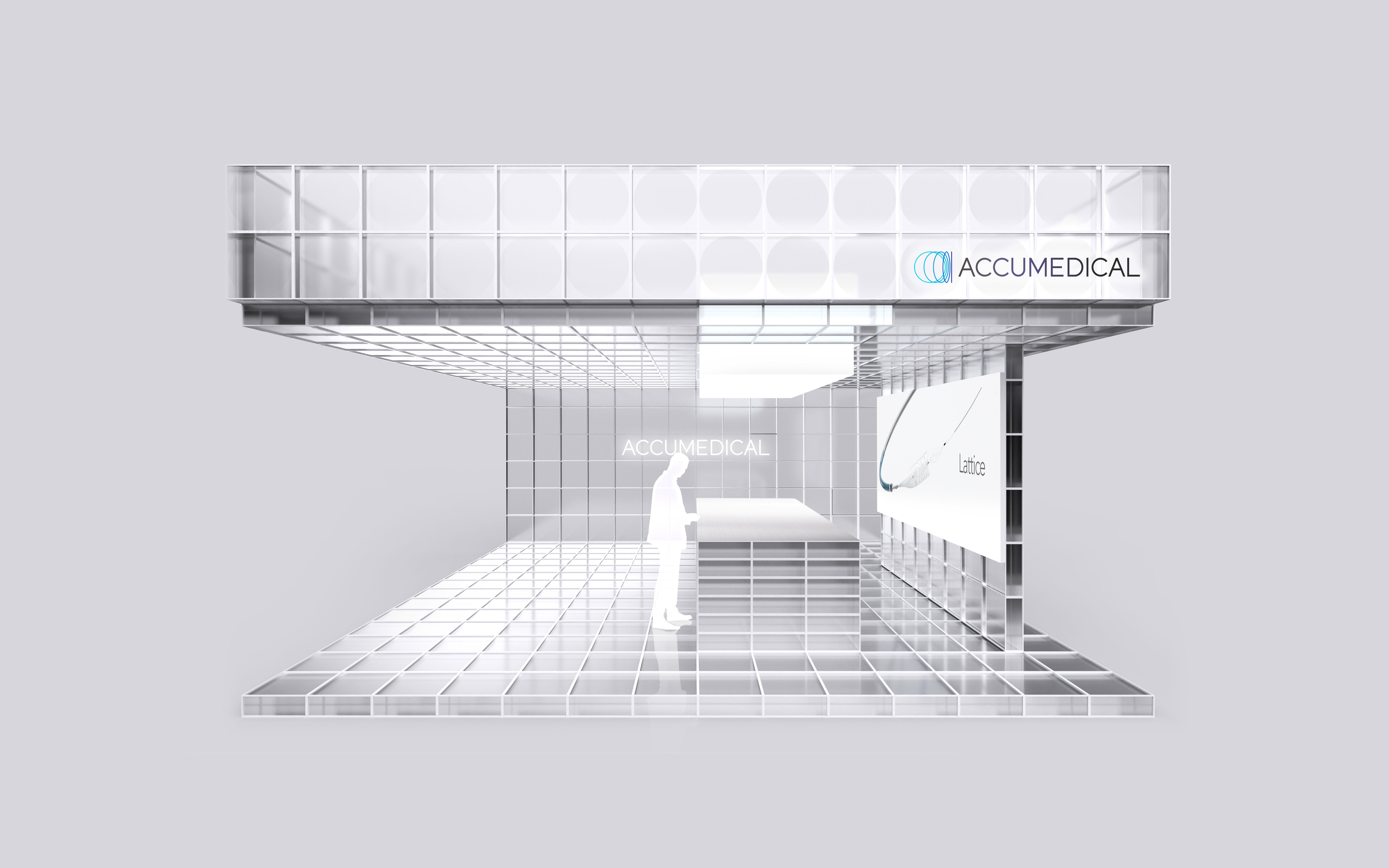 本方案从医疗科技背后的精密结构、工程系统与技术逻辑出发,将“网格”作为贯穿整个展台的核心视觉语言。通过透明结构、模块化框架以及连续的矩阵关系,形成一个具有强烈科技属性的未来空间,表达 AccuMedical 在医疗器械研发过程中所代表的精密、理性、系统与创新能力。 顶部、墙面及地面采用统一的网格体系,使整个空间形成从建筑结构到视觉语言的一体化设计。半透明玻璃与金属框架让展台具有类似精密仪器、工程结构或数字坐标系统的视觉特征,同时大量透明材质削弱了结构本身的重量感,使复杂的网格体系依然保持轻盈和通透。 与方案一相比,本方案更强调空间的结构感与技术表达。品牌 Logo、产品大屏以及中心展示区被嵌入规则的几何系统之中,在高度秩序化的环境中形成清晰的信息层级。尤其是产品展示屏与透明网格之间形成鲜明对比,使具体医疗产品成为整个“技术系统”中的核心节点,从而强化“产品源自精密工程与创新研发”的品牌联想。 视觉上,整个空间如同一个被放大的医疗科技装置或精密实验系统,既具有未来感,也能够体现 AccuMedical 在材料、结构、工程和医疗创新方面的专业属性。相比传统医疗展台,它拥有更强的视觉记忆点,也更适合塑造年轻、前沿、具有研发驱动力的品牌形象。 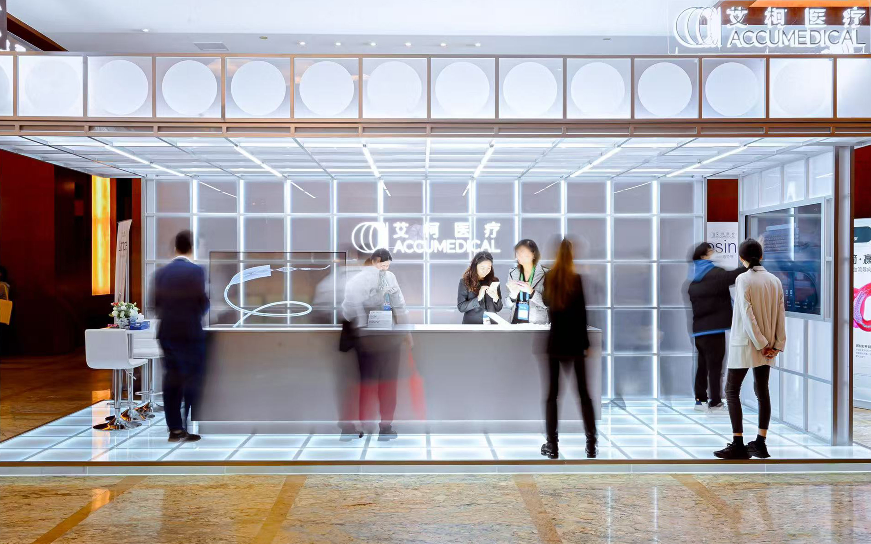 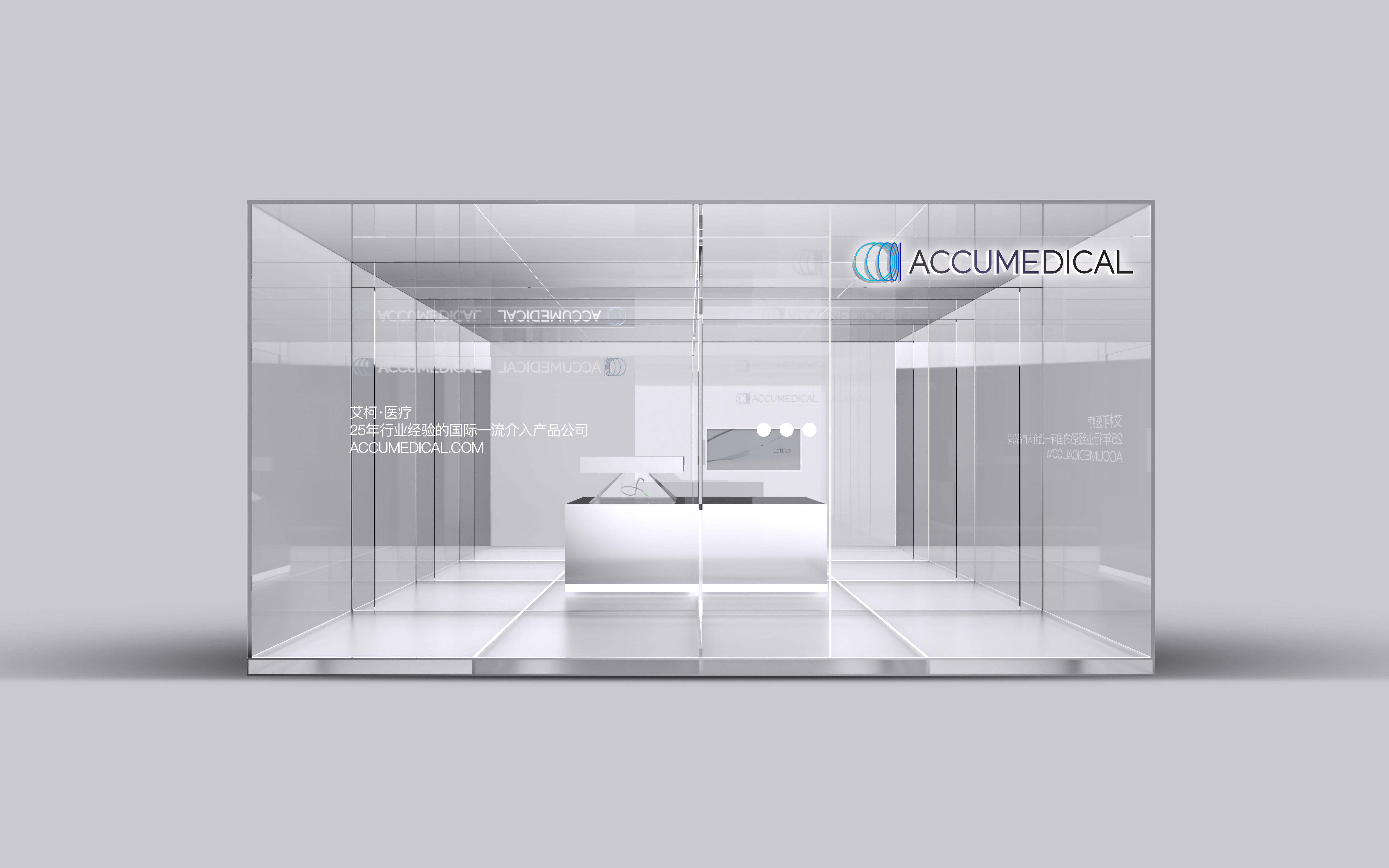 将医疗科技品牌语言转化为空间体验,通过结构、材质、光与数字内容的统一设计,打造兼具品牌识别、产品展示与未来科技感的 AccuMedical 展厅。 ## English Content ### Introduction We provide AccuMedical with showroom space design services to extend their medical technology brand language to offline space experience. Focusing on the brand characteristics of "professionalism, precision and innovation", the overall design is carried out from spatial concept, visual style, dynamic line planning, brand display to product presentation. Through minimalist structure, transparent materials and light environment, a futuristic medical science and technology space is created, and brand identification and product display efficiency are strengthened in limited exhibition scenes. Service Content: Space concept design/exhibition hall visual design/brand space extension/display dynamic line planning/product display design/digital screen content planning  Drawing on the intricate architectures, engineering systems, and technical logics underpinning medical technology, this design scheme employs a “grid” as the overarching visual language that runs throughout the entire booth. Through its transparent structure, modular framework, and continuous matrix relationships, the space embodies a strong technological identity, reflecting AccuMedical’s commitment to precision, rationality, systematic design, and innovative capability in medical device R&D. The ceiling, walls, and floor are unified under a single grid system, creating an integrated design that seamlessly links the architectural structure with the visual language of the space. Translucent glass and a metal frame lend the exhibition booth the visual character of precision instruments, engineering structures, or digital coordinate systems, while the extensive use of transparent materials diminishes the perceived weight of the structure, ensuring that even its intricate grid system remains light and airy. Compared with Option One, this方案 places greater emphasis on the spatial structure and the expression of technology. The brand logo, the product’s large display, and the central exhibition area are integrated into a structured geometric system, establishing a clear information hierarchy within a highly ordered environment. In particular, the stark contrast between the product display screens and the transparent grid highlights each medical device as a central node within the overarching “technology ecosystem,” thereby reinforcing the brand association that “our products are born from precision engineering and cutting-edge R&D.” Visually, the entire space resembles an enlarged medical‑technology device or a precision experimental system, exuding a futuristic aesthetic while underscoring AccuMedical’s expertise in materials, structural design, engineering, and medical innovation. Compared with traditional medical exhibition booths, it boasts more striking visual highlights and is better suited to cultivating a brand image that is youthful, cutting-edge, and driven by innovation.  This program starts from the precise structure, engineering system and technical logic behind medical technology, and uses "grid" as the core visual language throughout the booth. Through transparent structure, modular framework and continuous matrix relationship, a future space with strong scientific and technological attributes is formed to express the precision, rationality, system and innovation ability represented by AccuMedical in the process of medical device research and development. The top, wall and ground adopt a unified grid system, so that the whole space forms an integrated design from the architectural structure to the visual language. Translucent glass and metal frames give the stand visual features similar to precision instruments, engineering structures or digital coordinate systems, while a large number of transparent materials weaken the weight of the structure itself, keeping the complex grid system light and transparent. Compared with scheme one, this scheme emphasizes the structural sense and technical expression of space more. The brand logo, product screen and central display area are embedded in a regular geometric system, forming a clear information hierarchy in a highly ordered environment. In particular, the sharp contrast between the product display screen and the transparent grid makes the specific medical product become the core node in the whole "technology system", thus strengthening the brand association of "products from precision engineering and innovative research and development. Visually, the entire space resembles a magnified medical technology device or precision experimental system, both futuristic and able to reflect the AccuMedical's expertise in materials, structure, engineering and medical innovation. Compared with traditional medical booths, it has stronger visual memory points and is more suitable for shaping a young, cutting-edge, R & D-driven brand image.   The medical science and technology brand language is transformed into space experience, and through the unified design of structure, material, light and digital content, a AccuMedical exhibition hall with brand identification, product display and future science and technology sense is created.