# BIBF国际插画大赛 / 品牌升级与全球赛事官网 - ID: 416 - URL: https://www.stoyard.com/works/416 - English URL: https://www.stoyard.com/en/works/416 - Year: 2025 - Cover: https://static.glabcms.stoyard.com/stoyard/project/cover/20250921/vu6jz7lm8k.png - Float Image: https://static.glabcms.stoyard.com/stoyard/project/float/20250921/j316bhcupsg.png - Categories: 活动、展览设计服务, 数字化策略咨询, 标志设计, 中小型企业网站方案, 产品原型(UX), 视觉规范(VI)手册, UI, 软件设计解决方案, 用户体验研究, 具体应用设计, 政府、大学、国际组织, 艺术与文化, 文娱、传媒 - English Categories: Event & Exhibition Design, Innovation Creative Consulting, Logotype, Products Marketing Website, UX Design, VI Manual, UI Design, Software Design Solution, User Experience Research, Visual Application Systems Book, Government、Organizations, Arts & Culture, Entertainment、Media - Author: 葛熙呈 - English Author: Xicheng Ge - Publish: 2025-09-10 - Editor: STOYARD BEIJING - External Link: http://www.bibf-illustration.com ## 中文主体 ### 项目简介 BIBF国际插画大赛是北京国际图书博览会(BIBF)旗下专题品牌之一。大赛面向全球专业插画艺术家以及热爱插画的少年儿童,邀请国际知名插画专家以及国内外出版机构组成专业评审团队。征集赛道根据参赛者年龄分为专业赛道和青少年赛道,并根据赛道类别细分奖项。 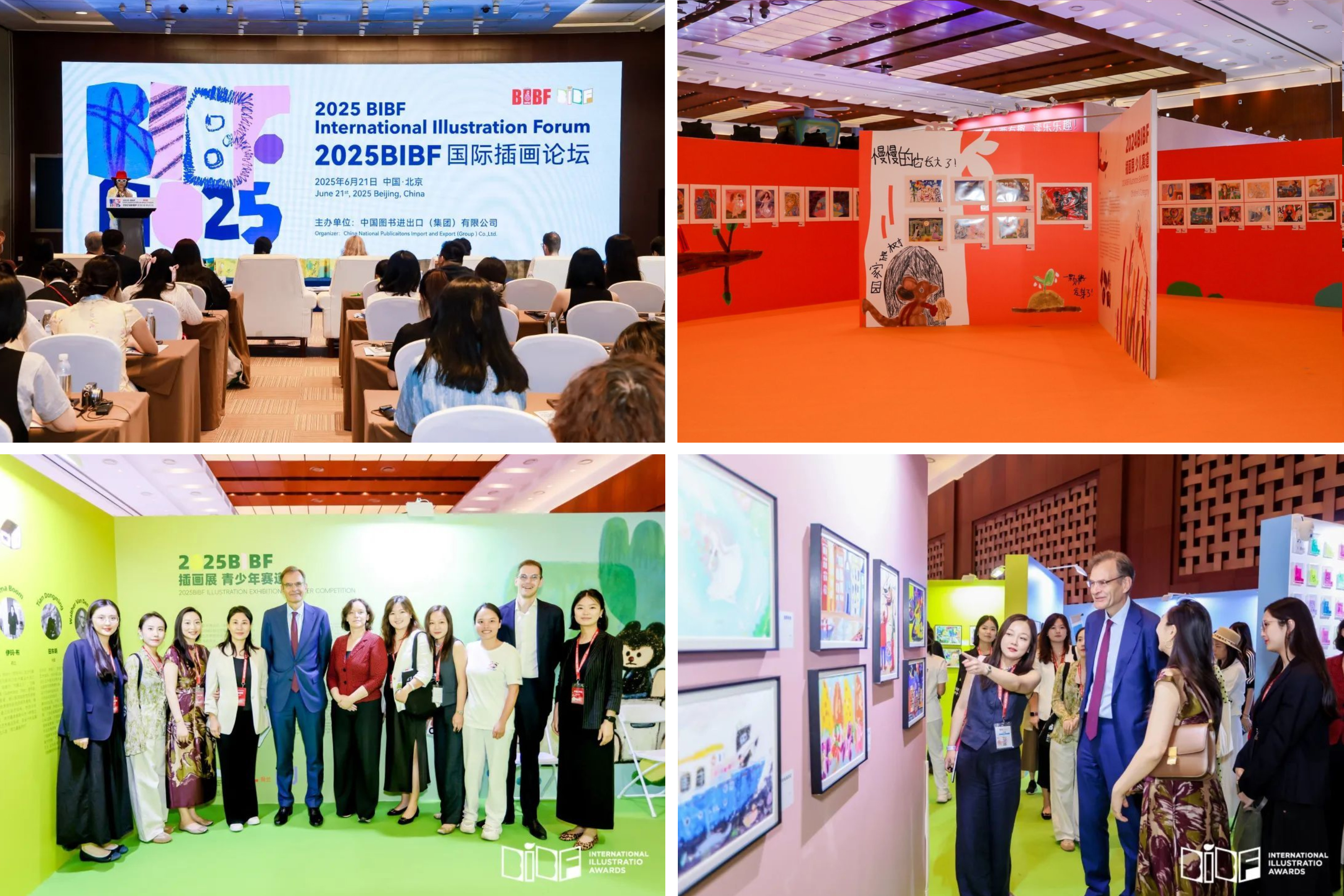 本次 BIBF 插画大赛 Logo 设计以“绘本”为核心灵感,象征创作的展开与灵感的启程。绘本的形态不仅呼应了“图书”这一核心载体,同时也寓意着多样性、开放性与延展性,契合插画创作中丰富的表达方式与无限的可能。 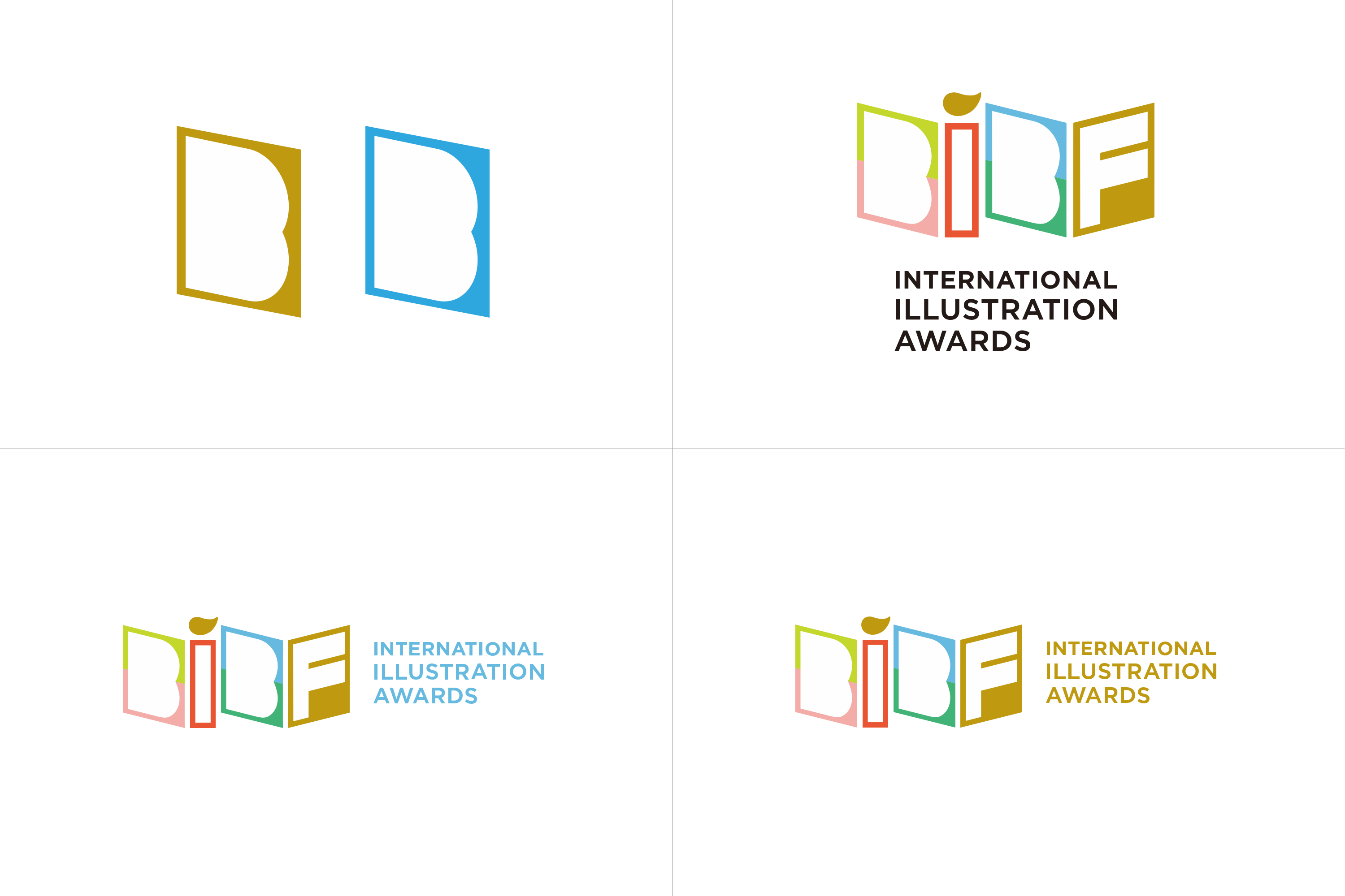 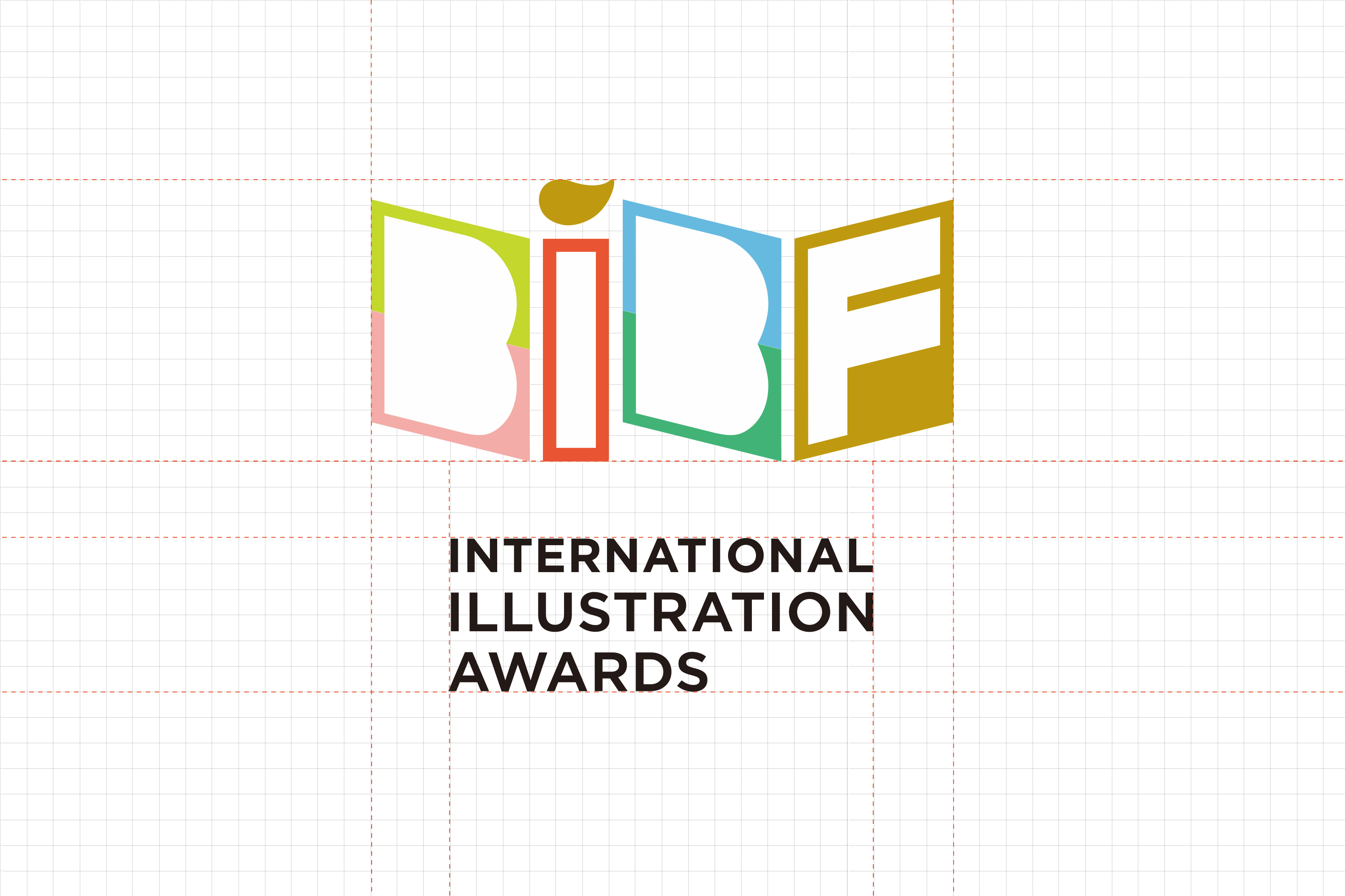 Logo采用了六种不同的颜色,代表来自不同文化背景、风格迥异的插画创作者,色彩之间的共存与协调,寓意此次大赛包容多元、鼓励个性表达的理念。色彩的排列与绘本形态的动态结合,使整体视觉更具节奏感与现代感。 同时将画笔的元素融入其中,强调此次大赛“插画”这一核心主题,使标志在视觉识别上具有更强的关联性与创意性。画笔如同一支打开创作之门的钥匙,引导观者进入视觉艺术的世界。 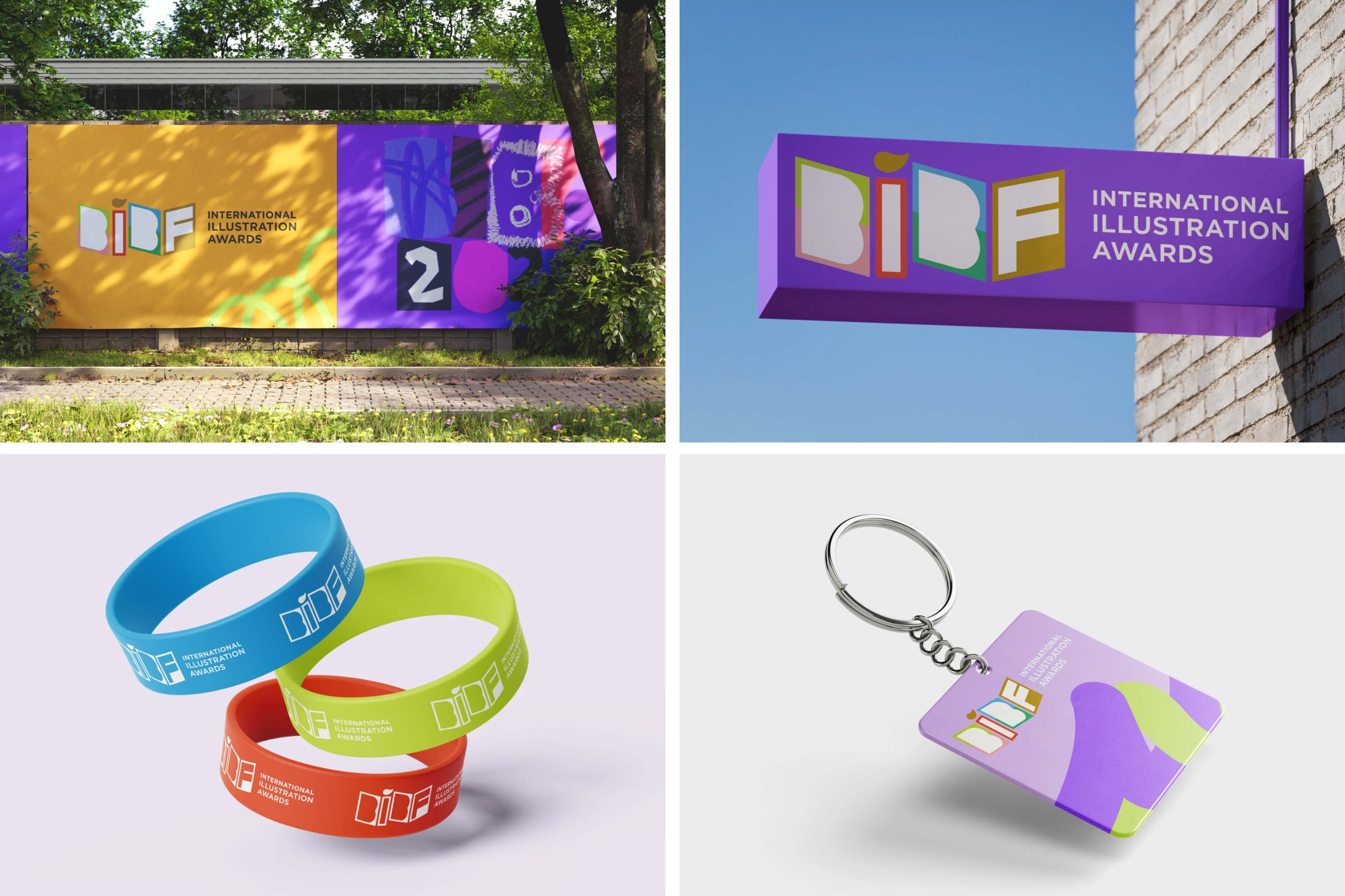 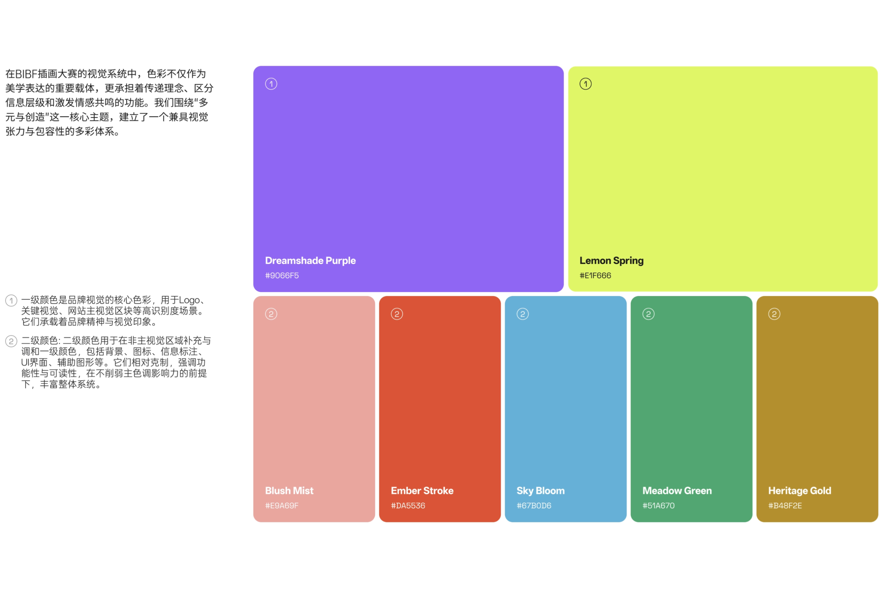 在BIBF插画大赛的视觉系统中,色彩不仅作为美学表达的重要载体,更承担着传递理念、区分信息层级和激发情感共鸣的功能。我们围绕“多元与创造”这一核心主题,建立了一个兼具视觉张力与包容性的多彩体系。 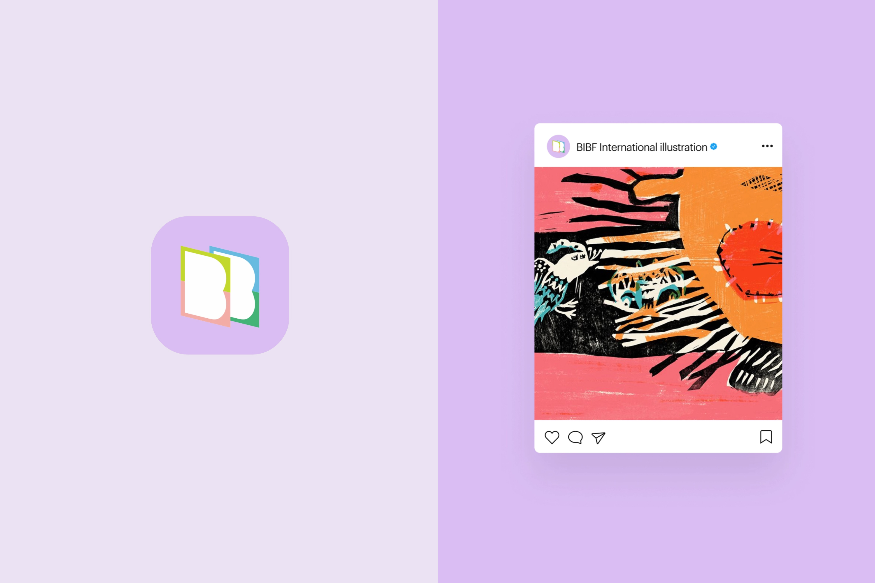   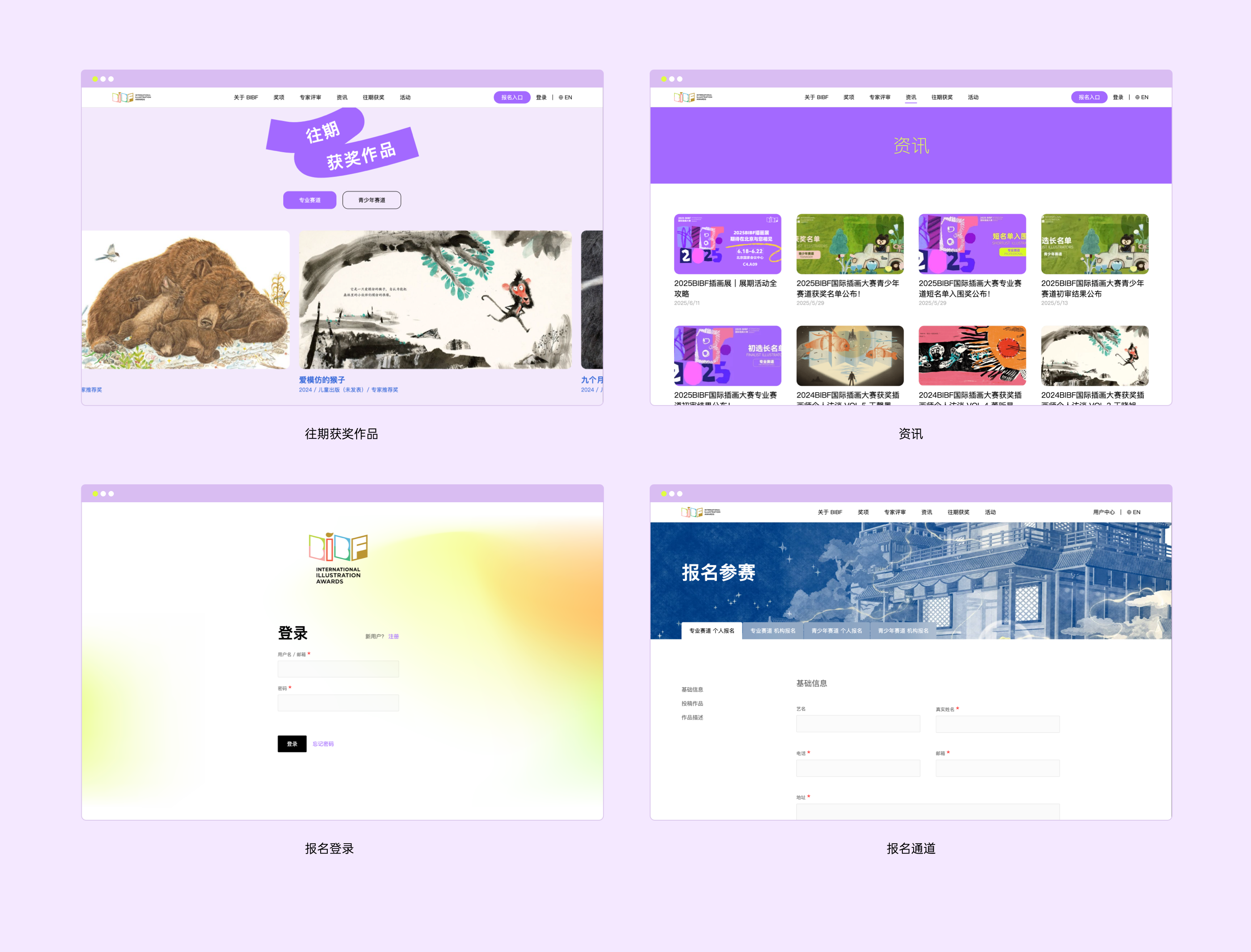    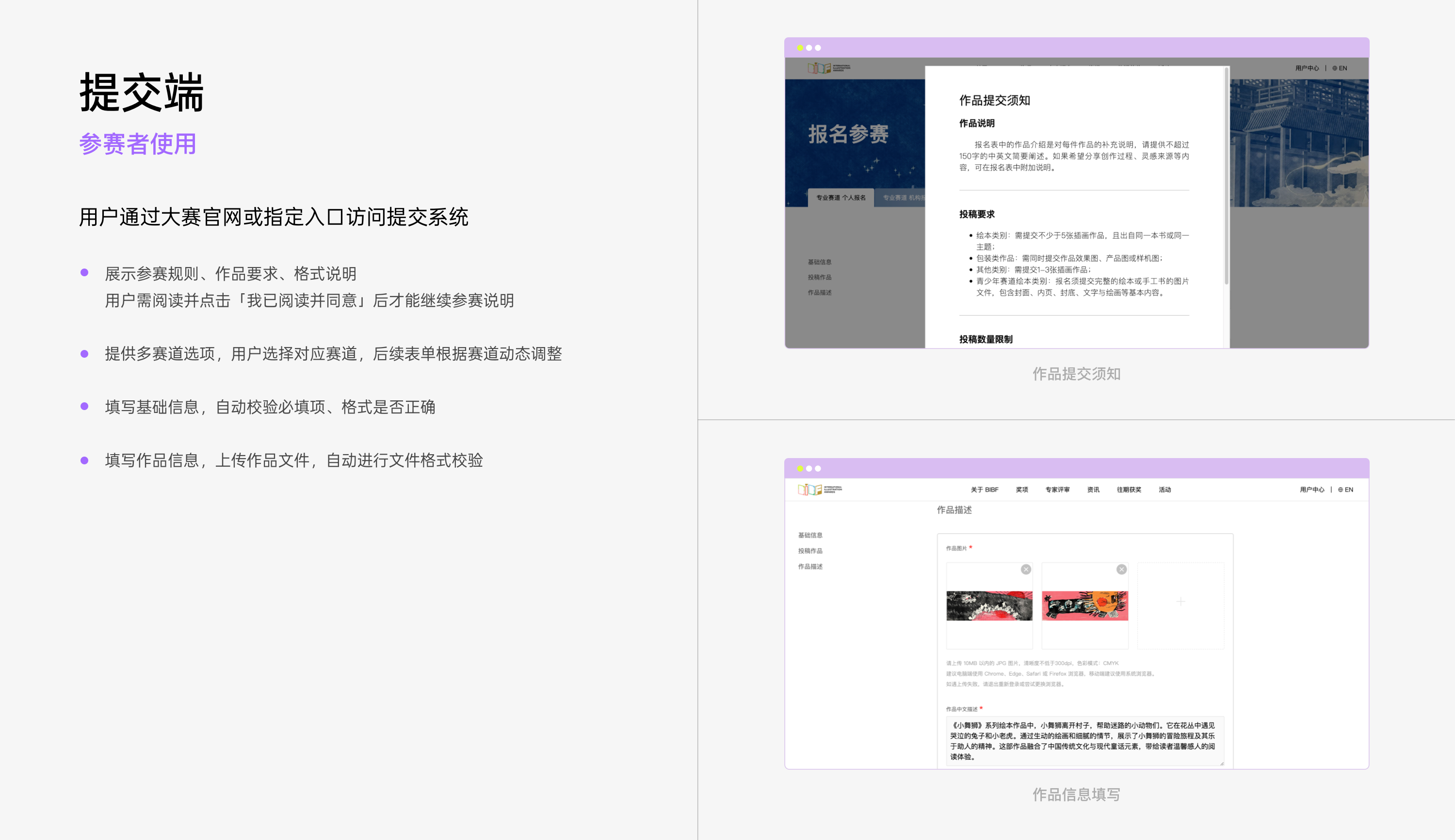 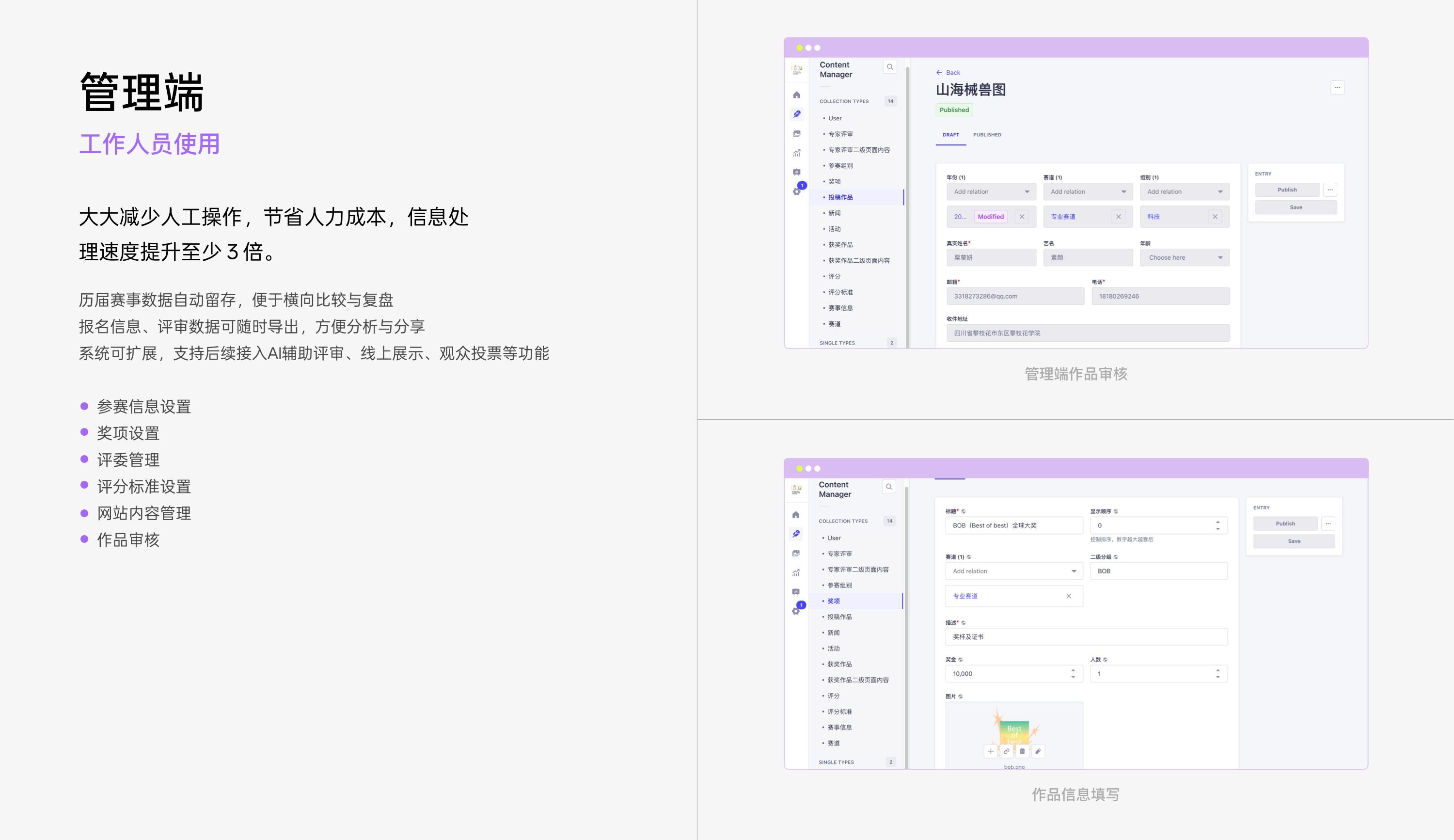 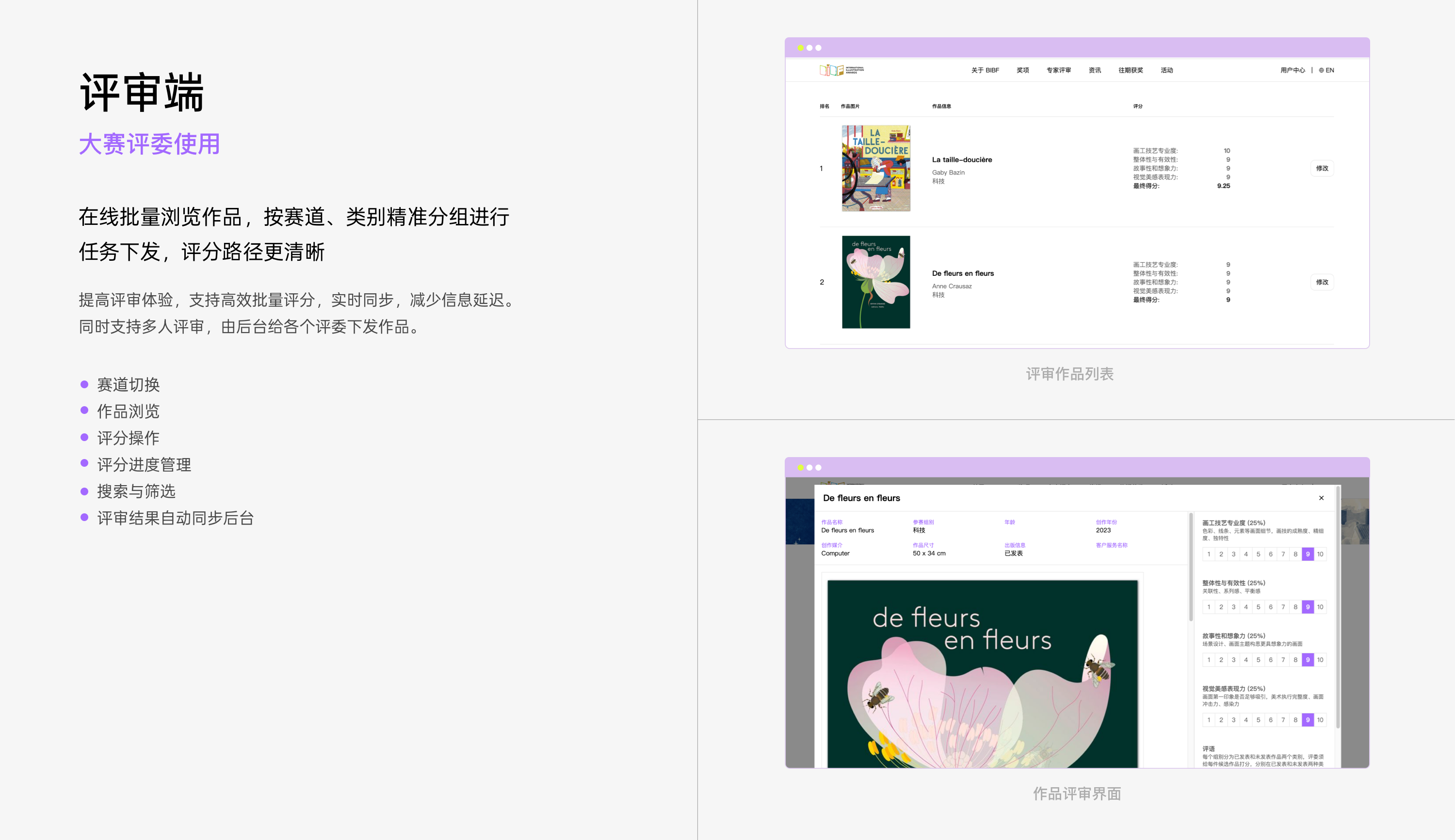 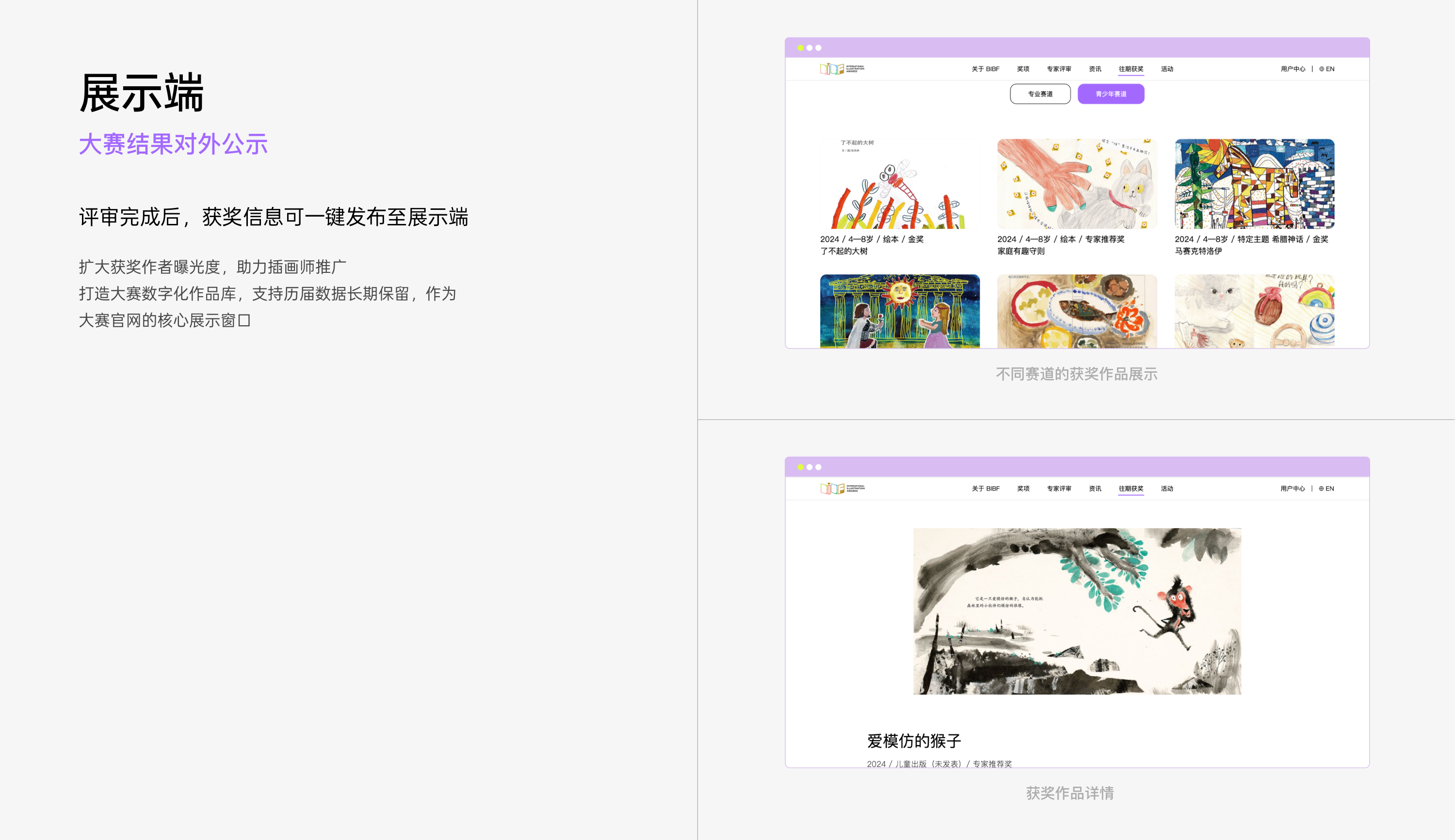 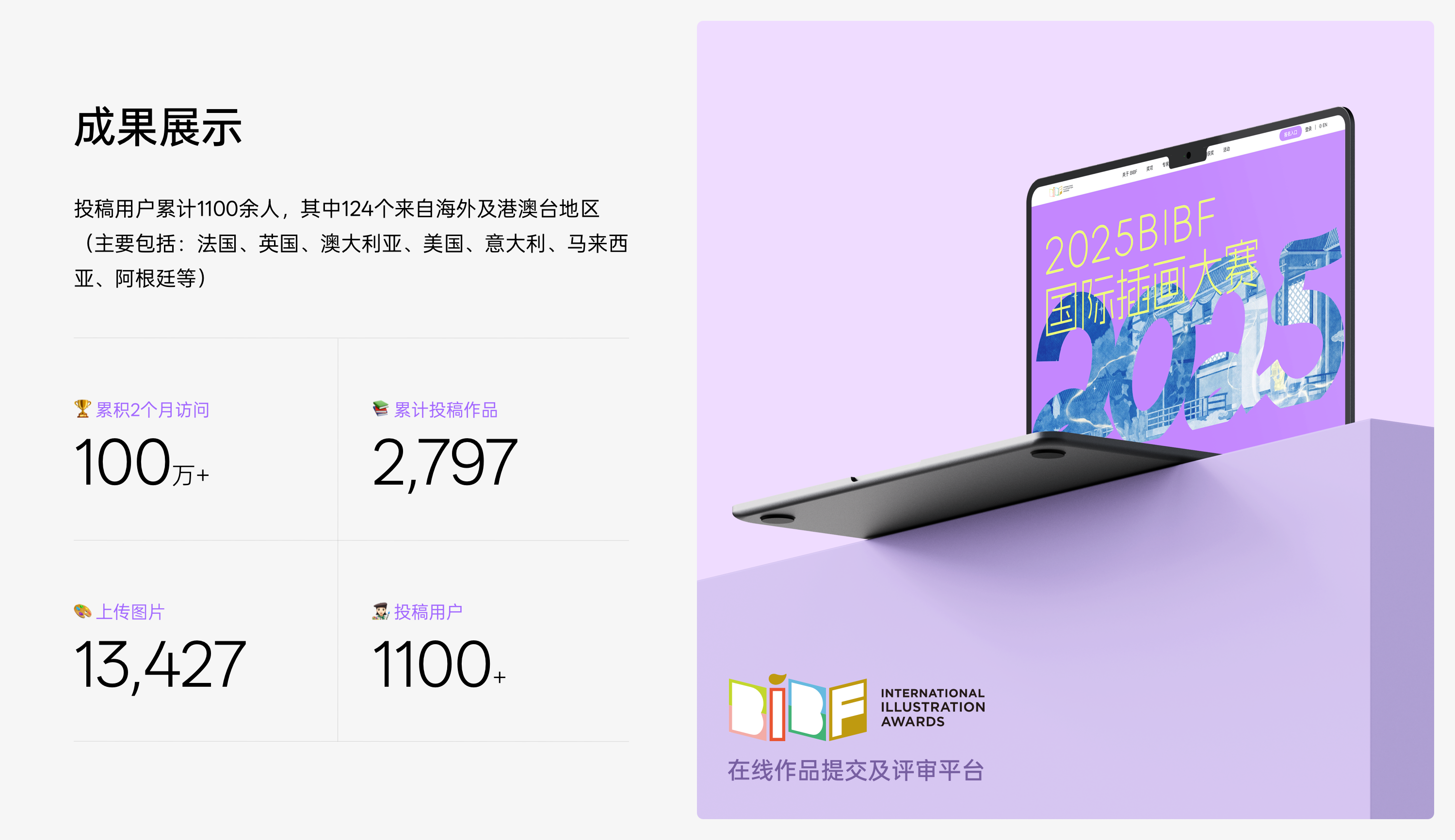 ## English Content ### Introduction BIBF International Illustration Award is one of the special brands under the umbrella of Beijing International Book Fair (BIBF), with professional international review resources, integrating the three major projects of overseas artist residency, overseas publishing fund, and overseas exhibition of winning works.  The Logo design of this BIBF illustration competition takes "picture book" as the core inspiration, symbolizing the development of creation and the departure of inspiration. The form of picture books not only echoes the core carrier of "books", but also implies diversity, openness and extensibility, which fits the rich expression and infinite possibilities in illustration creation.   Logo uses six different colors, representing illustration creators from different cultural backgrounds and styles. The coexistence and coordination of colors implies the concept of tolerance and diversity and encouragement of individual expression in this competition. The arrangement of colors and the dynamic combination of picture book form make the overall vision more rhythmic and modern. At the same time, the elements of the brush are integrated into it, emphasizing the core theme of "illustration" in this competition, so that the logo has a stronger relevance and creativity in visual recognition. The brush is like a key to open the door of creation, leading the viewer into the world of visual art.   In the visual system of BIBF illustration competition, color is not only an important carrier of aesthetic expression, but also bears the function of conveying ideas, distinguishing information levels and stimulating emotional resonance. Around the core theme of "diversity and creation", we have established a colorful system with both visual tension and inclusiveness.            