# 大弈书房 / 国学文化品牌创新设计 - ID: 406 - URL: https://www.stoyard.com/works/406 - English URL: https://www.stoyard.com/en/works/406 - Year: 2023 - Cover: https://static.glabcms.stoyard.com/stoyard/project/cover/20240913/qxcoimctmnb.jpg - Categories: 标志设计, 社交媒体传播、互动H5, 艺术与文化 - English Categories: Logotype, Social Media/H5 interaction, Arts & Culture - Author: STOYARD - English Author: STOYARD - Editor: STOYARD BEIJING ## 中文主体 ### 项目简介 我们大弈书房品牌升级了全新的视觉形象。我们希望通过设计,赋予客户在文化创新内容品类中更高的竞争力和辨识度。视觉策略是剥离复杂的视觉,发现本质,并将其清晰可视地表现出来。 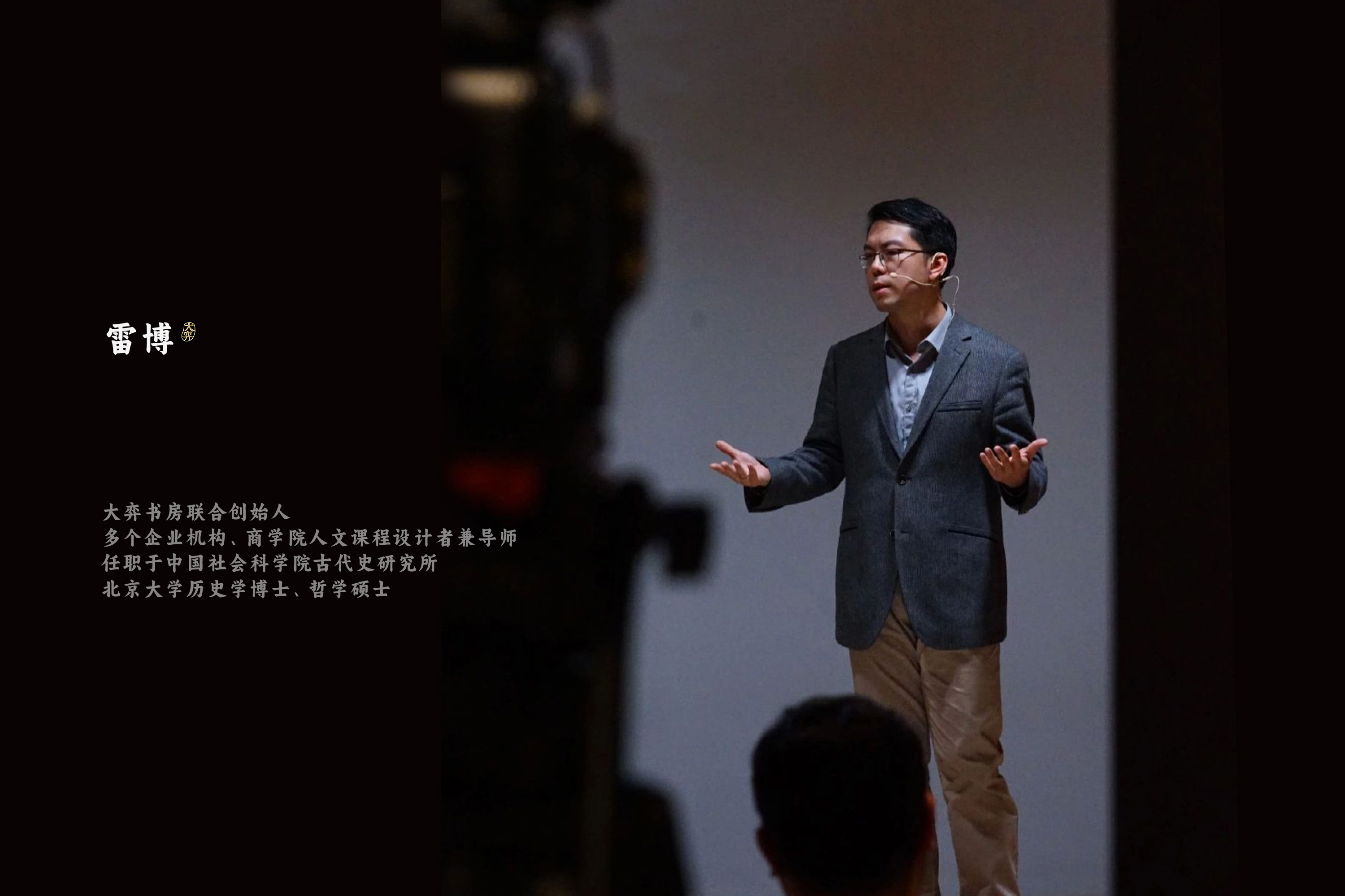 项目背景 “大弈书房”品牌由北京大弈教育科技有限公司持有,专注于文化教育领域,旨在为用户提供独特角度的优质文化内容。 一直以来,“大弈书房”品牌对于宣扬中国传统文化做出不懈努力,创作出众多优质内容,如由中国社科院雷博老师对中国传统哲学、玄学以及文学的精彩讲述,都制作成了很优秀的课程内容,并分享给每一个对古典文艺感兴趣的用户。正是这种对于传统文化的执著、热爱成为了品牌最强的生命力。 基于此,我们也将设计的灵感来源深入到中国传统的文化长河中,从中选取一段与品牌最为匹配的内容,加以延展,最终形成一种有意义的品牌语言,增加传播力。 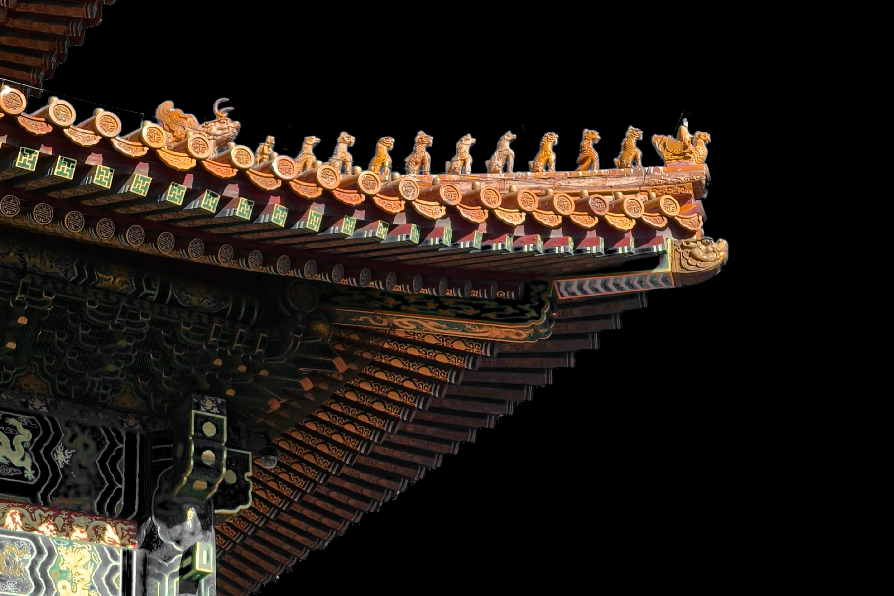 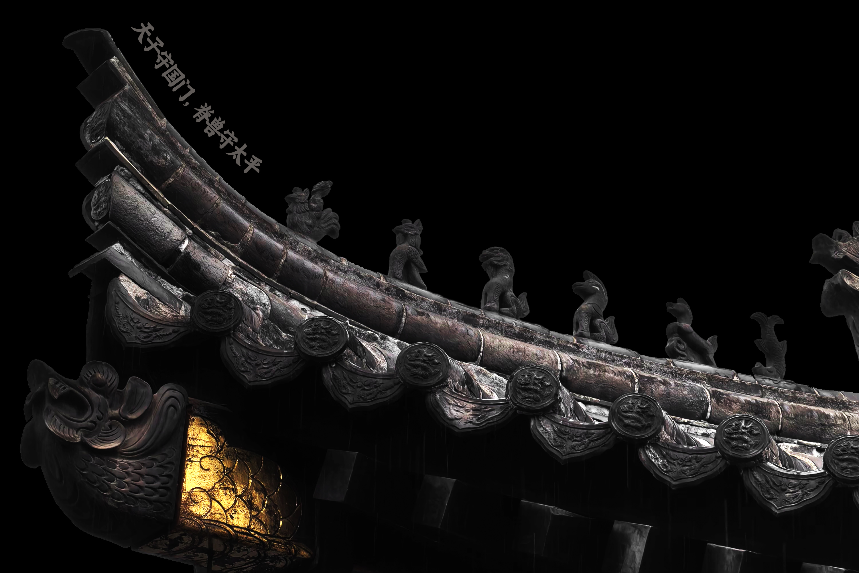 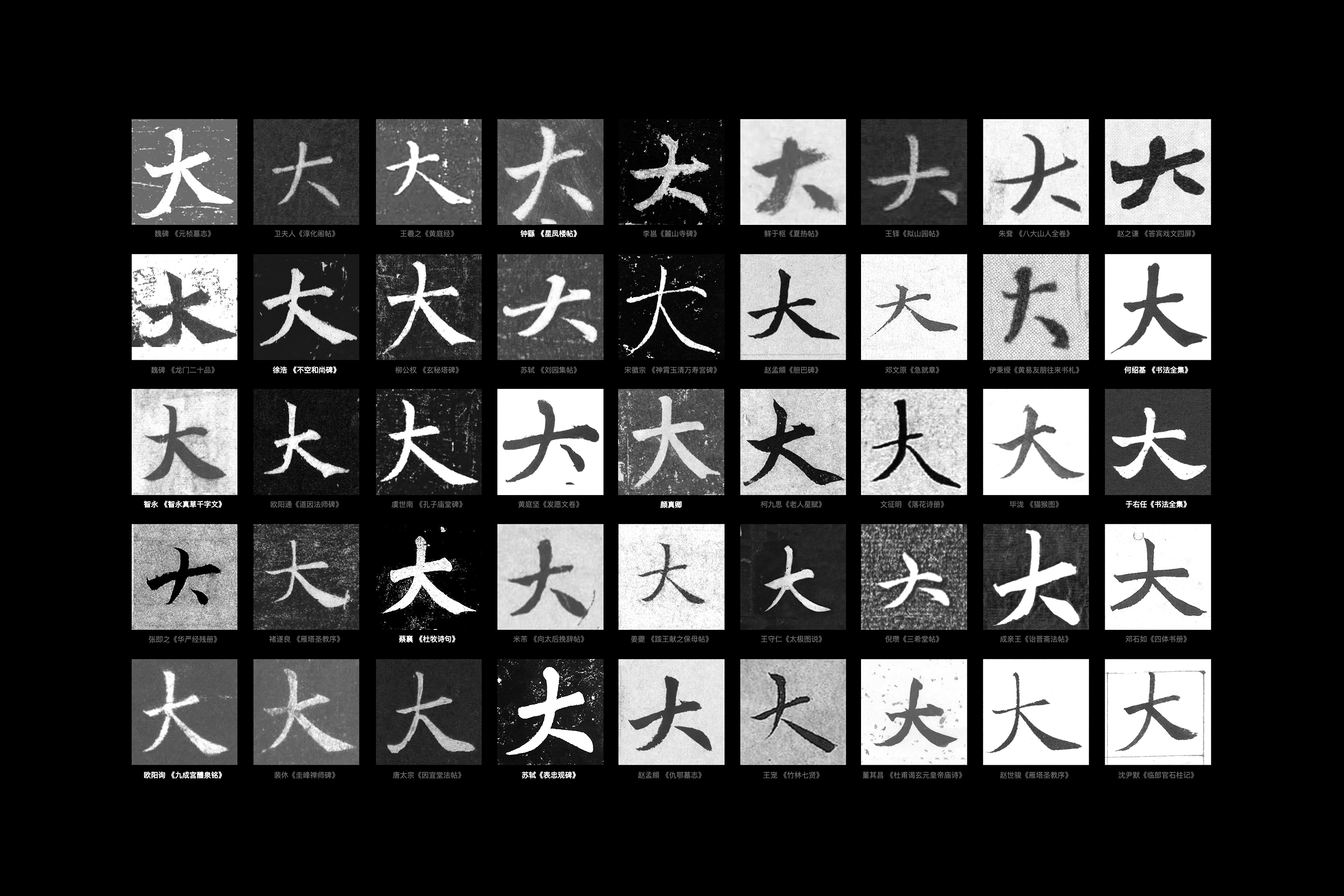     字、形、色相得益彰 “大弈书房”这四个字是整个品牌视觉升级的核心内容,我们希望字体能表达品牌所要传达的内容,我们并没有全新创造一个“新”字体或者图形。我们经过研究调研,确定了以唐代书法家颜真卿的书法作品作为基底,结合中国古建筑“房檐”“脊兽”等沉淀的深厚文化内核的符号进行自体形态设计,适度对毛笔的感知抽象化,并逐步提炼文字细节,融合呈现在最终字体之中。 [Video](https://static.glabcms.stoyard.com/stoyard/gallery/20241229/9q3we2akm6v.mp4) 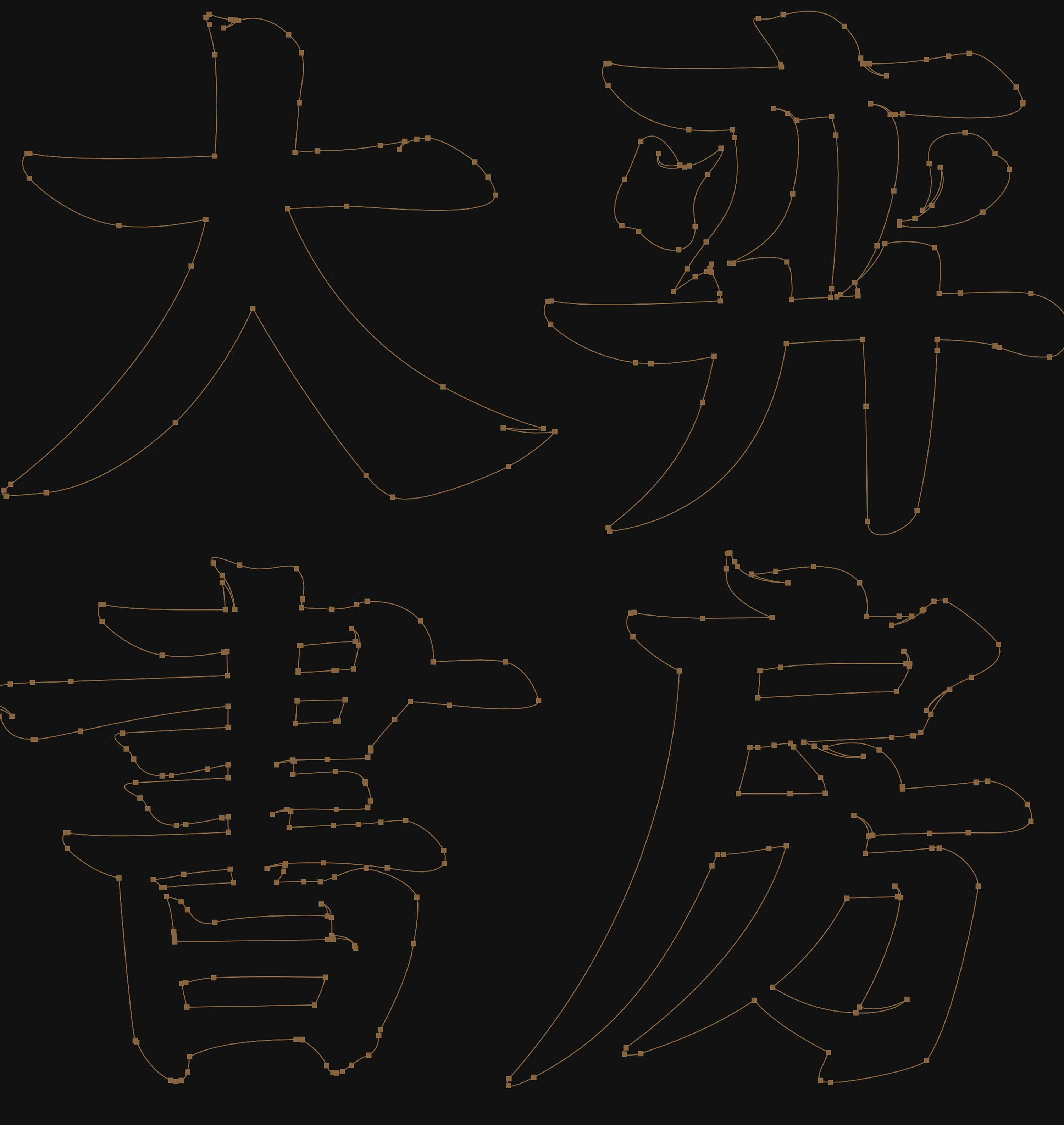 [Video](https://static.glabcms.stoyard.com/stoyard/gallery/20241118/dv0fpgh9zgj.mp4) 而在用色上,我们没有一笔浓墨重彩,全套选取了中国传统色中典雅、素净的传统色,那是古人从自然、烟雨中创造的颜色,淡雅轻盈。而图形的选择以及画面布局,也借鉴古典艺术作品常见的留白与隐喻的特色,这种方法应用于海报、书籍封面等场景中,会有“虽不全见但意蕴已现”的效果,也符合品牌用户的审美期待。 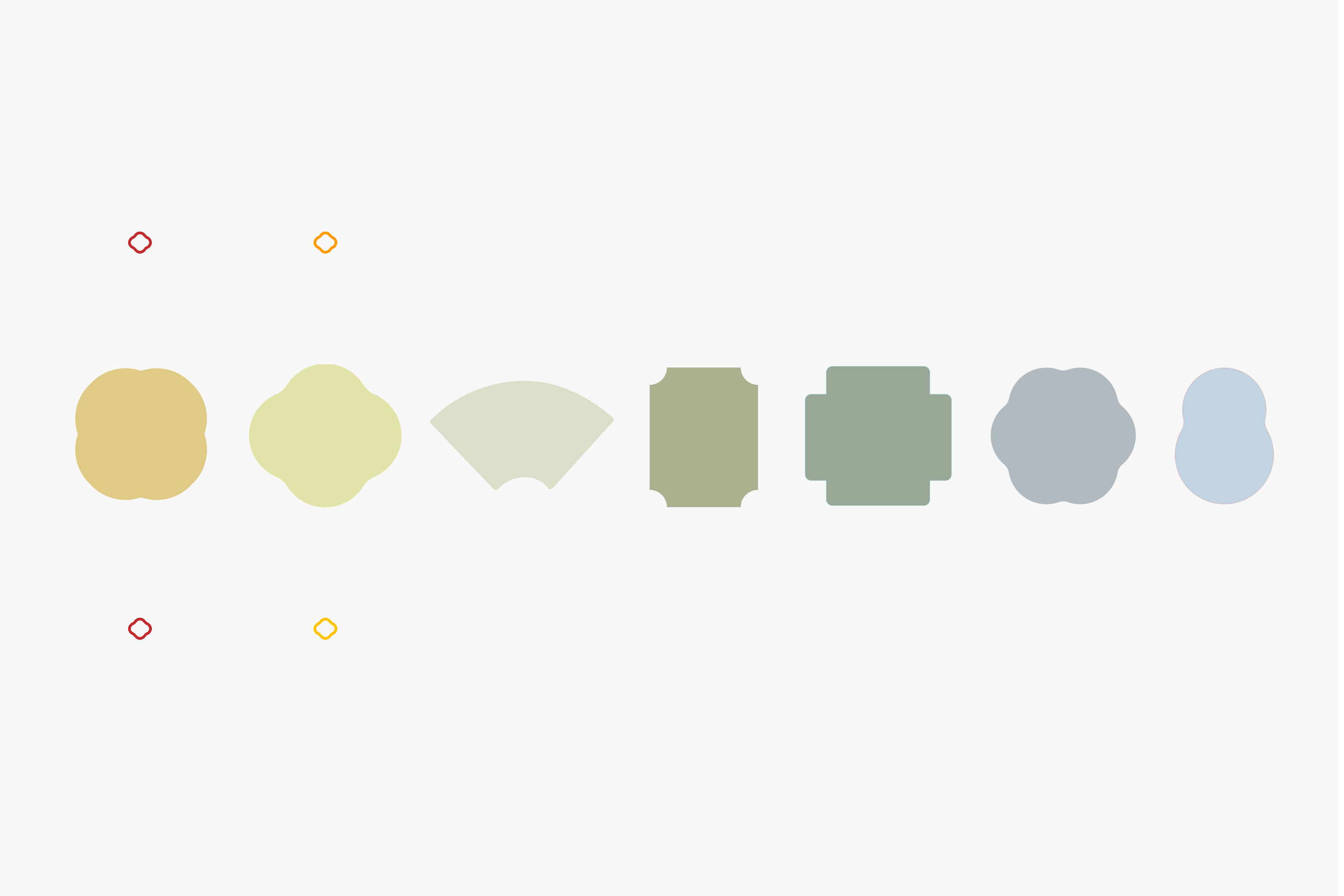 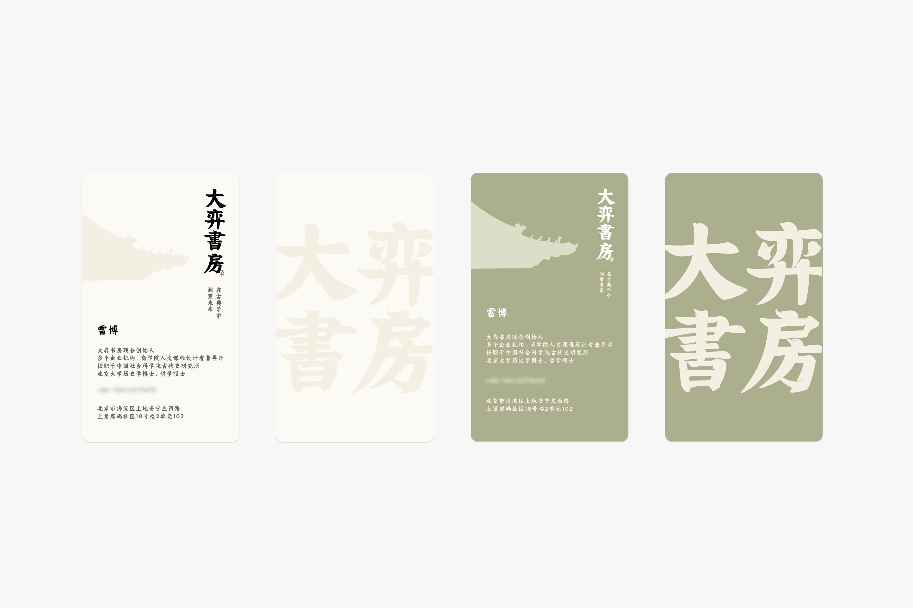 字与色,形与色,一重一轻,显得相得益彰,我们把品牌的风雅与庄重很好的融合在一起。 整个设计思路就是希望这座沉淀了厚重文化的“书房”经过设计解读和延展能更富有灵动感,那些好的内容会沿着这些细微的变化而流向更广阔的空间。 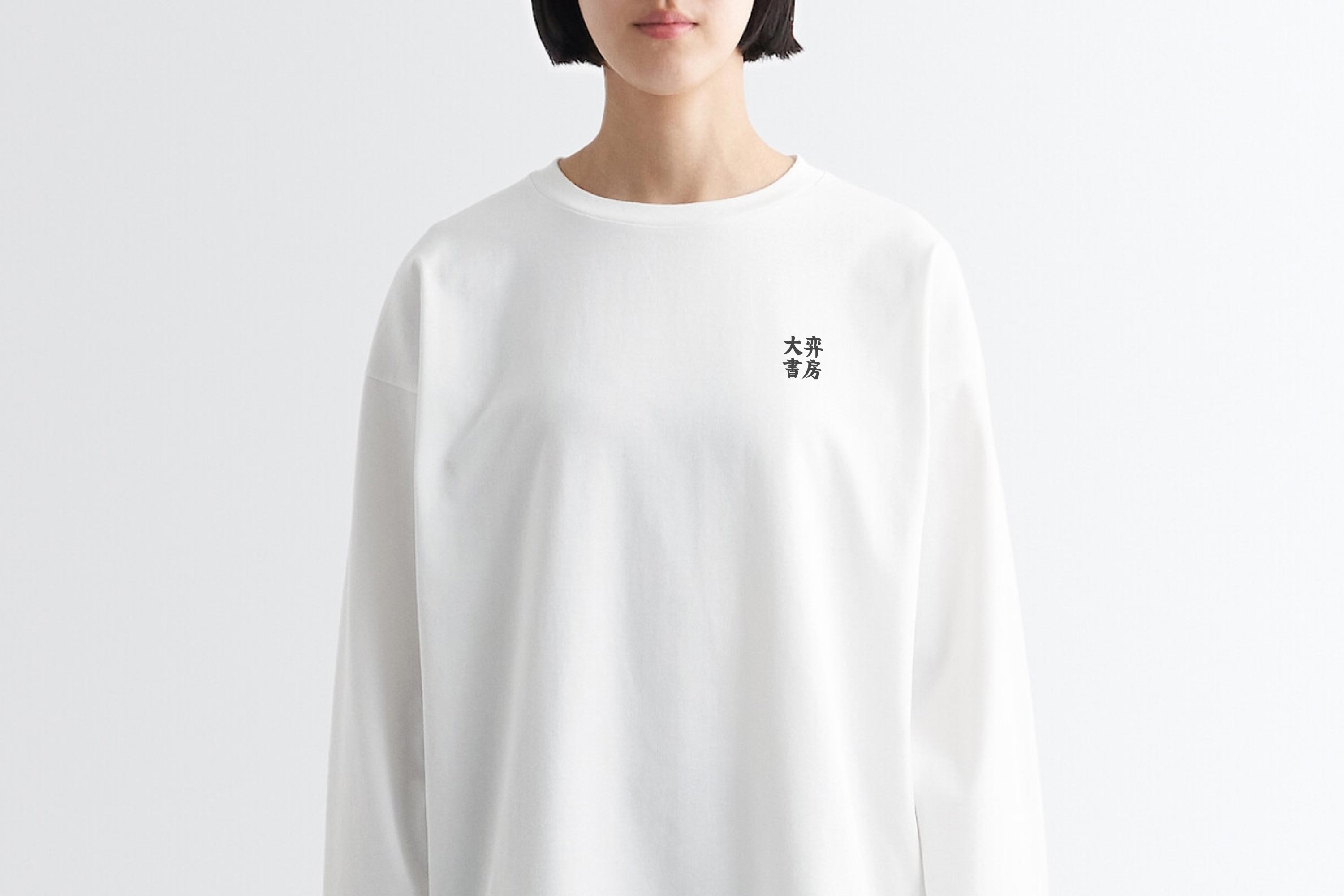 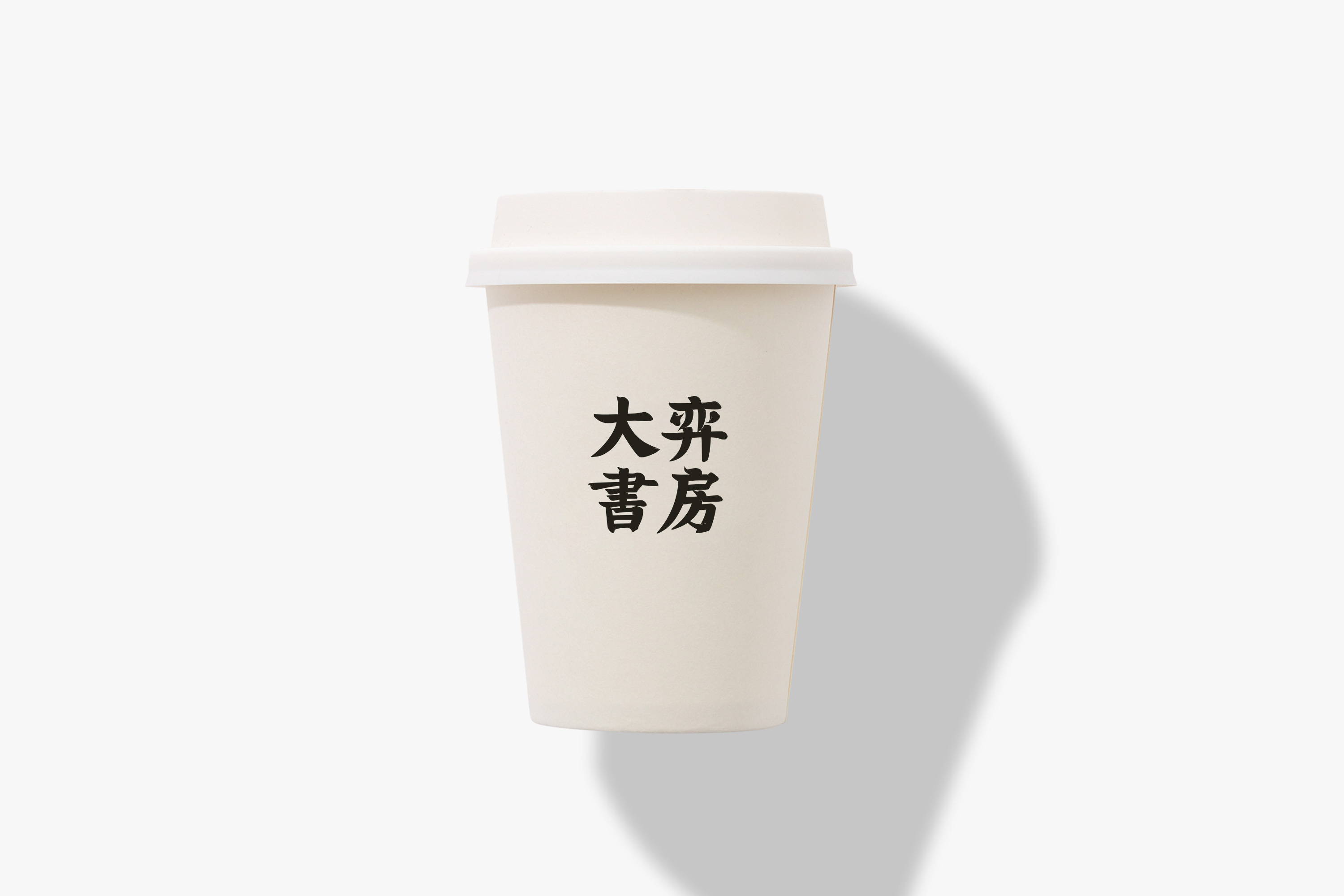 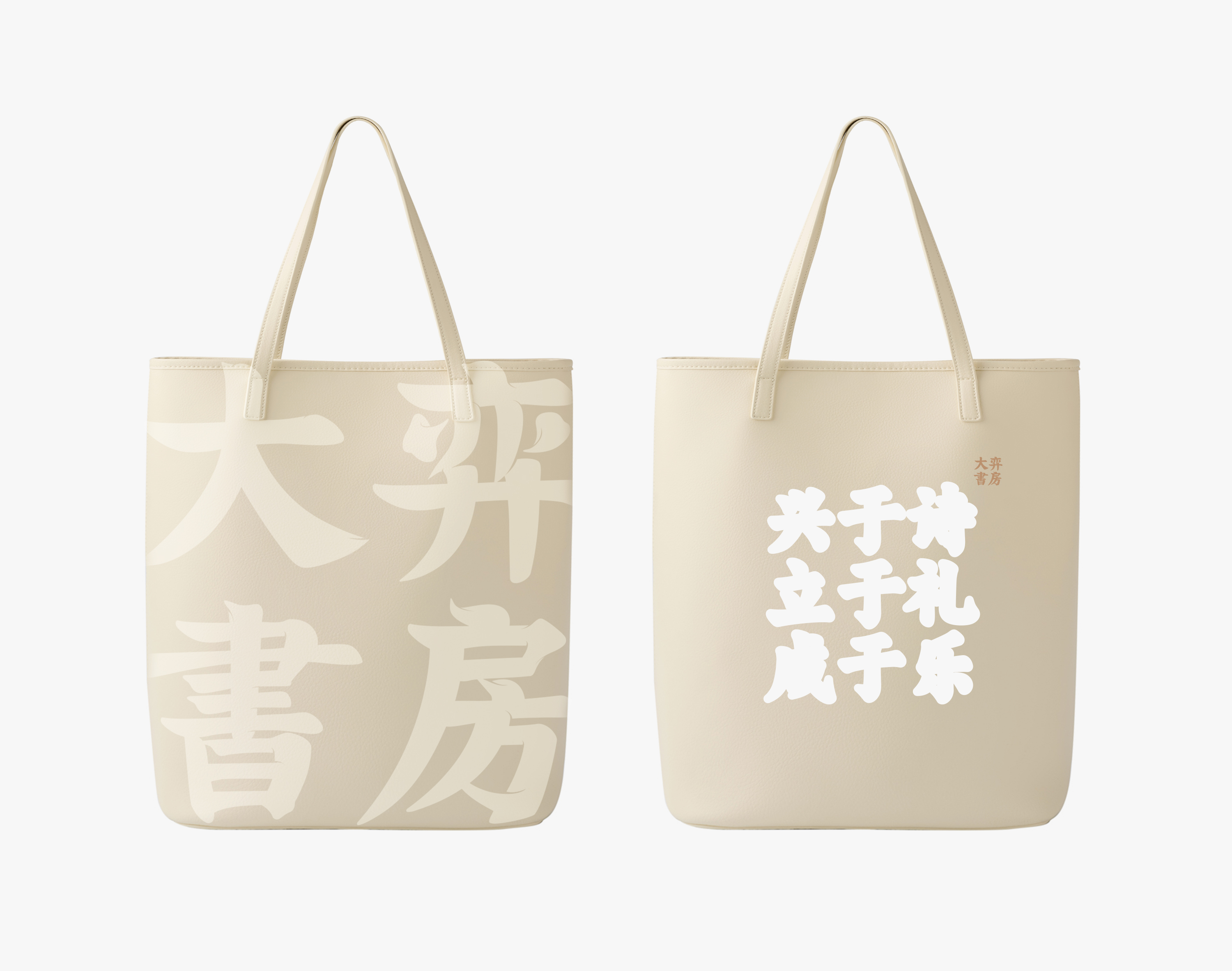 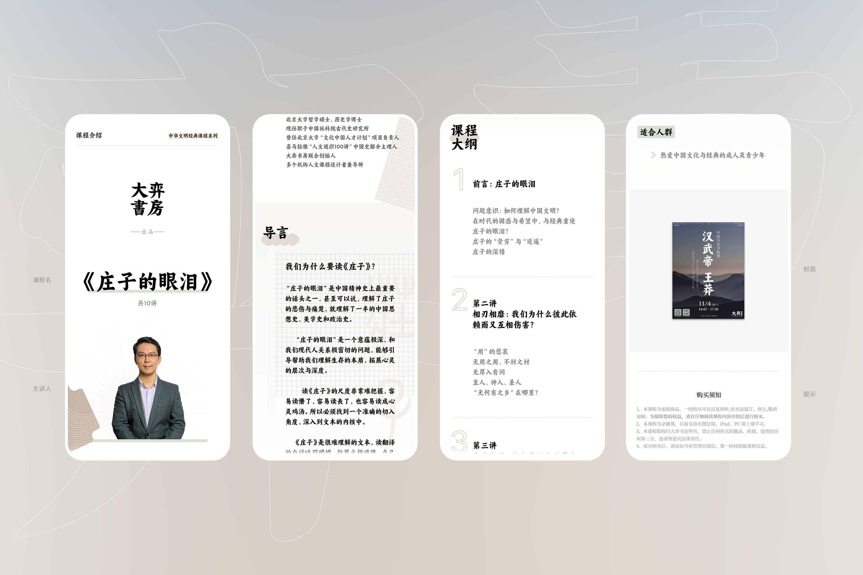 灵感的归处是大道至简 我们为品牌设计了一系列应用延伸,服装、包等,整体都是保持古风古韵,既不显得沉闷也不会过于跳脱,在古与今之间,选择大道至简,在视觉上不横加修饰,而将真正复杂的东西留给品牌输出的内容。不让形喧宾夺主,保留书房内部的秀丽丰厚。 这种创作思维也延伸至移动端平台页面的排版布局上,字体大小、行高段距、背景色、标题、行文节奏等,整个页面都会统一于品牌核心。 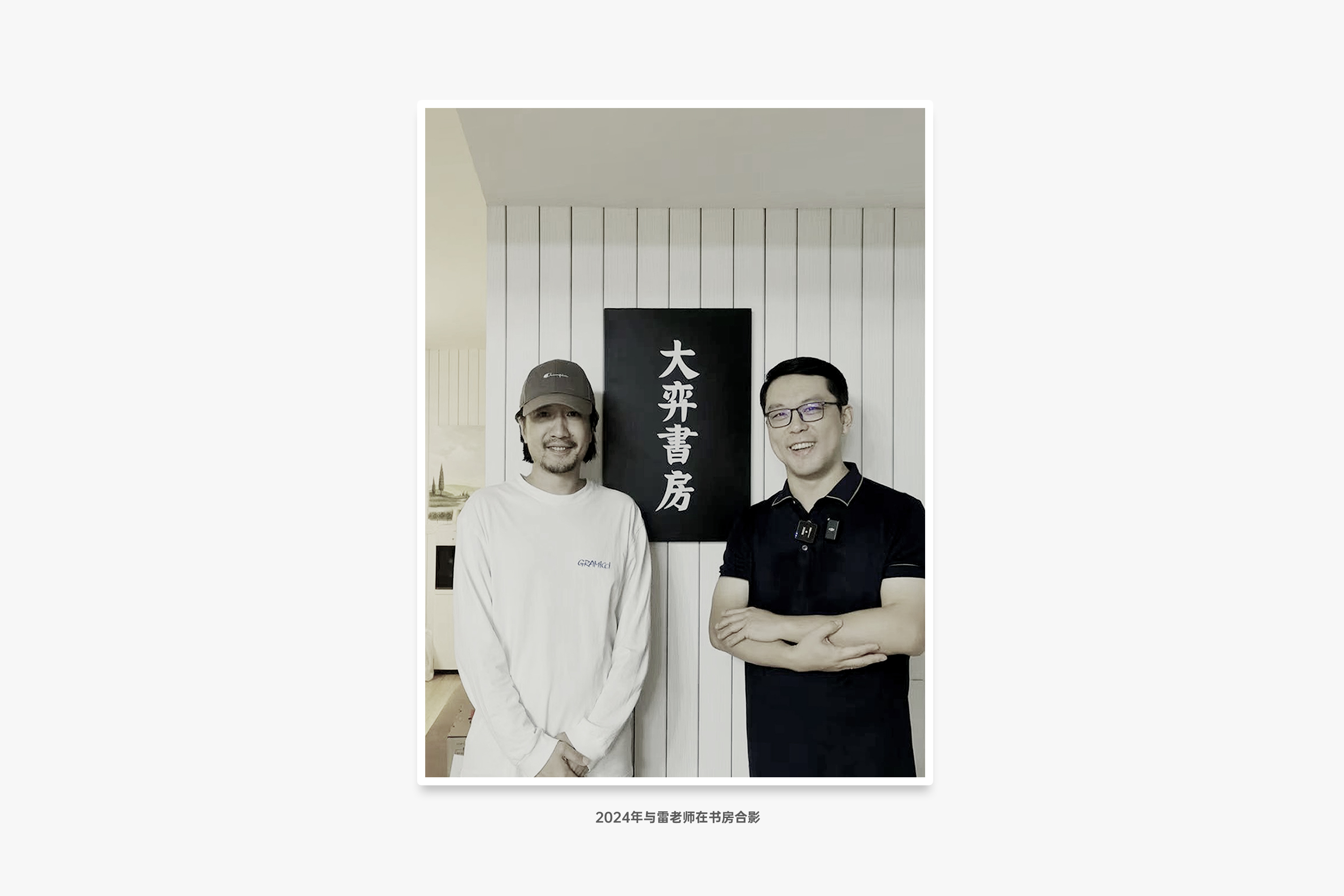 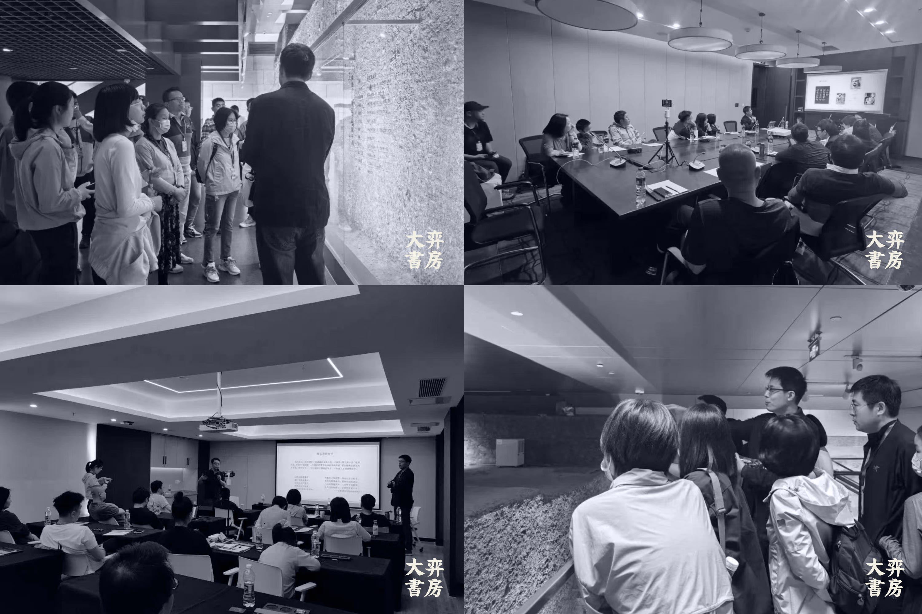 ## English Content ### Introduction We have upgraded our brand image for DAYISHUFANG with a new visual identity. We hope to enhance our clients' competitiveness and distinctiveness in the cultural innovation content category through design. Our visual strategy involves stripping away complex visual elements, revealing the essence, and presenting it in a clear and visible manner.  1. Project background The brand "Great Yi Study" is held by Beijing Great Yi Education Technology Co., LTD., focusing on the field of education and entertainment, aiming to provide users with high-quality educational resources and experiences. With the development and marketing of the brand, "Big Yi Study" is expected to establish a unique brand image and influence in the education industry. For a long time, the brand of "Big Game Bookstore" has made unremitting efforts to promote traditional Chinese culture, creating a lot of high-quality content, such as the wonderful narration of traditional Chinese philosophy, metaphysics and literature by teacher Lei Bo of the Chinese Academy of Social Sciences, which has been produced into excellent course content, and shared with every user who is interested in classical literature and art. It is this persistence and love for traditional culture that has become the strongest vitality of the brand. Based on this, we also deepen the inspiration source of design into the long river of traditional Chinese culture, select a section of content that best matches the brand, and extend it, and finally form a meaningful brand language to increase the communication power.        The characters, shapes, and colors complement each other. The four characters "Daiyi Bookroom" are the core content of the entire brand visual upgrade. We wanted the font to convey the brand's message, so we didn't create a "new" font or graphic from scratch. Instead, we found the works of the Tang Dynasty calligrapher Yan Zhenqing and interpreted them. Yan's calligraphy features bold and majestic strokes, as well as a sense of weight and dignity. We then combined it with symbols such as the eaves and roof ornaments of ancient Chinese royal architecture, which have deep cultural connotations, to extract shapes and graphics. We then integrated these elements into the final brand symbol. [Video](https://static.glabcms.stoyard.com/stoyard/gallery/20241229/9q3we2akm6v.mp4)  [Video](https://static.glabcms.stoyard.com/stoyard/gallery/20241118/dv0fpgh9zgj.mp4) 2. Word, shape and color complement each other The four words "Big chess study" are the core content of the entire brand visual upgrade, we hope that the font can express the content of the brand to convey, so we found the works of Tang Dynasty calligrapher Yan Zhenqing, after interpretation, Yan's calligraphy, a stroke and a stroke to show the majestic atmosphere and thick dignified, the most in line with the brand positioning. In the use of color, we do not have a heavy brush, a full set of traditional Chinese traditional color of elegance, plain and clean, that is the ancient people from nature, the color created in the rain, elegant and light. The choice of graphics and the layout of the picture also draw on the characteristics of the white space and metaphor commonly found in classical art works. When applied to posters, book covers and other scenes, this method will have the effect of "not fully seen but already present", which is also in line with the aesthetic expectations of brand users.   Word and color, shape and color, one weight and one light, appear to complement each other, we put the brand elegance and gravitas well together. The whole design idea is to hope that this "study" with thick culture can be more dynamic after design interpretation and extension, and those good contents will flow to a broader space along these subtle changes.     3. There is no easier place for inspiration We have designed a series of application extensions for the brand, clothing, bags, etc., the whole is to maintain the ancient style, neither dull nor too jumping, between the ancient and the present, choose the avenue to be simple, not visually modified, and leave the really complex things to the content of the brand output. Do not let the form dominate, keep the beautiful interior of the study rich. This creative thinking also extends to the layout of the mobile platform page, font size, line height distance, background color, title, writing rhythm, etc., the entire page will be unified in the brand core.  