# 某集体 ART+TECH / 视觉识别、官方网站升级 - ID: 403 - URL: https://www.stoyard.com/works/403 - English URL: https://www.stoyard.com/en/works/403 - Year: 2024 - Cover: https://static.glabcms.stoyard.com/stoyard/project/cover/20240724/jr3vbvbyon.png - Categories: 标志设计, 中小型企业网站方案, 建筑与设计 - English Categories: Logotype, Products Marketing Website, Design & Architecture - Author: STOYARD - English Author: STOYARD - Publish: 2024-06-13 - Editor: STOYARD BEIJING - External Link: https://www.moujiti.com ## 中文主体 ### 项目简介 某集体 ART+TECH,是一个专注于“艺术+科技”的创意集合体。团队集合了艺术家、设计师、建筑师、工程师、音乐人、策展人、剧作家、创意策划等多学科、多领域的专业型人才,并与全球艺术、科技及商业领域最具创造力和冒险精神的个人或机构通力合作,通过作品创制、策展策划、体验设计、公共艺术等实践,不断探索“艺术+科技”在博物馆、展览空间、商业空间、戏剧空间、公共空间等社会场域的应用场景。 [Video](https://static.glabcms.stoyard.com/stoyard/gallery/20240628/loqndhf1j8f.mp4) 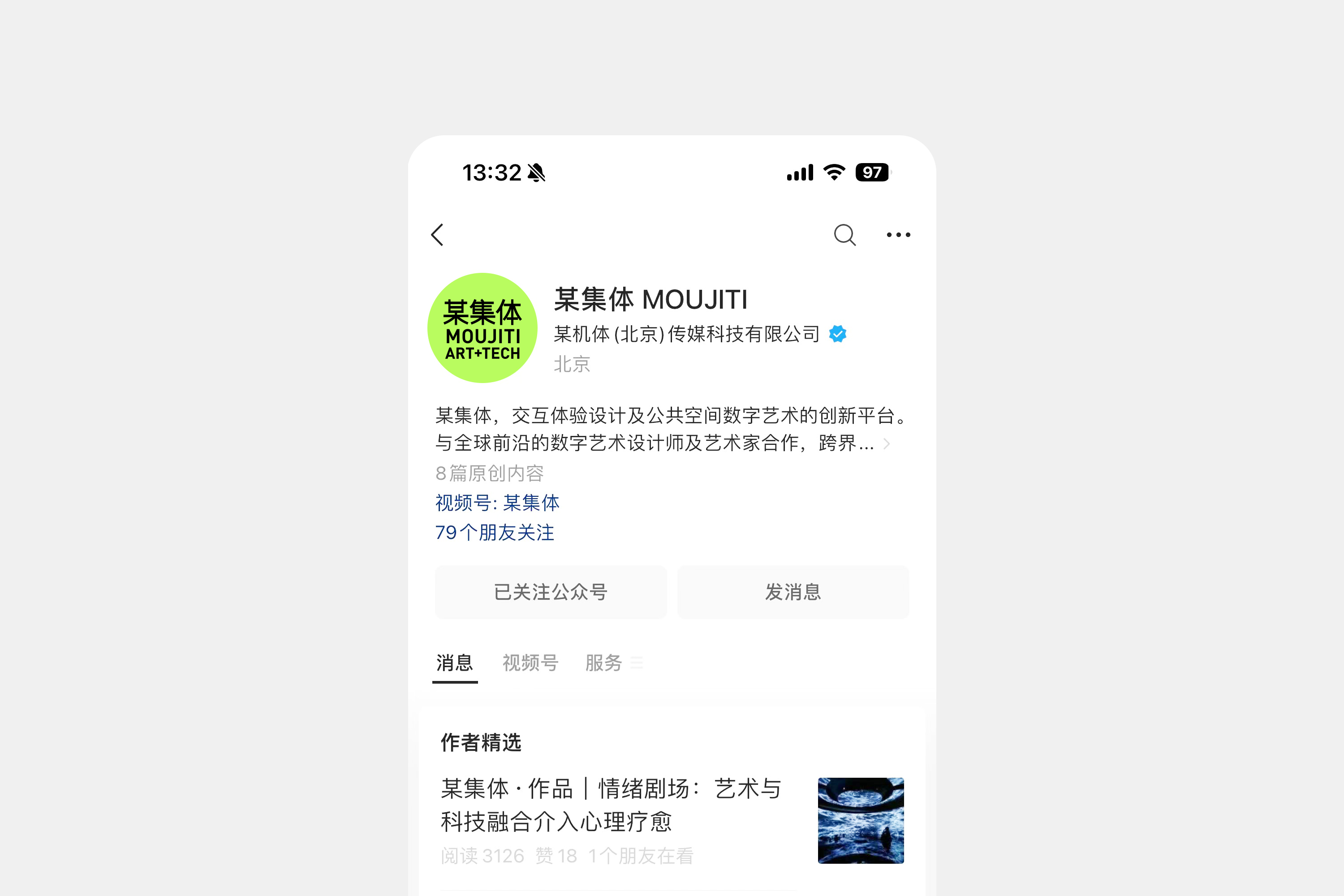 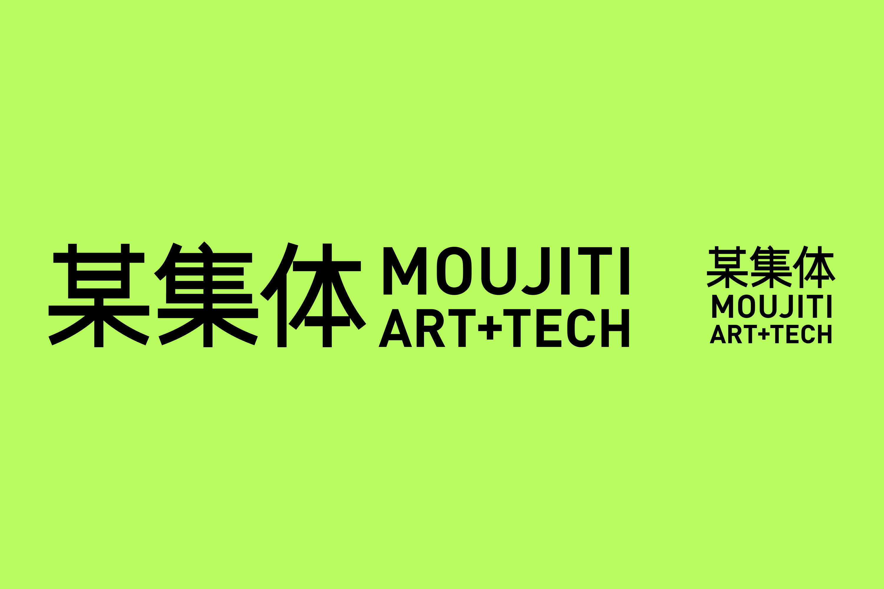 项目背景 某集体 ART+TECH 作为先锋艺术团队,一直以来热衷于在数字艺术与互动艺术领域探索,去挑战和发掘更多更新奇有趣的艺术表达力。他们多次尝试数字艺术与屏幕等数字载体的联动,举办大型艺术展览,围绕数字技术与数字创意,呈现当下的数字发展全景,打造产业×艺术×设计×生态有机耦合的可感知、可参与、跨媒介、跨学科、跨领域的数字现场。除了策划、创造多形式的艺术作品,他们对艺术本身的追求也将鼓励青年艺术家持续成长创作。 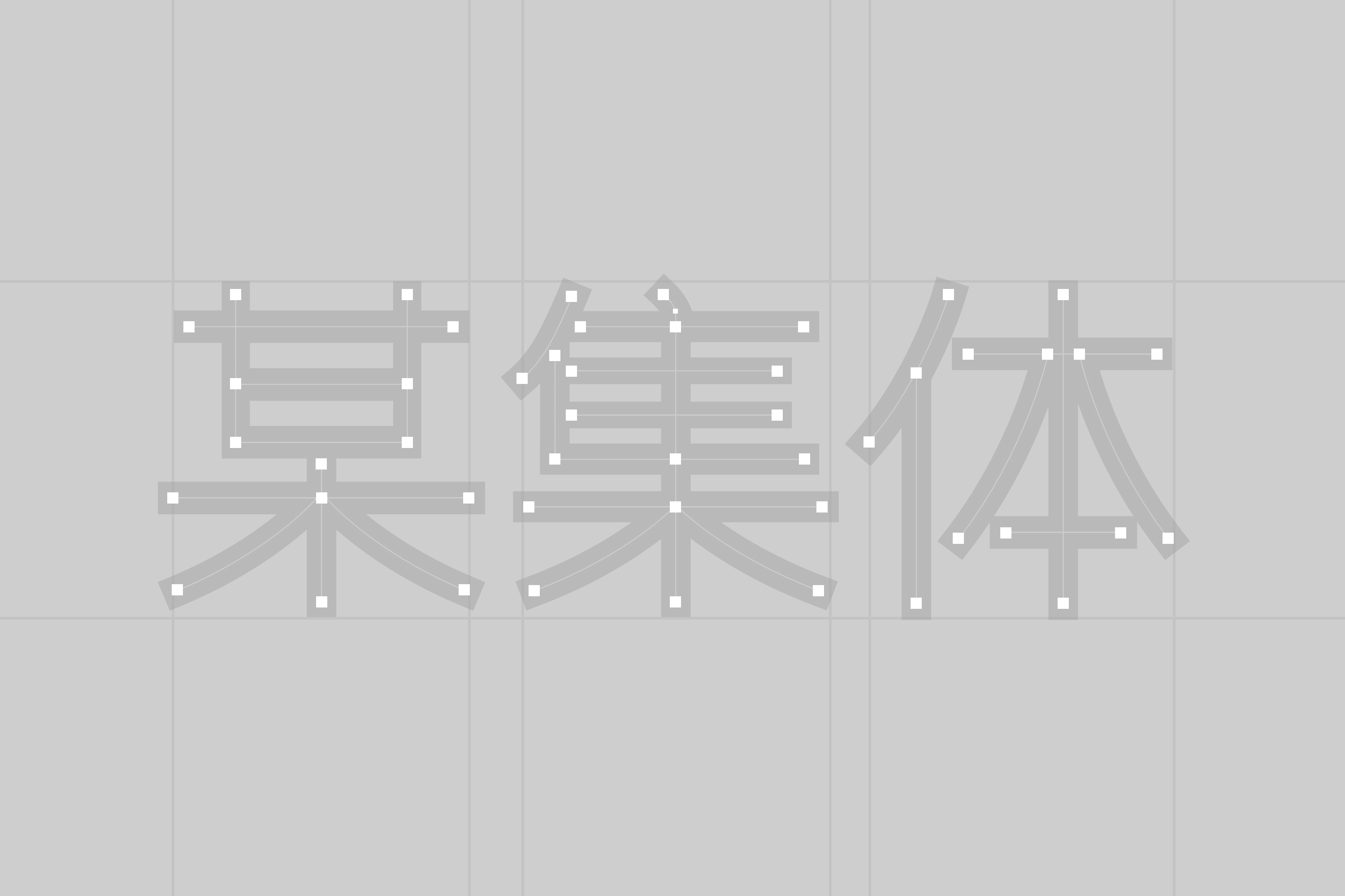 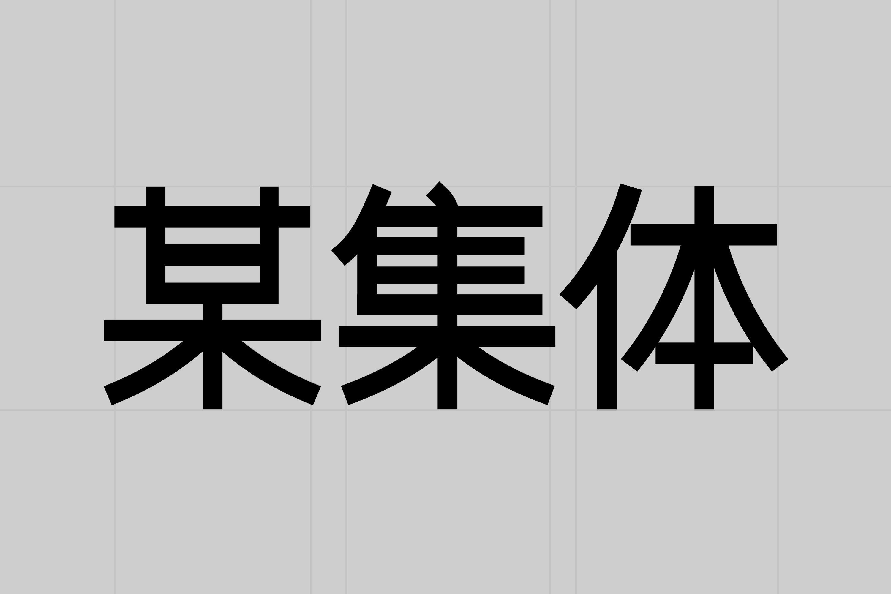 [Video](https://static.glabcms.stoyard.com/stoyard/gallery/20241109/nzv6f29eq2e.mp4) 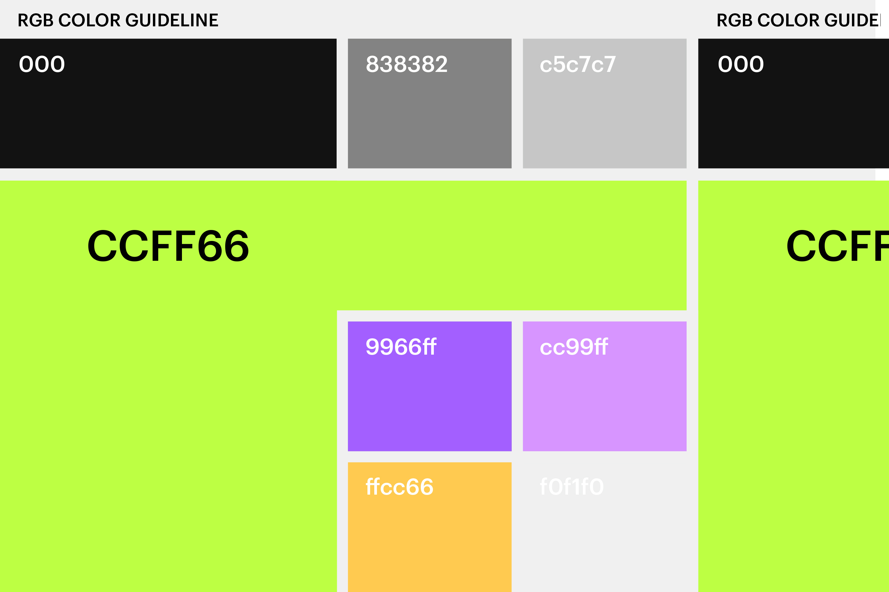 定义颜色 第一,由于在早期moujit创立之初,就选定荧光绿作为主色,100%的RBG荧光绿色在早期设备上视觉表现中使用较多,随着近几年高清屏幕和高亮度屏幕日益普及,RBG荧光绿色如果大面积使用,会比较强烈的刺激眼睛。 第二,原来的100%RBG荧光绿色是更具有先锋数字艺术的感觉,但也是一个数字后期行业惯用的扣屏绿色,随着moujiti业务发展到成立10余年,moujiti已经不局限在屏幕上或者后期上的创作上,moujiti在多个领域中均在探索并取得不错的成绩,如展览规划,空间叙事,装置,自有艺术作品等等,moujiti需要一个不是那么极端的绿色,可能是一个更多活力的绿色,更多年轻感的绿色。作为一个老牌创意公司,还在设计创新上不断颠覆,作品也年轻化,这个也给了我一点调整思路。 第三,moujiti在很多新媒体传播自身内容的时候,需要品牌的主色可以有更多包容性,可搭配其他辅助颜色进行综合使用,有冷暖的变化,而不局限为仅使用一个单一主色构成品牌色彩系统。 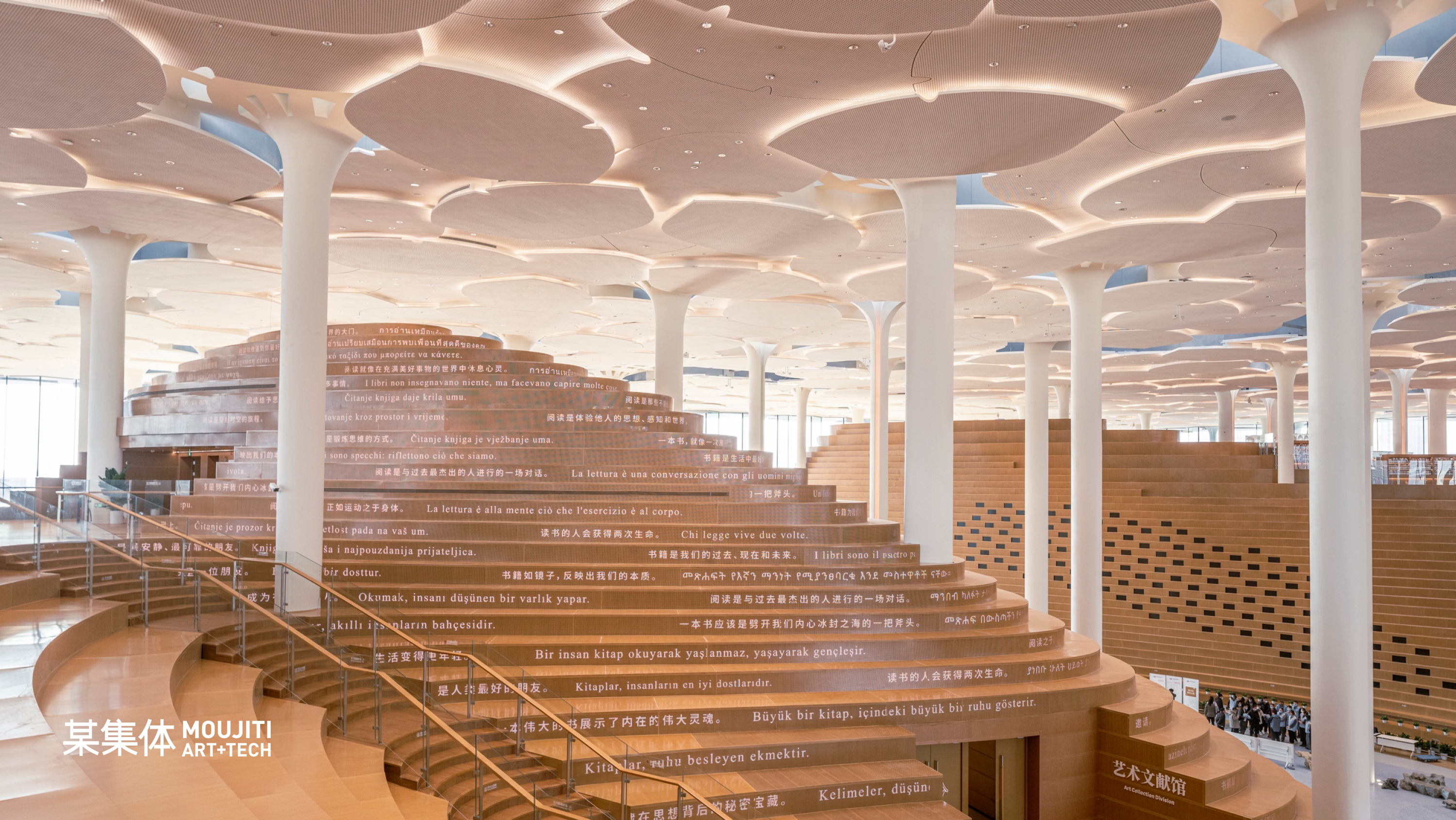 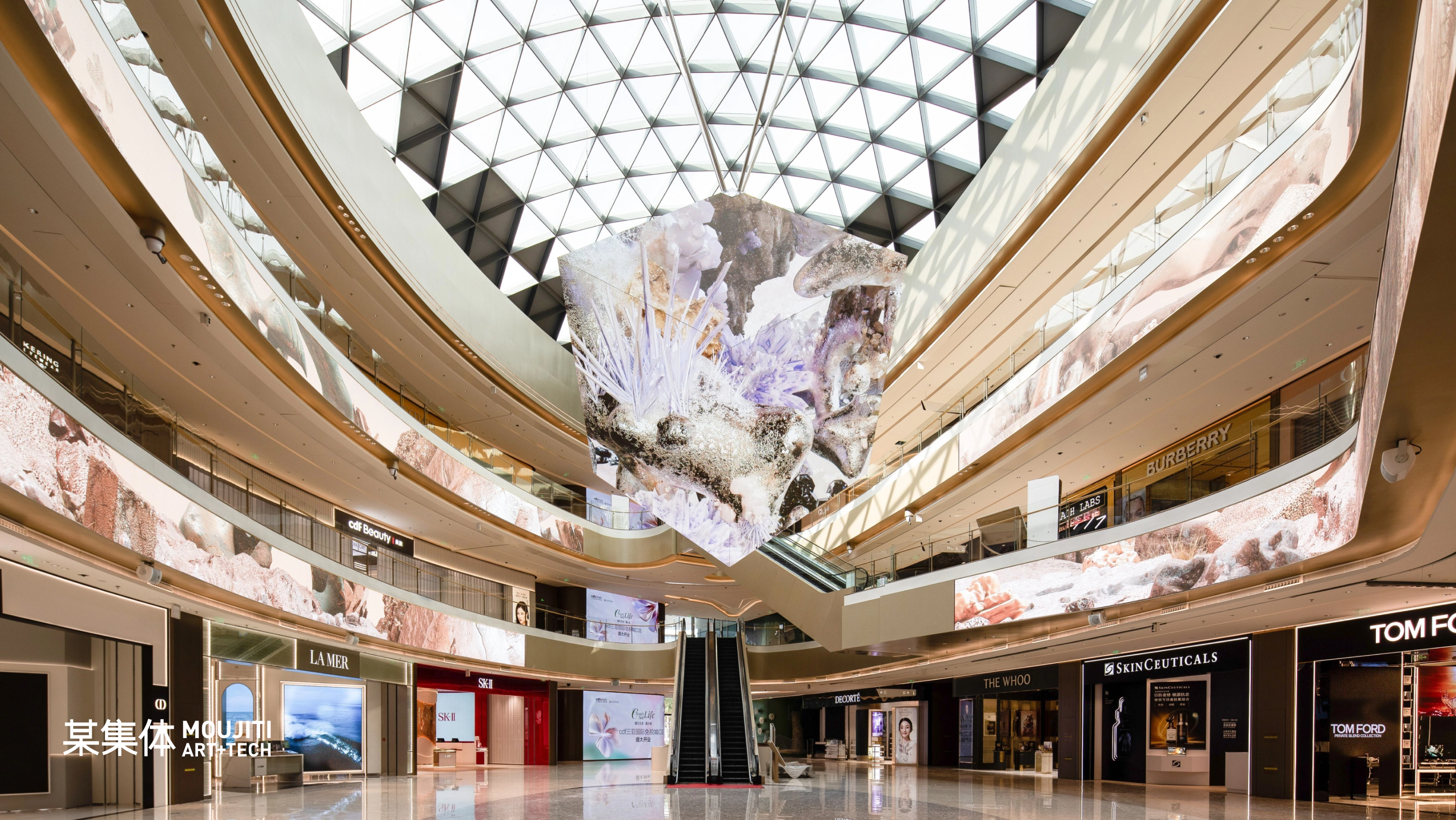 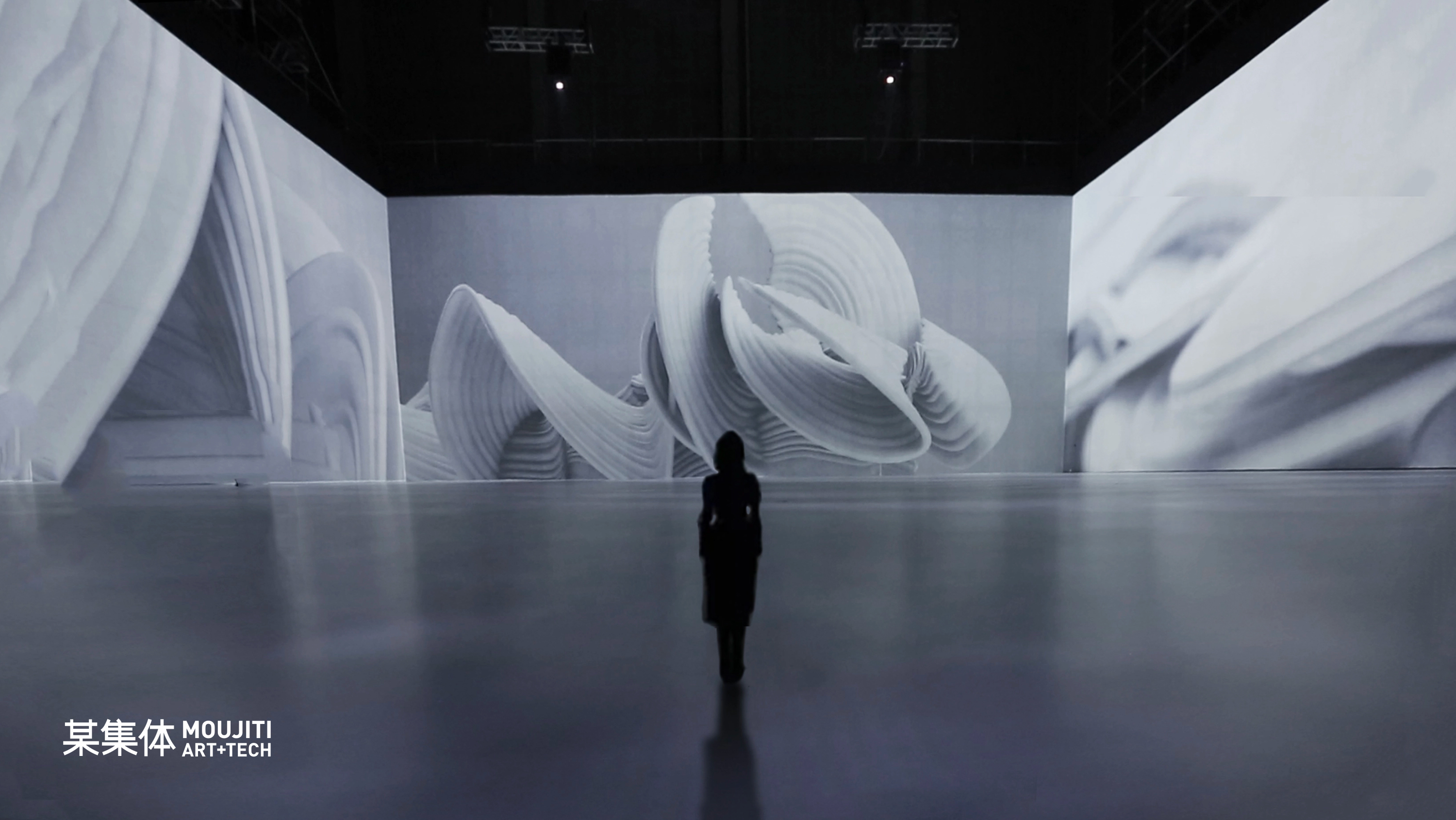 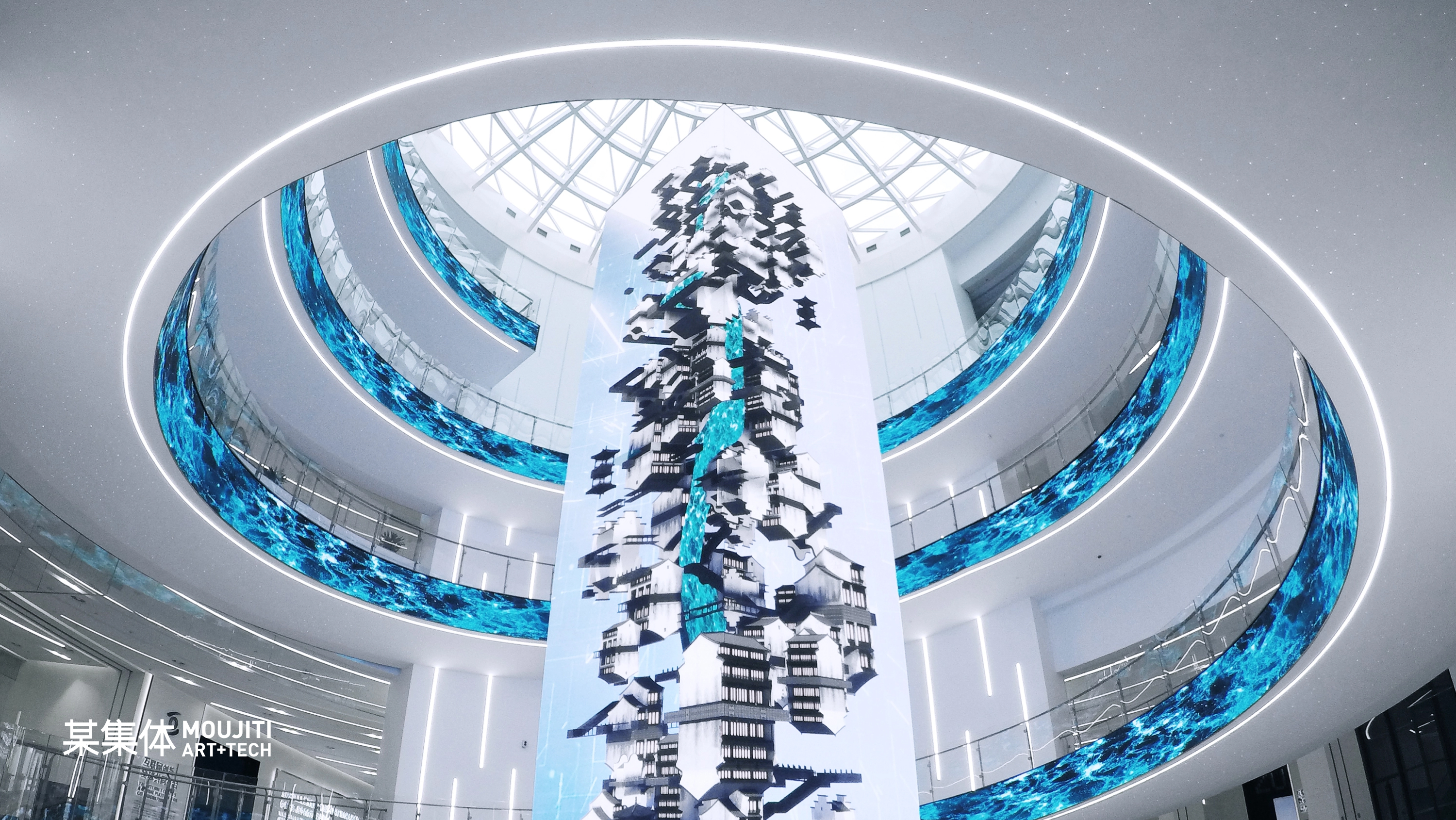 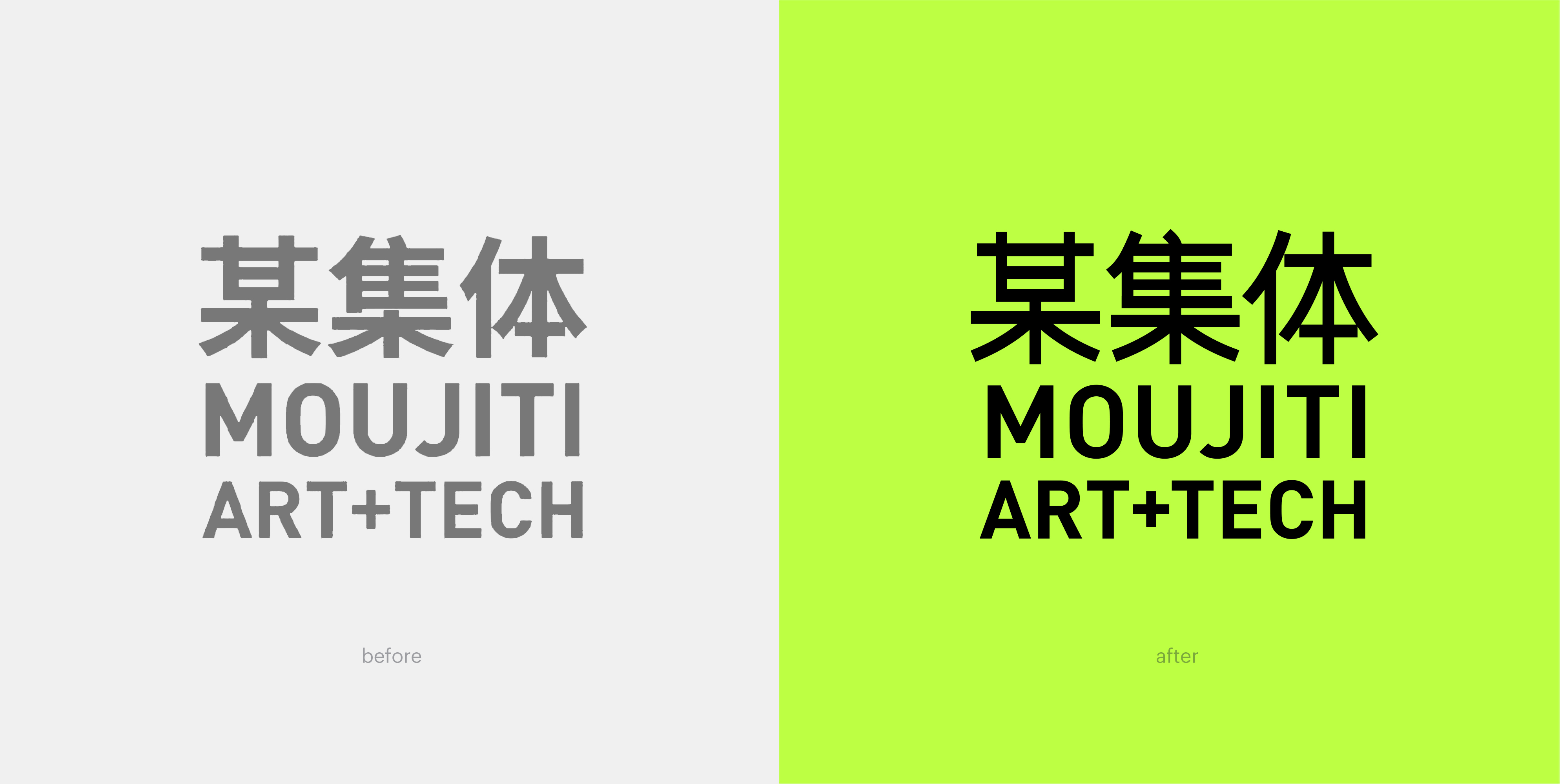 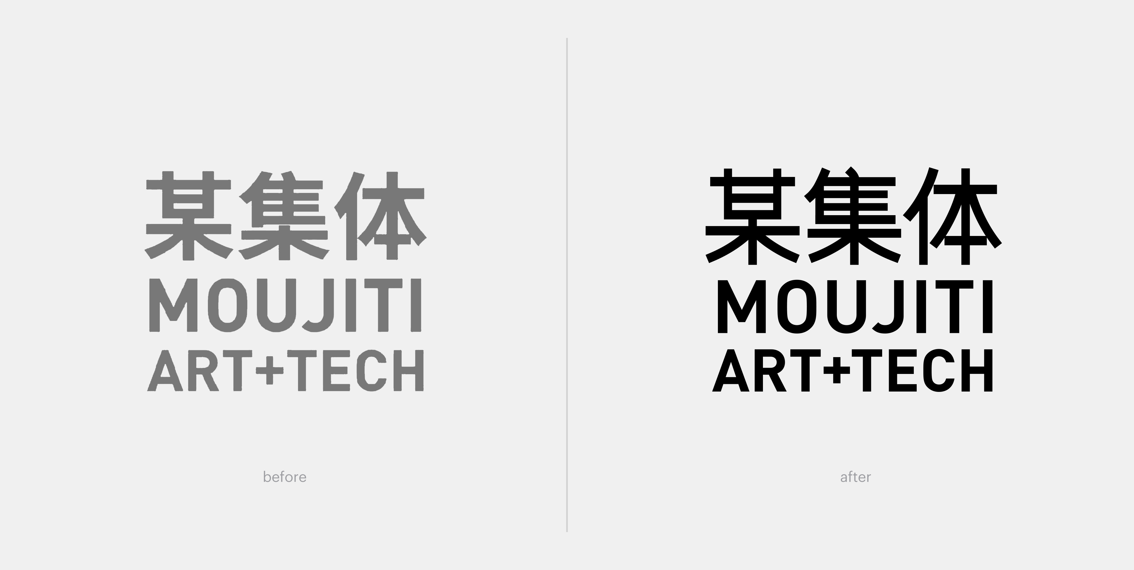 更多地展示作品本身的魅力 由stoyard设计并开发的某集体 ART+TECH 官方网站在视觉上保持了简约风格,去繁就简,让内容沉淀,更多地展示作品本身的魅力,让更多热爱艺术的人能够沉静下来,慢节奏地欣赏作品。 首页开屏以热门作品视频打开用户视野,醒目的三组文字“项目、策展、作品”简洁明了地为用户指出浏览方向。可以说,整个网站无一笔赘言,节奏流畅而舒朗。 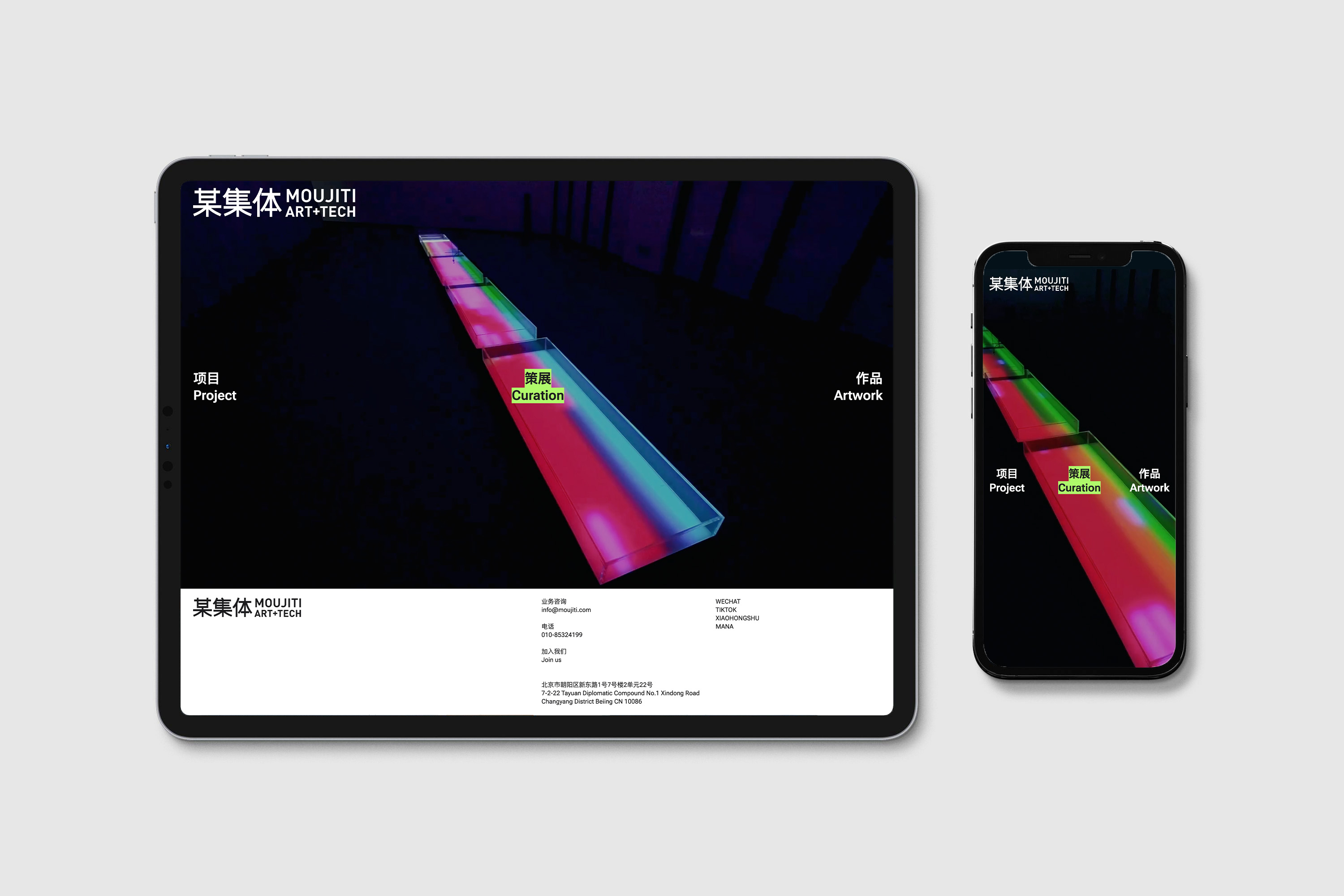 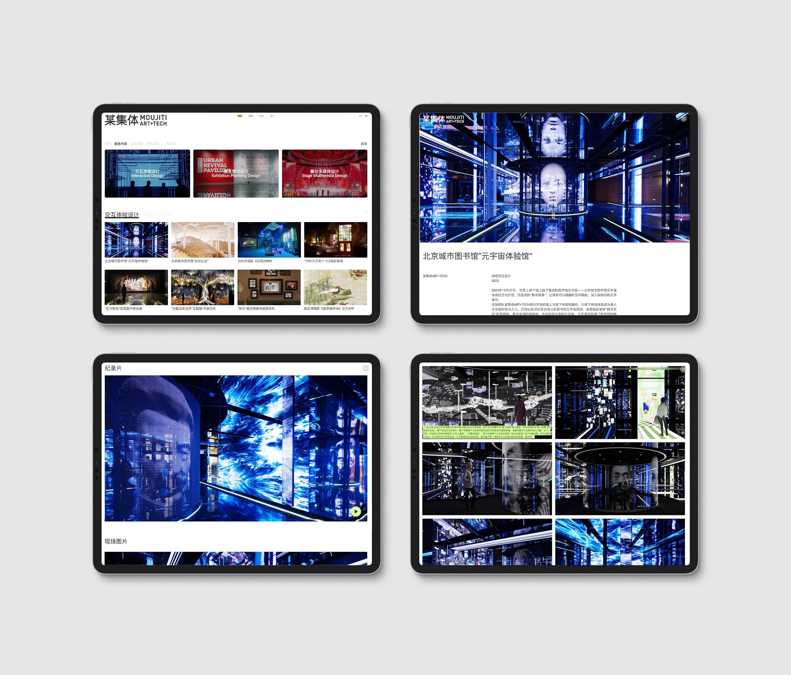 细节中的简约感 简约感体现在网站的每一处细节里,色彩上,为了避免大量作品的呈现导致画面过于杂乱,我们几乎舍弃了所有的多余颜色,唯一地保留着某集体 ART+TECH机构的核心色——绿色,并将它灵活地布局在文字背景、下划线、光标这些小细节里。使得用户在移动鼠标时,时不时能看到一抹绿色,就像无意间触发了一个惊喜。 于不经意间给于用户\读者一点小的乐趣,这也是我们在设计中始终都保有的一份诚意。我们希望艺术的网站能具备这样热情。 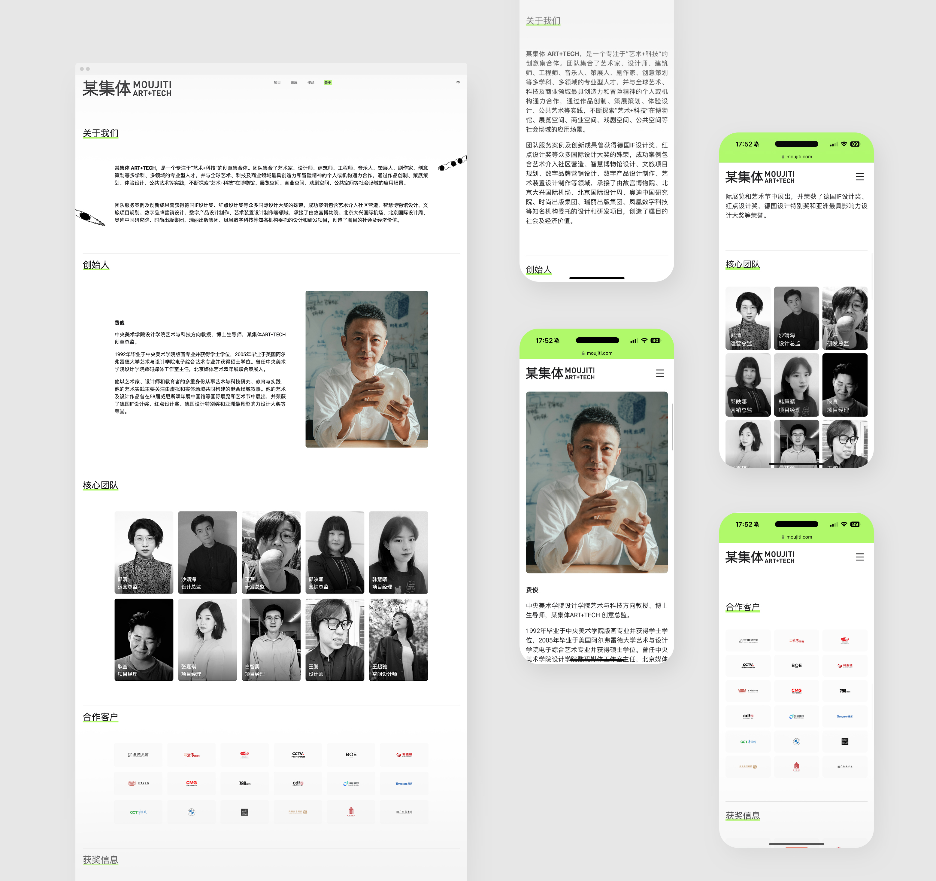 阅读就像呼吸一样 基于大众的移动端阅读习惯,网站内容的排版也需要进行多重考虑以满足不同屏幕下内容依旧美观。 一个页面中,文字\图像大小、图片与字的距离、多张图片排列方式,以及某段内容的字数,这些容易忽略地问题体现在屏幕阅读中,会影响整个画面的观感,我们不能因为内容多,而让用户产生阅读焦虑。 所以,设计师要在排版过程中做出多次调试,选择最恰如其分的方案。 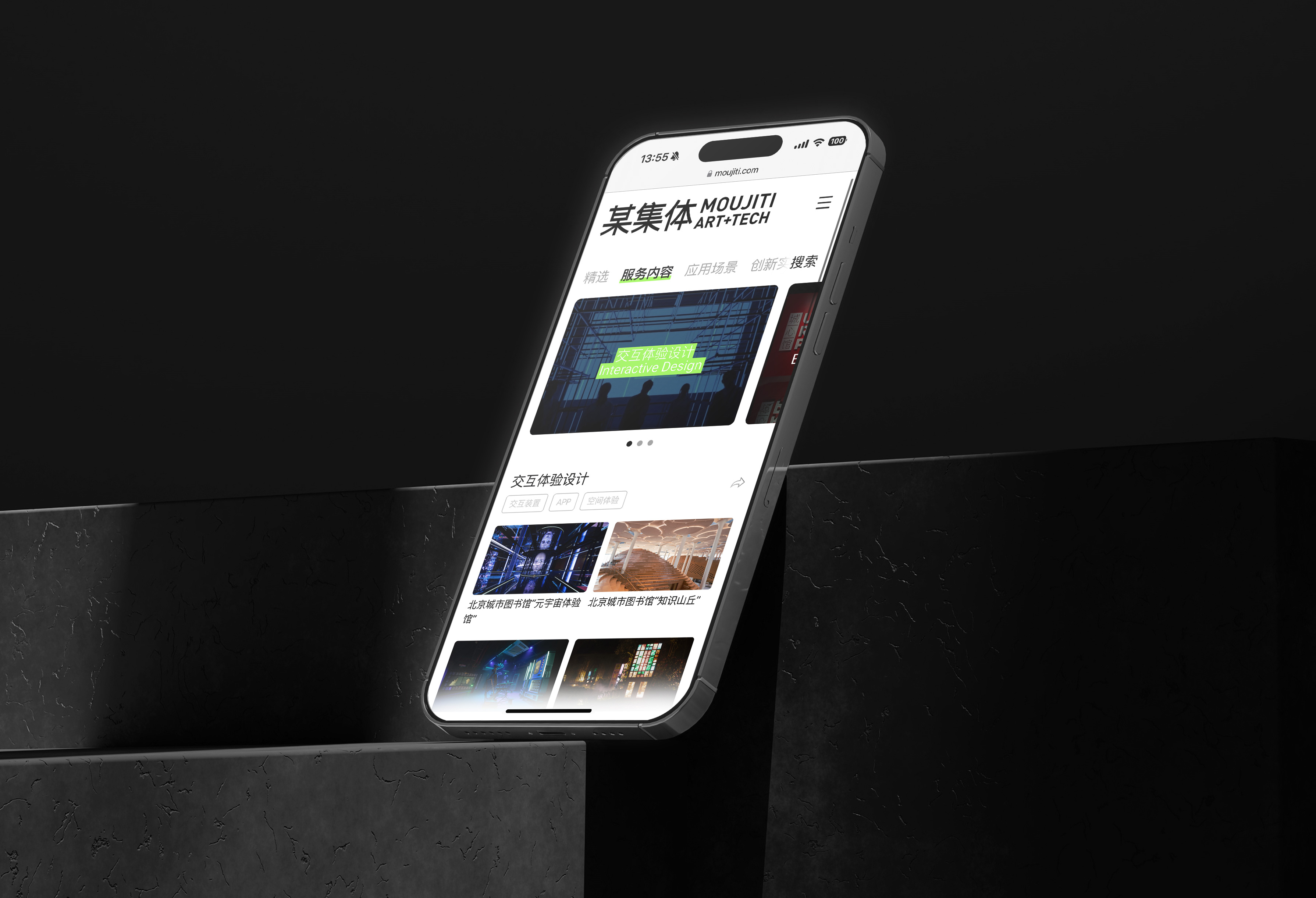 一点思考 某集体 ART+TECH艺术网站的设计,实际上是对一个经典案例库地设计,往常项目中,案例会作为企业网站的一个部分,而在此次设计中,案例显然是最为核心的部分,这类型的设计往往考验的是我们对于数据的梳理能力。我们需要帮助网站对大量内容进行条件筛选优化,让用户快速、准确找到自己感兴趣的艺术内容。 整体来看,网站是以一个轻盈而精巧地形式呈现出来,并且,也留有拓展空间。这也比较符合某集体 ART+TECH 表达出来的对于创意、艺术的态度:以奔跑地、持续地、自由地的姿态进行探索。 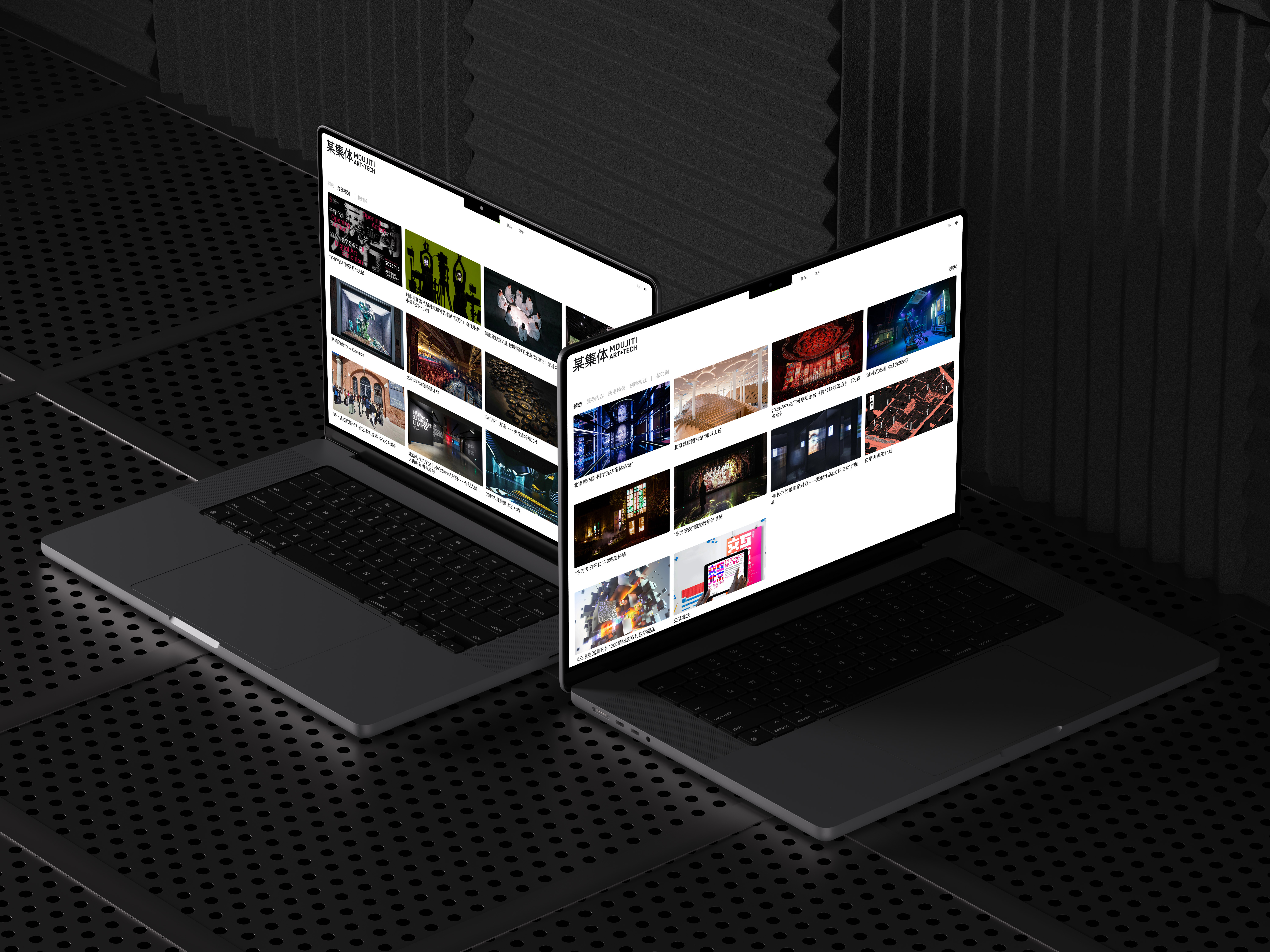 ## English Content ### Introduction A collective ART+TECH is a creative collection focusing on "art + technology". The team brings together artists, designers, architects, engineers, musicians, curators, playwrights, creative planners and other multidisciplinary and professional talents, and cooperates with the most creative and adventurous individuals or institutions in the world's art, technology and business fields, through the practice of work creation, curation planning, experience design, public art and other practices. Constantly explore the application scenarios of "art + technology" in museums, exhibition Spaces, commercial Spaces, drama Spaces, public Spaces and other social fields. [Video](https://static.glabcms.stoyard.com/stoyard/gallery/20240628/loqndhf1j8f.mp4)   1.Project Background As an avant-garde artistic team, the collective ART+TECH has always been passionate about exploring the fields of digital art and interactive art, challenging and uncovering more novel and interesting artistic expressions. They have repeatedly experimented with the integration of digital art and digital mediums such as screens, organizing large-scale art exhibitions that revolve around digital technology and digital creativity, presenting a comprehensive view of current digital development, and creating a perceptible, participatory, cross-media, interdisciplinary, and cross-domain digital scene that organically combines industry, art, design, and ecology. In addition to planning and creating diverse forms of artistic works, their pursuit of art itself will also encourage young artists to continue growing and creating.   [Video](https://static.glabcms.stoyard.com/stoyard/gallery/20241109/nzv6f29eq2e.mp4)  Define Colors First, since the company Moujit was founded, fluorescent green was chosen as the main color, and 100% RBG fluorescent green was used more in early visual displays due to its high visibility. However, as high-definition screens and high-brightness screens have become more common in recent years, using RBG fluorescent green in large areas can be quite eye-straining. Secondly, the original 100% RBG fluorescent green had a more avant-garde digital art feel, but it was also a common green mask used in the digital post-production industry. As moujiti's business has grown to over a decade of existence, moujiti is no longer limited to screen or post-production creations. Moujiti is exploring and achieving good results in multiple fields, such as exhibition planning, spatial narrative, installation, and self-owned artworks. Moujiti needs a green that is not so extreme, perhaps a more vibrant green, a greener with more youthful feel. As an established creative company, we are constantly innovating in design and pushing the boundaries of our work, making it more youthful. This also gave me some inspiration to adjust my thinking. Third, when Moujiti disseminates its content through many new media, it needs the brand's main color to have more inclusiveness, allowing for the use of other complementary colors for comprehensive use, with changes in temperature and hue, rather than being limited to using only one single main color to form the brand's color system.       2.Showcase the Charm of the Works Themselves The official website of the collective ART+TECH, designed and developed by Stoyard, maintains a minimalist visual style, simplifying the layout to allow the content to take precedence, showcasing the charm of the works themselves, and enabling more art enthusiasts to calm down and appreciate the works at a slower pace. The homepage opens with a video of popular works to broaden the user's perspective, and the three conspicuous texts "Projects, Exhibitions, Works" clearly indicate the browsing directions for users. It can be said that the entire website is concise without any redundant words, and the rhythm is smooth and relaxed.   3.The Sense of Minimalism in Every Detail The sense of minimalism is embodied in every detail of the website. In terms of color, to avoid the presentation of a large number of works leading to a cluttered appearance, we have almost abandoned all unnecessary colors, retaining only the core color of the collective ART+TECH institution - green, and flexibly incorporating it into small details such as text backgrounds, underlines, and cursors. This allows users to occasionally see a touch of green when moving the mouse, as if unexpectedly triggering a surprise. Providing users/readers with a little bit of fun unintentionally is also a sincerity we always maintain in our design. We hope that an art website can possess such enthusiasm.  4. Reading is like breathing Based on the public's mobile reading habits, the layout of website content also needs multiple considerations to meet the beautiful content under different screens. In a page, the size of the text/image, the distance between the picture and the word, the arrangement of multiple pictures, and the number of words in a certain section of content, these easily ignored problems are reflected in screen reading, which will affect the appearance of the whole picture, we can not because of the content, and let users produce reading anxiety. Therefore, the designer should make many debugging in the process of typesetting and choose the most appropriate scheme.  5. A little thinking The design of a collective ART+TECH art website is actually the design of a classic case base, the usual project, the case will be a part of the corporate website, and in this design, the case is obviously the most core part, this type of design often tests our ability to comb the data. We need to help the website to optimize the condition of a large number of content, so that users can quickly and accurately find the artistic content they are interested in. Overall, the site is presented in a light and elegant form, and there is room for expansion. This is also more in line with the attitude towards creativity and ART expressed by a collective ART+TECH: to explore in a running, continuous and free attitude. 