# 中日韩合作秘书处 / 开放共享三国数据的数据港官网 - ID: 353 - URL: https://www.stoyard.com/works/353 - English URL: https://www.stoyard.com/en/works/353 - Year: 2022 - Cover: https://static.glabcms.stoyard.com/stoyard/project/cover/20221121/wdey764toy.jpg - Categories: 大型品牌官网定制, 政府、大学、国际组织 - English Categories: Office Website SOLUTION, Government、Organizations - Author: STOYARD - English Author: STOYARD - Publish: 2022-07-14 - Editor: STOYARD SHANGHAI - External Link: https://data.tcs-asia.org/ ## 中文主体 ### 项目简介 中日韩合作秘书处(以下称“秘书处”)是经中华人民共和国、日本国和大韩民国 三国政府批准建立的国际组织,旨在促进三国之间的和平与共同繁荣。 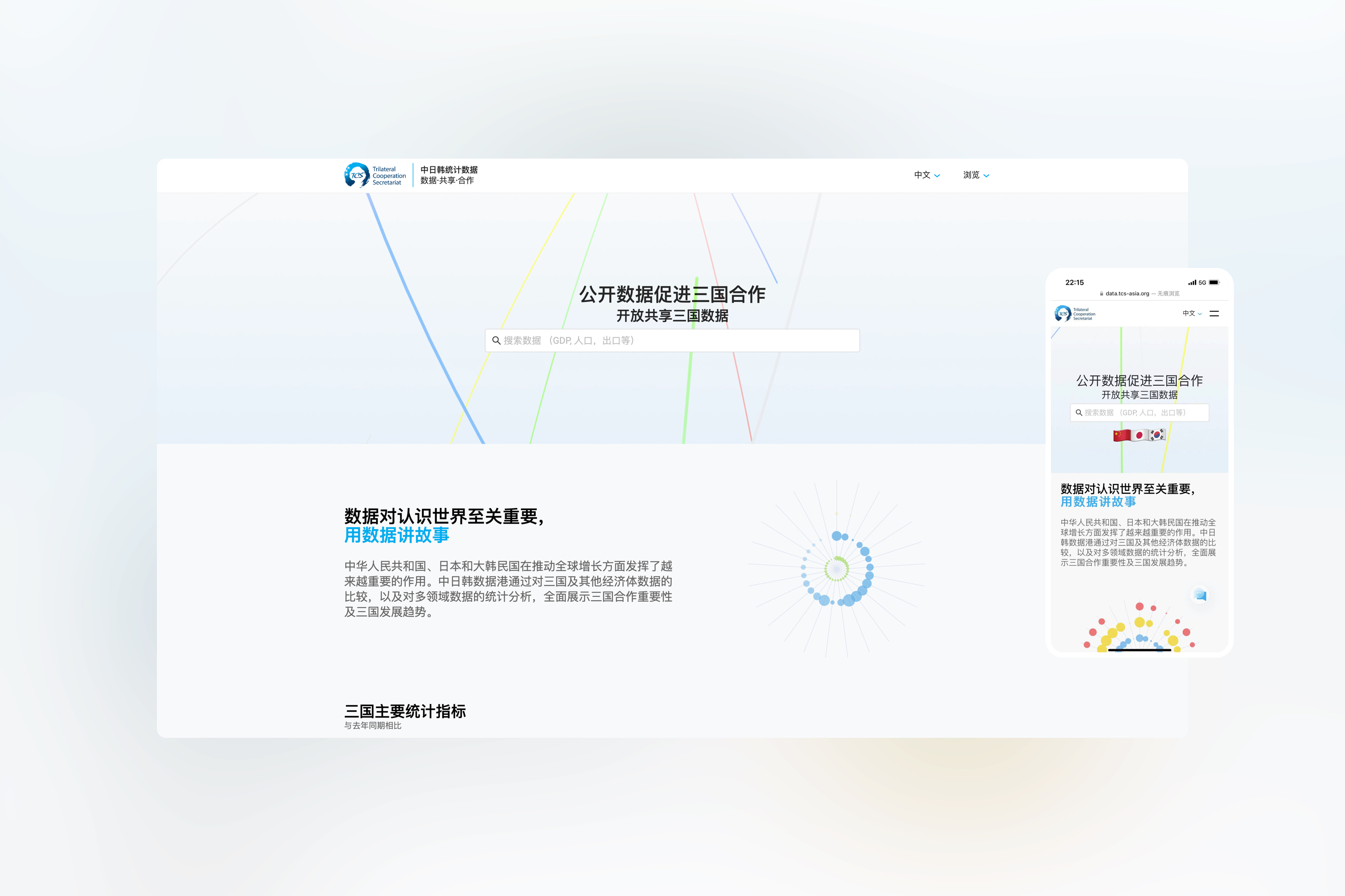 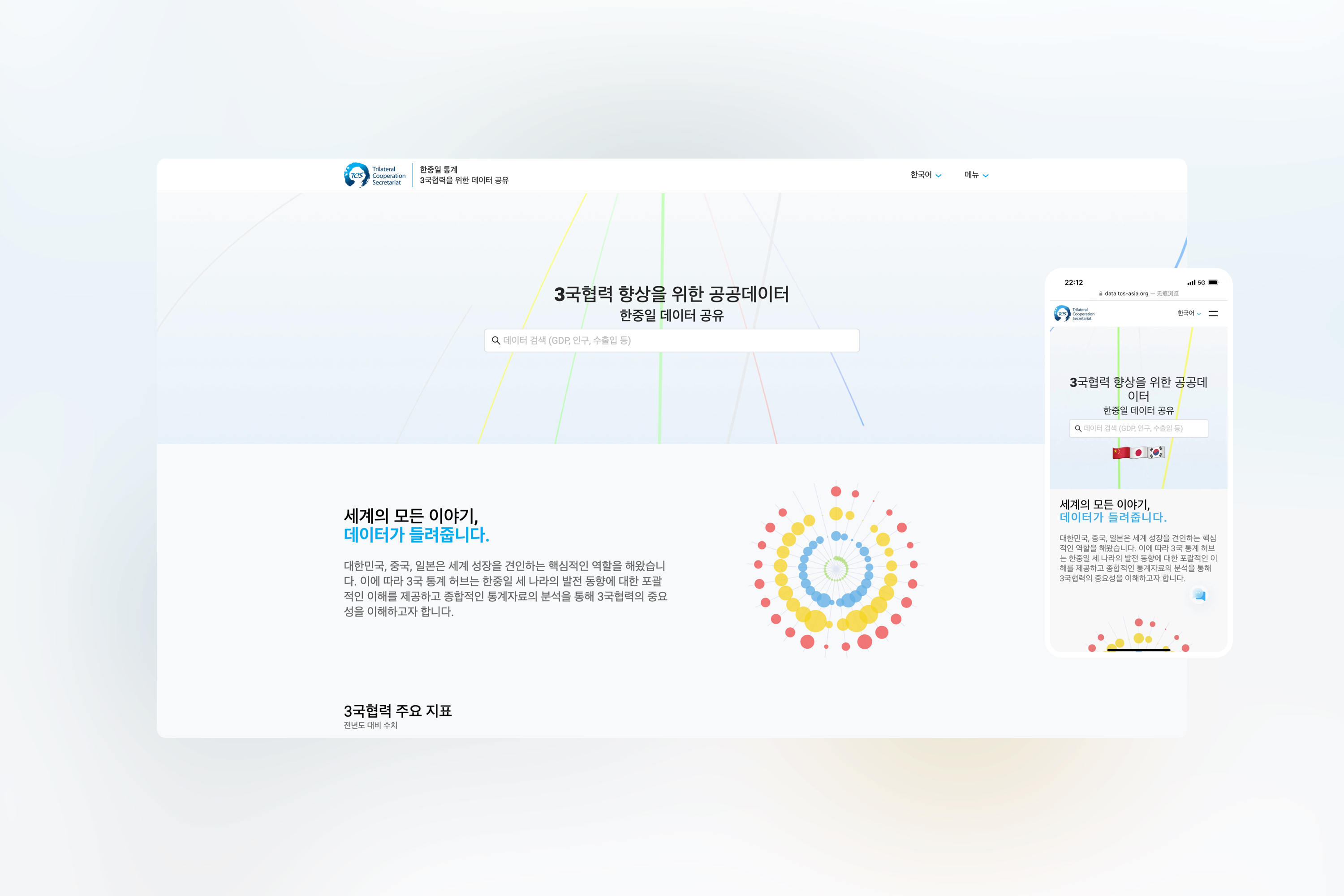 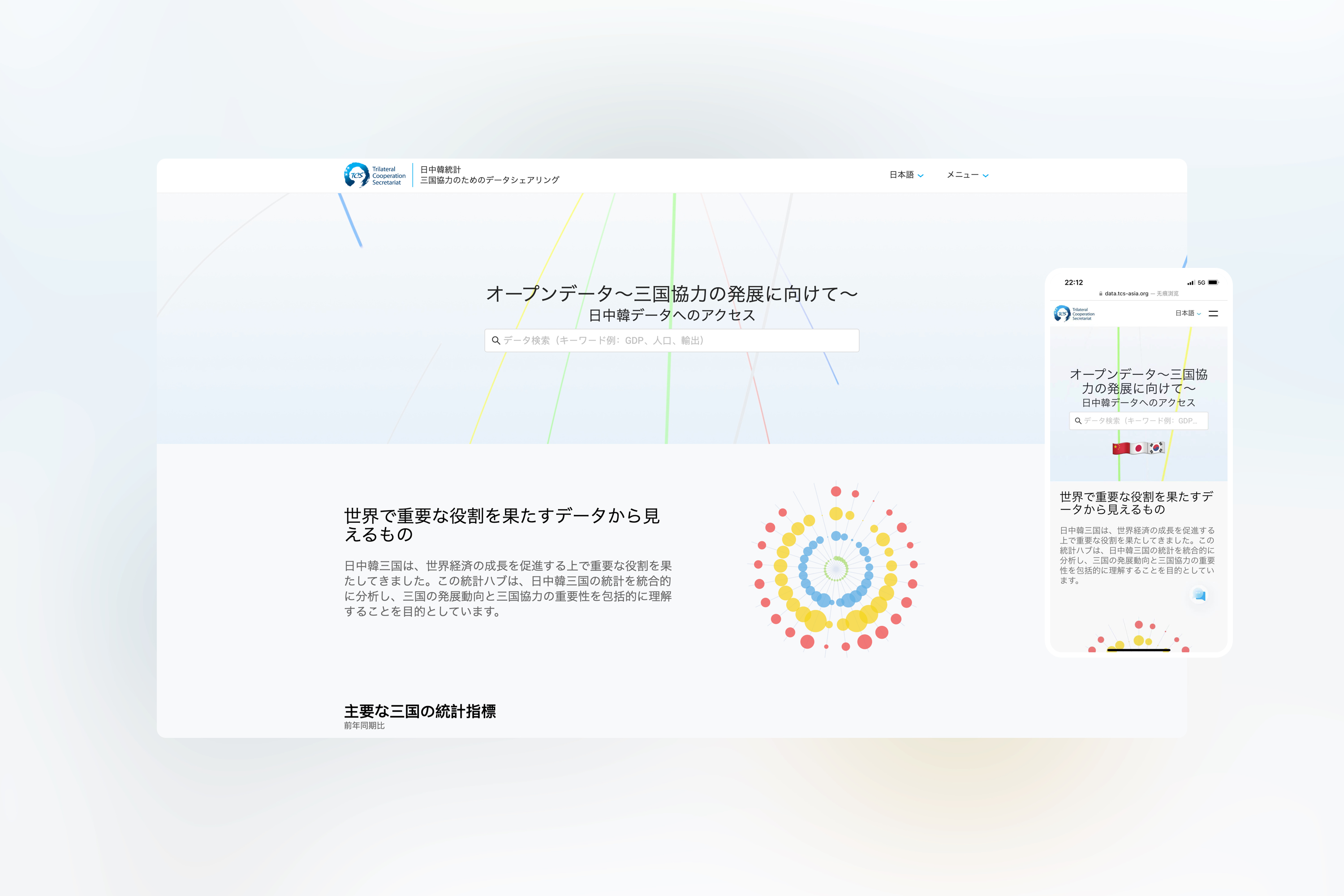 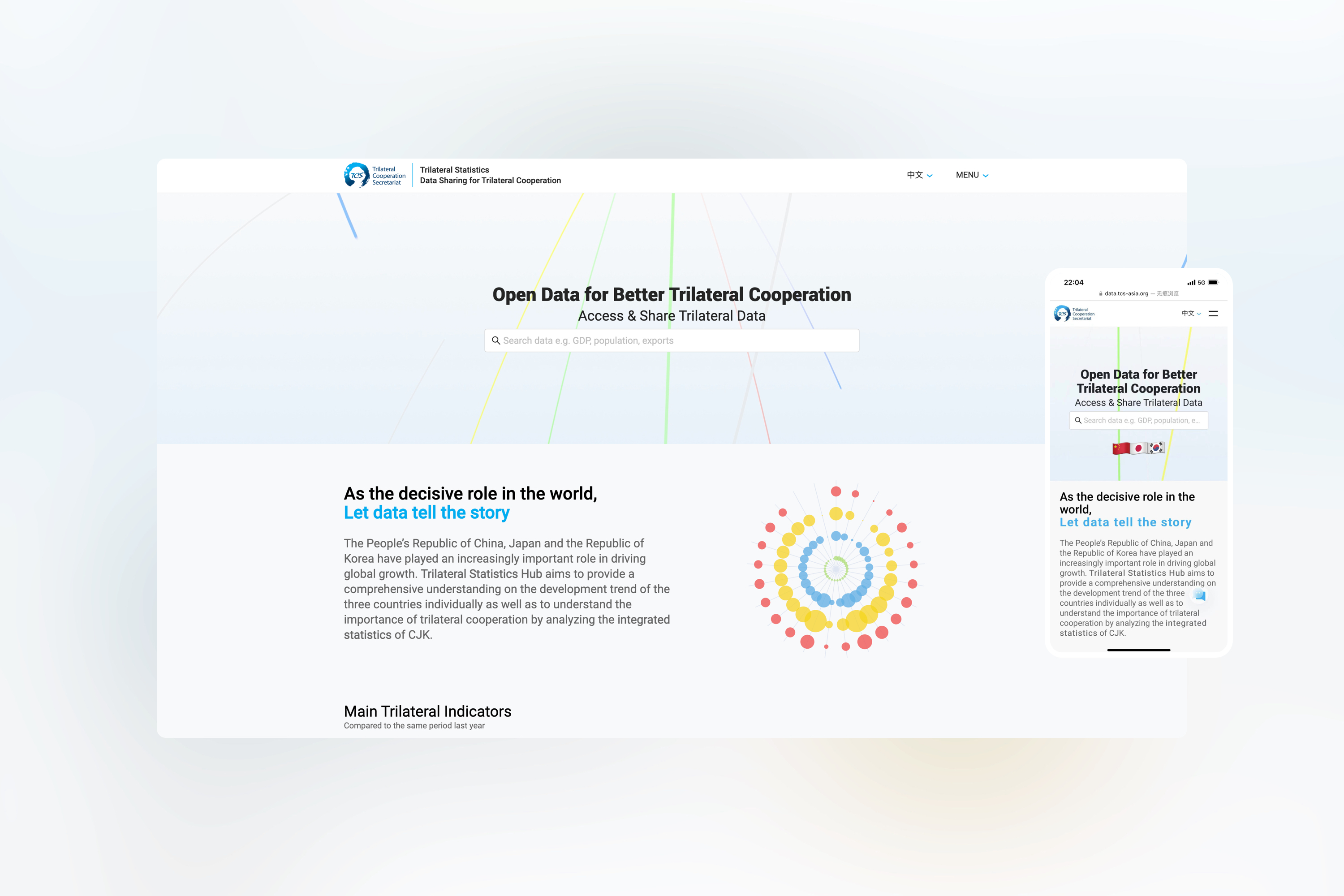 2011年9月,中日韩合作秘书处在韩国首尔正式挂牌成立。其主要职责在于为三国领导人会议、外长会议、三方委员会和其他部长级会议、外交高官磋商等三国磋商机制的运行和管理提供行政和技术支持,必要时派代表参加主要的磋商机制会议。 同时评估合作项目并起草报告,将必要的文件编入数据库,提交三方委员会或三国外长会议通过年度进展报告。 因而Stoyard为其设计了专门的数据存放网站,整合各年份的信息、加以处理。通过更加简洁直观的形式展现。  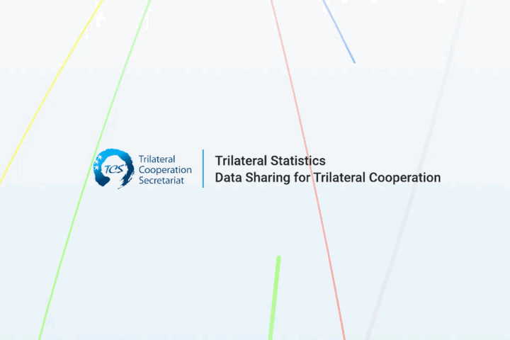 网站拥有完整的字体使用规范,同时包含中、日、韩、英,四国语言翻译。我们竭尽全力的保证在四种语言环境下,网站视觉规范都保持着尽可能的统一、舒适、准确。 在视觉系统上我们同样做足了功课,我们选择蓝色作为网站的主色调,同时赋予中、日、韩、三国、世界以不同通色彩,而这一视觉色贯穿始终,从官网、视频、表格无一例外。 我们打破了传统数据化网站的单调,赋予其更明快清新的定义。同时在每一个数据内容的处理上又是严谨的,规范的。 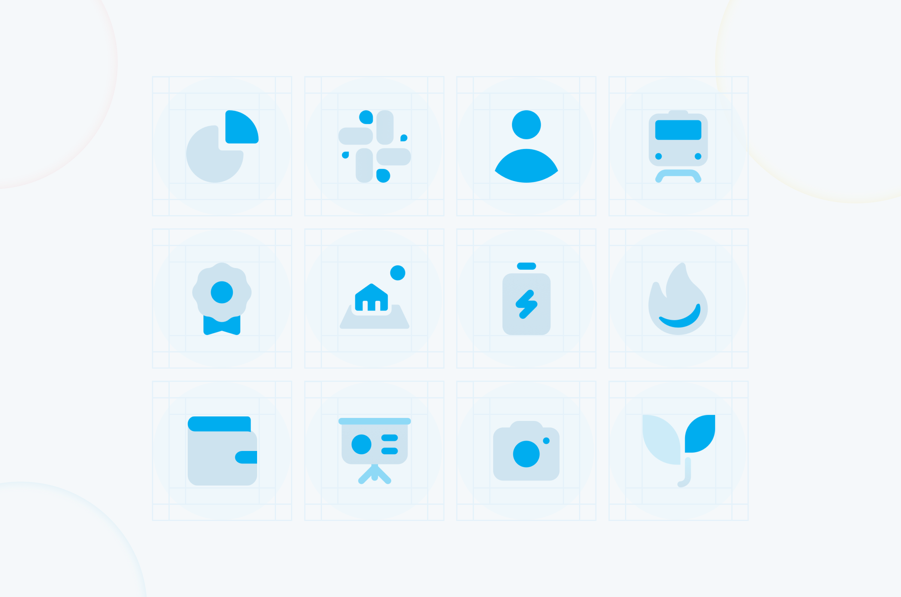 我们为官网设计了一套ICON,希望通过ICON来丰富整个页面的细节,同时打破数据化的沉闷氛围。严肃的数据信息结合生动有趣的元素,可以有效地降低视觉压力。 我们将大量数据变化趋势,提炼为图形。通过图形化的方式表达难以叙述的内容。 在设计过程中,我们采用了轻盈的颜色体系。从视觉上给人以轻松的观感,打破大量数据所带来的沉闷感。我们希望创造的不仅仅是工具,而是能为用户带来良好体验和观感的产品。 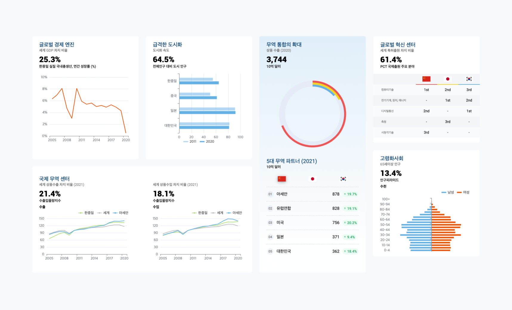 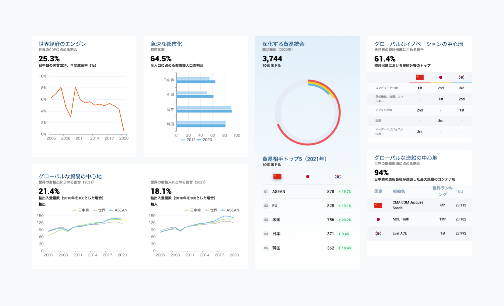 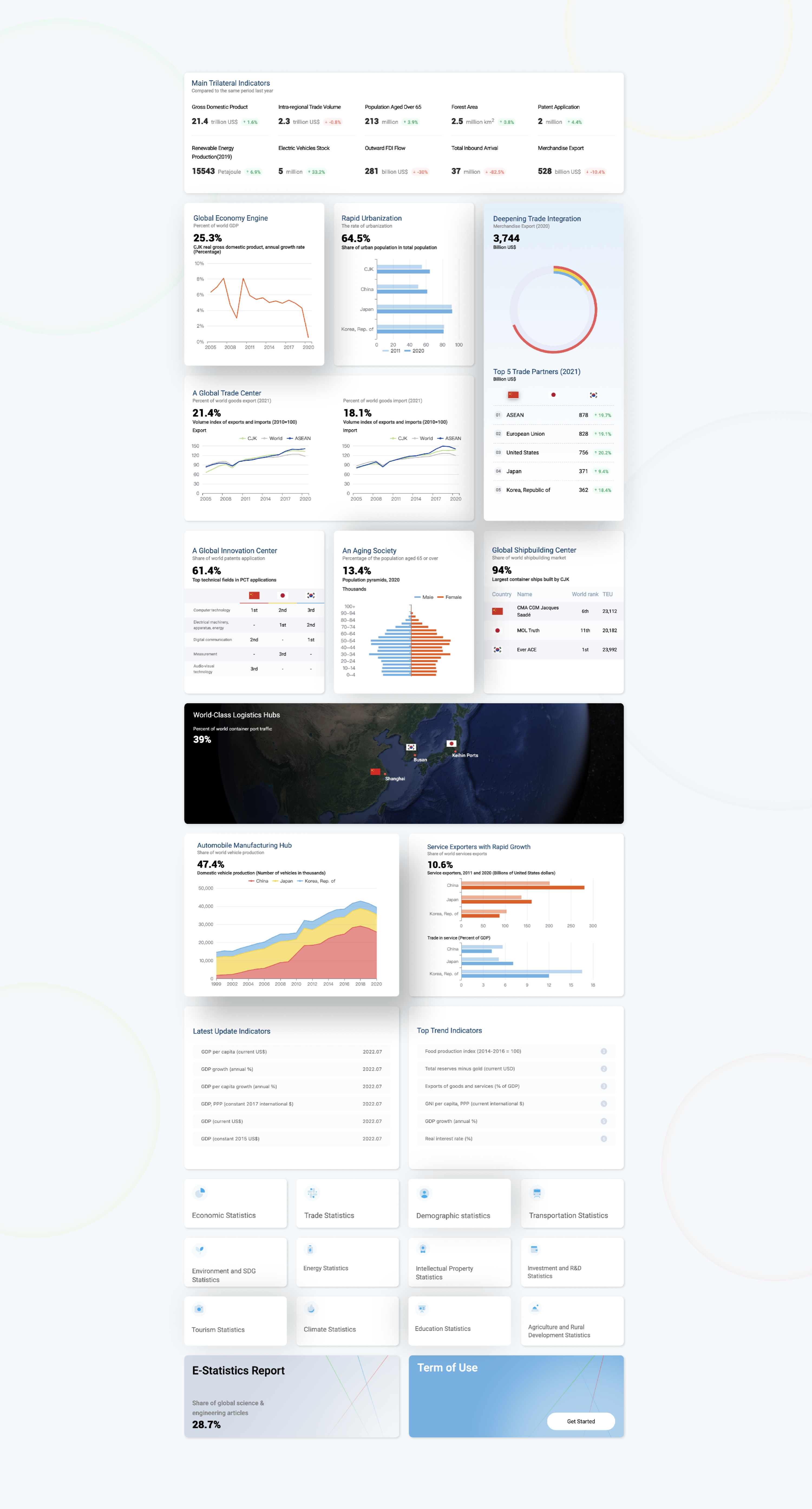 我们尝试突破传统的统计图样式,采用全新的颜色、表格类型去诠释数据,同时又需要在不断变化的视觉冲击下保有数据化的理性与克制。 如何保持美学与理性的平衡,这是我们需要解决的重要问题。 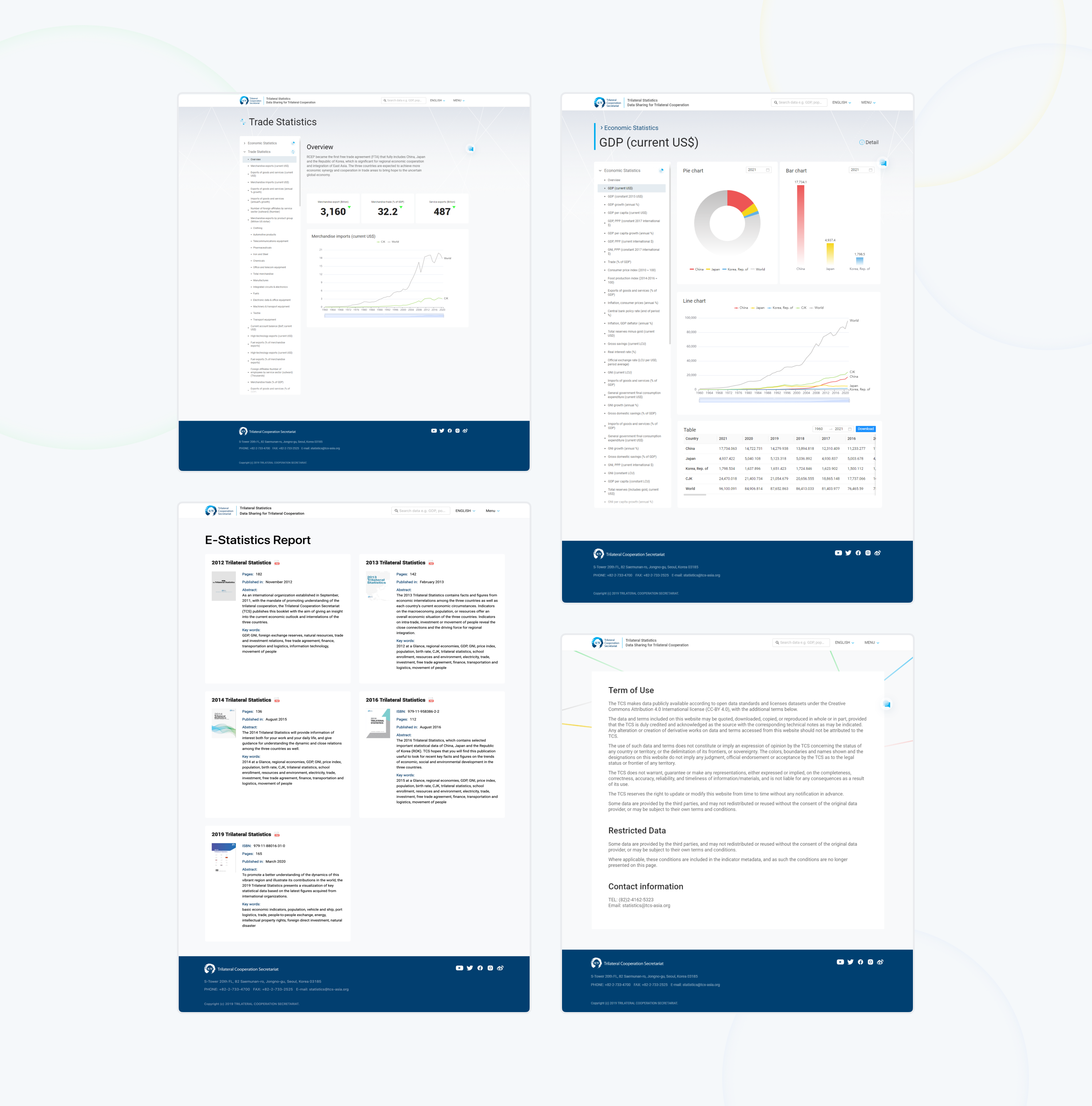 除了首页之外,我们还设计了用于展示庞大数据的详情页,以及报告等其他页面。 为了能够更好的展示数据,我们通过公式对后台的数据进行换算处理,得到更简洁更明晰的数据库。 用户如果想要得到某一方面的信息,但在页面中没有展示,可以通过搜索的方式,快速检索后台数千条数据,得到最优答案。 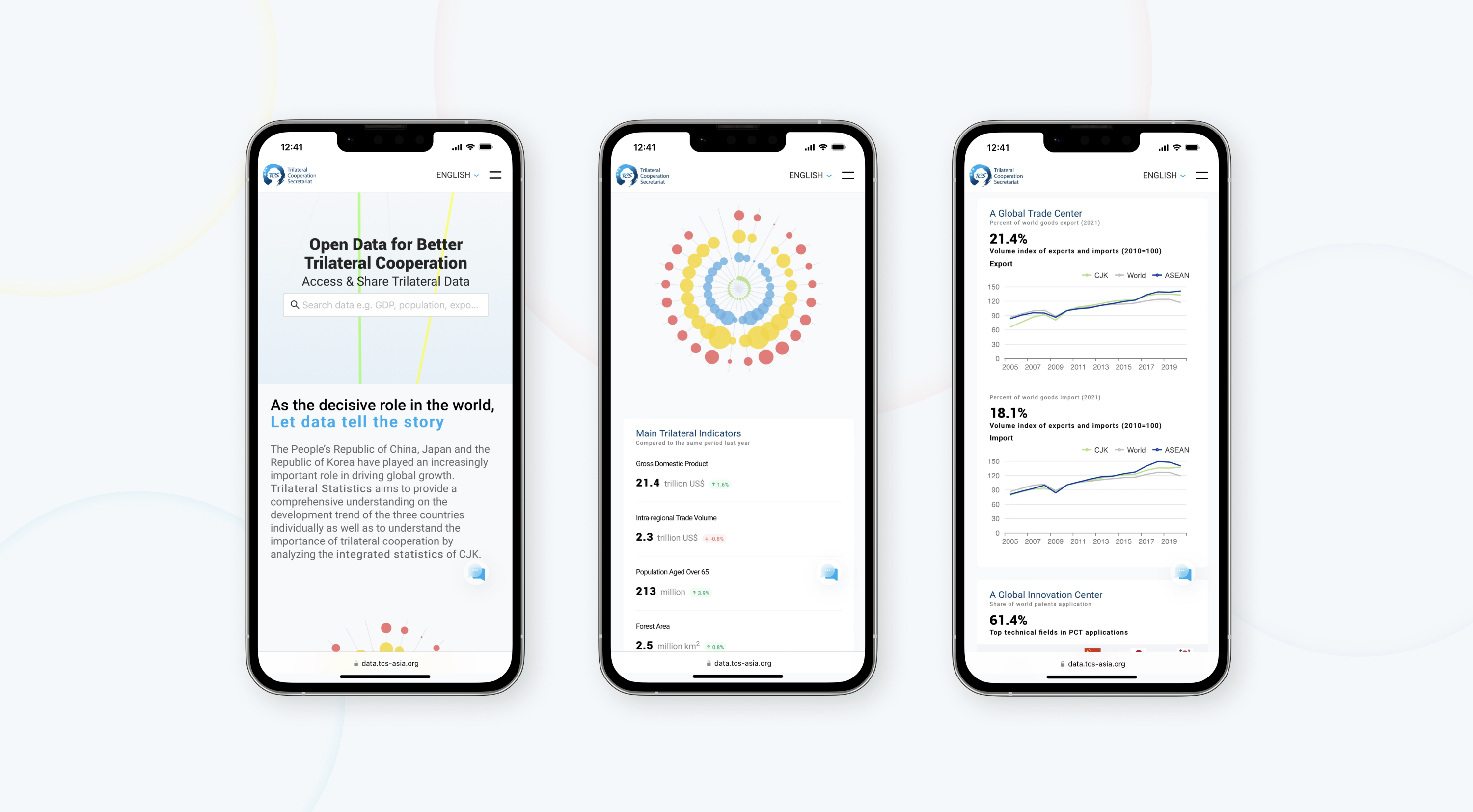 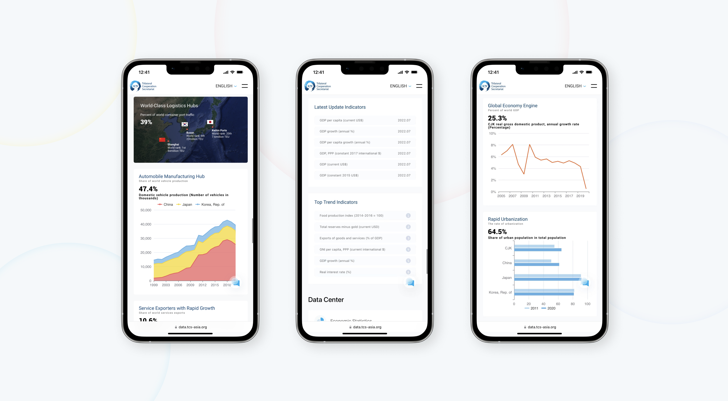 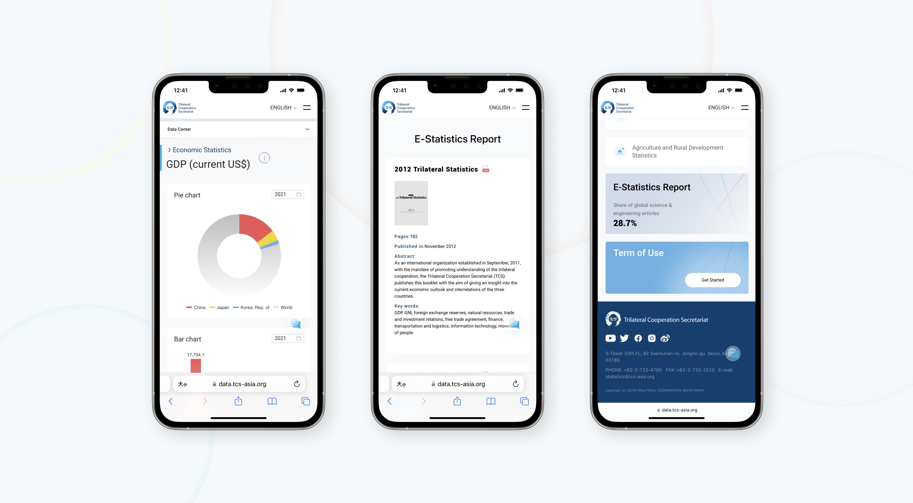 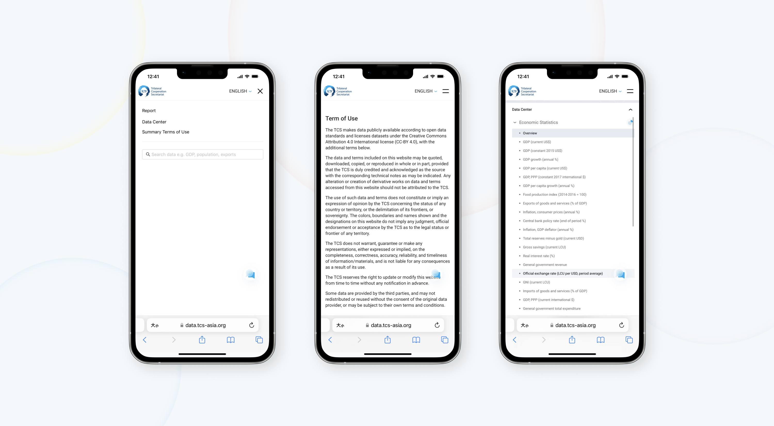 为了更便捷快速的查找数据,提高用户的体验感,我们做了移动端的页面适配。对于布局,排版都做了重新的设计。 同时我们对统计图的大小进行了重新权重,提升整体的观感与流畅性。 这些小的细节虽然很容易令人忽视,但在使用过程中,这些细微差距反而会给用户带来好感。 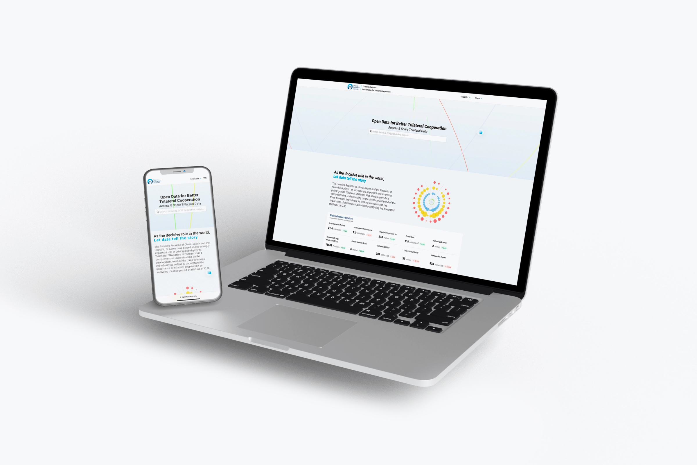 ## English Content ### Introduction The trilateral cooperation secretariat (hereinafter referred to as the "secretariat") is by the People's Republic of China, Japan and the republic of Korea in The Three Kingdoms of government approval to build international organization, to promote peace and common prosperity between the three countries.     In September 2011, the Trilateral Cooperation Secretariat was officially established in Seoul, South Korea. Its main responsibilities are to provide administrative and technical support for the operation and management of the three-country consultation mechanism, including the three-country leaders' meeting, the foreign ministers' meeting, the tripartite committee and other ministerial-level meetings, and the consultation of senior diplomats, and to send representatives to participate in the main consultation mechanism meetings when necessary. At the same time, evaluate cooperation projects and draft reports, compile necessary documents into the database, and submit the annual progress report to the tripartite committee or the meeting of the three foreign ministers for approval. Therefore, Stoyard designed a special data storage website for it, integrating the information of each year and adding one for processing. Presented in a more concise and intuitive form.   The website has complete font usage specifications, including Chinese, Japanese, Korean, English, and four language translations. We've gone to great lengths to ensure that the site's visual specifications remain as consistent, comfortable, and accurate as possible across all four languages. We also did our homework on the visual system. We chose blue as the main color of the website, and at the same time gave China, Japan, Korea, the three countries, and the world different colors. This visual color runs through, from the official website, video, Forms are without exception. We break the monotony of traditional data-based websites and give them a clearer and fresher definition. At the same time, it is rigorous and standardized in the processing of each data content.  We have designed a set of ICONS for the official website, hoping to enrich the details of the whole page through ICON and break the dreary atmosphere of data. Serious data information combined with lively and interesting elements can effectively reduce visual stress. We take a lot of data and we distill it into a graph. To graphically express something that is difficult to describe. During the design process, we adopted a light color system. Visually, it gives people a relaxed look and feel, and breaks the dull feeling brought by a large number of data. We want to create not just tools, but products that give users a good experience and feel.    We try to break through the traditional statistical chart style, and use new colors and table types to interpret data. At the same time, we need to maintain the rationality and restraint of data under the constantly changing visual impact. How to keep the balance between aesthetics and rationality is an important problem we need to solve.  In addition to the home page, we also designed the detail page to display the large data, as well as other pages such as reports. In order to better display the data, we converted the data in the background through the formula to get a more concise and clearer database. If users want to get a certain aspect of information, but not displayed in the page, they can search through the way, quickly retrieve thousands of background data, get the best answer.     In order to find data more conveniently and quickly and improve users' experience, we made mobile terminal page adaptation. The layout and layout were redesigned. At the same time, we re-weighted the size of the statistical graph to improve the overall look and feel and fluency. It's easy to overlook these small details, but in the process of using them, these small differences can actually benefit the user. 