# 华鹿能源集团 / 视觉识别,网站设计 - ID: 34 - URL: https://www.stoyard.com/works/34 - English URL: https://www.stoyard.com/en/works/34 - Year: 2012 - Cover: https://static.glabcms.stoyard.com/object/20180815/cvlnvxcw5y5.png - Categories: 技术解决方案:网站整体解决方案 - English Categories: Technical Solutions:Full-Service Website Solution - Author: STOYARD - English Author: STOYARD - Publish: 2018-08-15 - Editor: 熙呈 ## 中文主体 ### 项目简介 华鹿能源集团品牌形象的一次重要更新,目的是:成为中国有影响力和号召力的能源集团品牌。为华鹿单独设计一套完整的企业网络建设化体验解决方案,将华鹿的标志系统进行升级,完善视觉识别系统,使其更加适应现代数字化媒介的应用和传播。同步也全新设计和开发了新版集团官网。立体的更新了品牌对外的视觉形象。  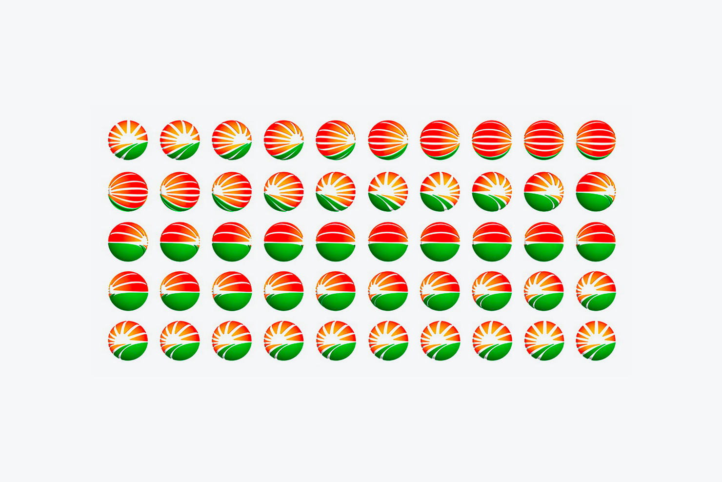 标志灵感:草原上的旭日东升——华鹿能源,美于外,实于内。把我们的标志比作地平线上的太阳,东升,上北下南,左西右侧为东,我们将华鹿的标志厚度化处理后放在整个广告画面的右侧,寓意正为:旭日东升。伴随大地,草原,绿色,人们对希望的期盼,构成了这个诠释华鹿品牌的网站交互页面设计。 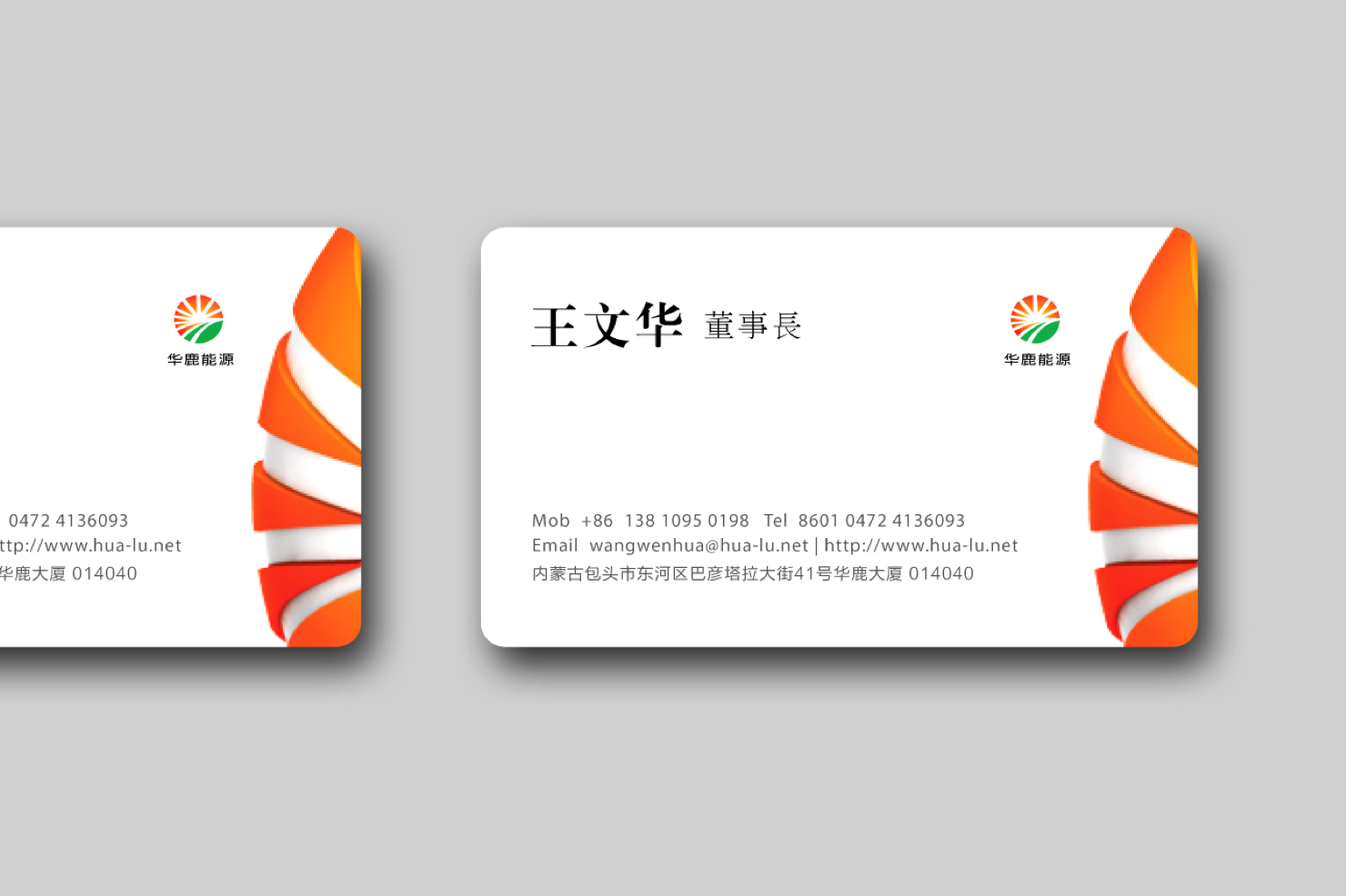 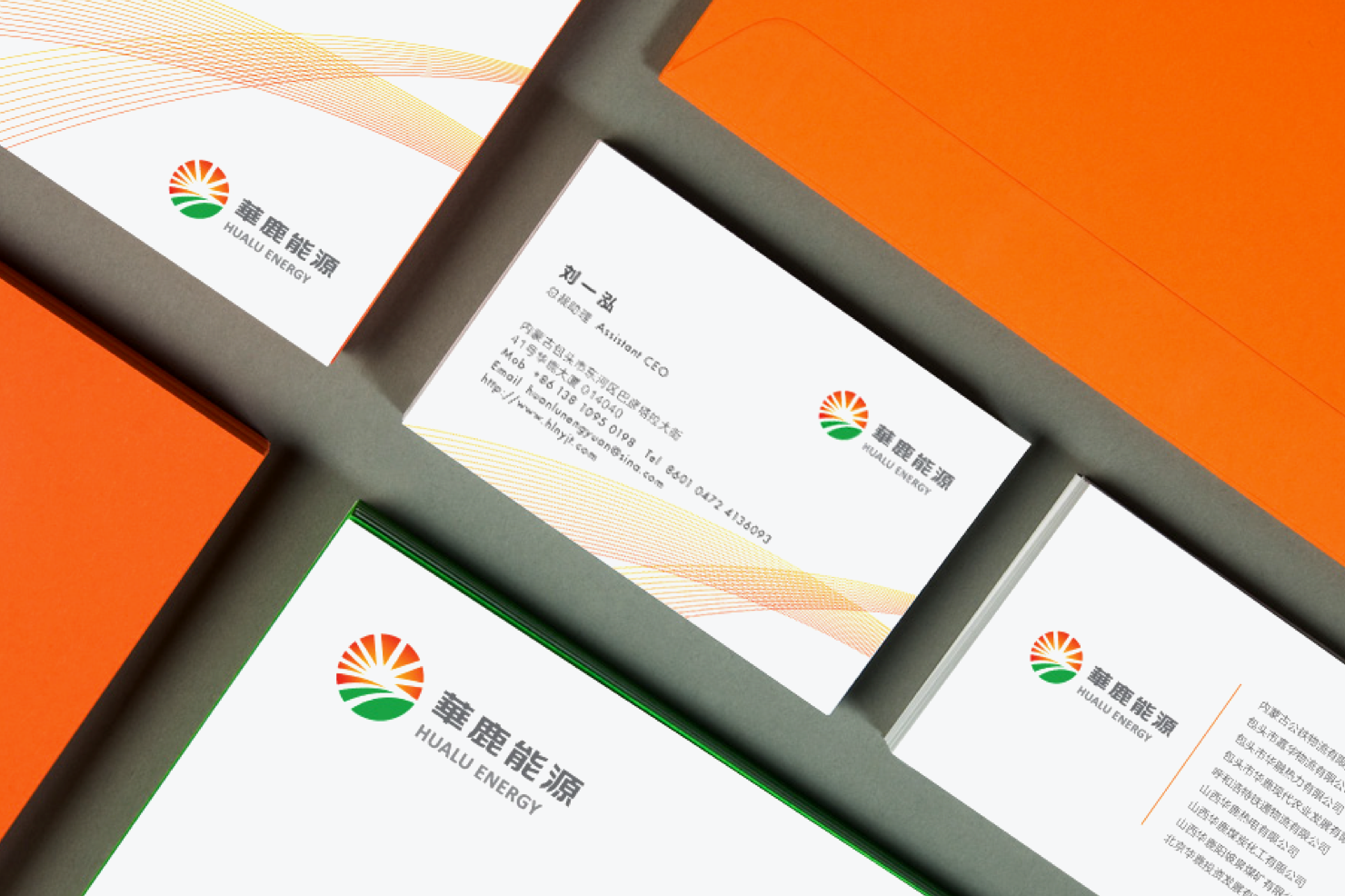 采用新的多媒体技术,让网站更加具有良好的交互效果,界面友好,易操作性强,突出能源行业特色,同时体现出与时俱进的现代企业风貌,色彩简约友好,网站内容模块主次清晰,采用国际化的CSS的前端标准开发。 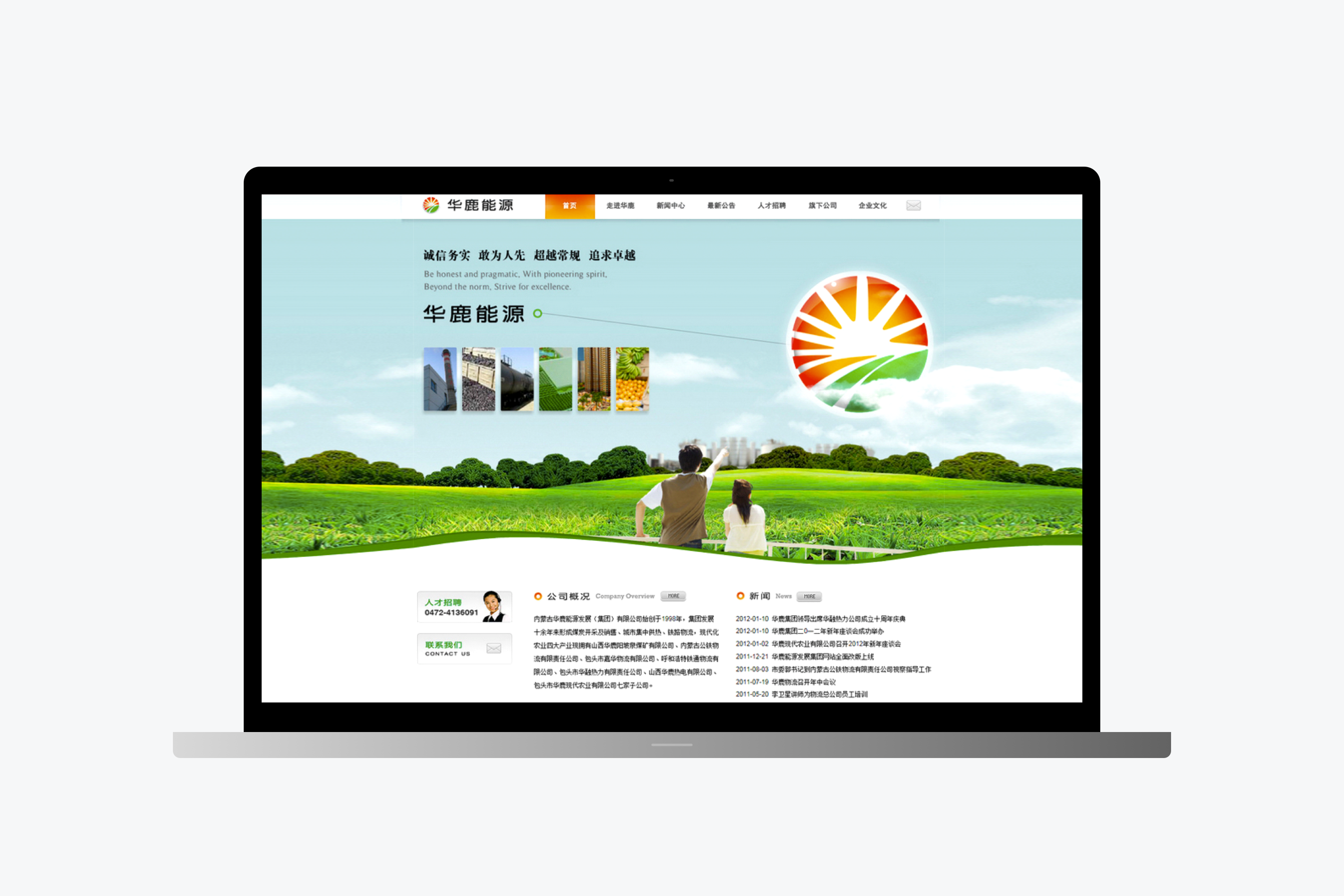 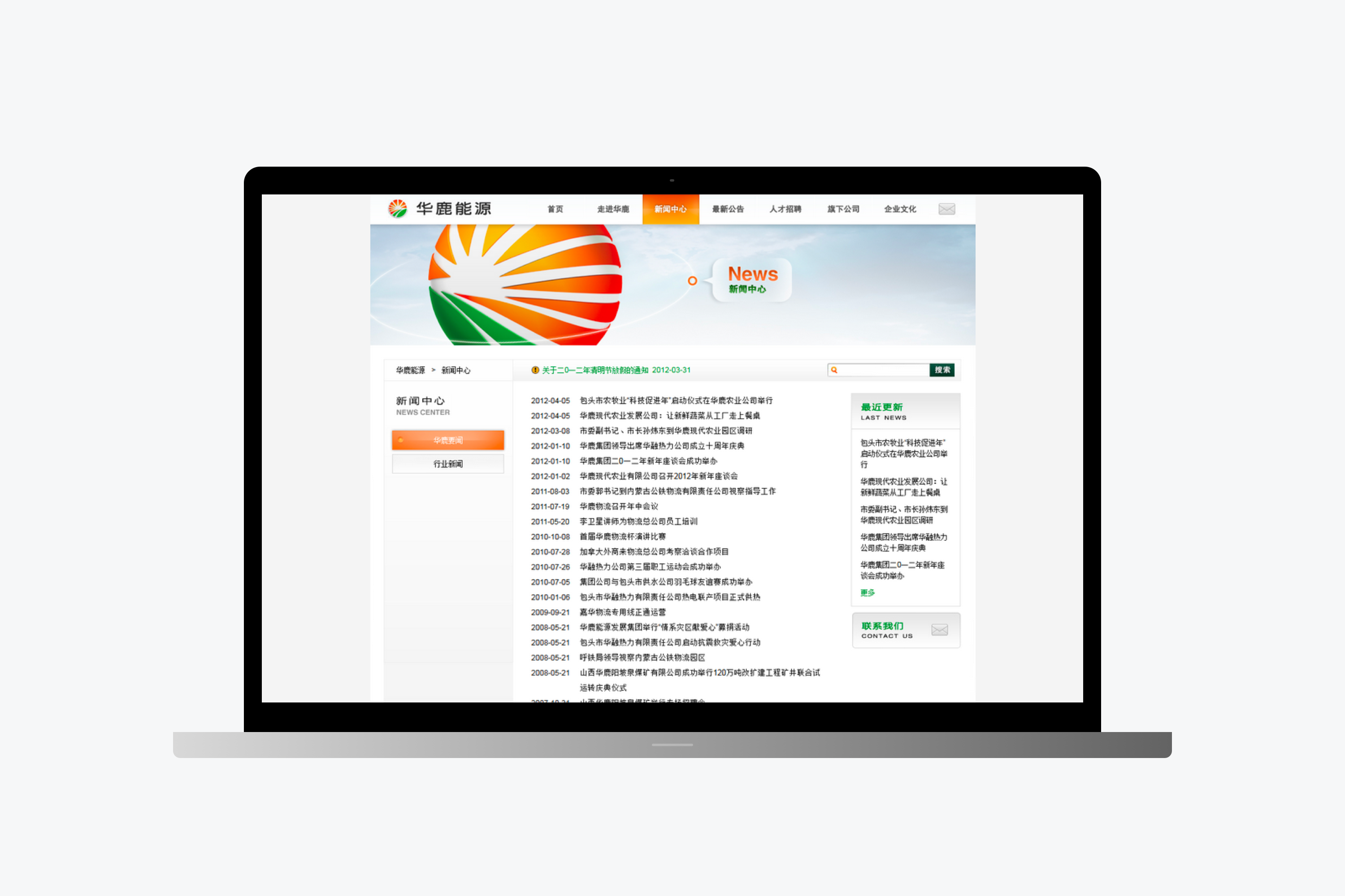 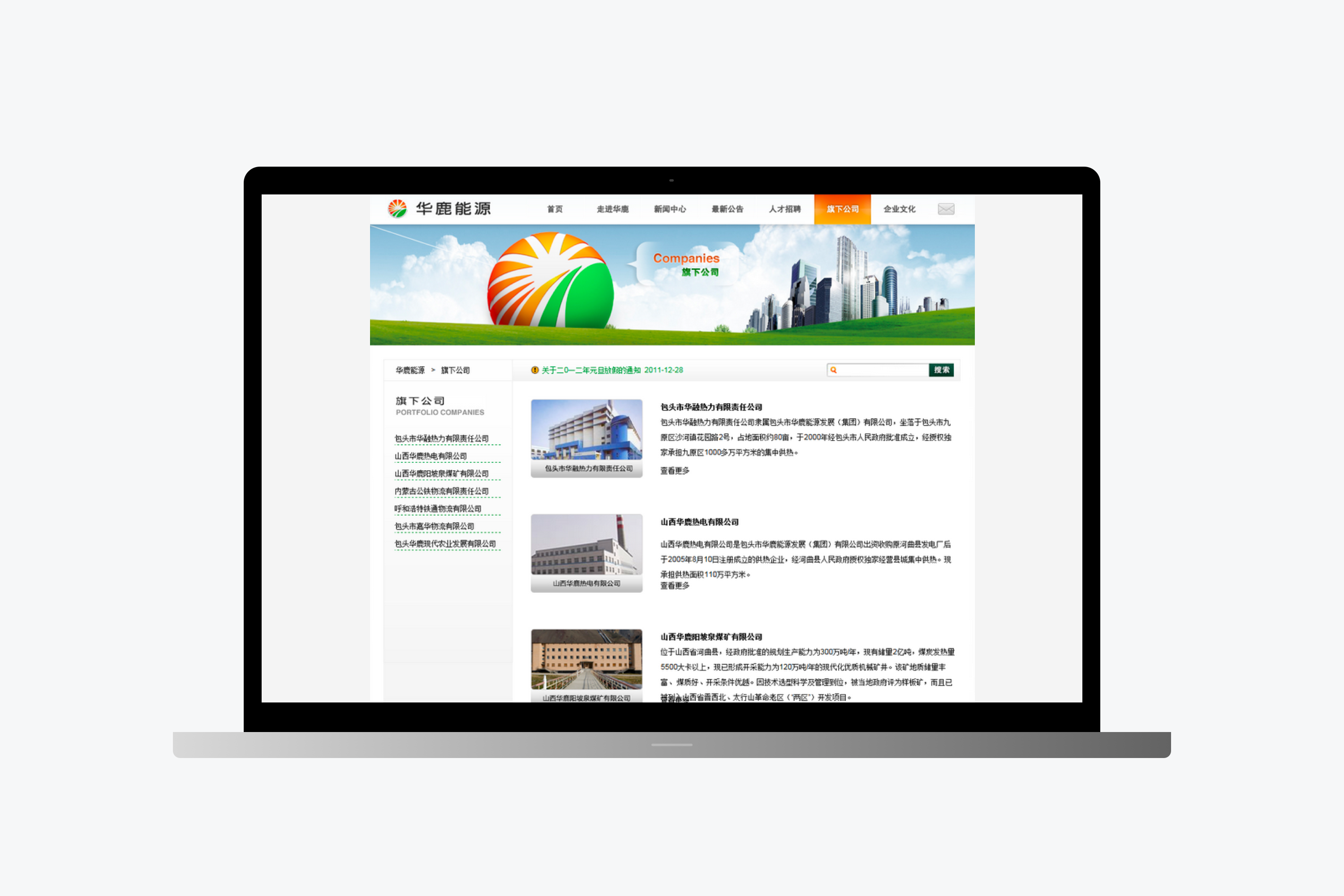 ## English Content ### Introduction An important update of the brand image of Hualu Energy Group aims to become China's influential and appealing energy group brand. Design a complete enterprise network construction experience solution for Hualu alone, upgrade Hualu's logo system, and improve the visual recognition system to make it more suitable for the application and dissemination of modern digital media. Synchronization also newly designed and developed the new version of the group's official website. The three-dimensional update of the brand's external visual image.   Mark inspiration: deer prairie sunrise - China energy, beautiful on the outside, solid within.Compare our logo to the sun on the horizon, dongsheng, north south, on the left on the right side of west to east, we will be a sign of China deer thickness after treatment, on the whole that the right side of the moral is: the sunrise.Green, along with the earth, grassland, people hope to hope, constituted the deer brand interpretation China website interaction design.   Adopting new multimedia technology, make websites more has good interaction effect, friendly interface, strong operability, highlight the characteristics of the energy industry, at the same time reflects the modern enterprise, advancing with The Times of color contracted friendly, website content module clear, primary and secondary adopt international standard CSS front-end development.   