# DASHILAR.ORG / 北京·大栅栏文化社区网站 - ID: 265 - URL: https://www.stoyard.com/works/265 - English URL: https://www.stoyard.com/en/works/265 - Year: 2017 - Cover: https://static.glabcms.stoyard.com/object/20180522/0rnowsfhjpxm.png - Categories: 大型品牌官网定制, 城市设计、城市更新, 艺术与文化, 建筑与设计 - English Categories: Office Website SOLUTION, City Renovation, Arts & Culture, Design & Architecture - Author: STOYARD - English Author: STOYARD - Publish: 2018-08-18 - Editor: STOYARD SHANGHAI - External Link: http://www.dashilar.org.cn ## 中文主体 ### 项目简介 网站的内容是介绍北京大栅栏文化艺术区,在这里找到有趣的艺术活动,了解有趣的北京文化,讨论有趣的创意话题。设计通过多层页面间的自由、放松的交互体验,多线索展示大栅栏丰富的内容信息我们试图让复杂的内容和庞大的信息通过灵巧的设计而更加容易找到和阅读。 [Video](https://static.glabcms.stoyard.com/object/20180513/93e4kb553bn.mp4) 大栅栏历史是北京文化发展的缩影,根据其现有历史了解它的过去和未来,经过整理和了解,“穿越”的概念贯穿整个大栅栏的过去和未来,通过这一概念灵活调整和组合,使其在网站模块加以充分体现,网站设计打破了传统网页单一垂直线索的设计模式,设计了更符合内容的交互效果,通过交互层层带入,使其三个核心版块都能在首页体现。网站通过设计呈现出一种全时间、全空间跨度的文化社区。 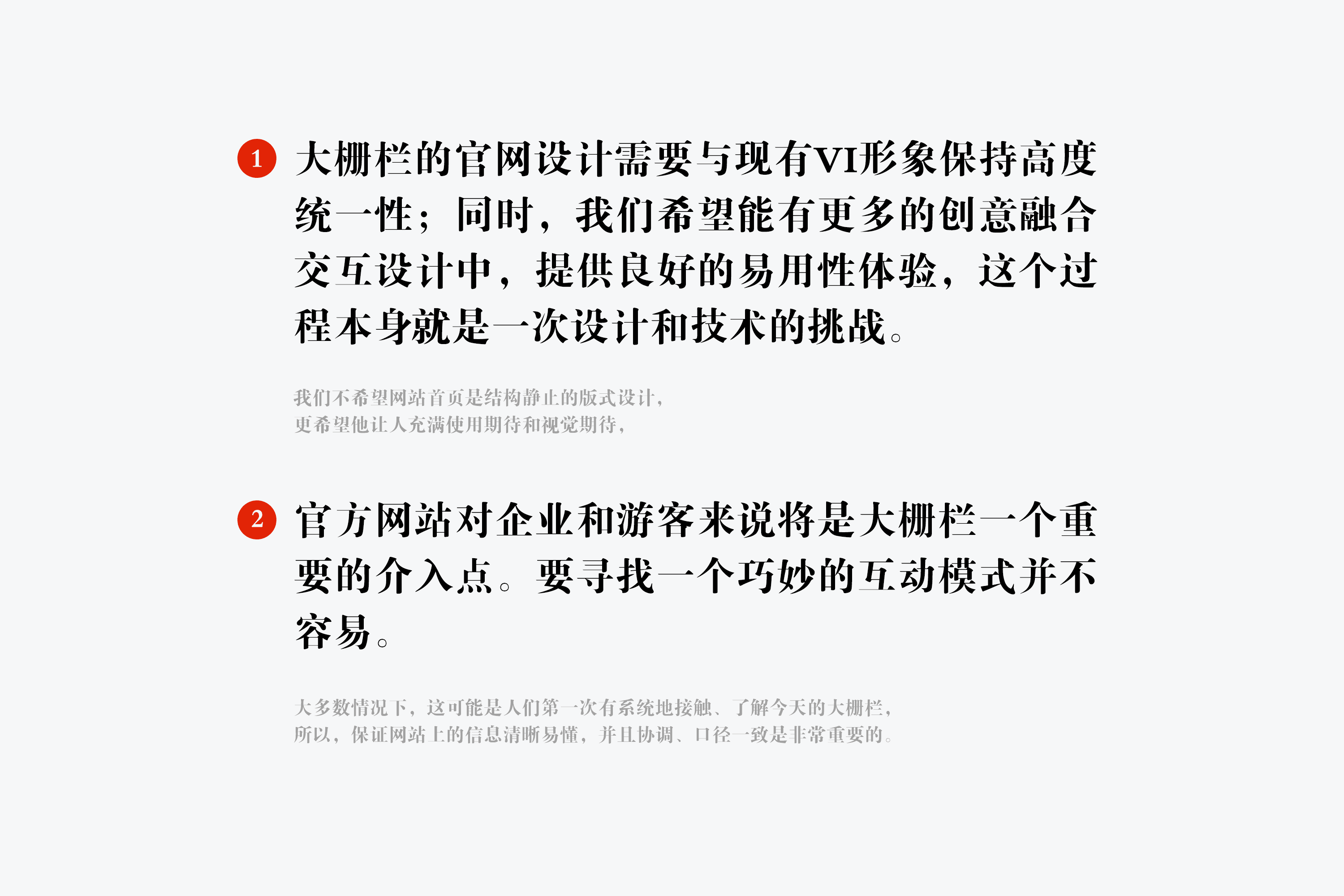 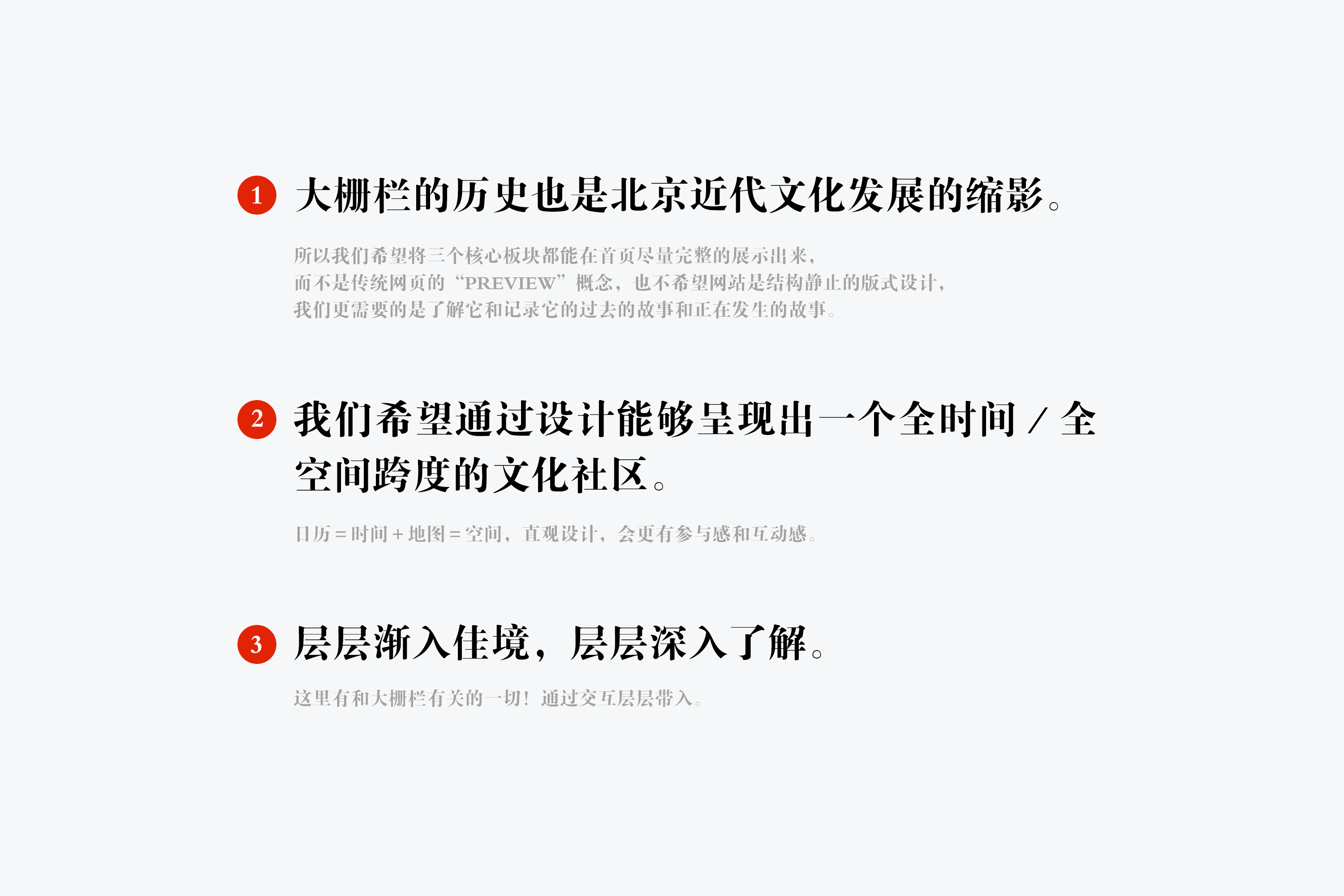 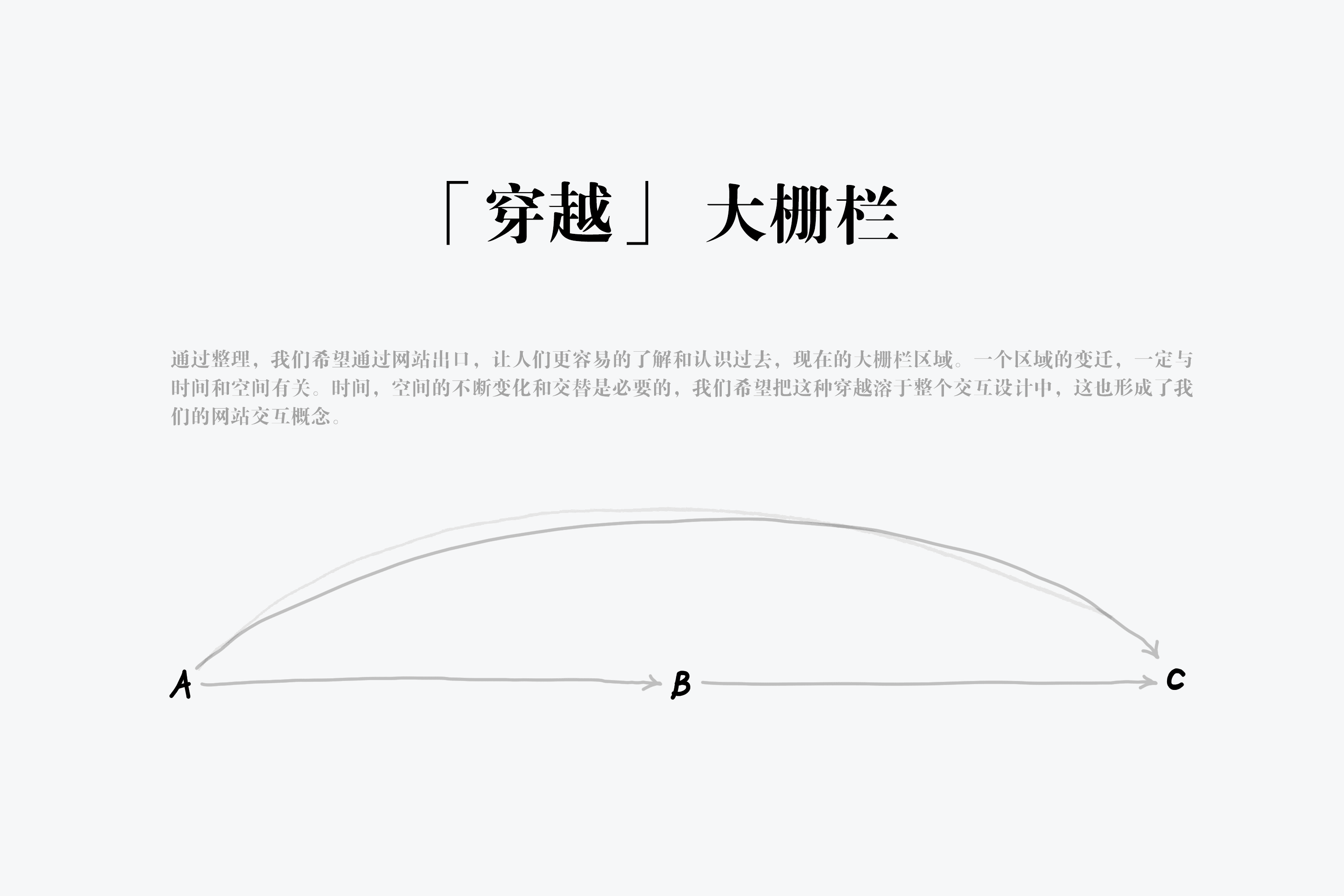 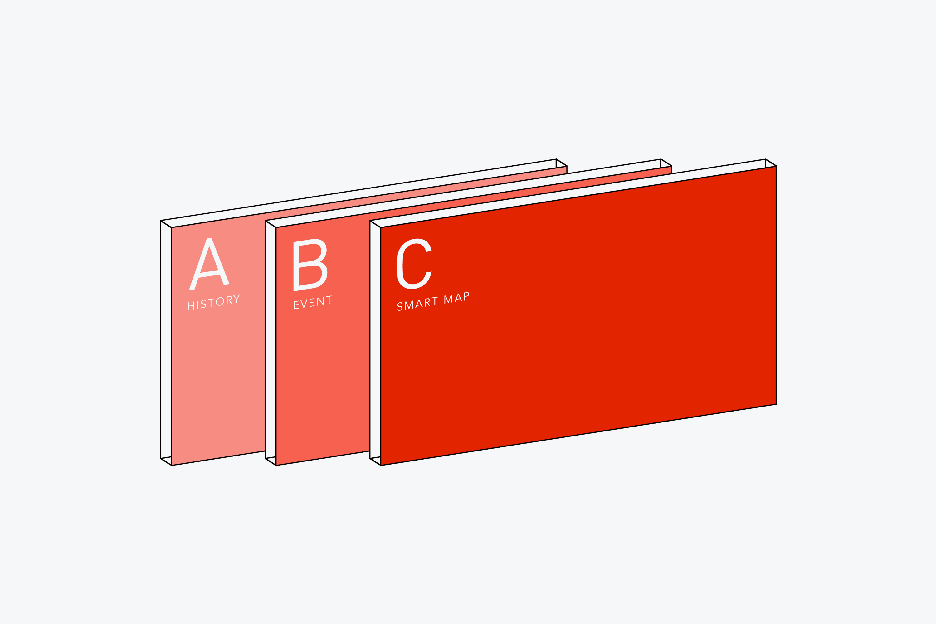 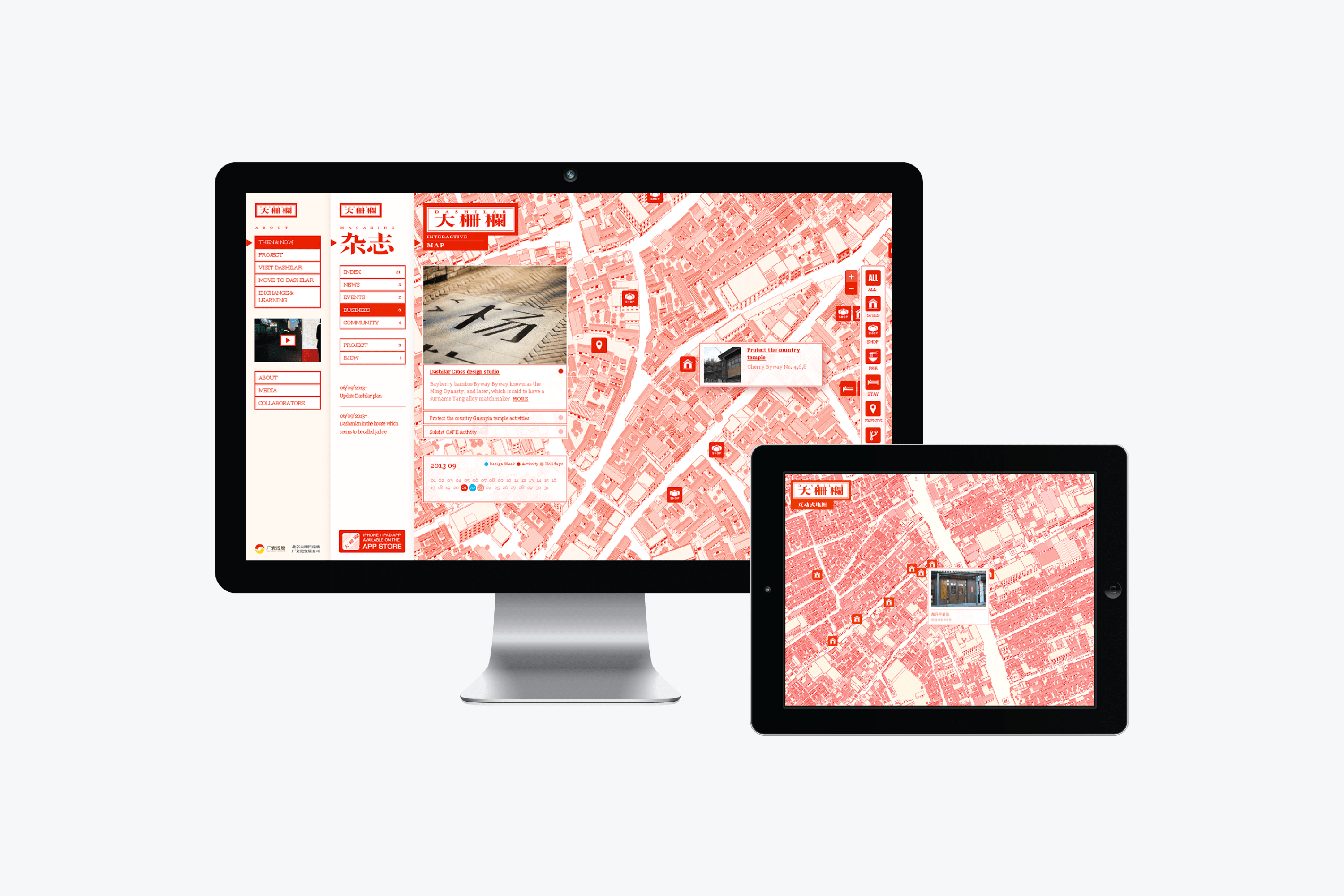 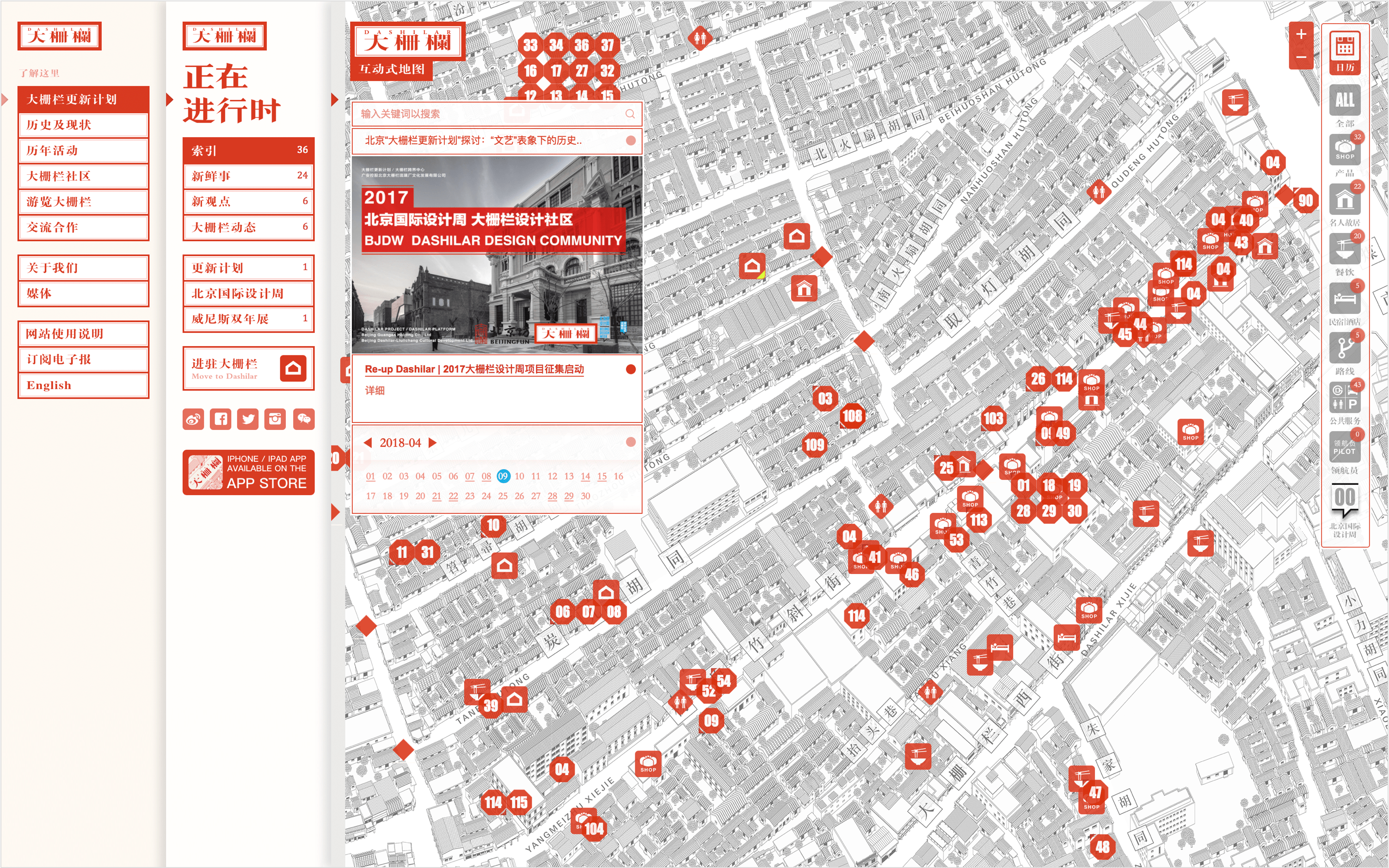 了解、正在进行时、地图:三个核心板块都能在首页尽量完整的展示出来,而不是传统网页的PREVIEW概念,也不希望网站是结构静止的版式设计,我们更需要的是了解它和记录它的过去的故事和正在发生的故事。日历正好代表时间,而地图代表空间:我们希望通过设计能够呈现出一个全时间,空间跨度的文化社区。 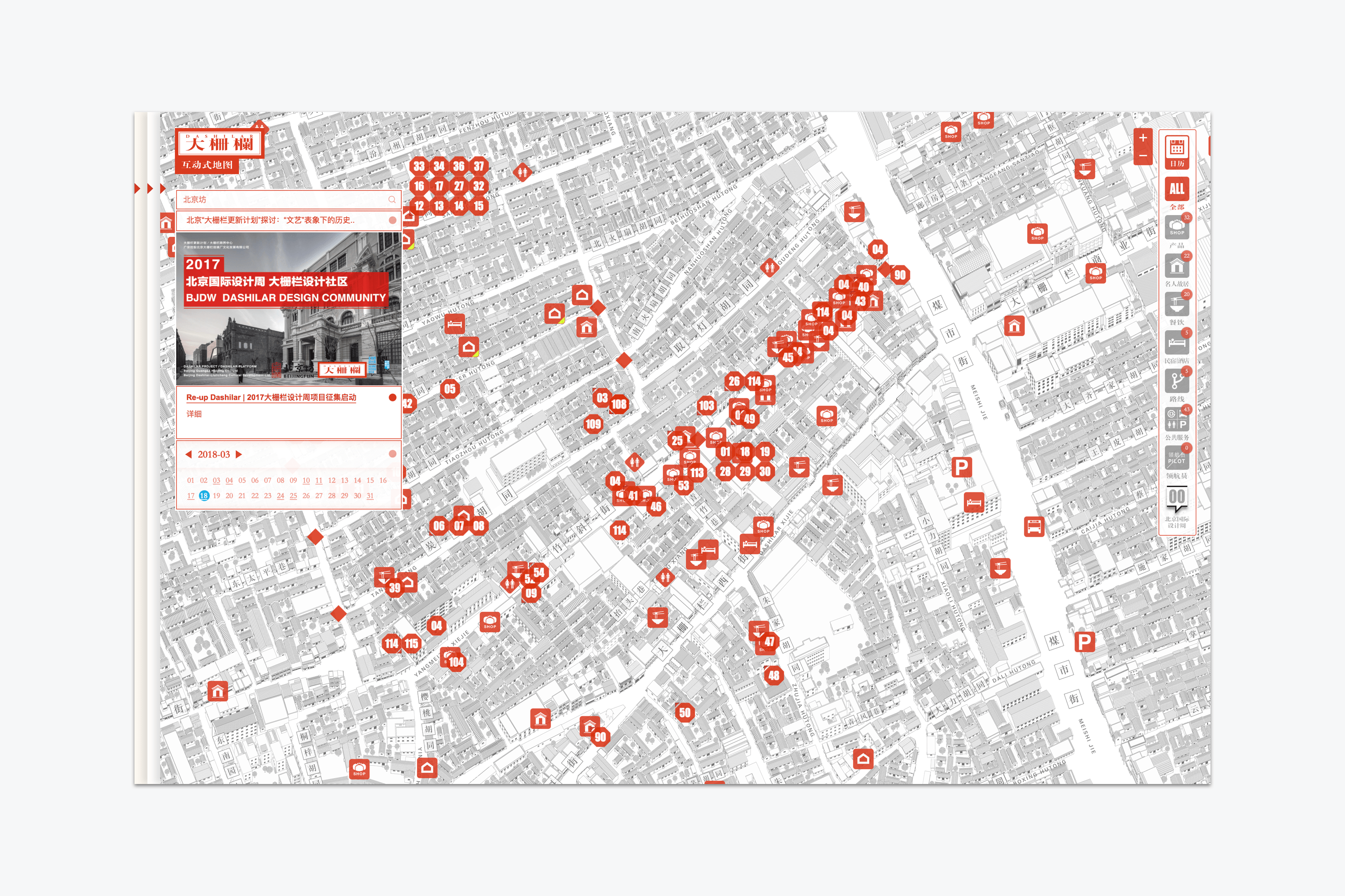 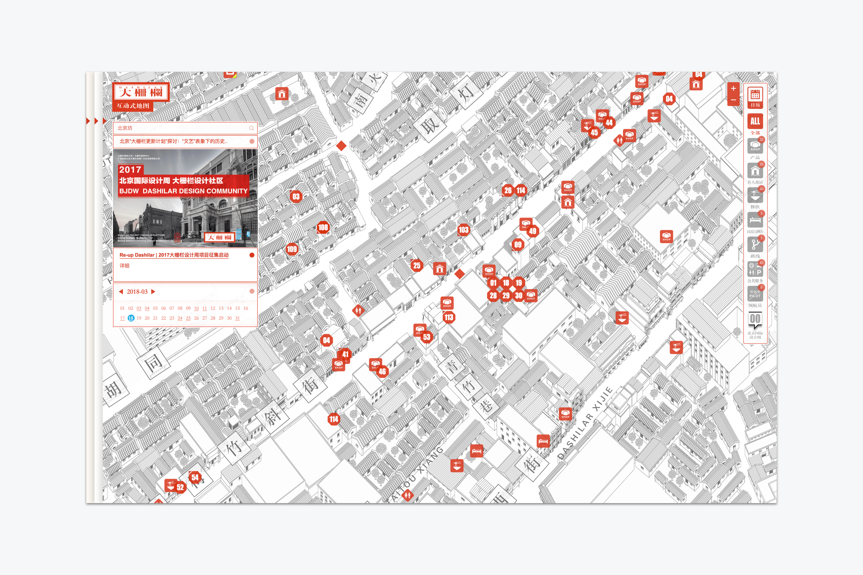 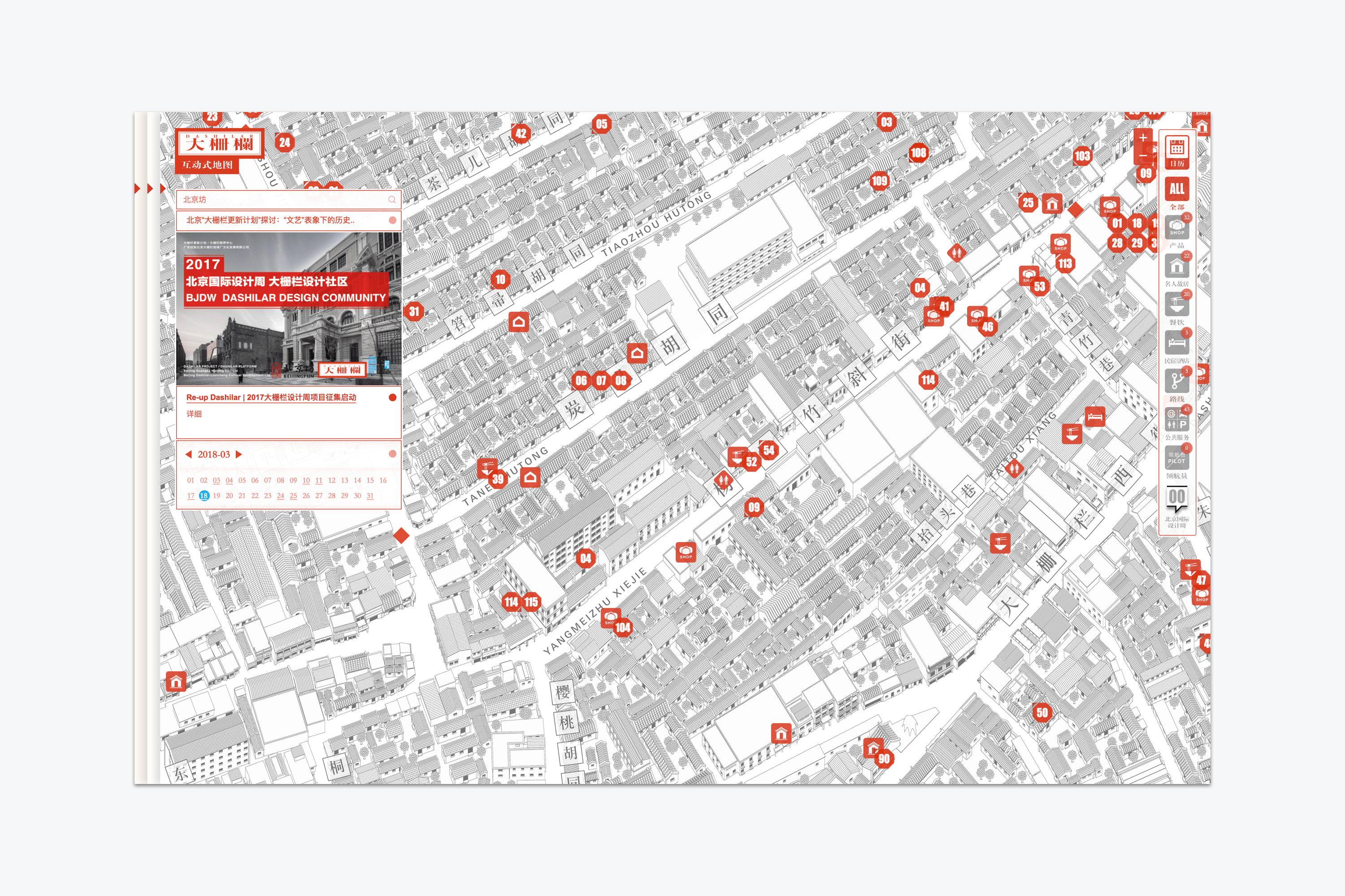 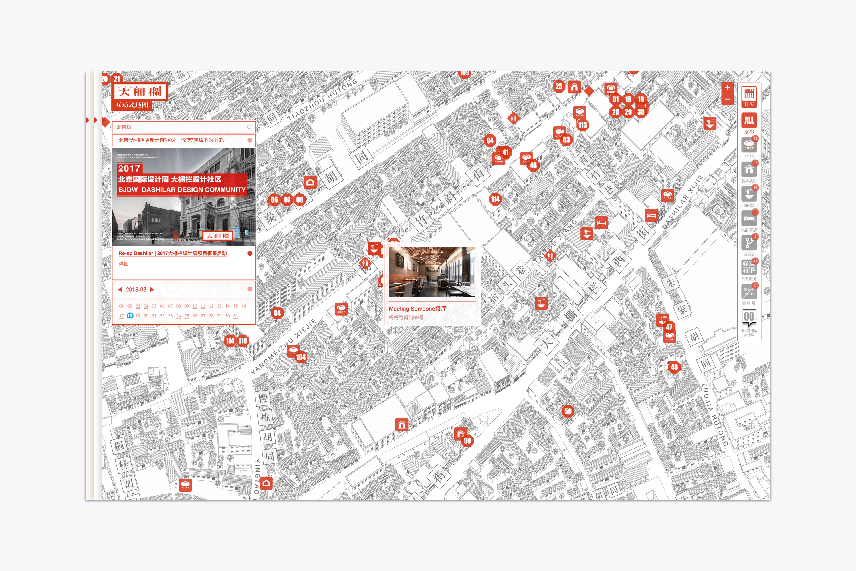 地图内数据点位有上百个,点击其中任何一个点位都可以弹出对应内容页面,点击“关闭”则可以回到地图页面,增加浏览效率。地图检索可搜索附近餐饮、文化建筑等。我们也设计了方便用户自助游览的建议线路,包括历史文化,设计之旅,吃货指南。 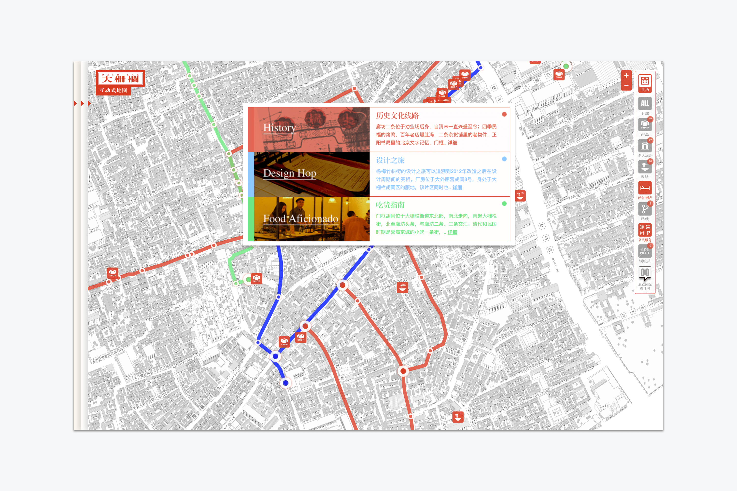 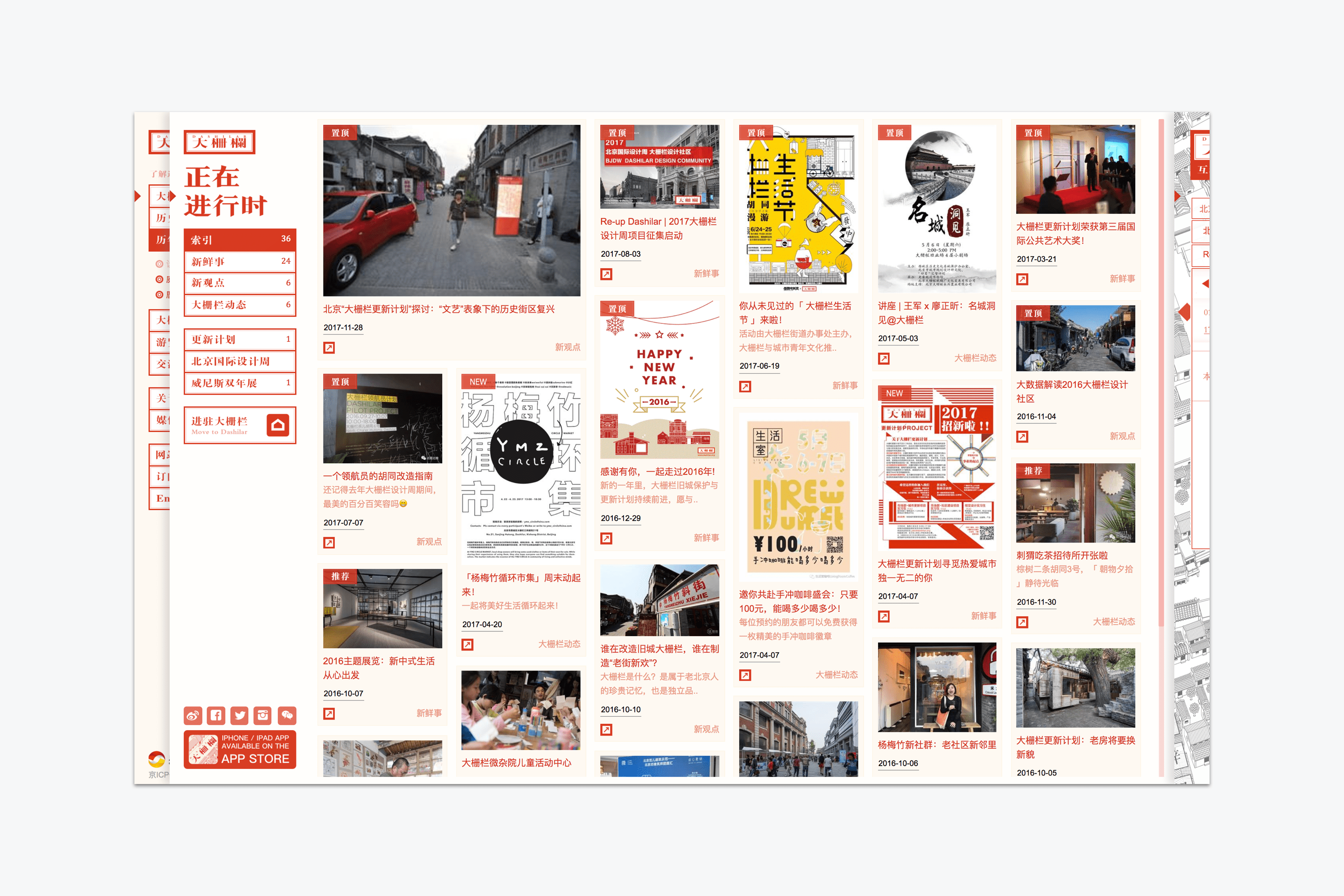 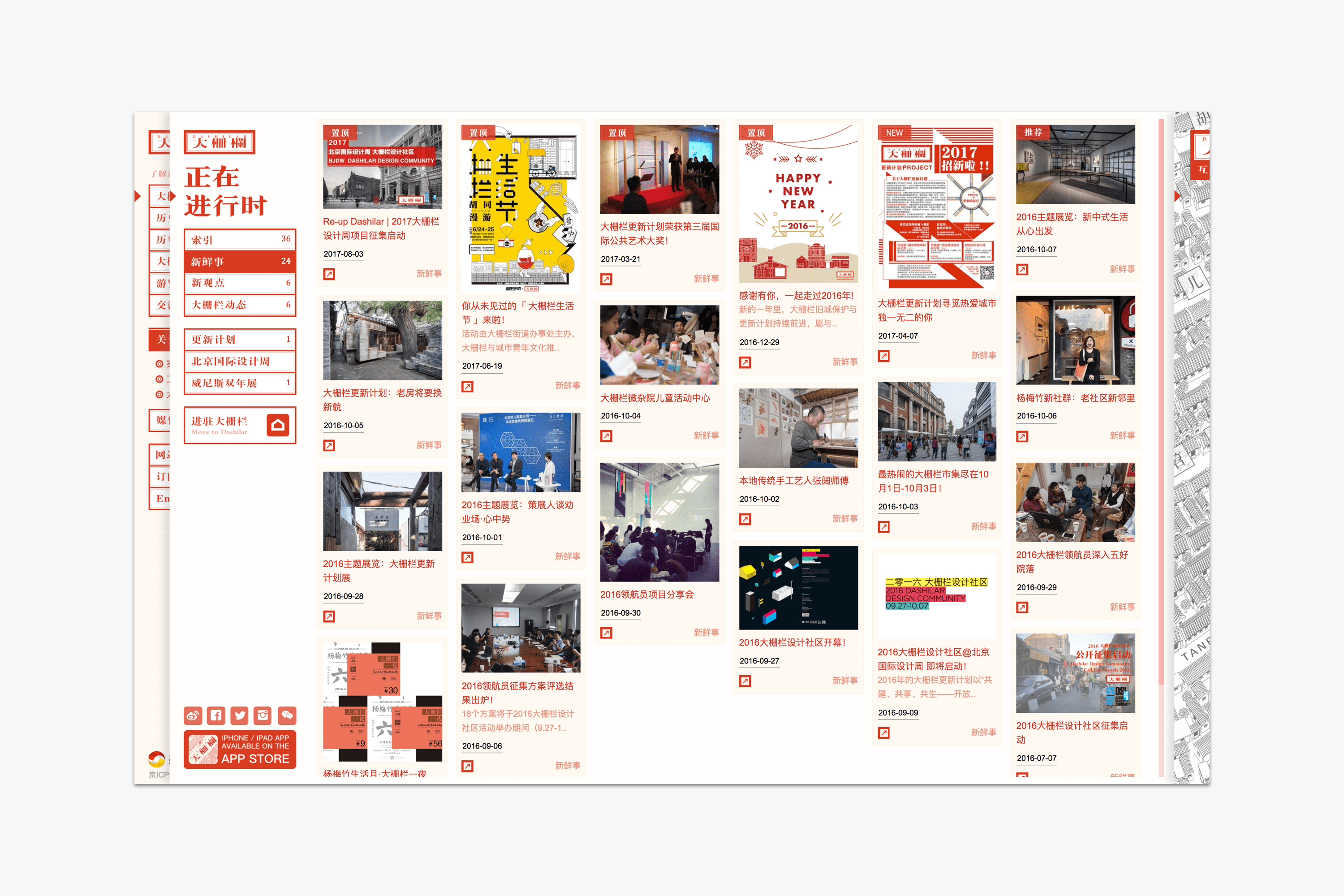 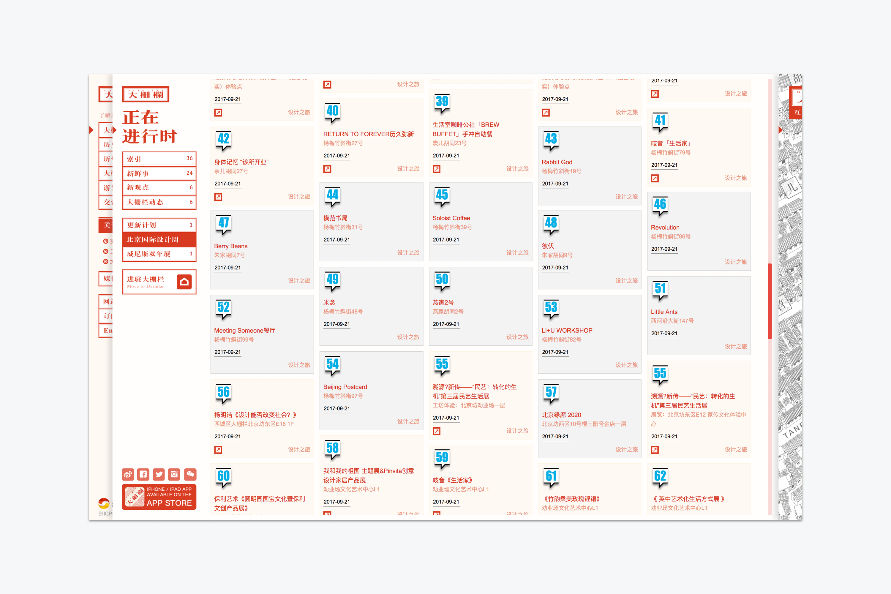 我们使用了全画幅响应式的视觉方式展示大栅栏丰富的内容信息,我们试图让复杂的内容和庞大的信息通过灵巧的设计而更加容易找到有趣的艺术活动,了解有趣的北京文化,讨论有趣的创意话题。让用户感受到这个老城复兴升级的艺术活力。 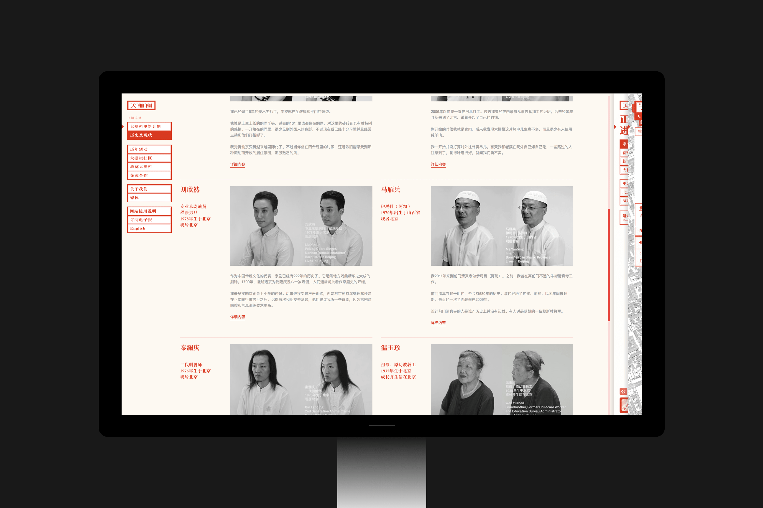 由于手机上展示的空间有限,我们需要更符合手机用户的使用习惯和设备交互的特性,我们简化了布局和操作,全新设计了移动端的界面,优化了显示内容,新的移动端展示方式类似一个内容阅读的信息流。把原本3个独立板块展开作为入口。 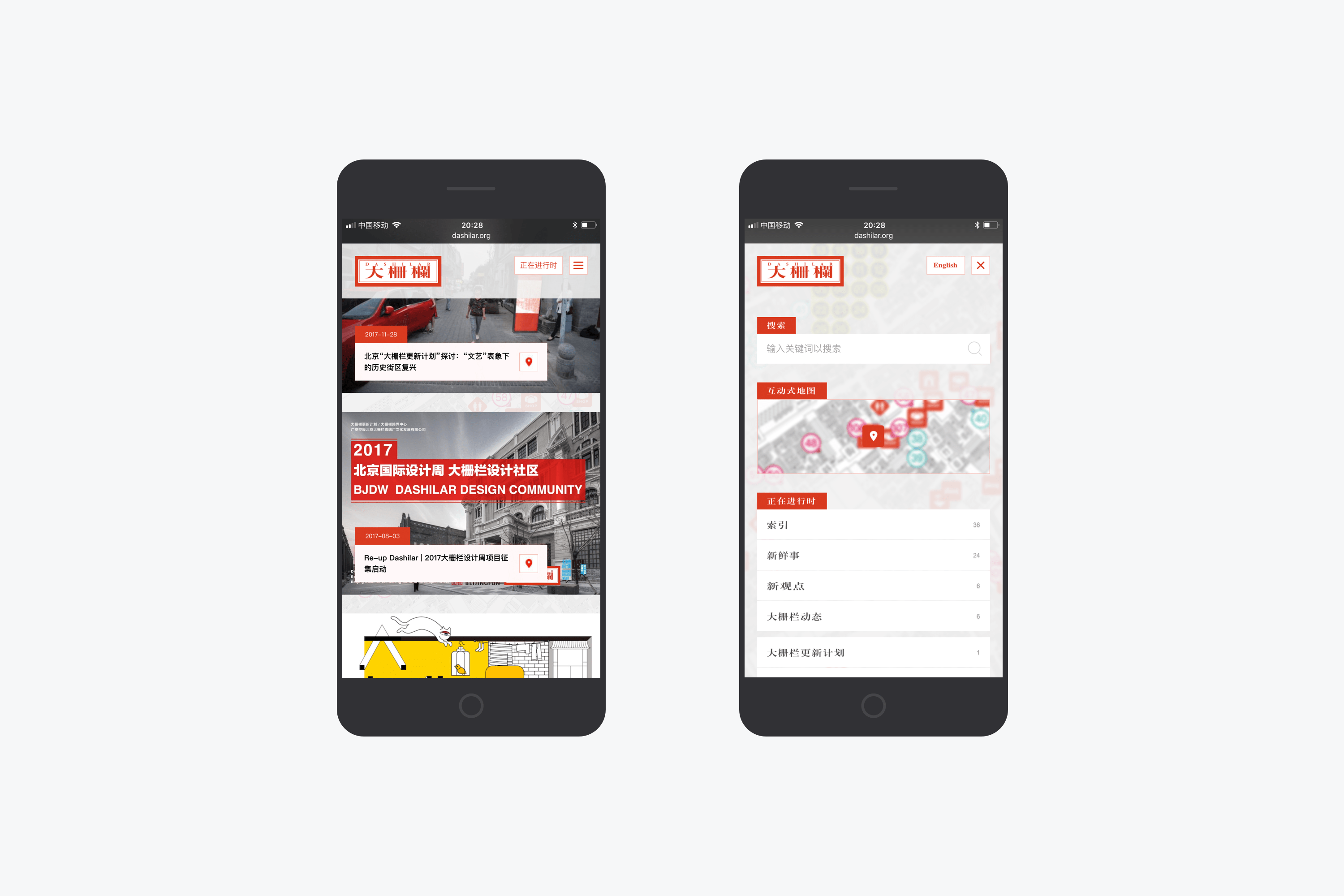 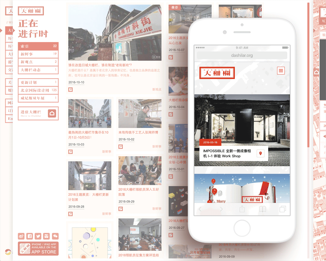 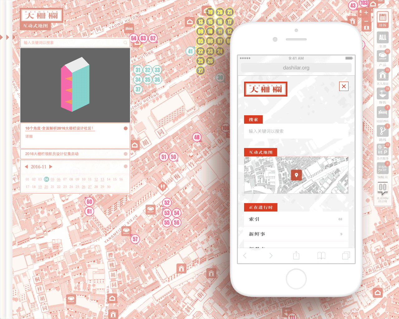 为了更好的和用户互动,我们设计了电子报NEWSLETTER,在系统中集成,管理和发布,用户注册后定期会收到来自设计周官方的新闻速览,订阅活动信息。 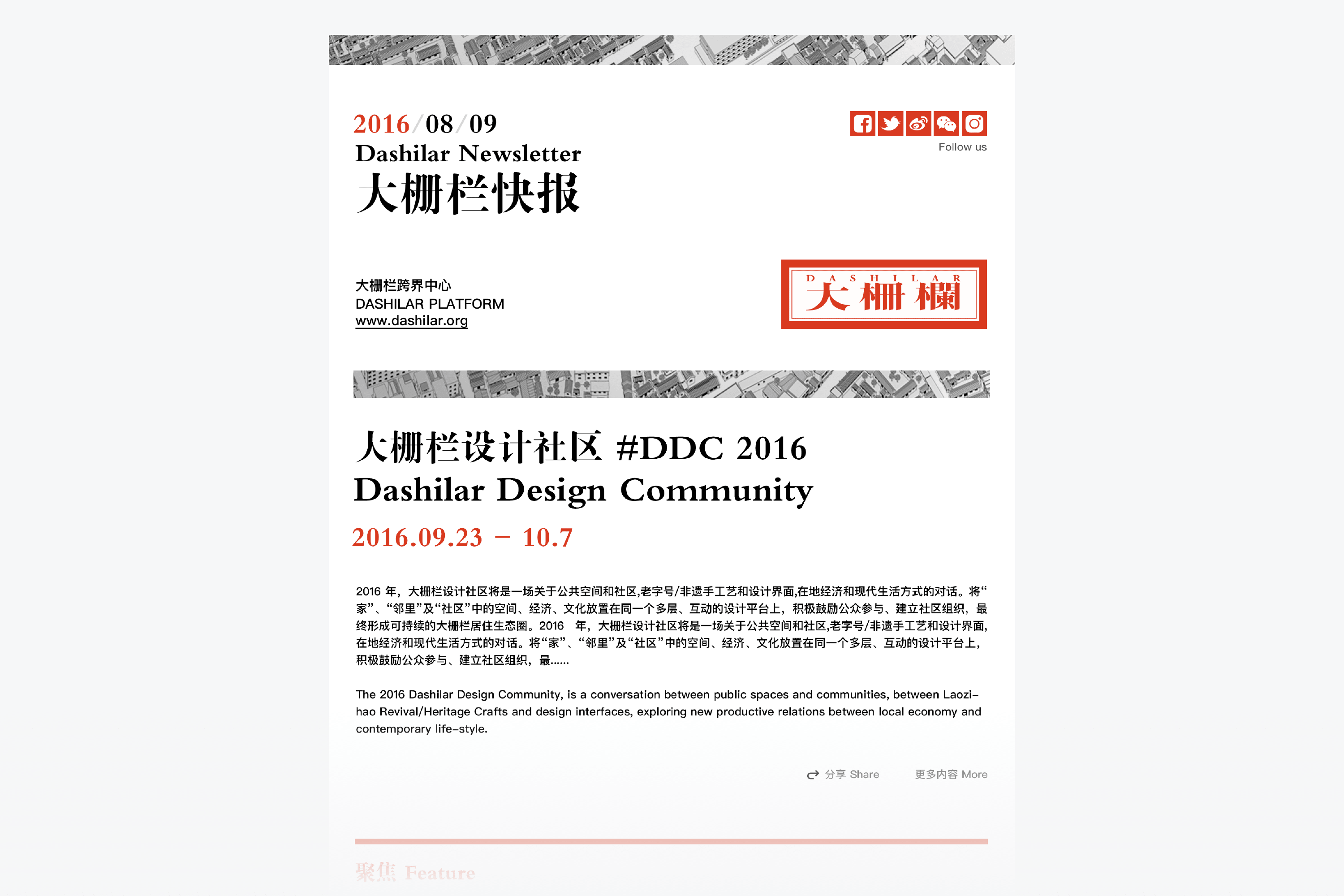 ## English Content ### Introduction Web site is to introduce the content of the dashilan culture art district of Beijing, found here interesting art activities, understand interesting Beijing culture, discuss interesting topics.Design by multilayer free, relaxed interaction experience between pages, many clues to show dashilan to enrich the content of the content of the information we try to make the complex and huge information through clever design and more easy to find and read. [Video](https://static.glabcms.stoyard.com/object/20180513/93e4kb553bn.mp4) dashilan is a microcosm of the Beijing cultural development history, according to its existing history to know its past and future, through sorting and understanding, the concept of" crossing "throughout the entire dashilan past and future, through the concept of flexible adjustment and combination, make its modules to fully embody the web, web site design broke traditional web design pattern of the single vertical clue, design more in line with the content of interaction effect, through interactive layers into, make its three core section can be reflected on the front page.Web site through the design took on a full time and full space span the culture of the community.       understanding, in the works, the map: three core plate can be on the front page as far as possible the full display, rather than a traditional web page PREVIEW concept, also do not want to site is the stillness of the format design structure, we have more need of understanding it and record it and the story of what is happening in the story of the past.Calendar on behalf of the free time, and map represents the space, we hope that by design to be able to display a full time, space span the culture of the community.     Map inside there are hundreds of data point, click on any one point can pop up corresponding content page, click on the "off" can return to the map page, browse efficiency increased.Map retrieval can search nearby restaurants, cultural construction and so on.We also design the convenient user self-help advice line, including the history and culture, design tour guide version.     We used a full-frame responsive way of visual display dashilan rich the content of the information, we try to make the content of the complex and huge information through clever design and more easy to find interesting art activities, understand interesting Beijing culture, discuss interesting topics.Let the user feel the old city renewal upgrade of artistic vitality.  Because in the mobile phone display space is limited, we need to be more in line with the use of mobile phone users habits and equipment characteristics of the interaction, we simplify the layout and operation, the new design for mobile side interface, to optimize the display content, new way similar to a mobile terminal display content the information flow of reading.The original three separate plate as the entrance.    In order to better interact with the user, we design the electronic NEWSLETTER, integrated in the system, management and release, users will receive regularly from design week official news quick reference, subscribe to the event information. 