# GIMI叽咪 / 给95后打造美妆社交平台 - ID: 247 - URL: https://www.stoyard.com/works/247 - English URL: https://www.stoyard.com/en/works/247 - Year: 2017 - Cover: https://static.glabcms.stoyard.com/stoyard/project/cover/20221225/osq28wnbwaa.jpg - Float Image: https://static.glabcms.stoyard.com/stoyard/project/float/20221225/g0wdj0zdo2i.png - Categories: 行业领域:医疗仪器,医药健康、时尚, 服务内容:品牌升级(Brand), 技术解决方案:网站整体解决方案、APP/小程序技术解决方案 - English Categories: Type of industry field:Biotech,Healthcare、Fashion, Service Content:Brand Design & Rebranding, Technical Solutions:Full-Service Website Solution、APP Programs Design Solution - Author: STOYARD - English Author: STOYARD - Publish: 2018-08-18 - Editor: STOYARD BEIJING ## 中文主体 ### 项目简介 GIMI叽咪是一个美容护肤社交平台。我们试图帮助GIMI设计一个年轻、有个性的追求“美力”社交平台。整个项目包括微信公众平台、网页端和logo的设计,以及后台管理系统。这是一个以用户为主、产品为辅的社交平台。 [Video](https://static.glabcms.stoyard.com/object/20180601/h1qda1rwkdw.mp4) gimi以微信公众号平台为主,依托于微信引流,因此十分注重移动端的交互。它的定位是社交平台,社交为主,产品为辅,因此我们将社交功能进行了强调,完整地设计了评论、点赞、打赏、私信的功能。我们与gimi多次研讨,最终确定了UX流程,之后设计了两套UI。 --- 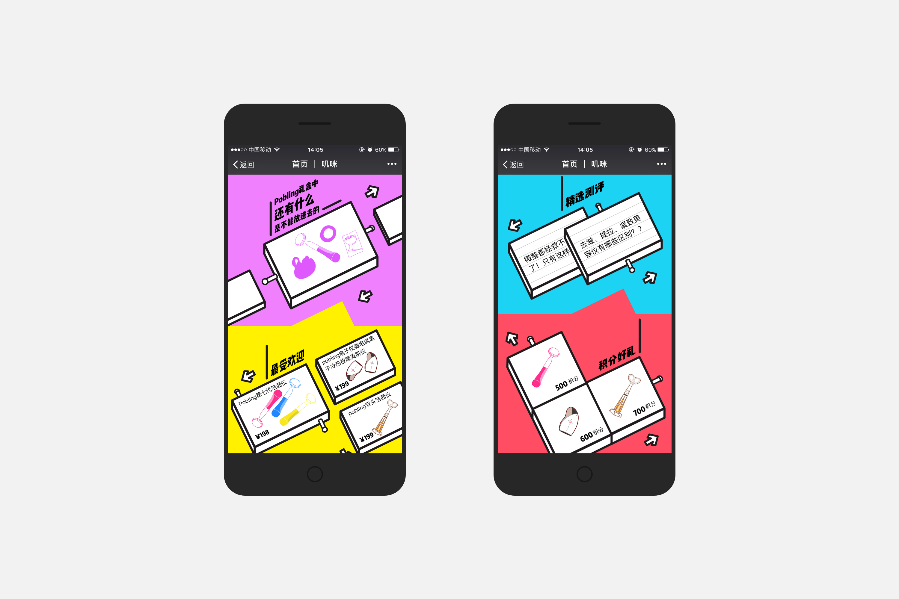 首页分为四个模块:推荐文章,最热商品,精选测评和积分好礼。我们用4个色块区分不同的模块,用2.5D的插画方式做了一系列主视觉。 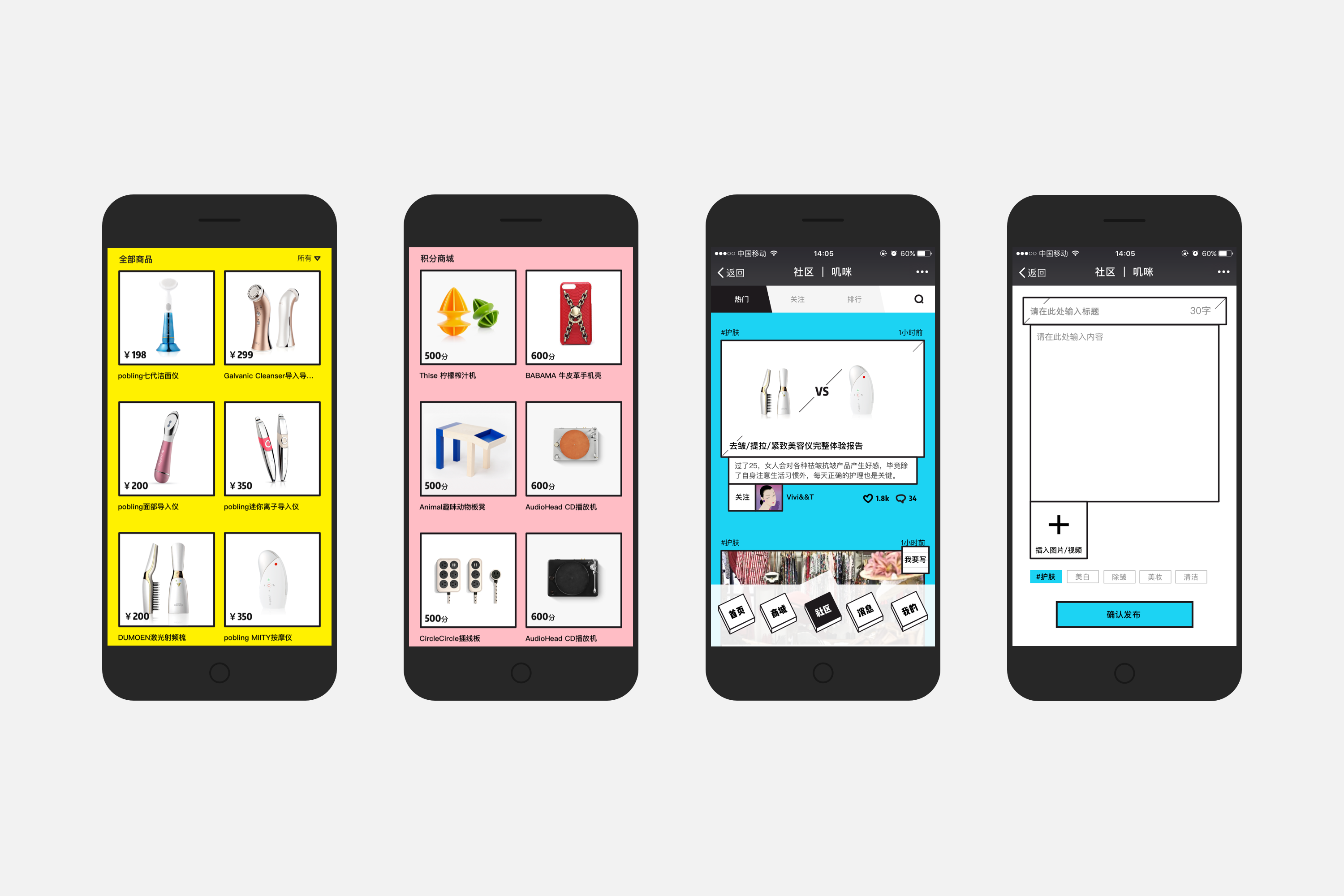 商品分为热门商品和积分换购商品两种,出现在商城的分类下。社区是以精选测评文章为载体的交流平台,用户可以在文章下评论、打赏、回复评论,也可以自己发表测评文章。 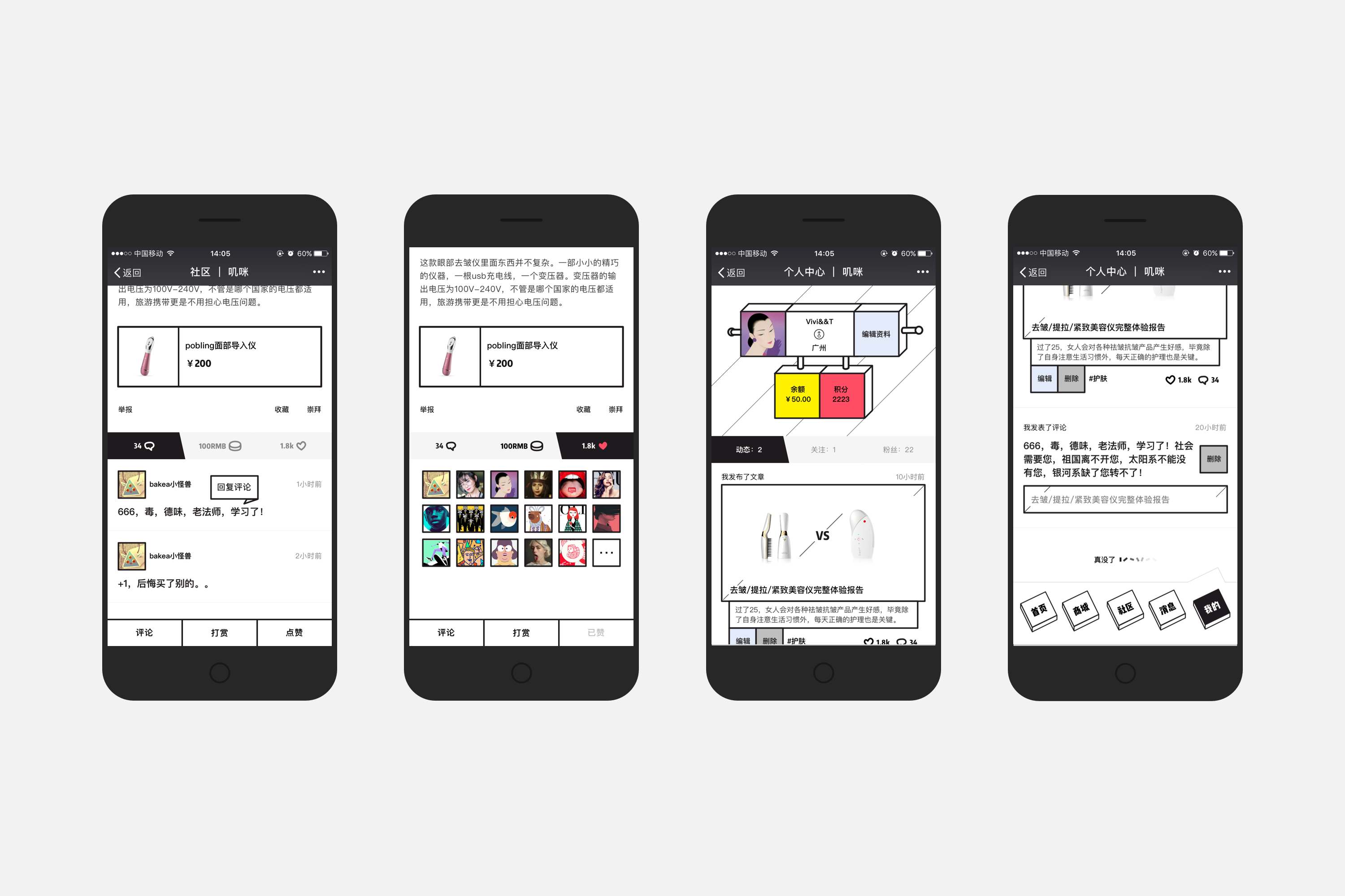 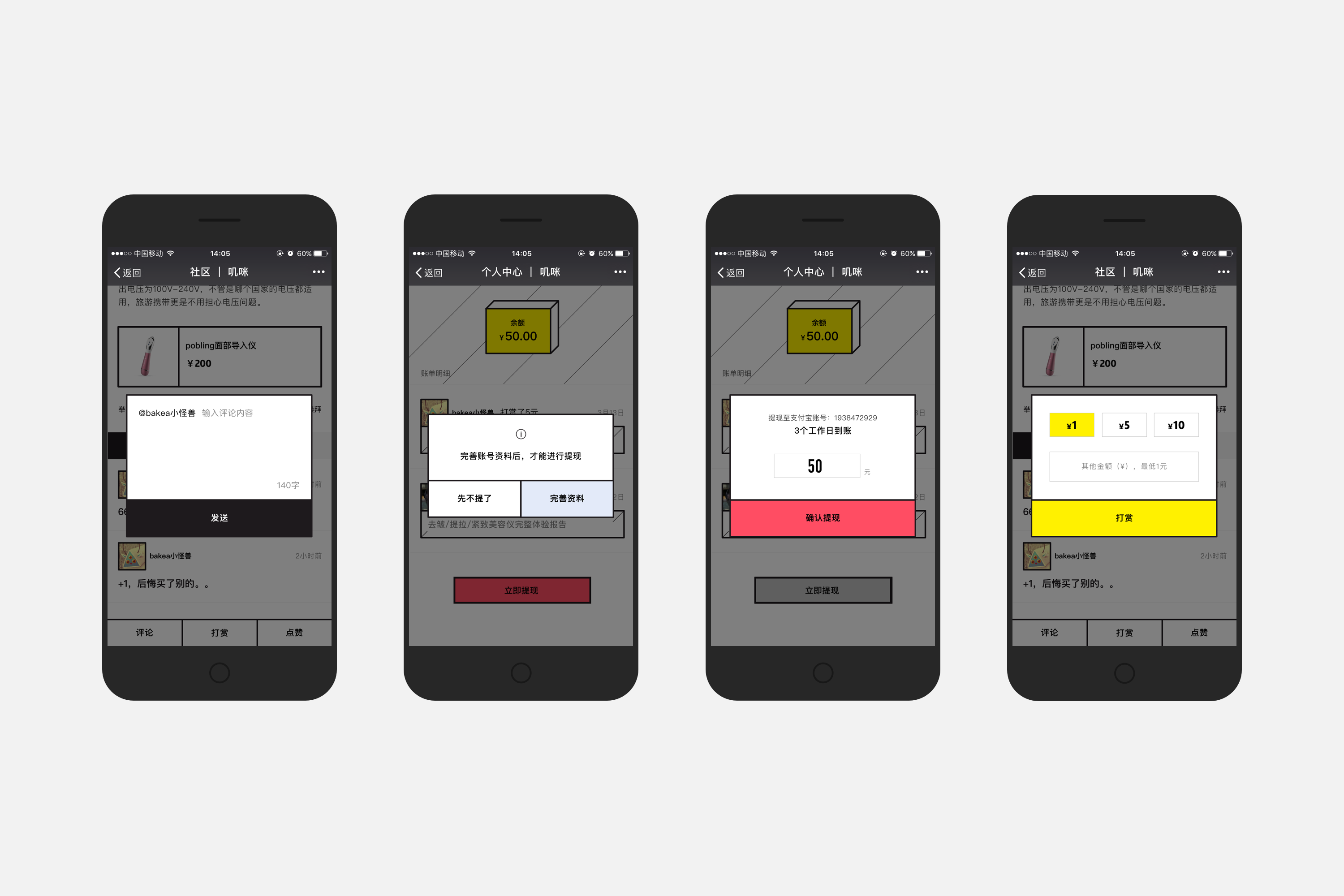 网页端主要负责产品展示和引流,因此在功能点的设置上,不如微信端那么多。首页结构类似,分别是广告图展示区,新品推荐区,积分好礼区和测评文章区。 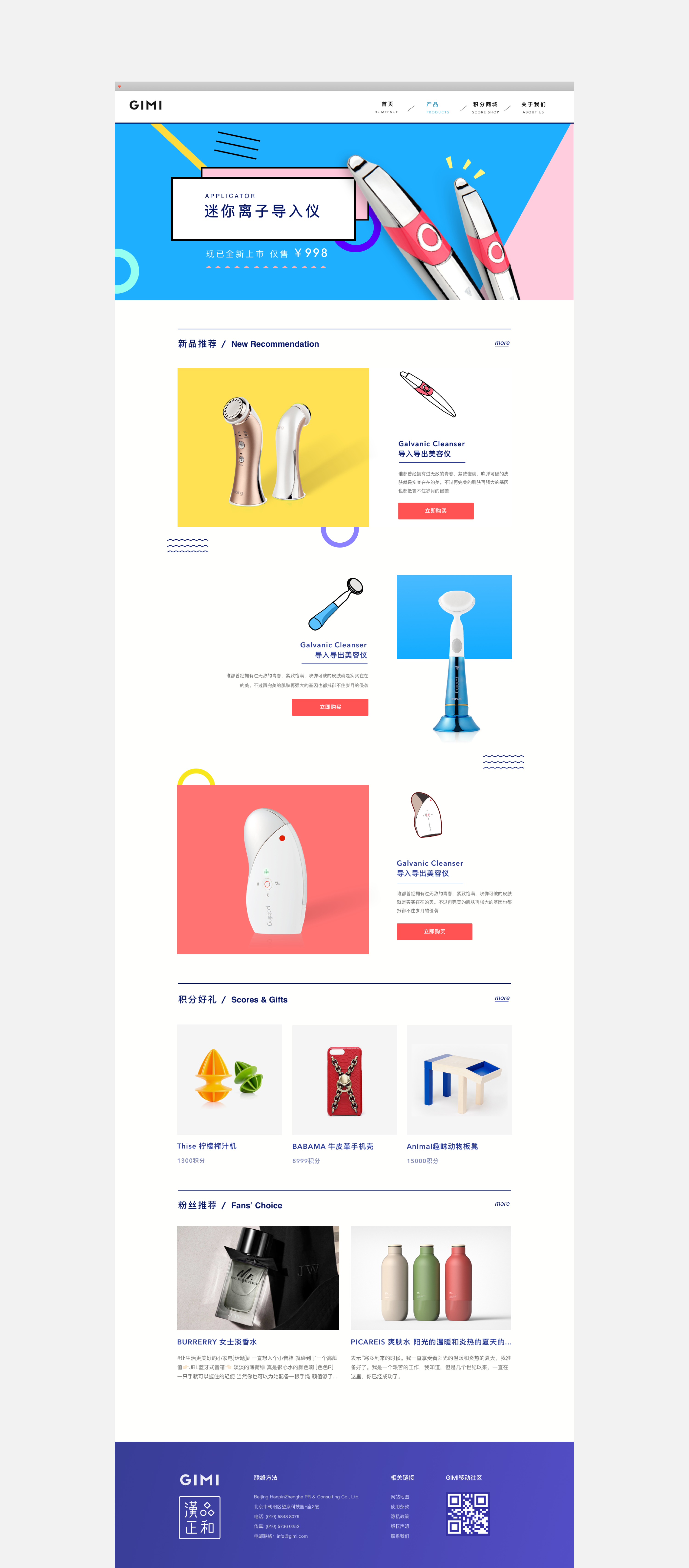 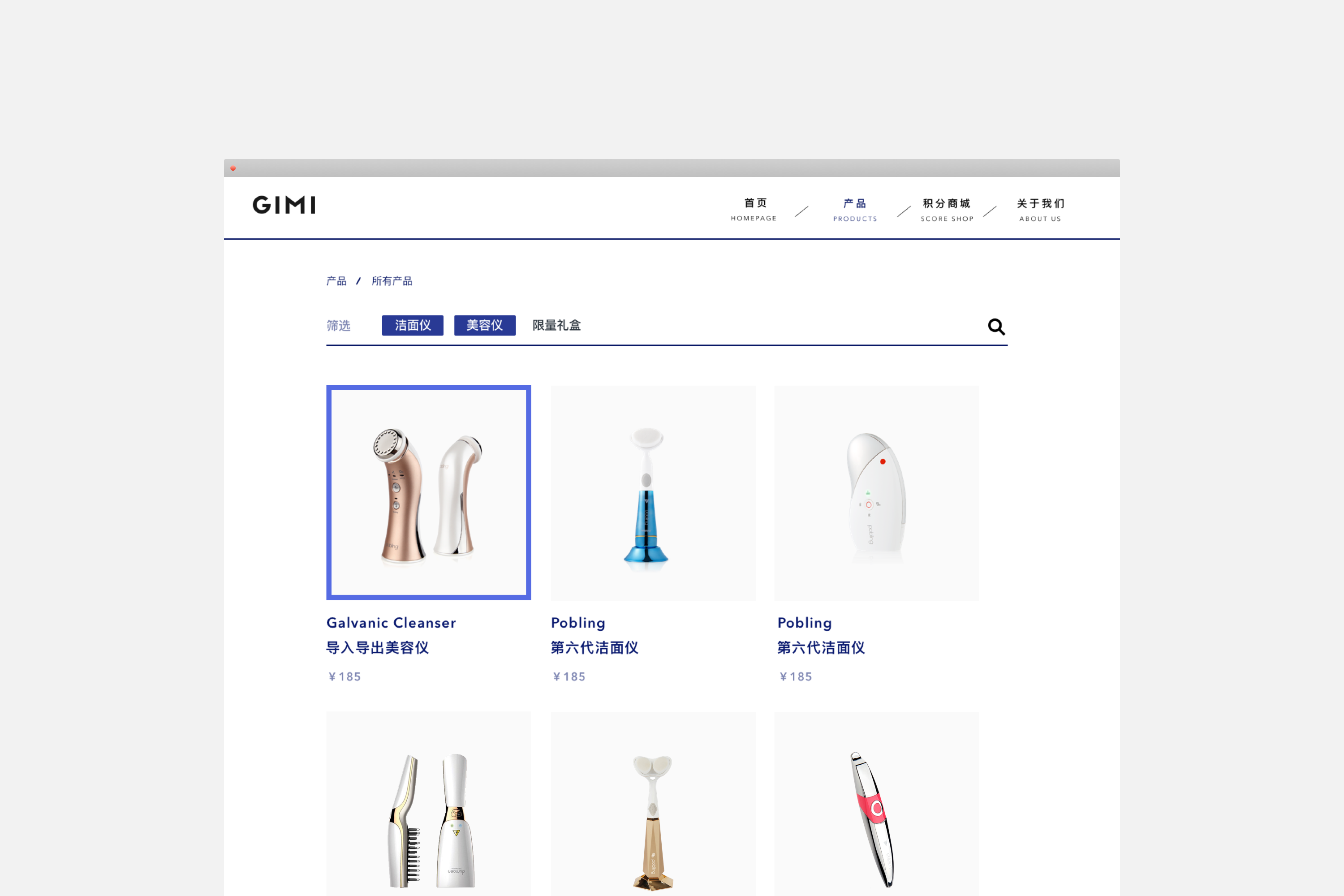 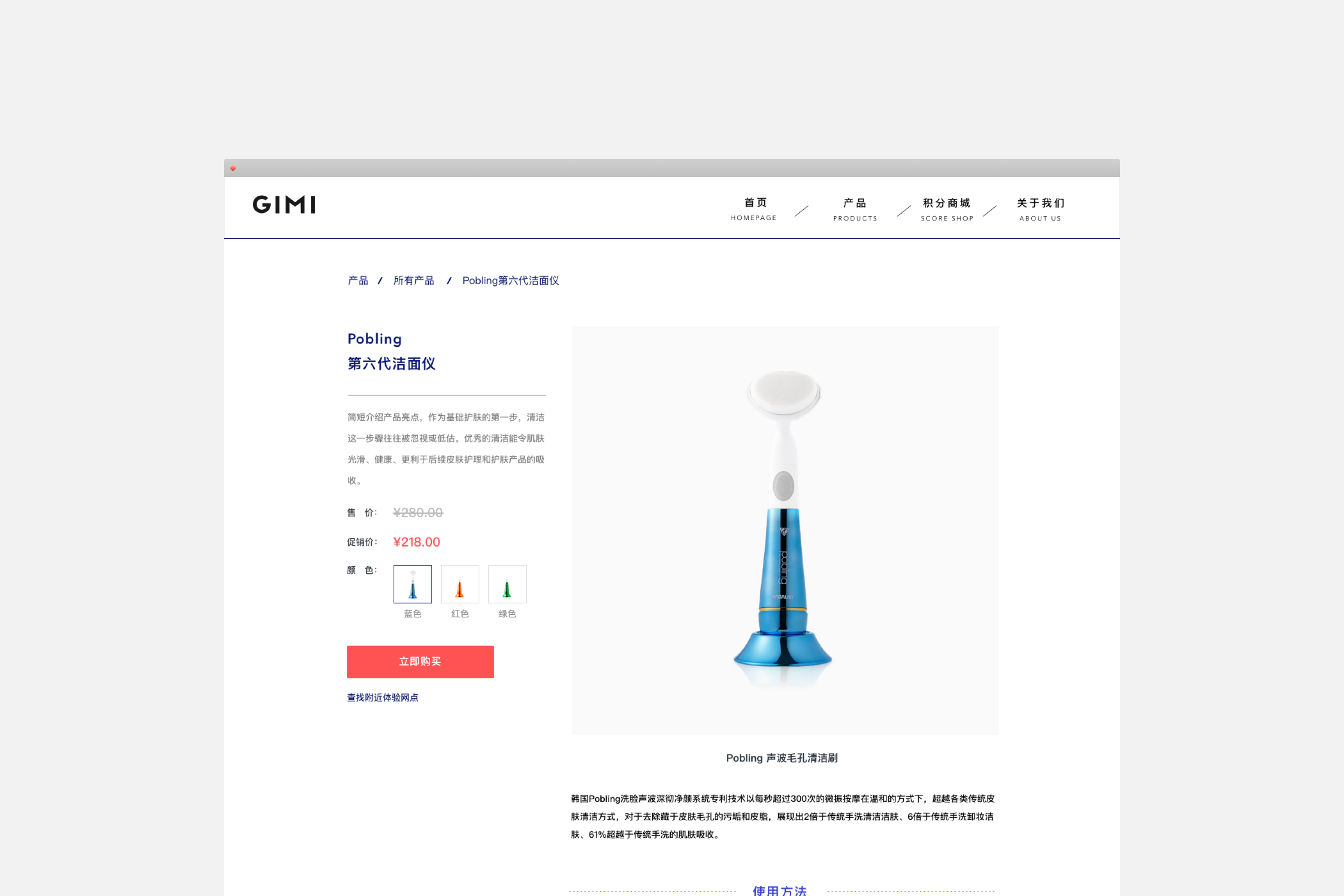 --- 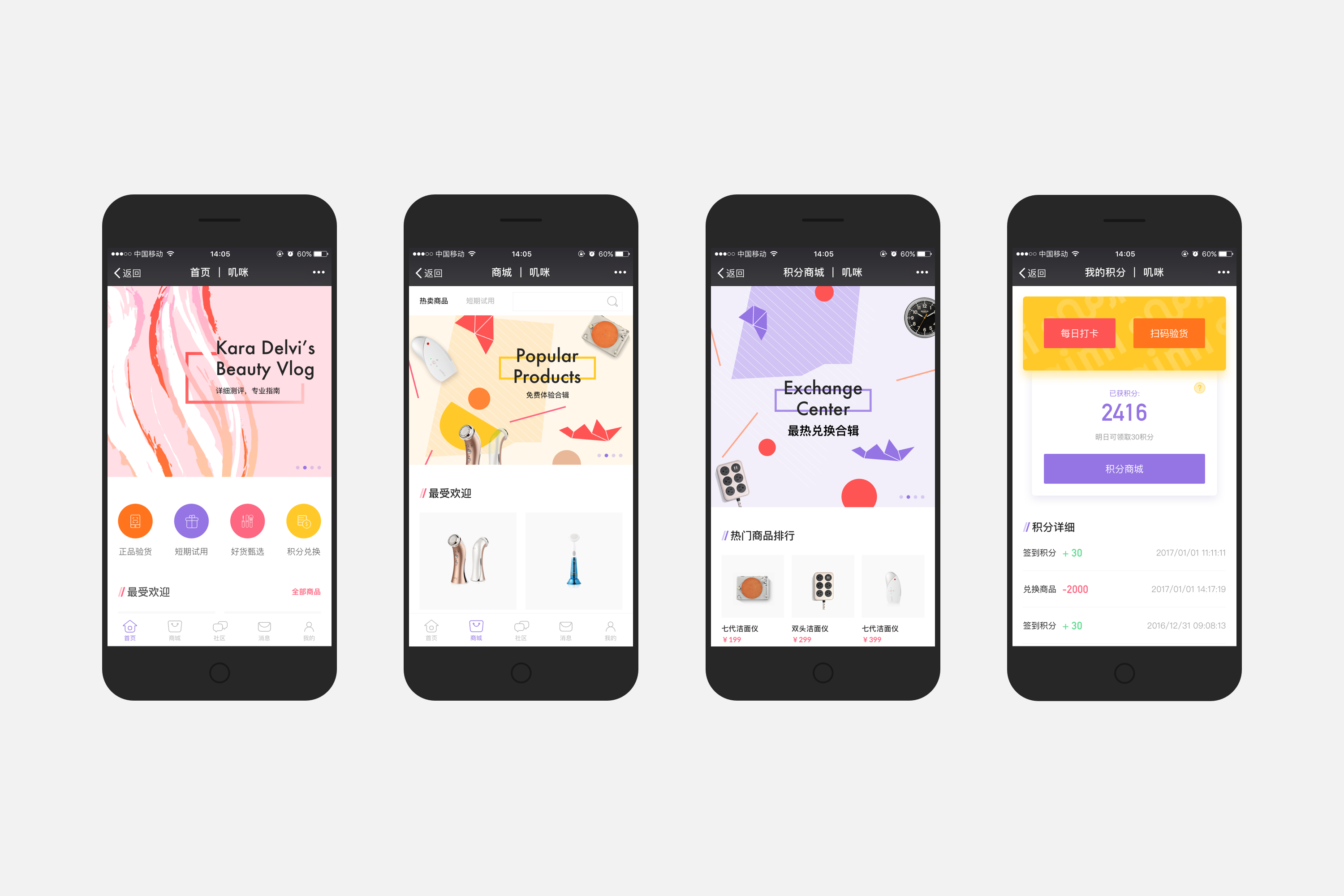 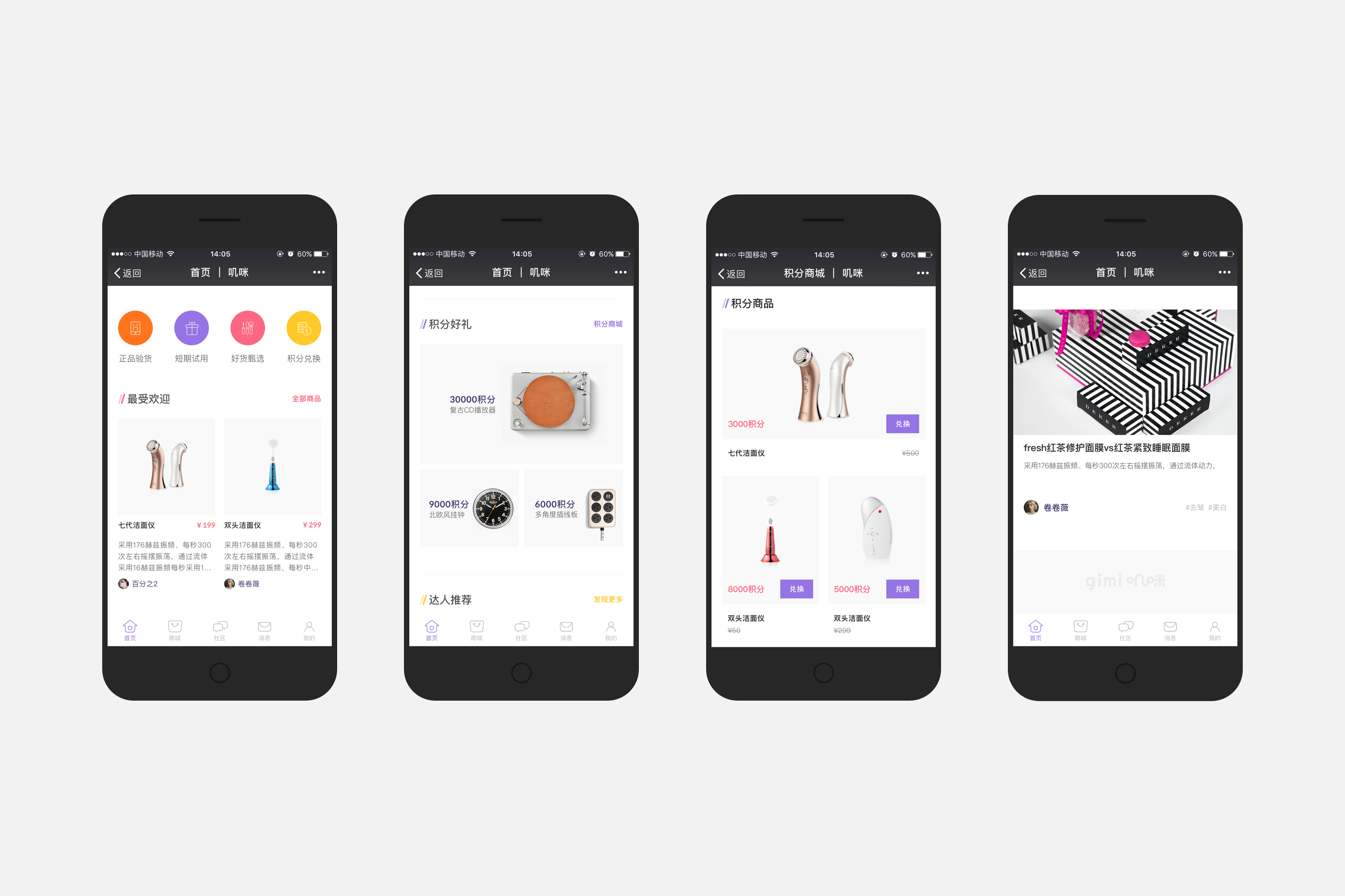 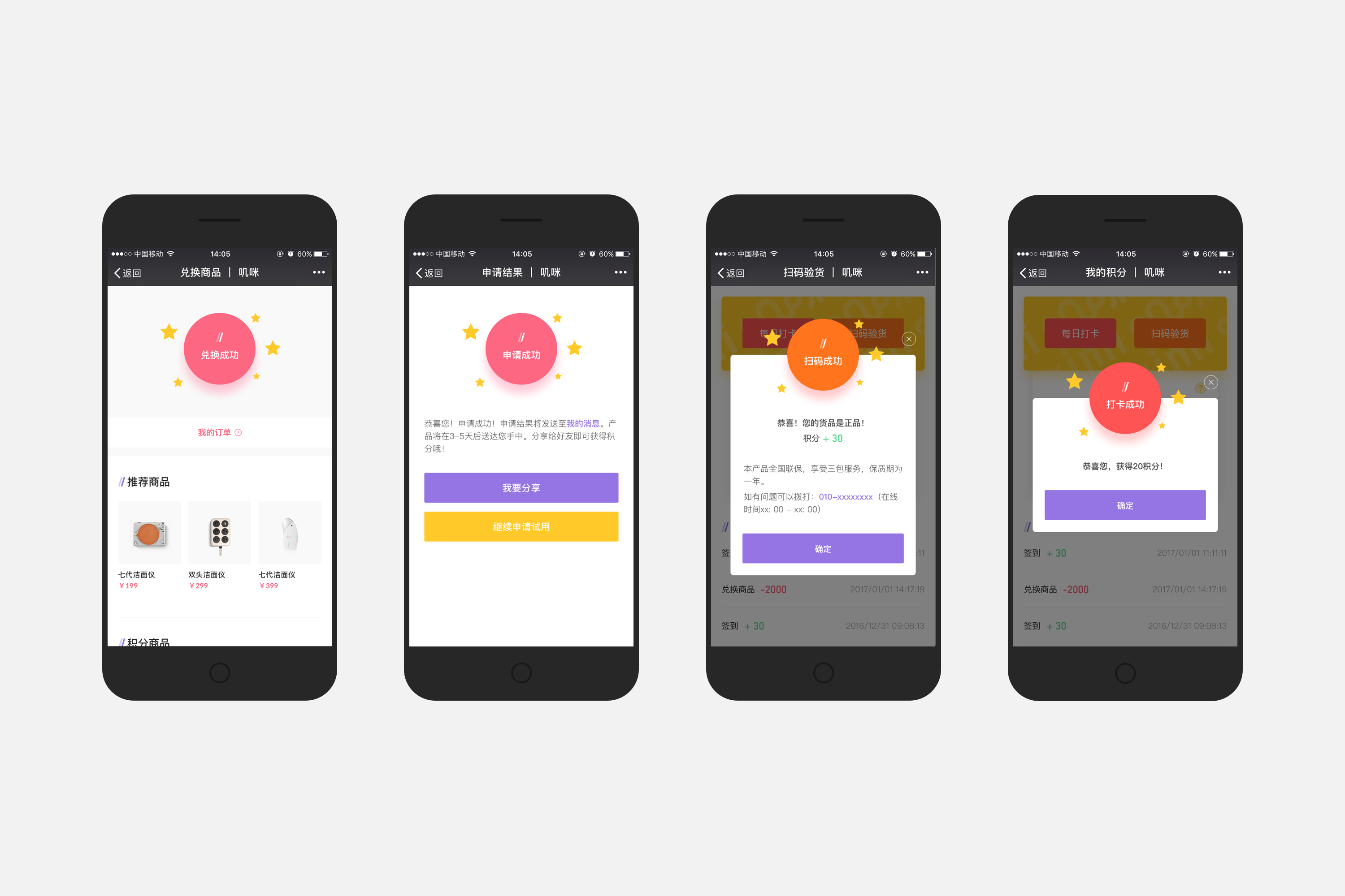 第二套UI的风格更偏向清新,自然,没那么pop。配色选的是饱和度较高的橙、粉和紫色,穿插点缀较暖的黄色。 ## English Content ### Introduction GIMI is a social platform of beauty and skin-care. We tried to help them build a young and bold social media brand. The whole project includes Wechat official platform, website and logo design, as well as backstage managing system. [Video](https://static.glabcms.stoyard.com/object/20180601/h1qda1rwkdw.mp4) Gimi is given priority to with # WeChat public platform, on WeChat drainage, therefore pays attention to the interaction on mobile.It is social platform positioning, social is given priority to, complementary products, so we will emphasize social function, complete design reviews, thumb up, exceptional, the function of DMS.We with gimi seminar for many times, finally determined the UX process, after the two sets of UI is designed. ---  home page is divided into four modules: recommended articles, the hottest commodity, selected evaluation and integral gifts.We distinguish between different modules, with four colors in 2.5 D made a series of primary visual illustration way.  Goods can be divided into hot commodities and integral in two kinds of goods, in the classification of the mall.Community is the selected test paper as the carrier of communication platform, users can under article reviews, exceptional, reply comments, also can review article published by themselves.   Web side is mainly responsible for product display and drainage, so on the function point setting, as well as WeChat end.Home page structure similar, respectively is advertising figure display new products recommended area, integral gifts area and evaluation area.    ---    The second set of UI style more pure and fresh, natural, not so pop.Color choice is high saturation of orange, pink and purple, with the ornament is warm yellow.