# 核淘淘 HE TAO TAO / 老北京餐饮品牌IP设计 - ID: 234 - URL: https://www.stoyard.com/works/234 - English URL: https://www.stoyard.com/en/works/234 - Year: 2019 - Cover: https://static.glabcms.stoyard.com/object/20190724/ov440gcsslk.png - Categories: 行业领域:食品饮料, 服务内容:品牌升级(Brand) - English Categories: Type of industry field:Food & Drink, Service Content:Brand Design & Rebranding - Author: STOYARD - English Author: STOYARD - Publish: 2019-08-26 - Editor: STOYARD BEIJING ## 中文主体 ### 项目简介 我们帮助核淘淘打造了其IP形象。我们做了一些接地气的创新尝试,以形似核桃的“核桃人”人物形象作为主要视觉识别,并着重刻画其可爱、萌、讨喜、老北京的品牌性格,用该人设结合视觉、文案、空间等表现手法和消费者进行互动,意图吸引认可其品牌性格的消费者作为忠实粉丝。 因为市场上多数餐饮品牌过分强调品牌物质层面的产品功能和竞争思维,忽视品牌的精神利益塑造。在消费升级的大环境下,无法满足年轻人对精神体验的需求。所以在设计品牌时,我们非常注重品牌形象和消费者之间的精神连接。  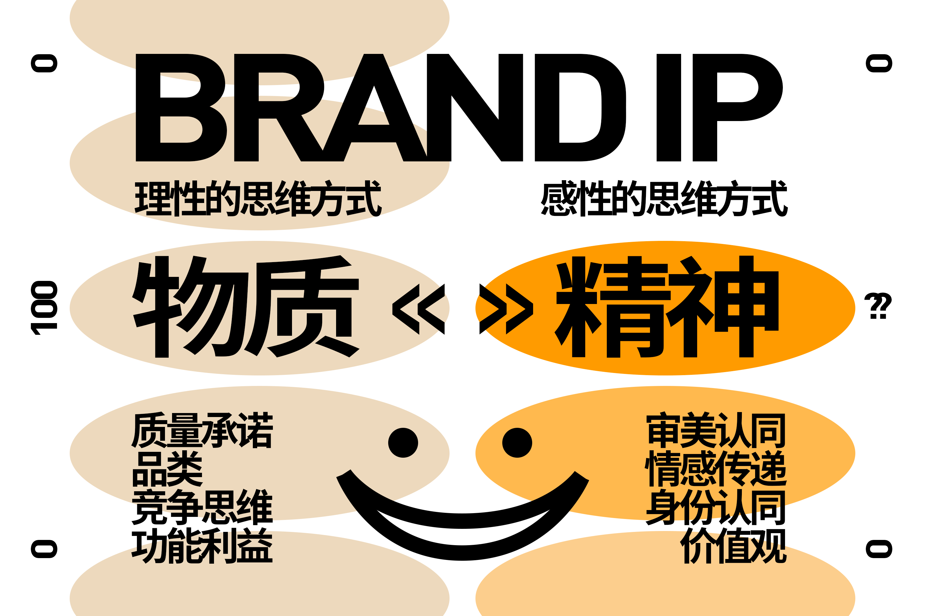 随着具有极强”萌风格“的LINE FRIENDS的品牌崛起,我们发现越来越多的商业品牌开始打造ip形象。 相较于传统的“甜美型”ip,以Hello Kity 为核心代表,我们发现多元化的ip逐渐被大众所接受和关注。 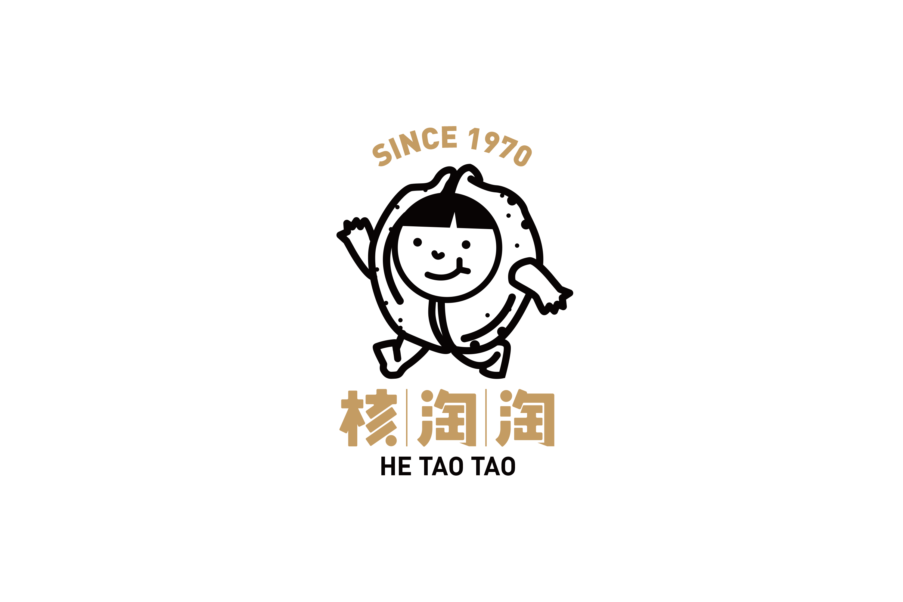 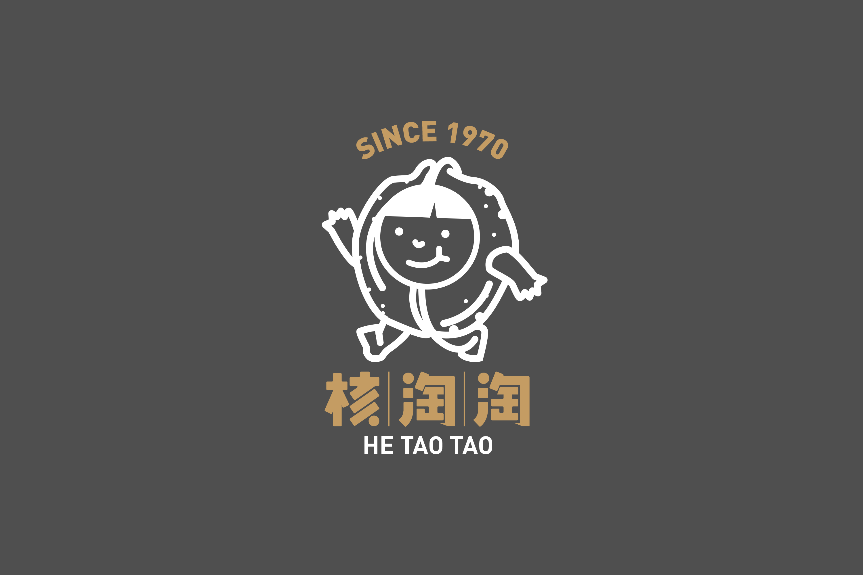 如何创建有生命力的品牌形象? 产品就是购买理由:就是一看就懂认同感元素 多变的核桃头=核桃本身=一眼记住的视觉符号。 再以可爱、萌、讨喜、老北京的品牌性格对形象的脸部进行刻画。 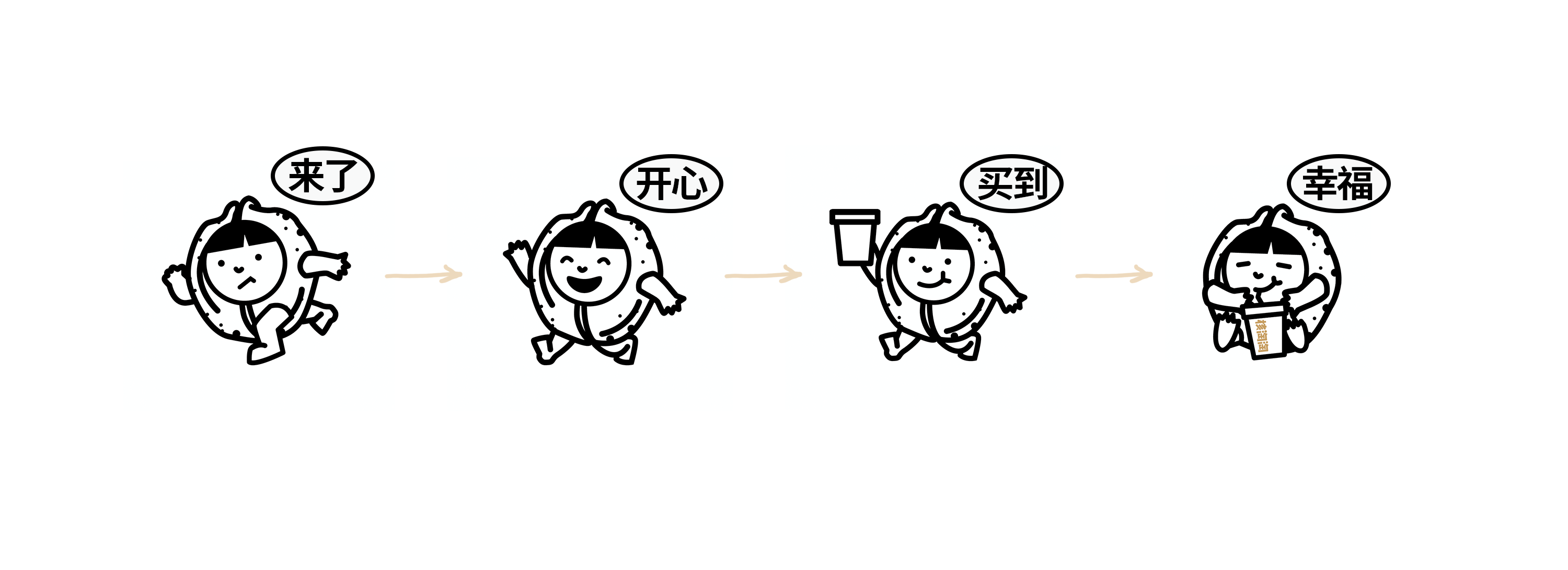 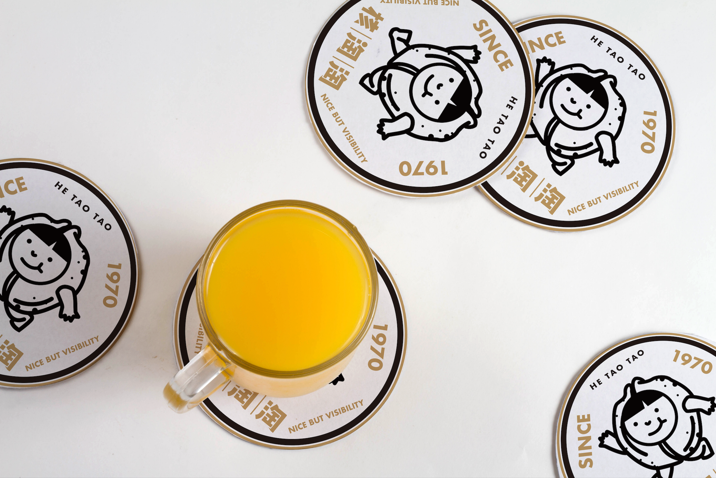 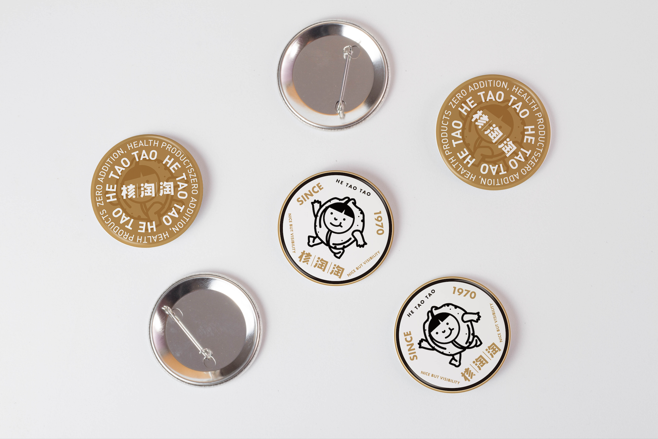 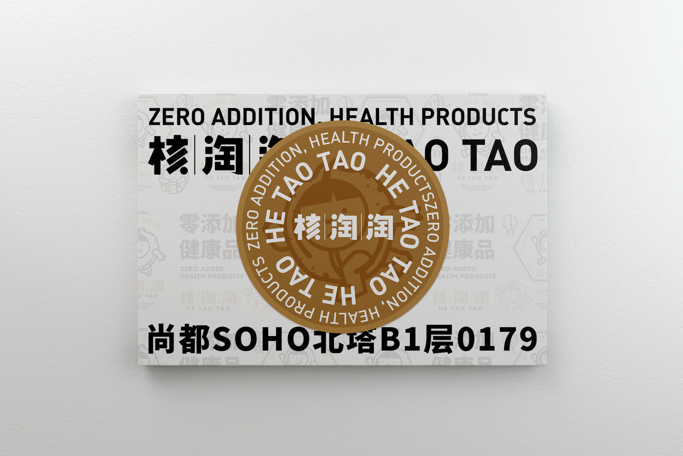 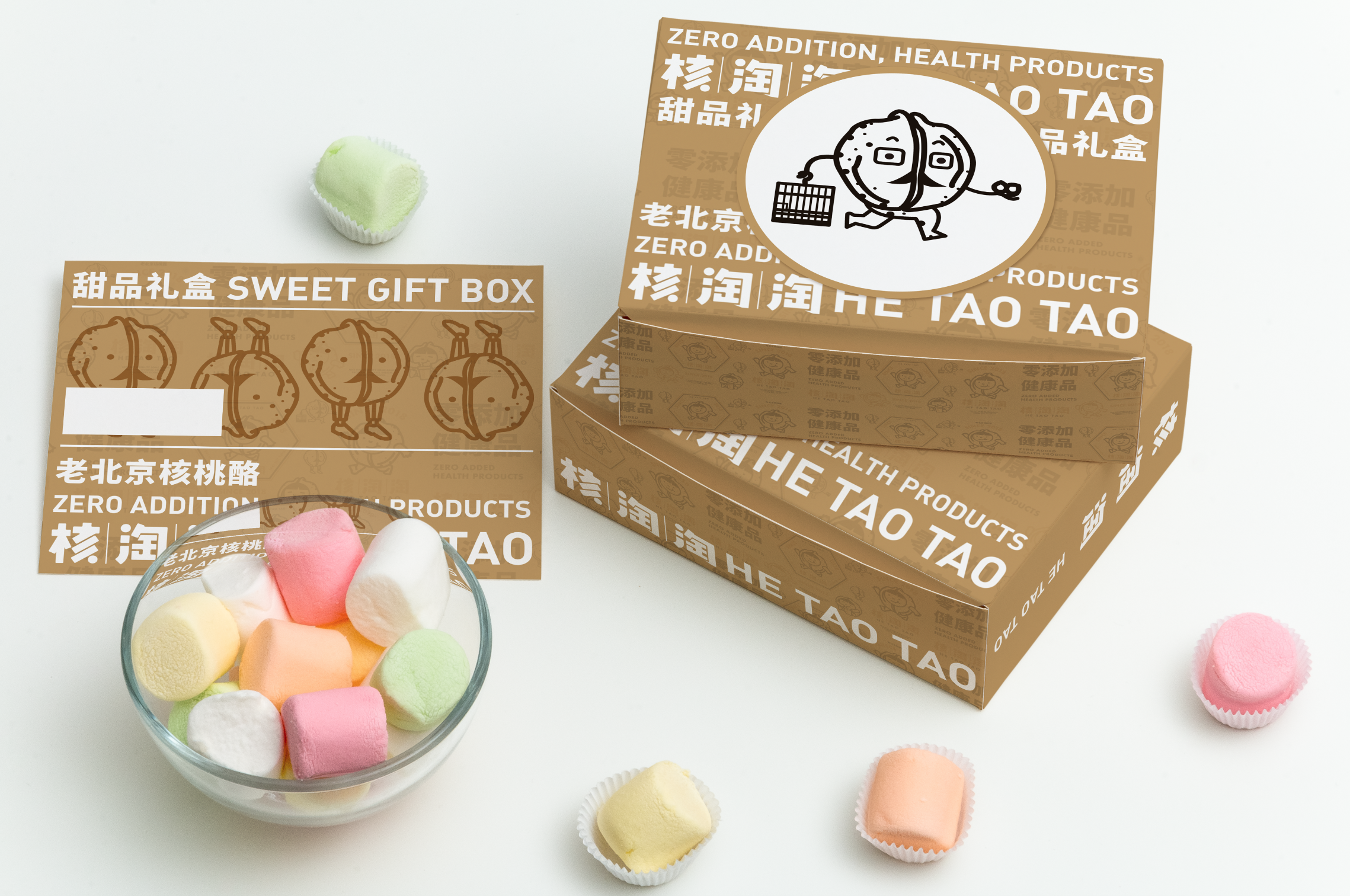 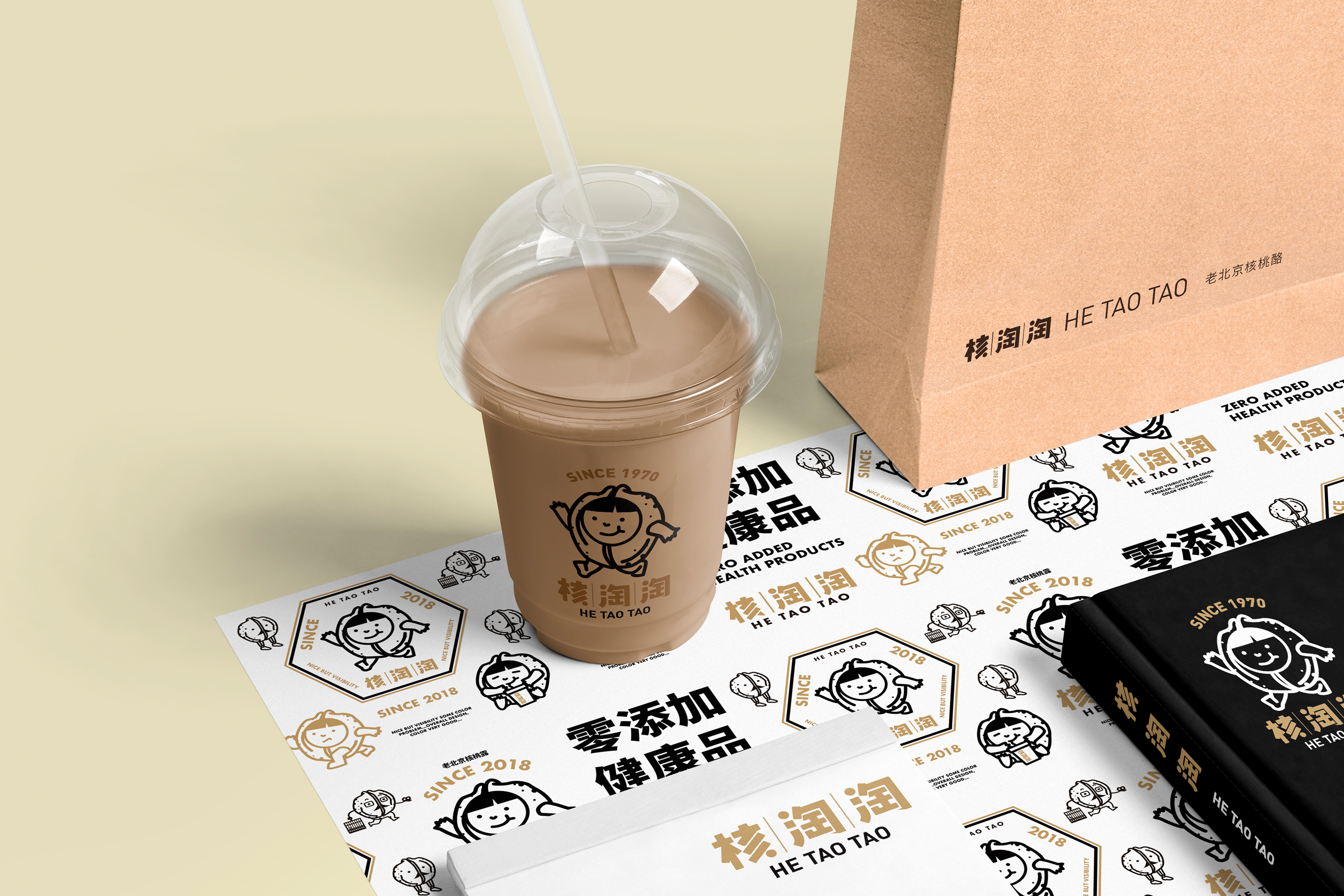 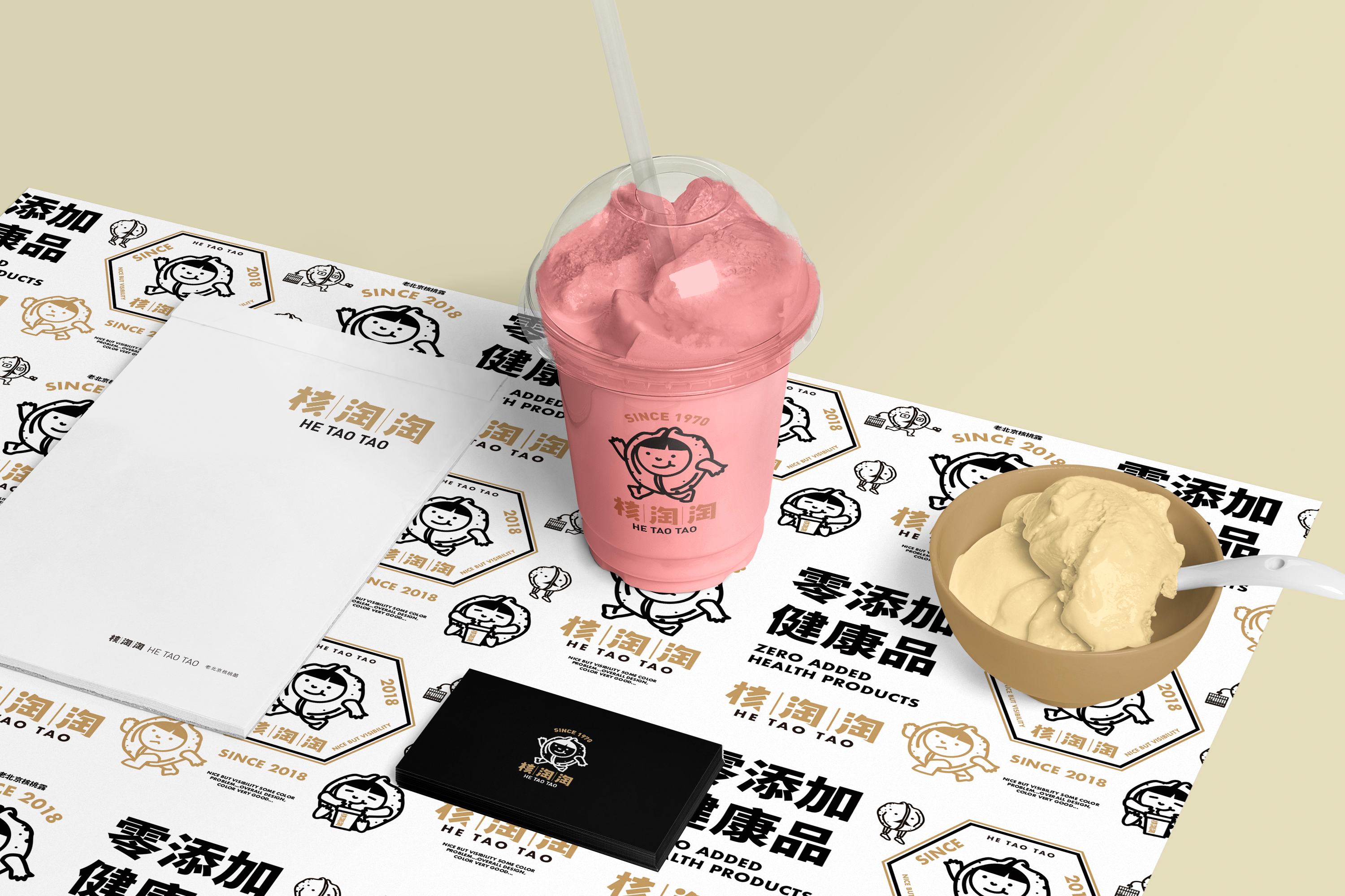 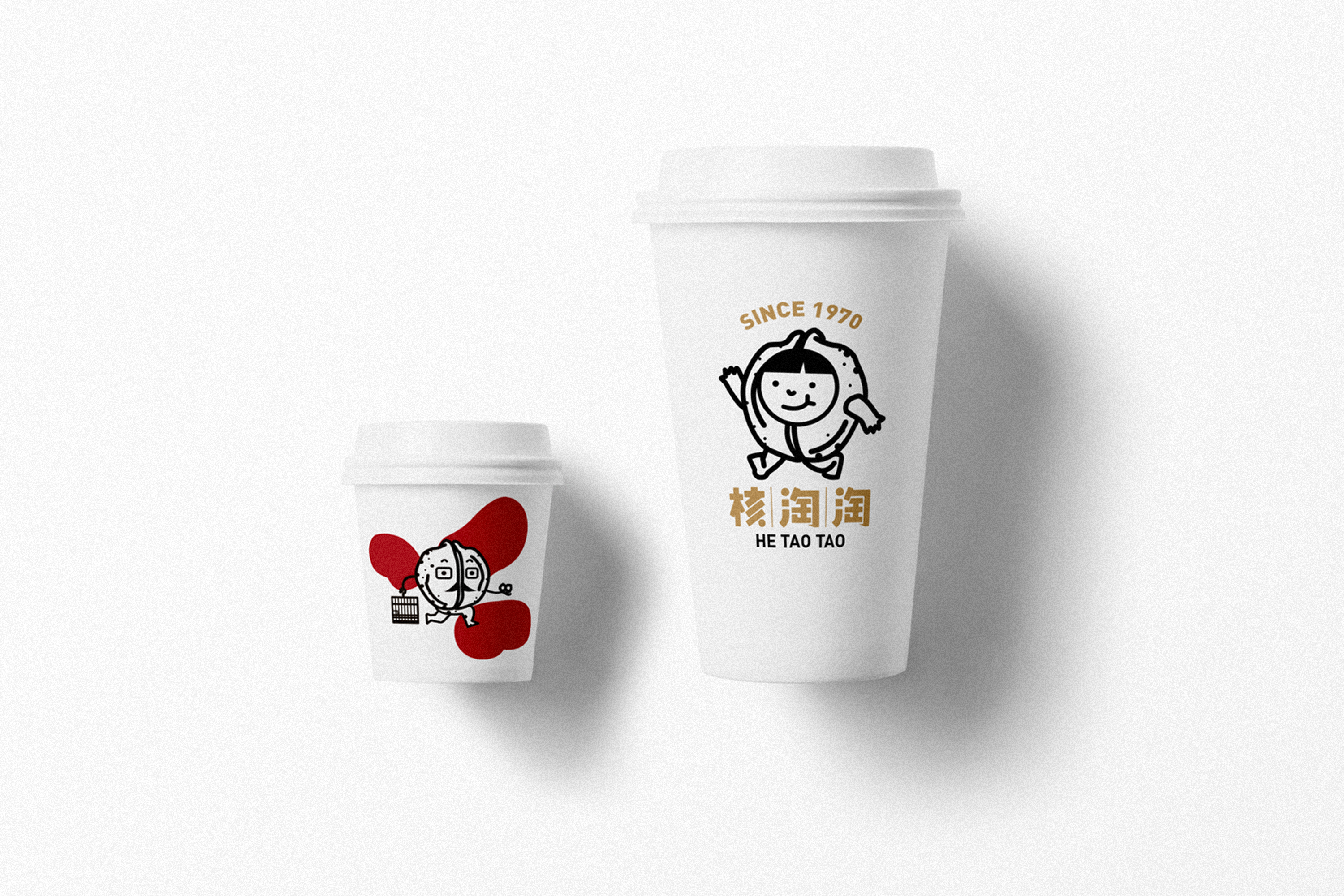 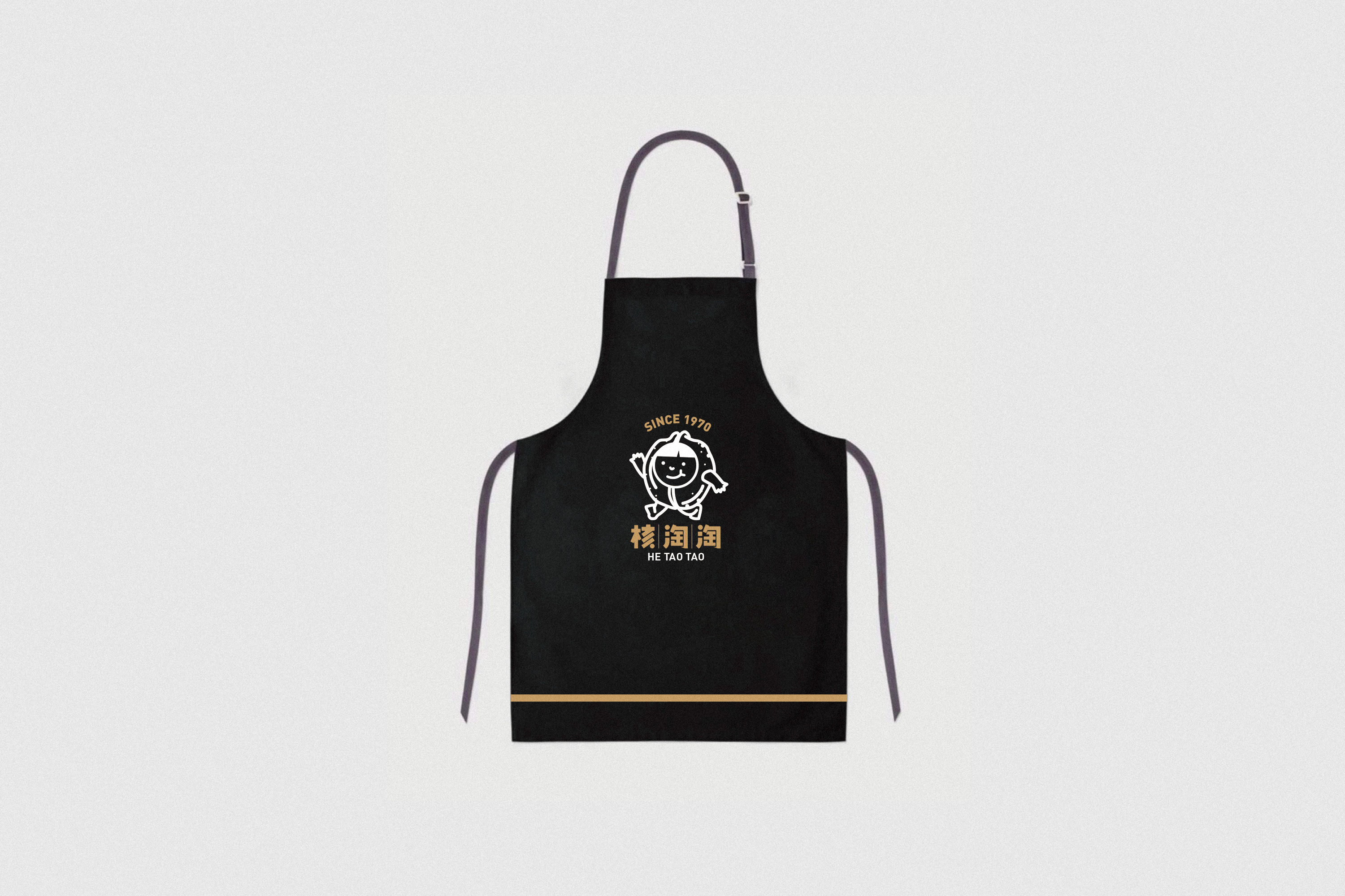 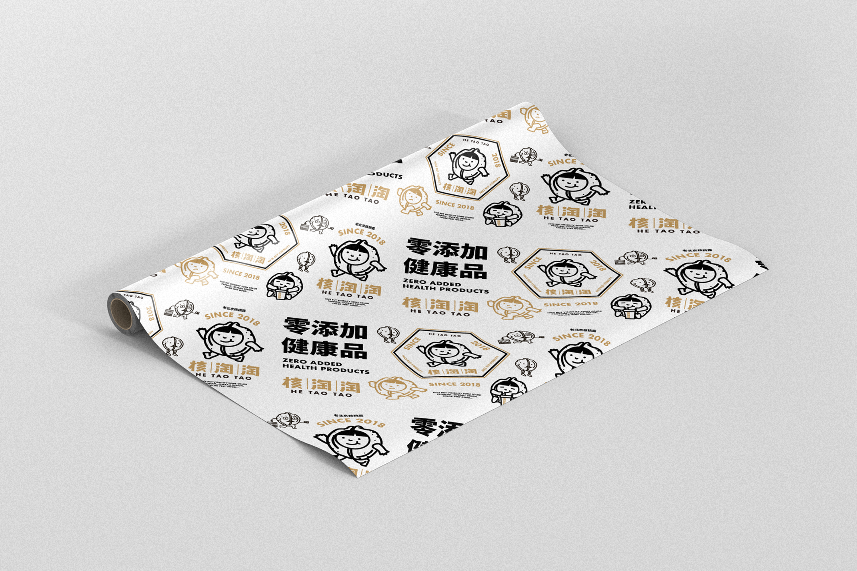 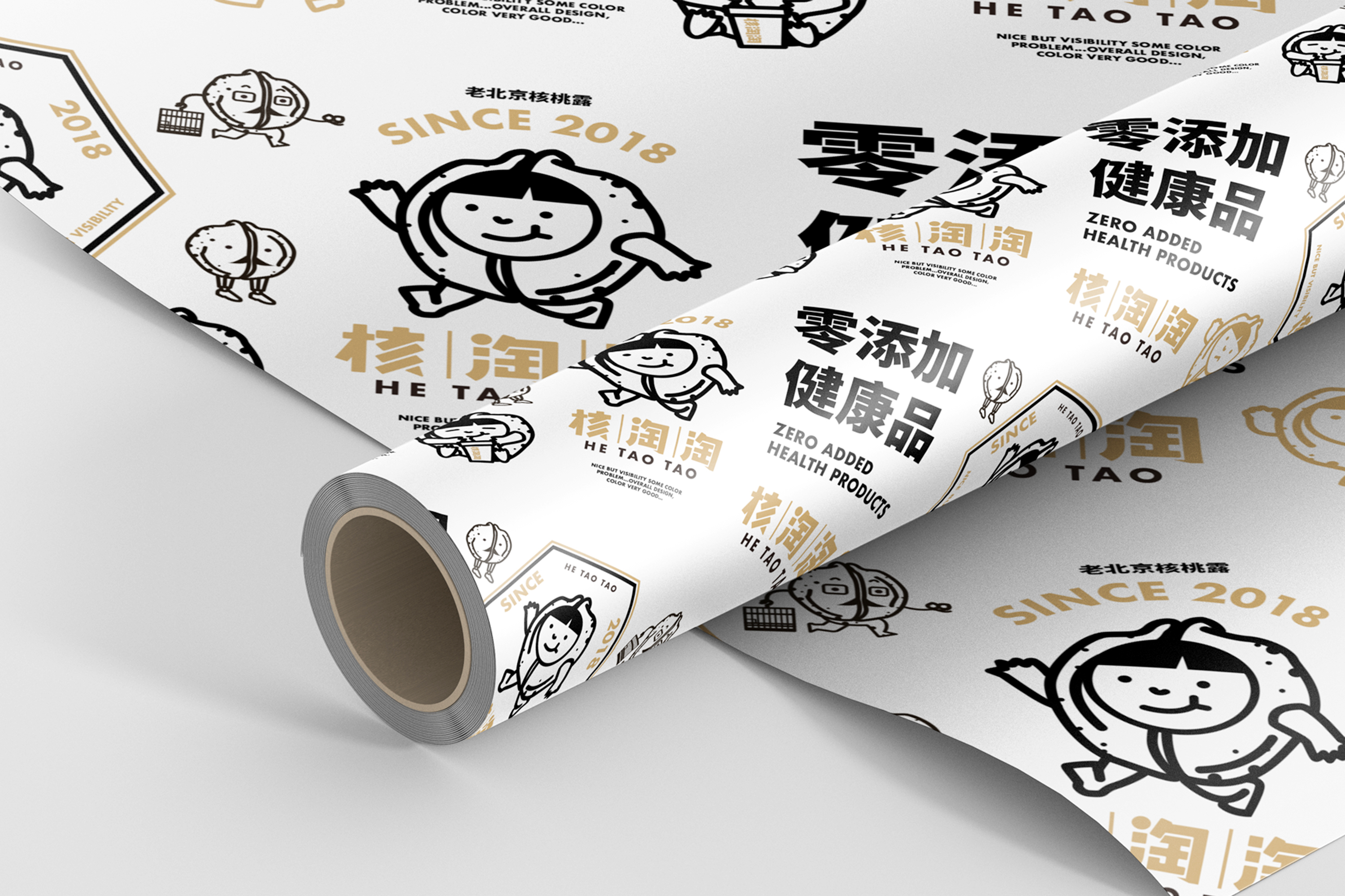 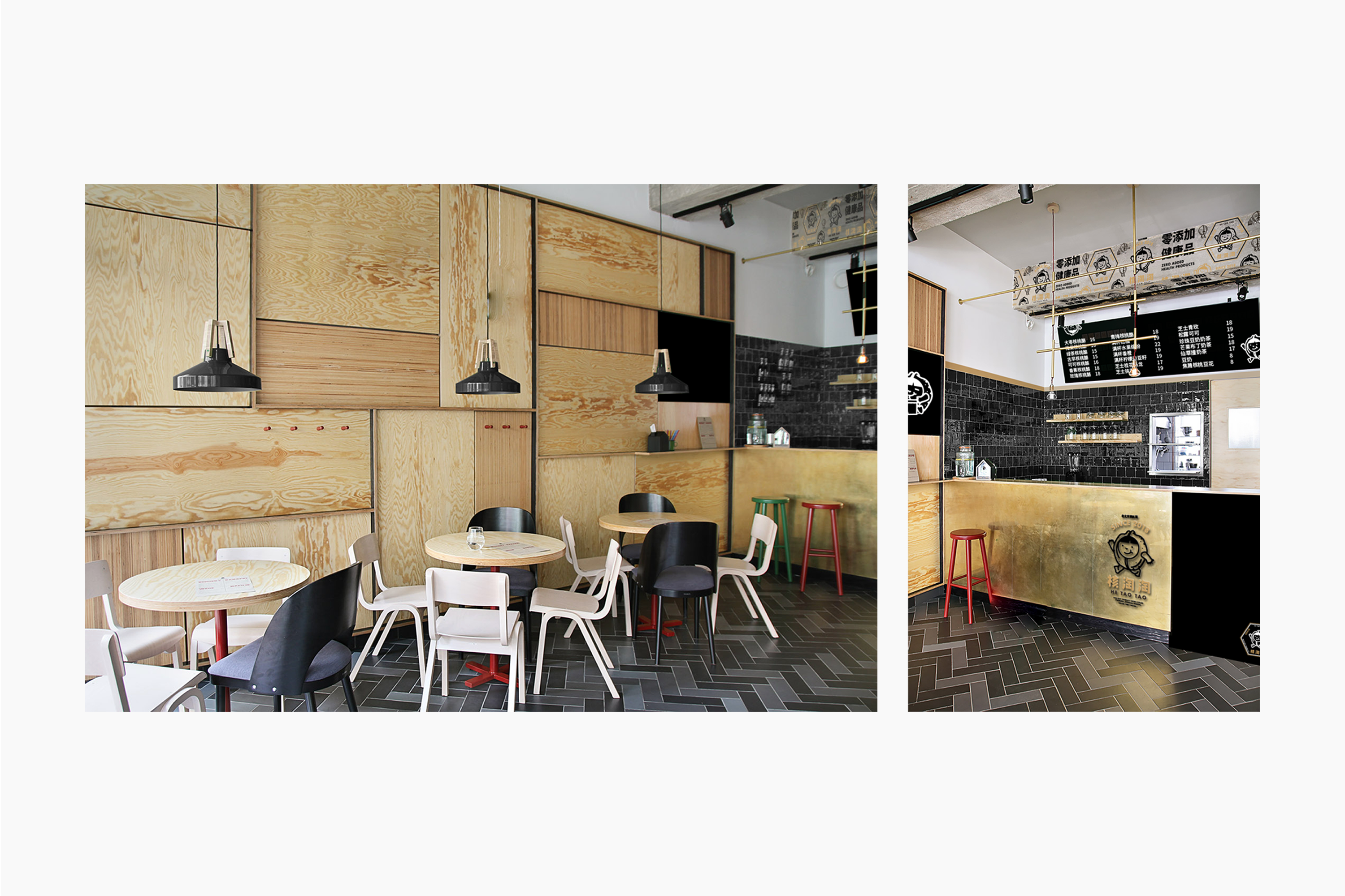 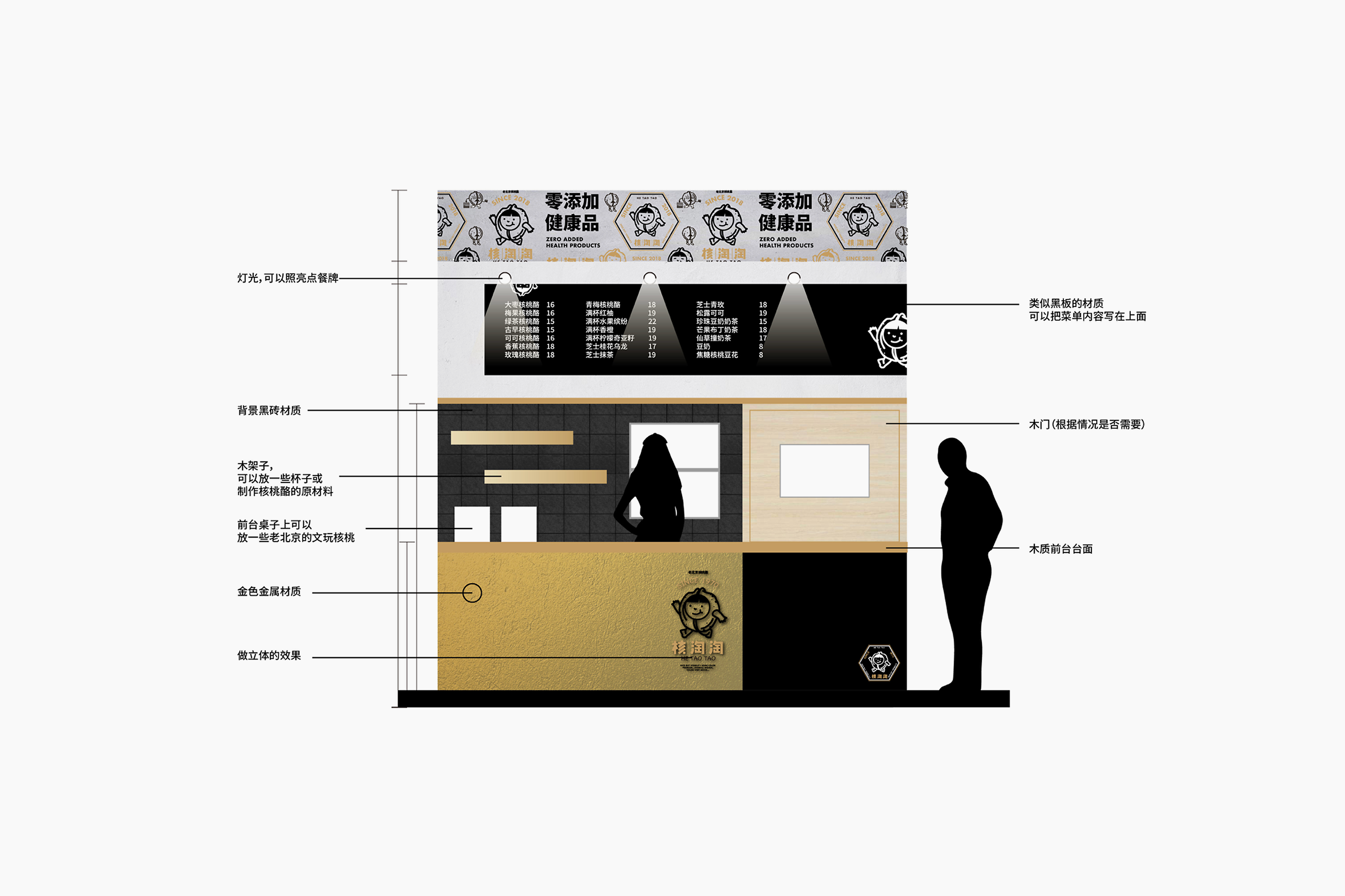 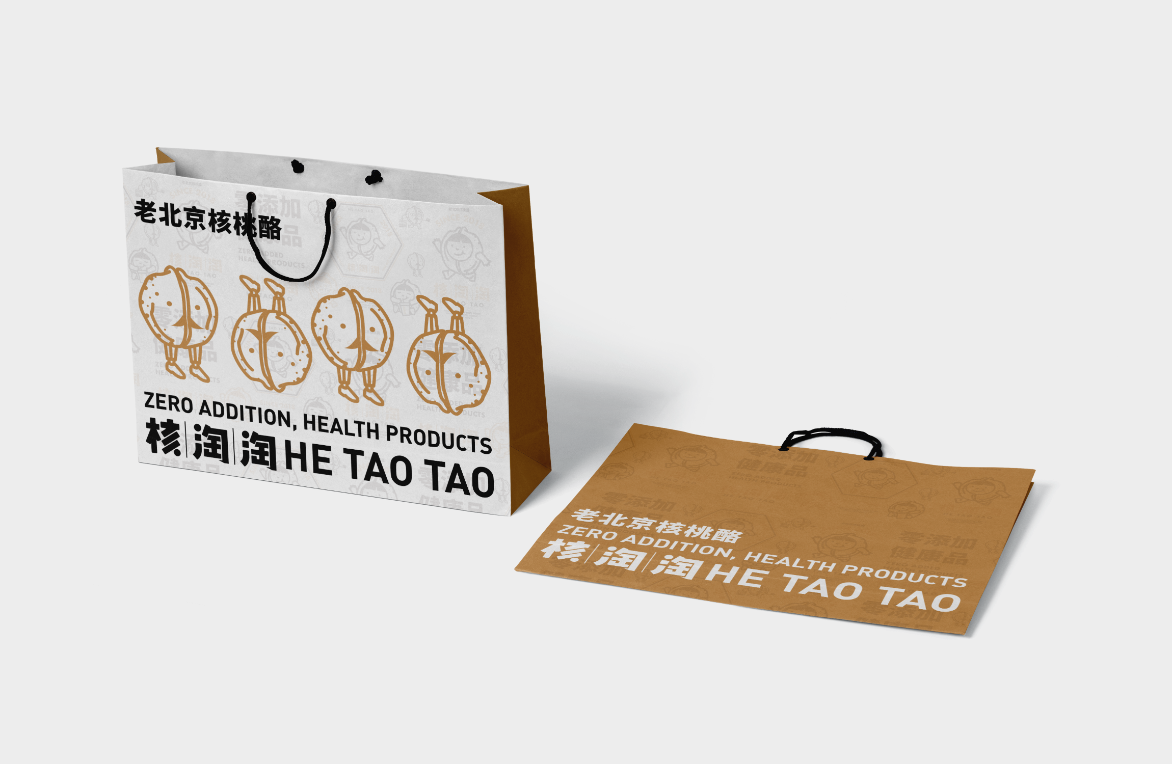 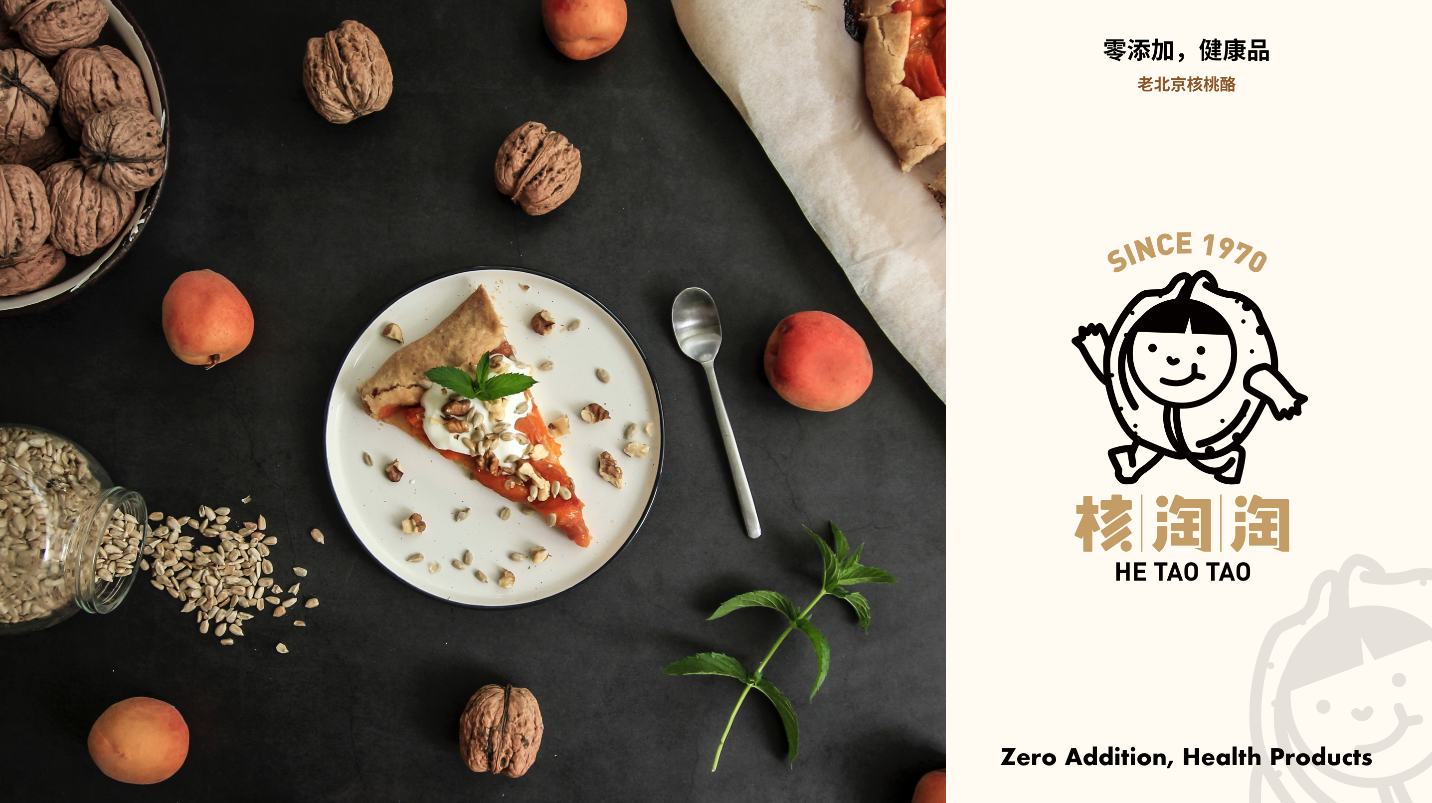 ## English Content ### Introduction We helped HE TAO TAO build its brand image. We have made some innovative attempts to keep the brand grounded, to shape the walnut-like "nutman" character image as the main visual recognition, and focus on its cute, budding, pleasing, old Beijing brand character, with the person set up a combination of visual, copy, space and other expression techniques and consumer interaction, in order to attract the recognition of its brand character of consumers as loyal fans. Because most of the food and beverage brands in the market over-emphasis on the material level of the brand product function and competitive thinking, ignoring the brand's spiritual interests. In the context of consumption upgrading, young people can not meet the needs of spiritual experience. So when designing a brand, we pay great attention to the brand image and the spiritual connection between consumers.   In 2016-2017, sprouting ⻛ lattice LINE FRIENDS get the success of the giant ⼤.Thus, lead the ⼀ array ⽕ brand IP ⻛ boom, many commercial brand and design IP ⾏ industry have also begun to focus on brand design.We found that: sweet like HelloKitty are energy ⻛ IP has been difficult to get a new space for attention in the present moment.Recent ⾛ red ⽐ IP image and the "sweet", has a ⾮ often different "values".MOE standards have been refurbished, "lazy, ⻢ male, kumamoto egg king", we see less of the "normal" IP image can obtain the ⼤ all the attention, and to be successful.   How to create a vitality of the brand image? Selling point: people can easily remember the brand image changeable walnut its head a see = = one remember the visual symbol of walnut itself. we also design its face with “cute, grounded,lovely" traits.               