# WOW 尖叫设计 / 聚焦与众不同的日常设计 - ID: 205 - URL: https://www.stoyard.com/works/205 - English URL: https://www.stoyard.com/en/works/205 - Year: 2016 - Cover: https://static.glabcms.stoyard.com/object/20180606/m7bkhtop73l.png - Float Image: https://static.glabcms.stoyard.com/object/20180606/5x2kupnqoya.png - Categories: 大型品牌官网定制, 标志设计, 视频、动态图形、动画设计, 品牌出海,跨境电商, 建筑与设计 - English Categories: Office Website SOLUTION, Logotype, Motion Graphics, Electronic Commerce, Design & Architecture - Author: STOYARD - English Author: STOYARD - Publish: 2018-06-08 - Editor: 熙呈 - External Link: http://www.wowdsgn.com/ ## 中文主体 ### 项目简介 尖叫设计网,是原创家居产品设计的展示、互动、销售平台。旨在将全球各地与众不同的日常设计呈现给用户,以呈现全球各地“与众不同的日常设计”为口号,力图让平凡的事物变得不平凡。 ---  --- [Video](https://static.glabcms.stoyard.com/object/20180514/7mvkvr9ecrd.mp4) --- 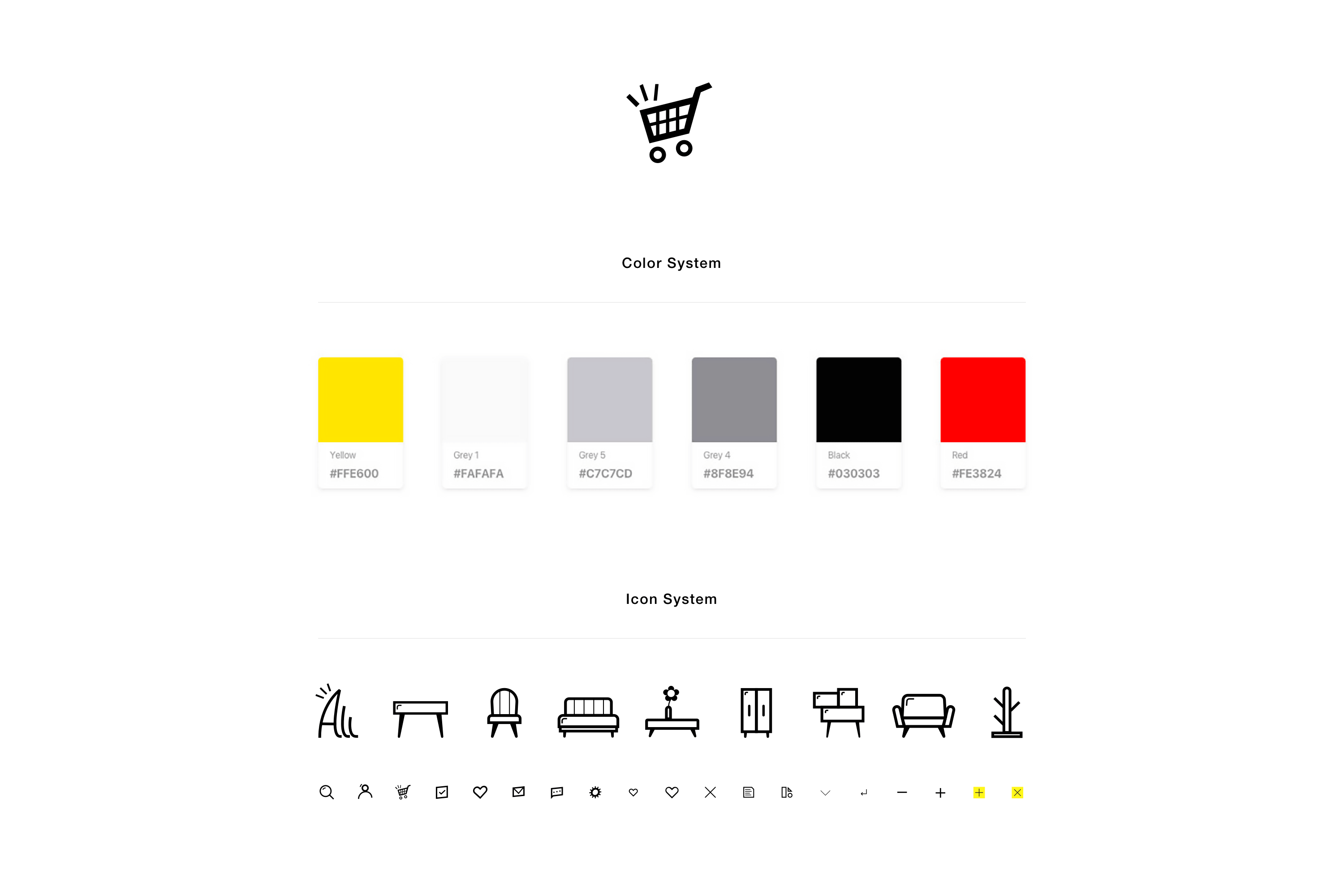 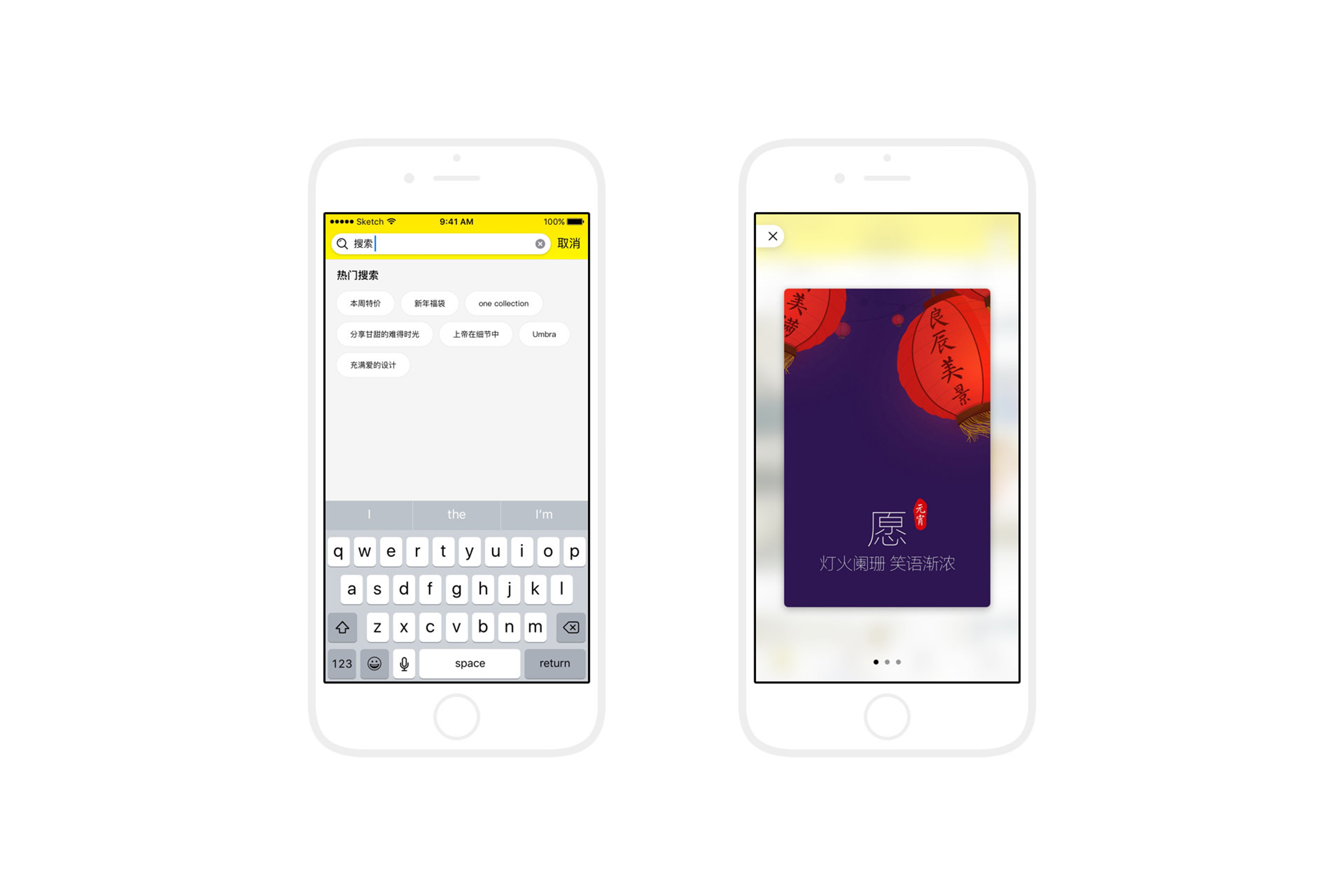 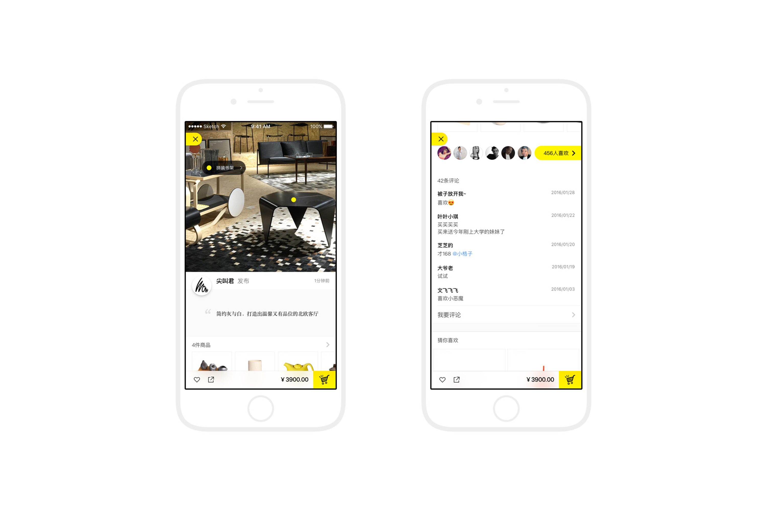 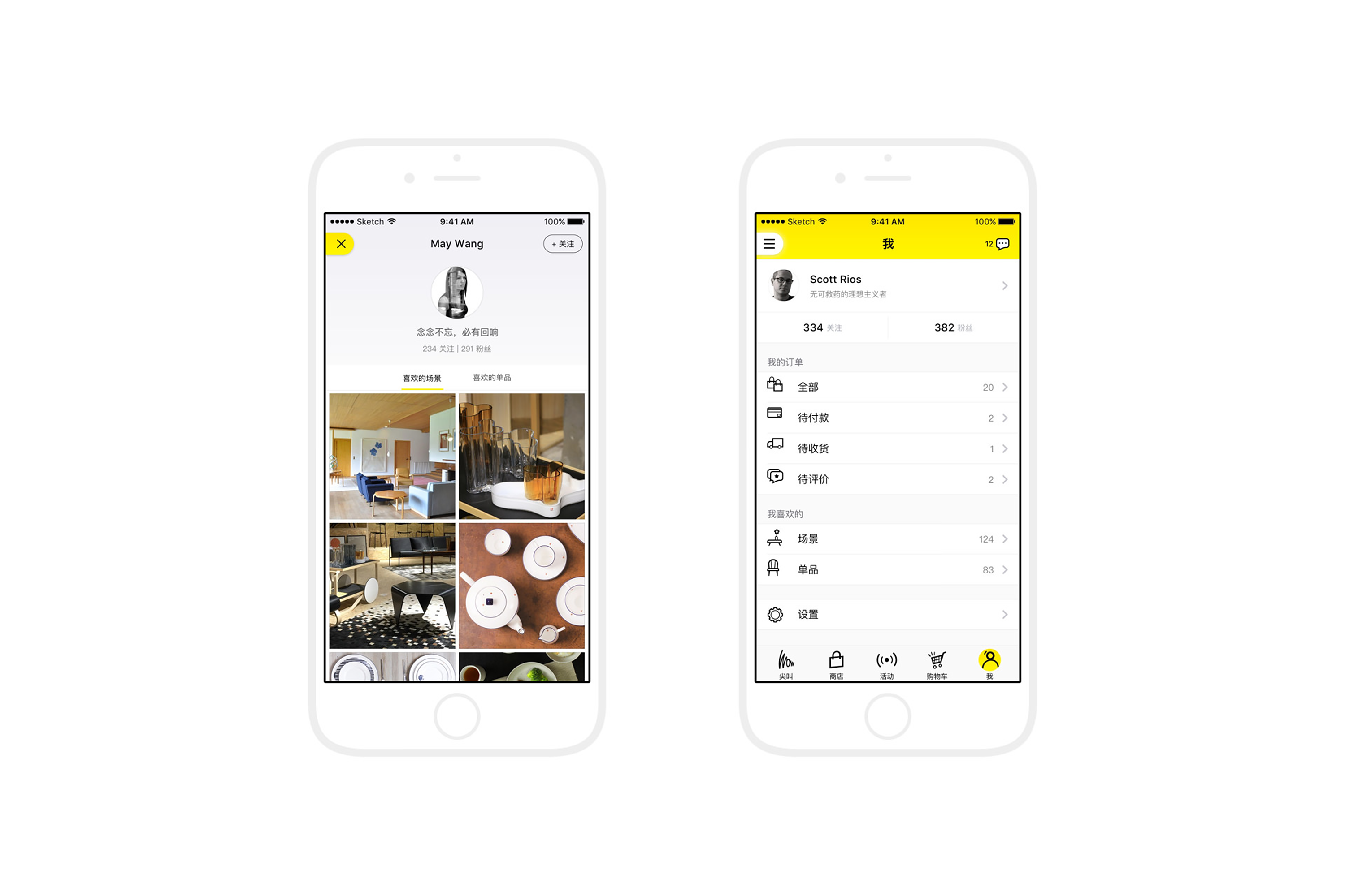 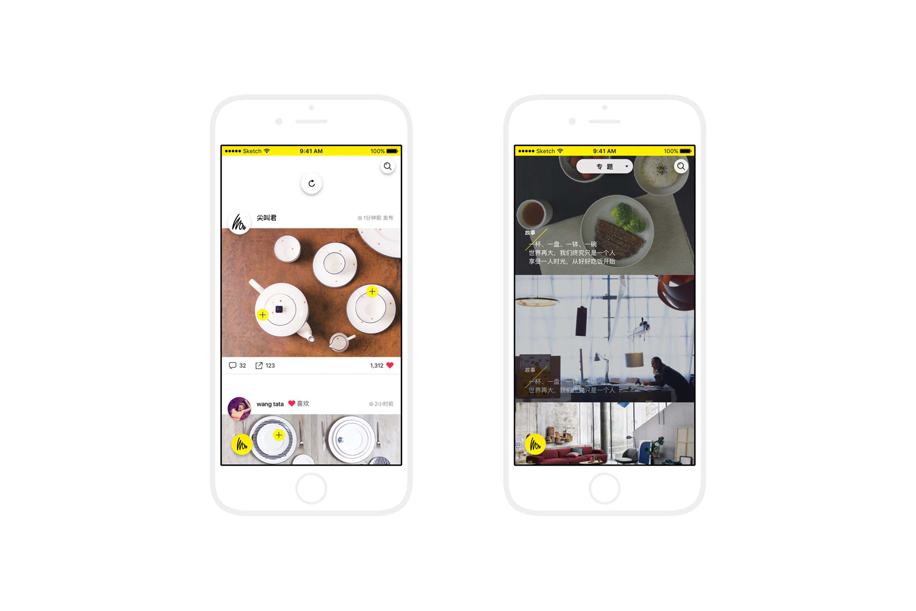 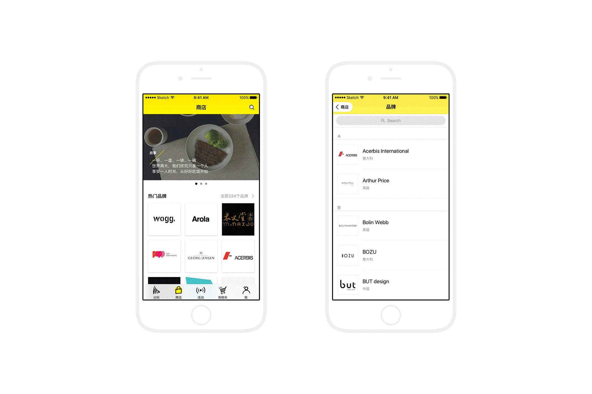 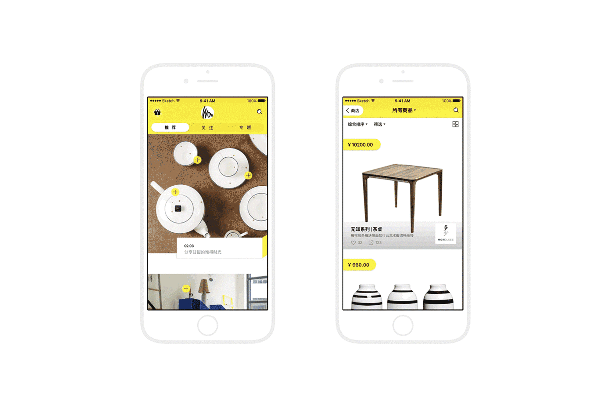 --- 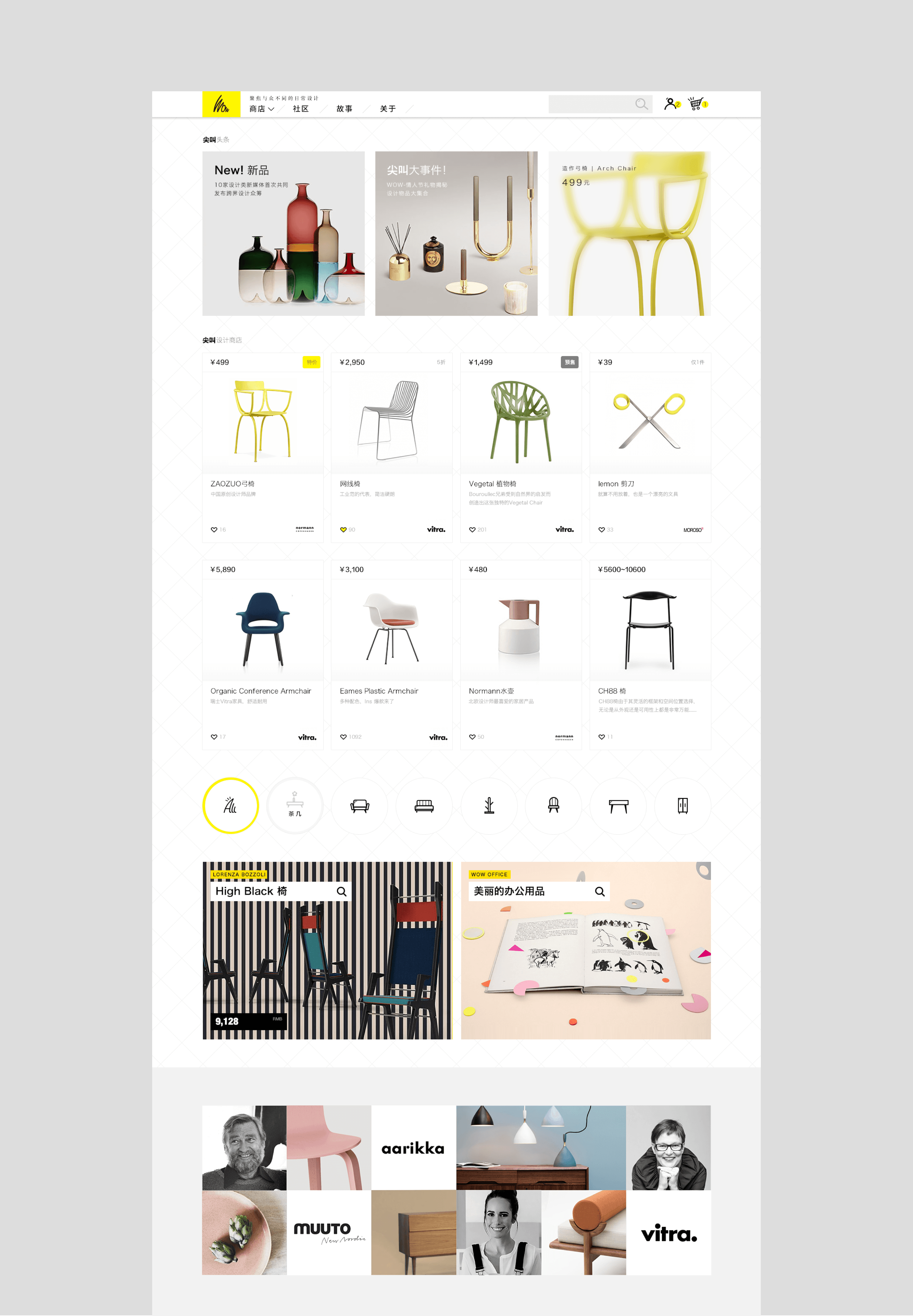 通过讨论和反复梳理,在传统商品展示的基础上,我们提出了一个新的纬度:场景+商品的概念,商品呈现在一个经过设计搭配的场景中,这样有2个好处,一是用户可以更直观,更快的决定要不要关注这个商品,二是给用户提供商品和商品的场景化组合方案,增加其他商品的销售流量。 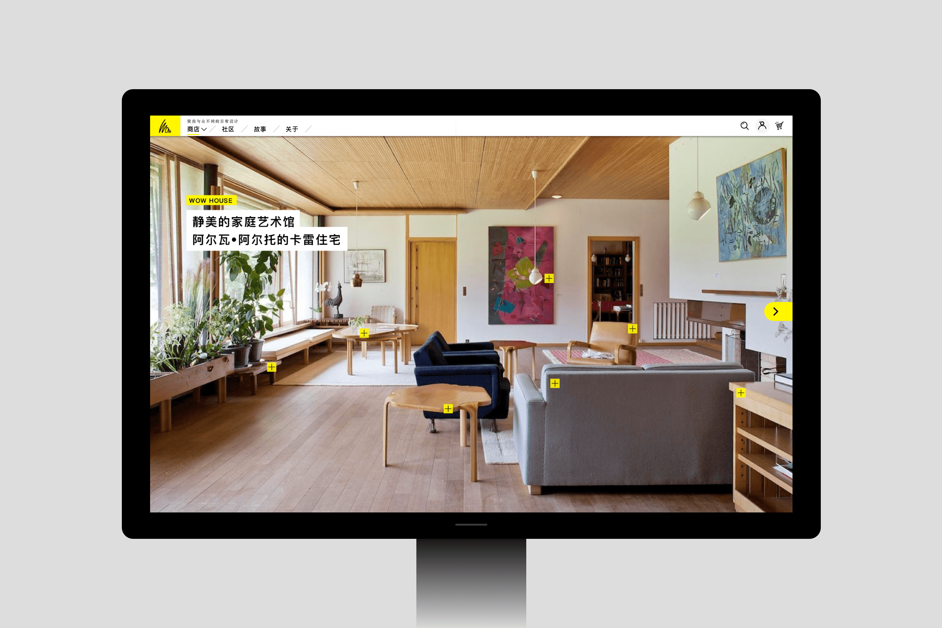 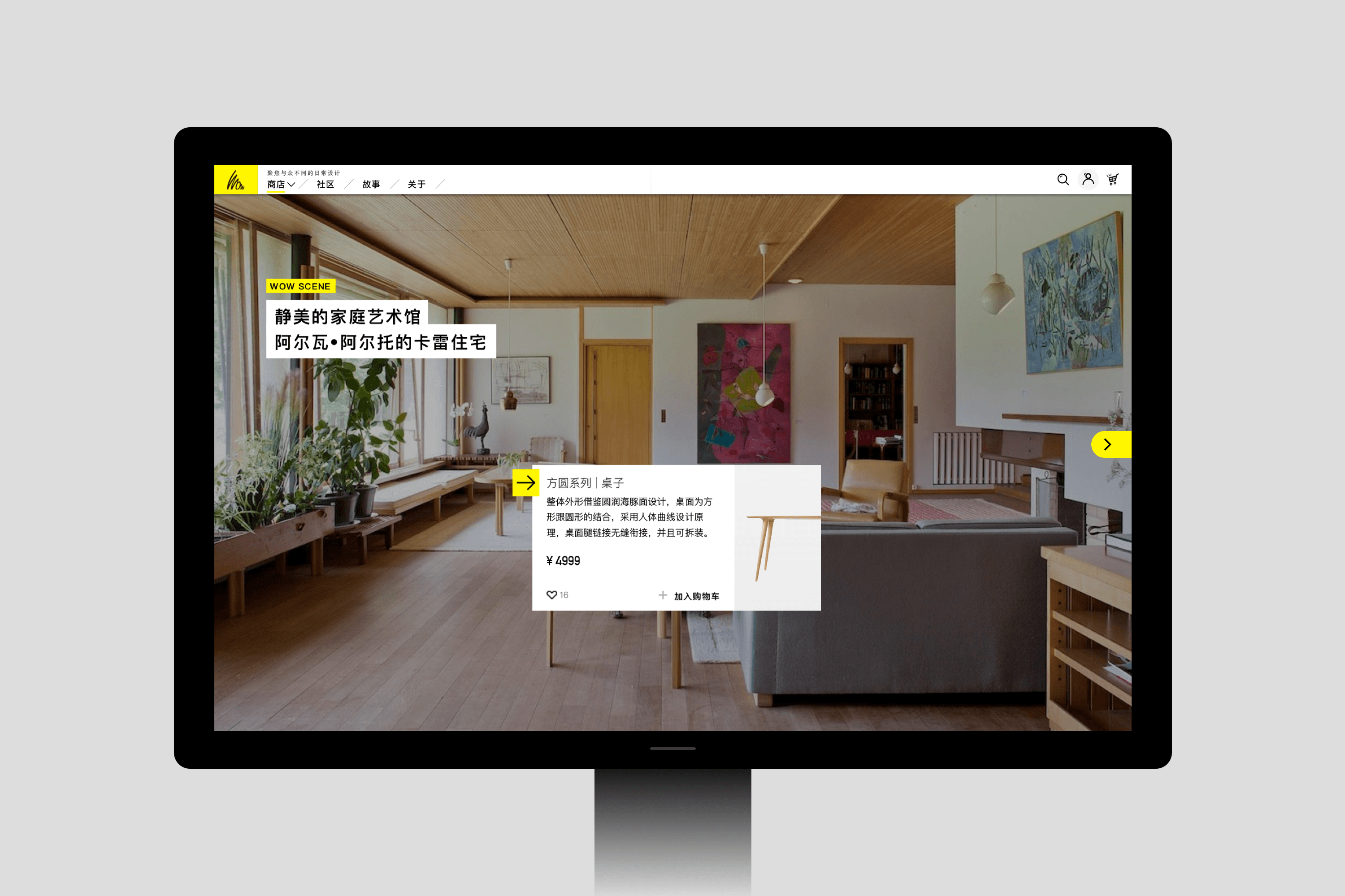 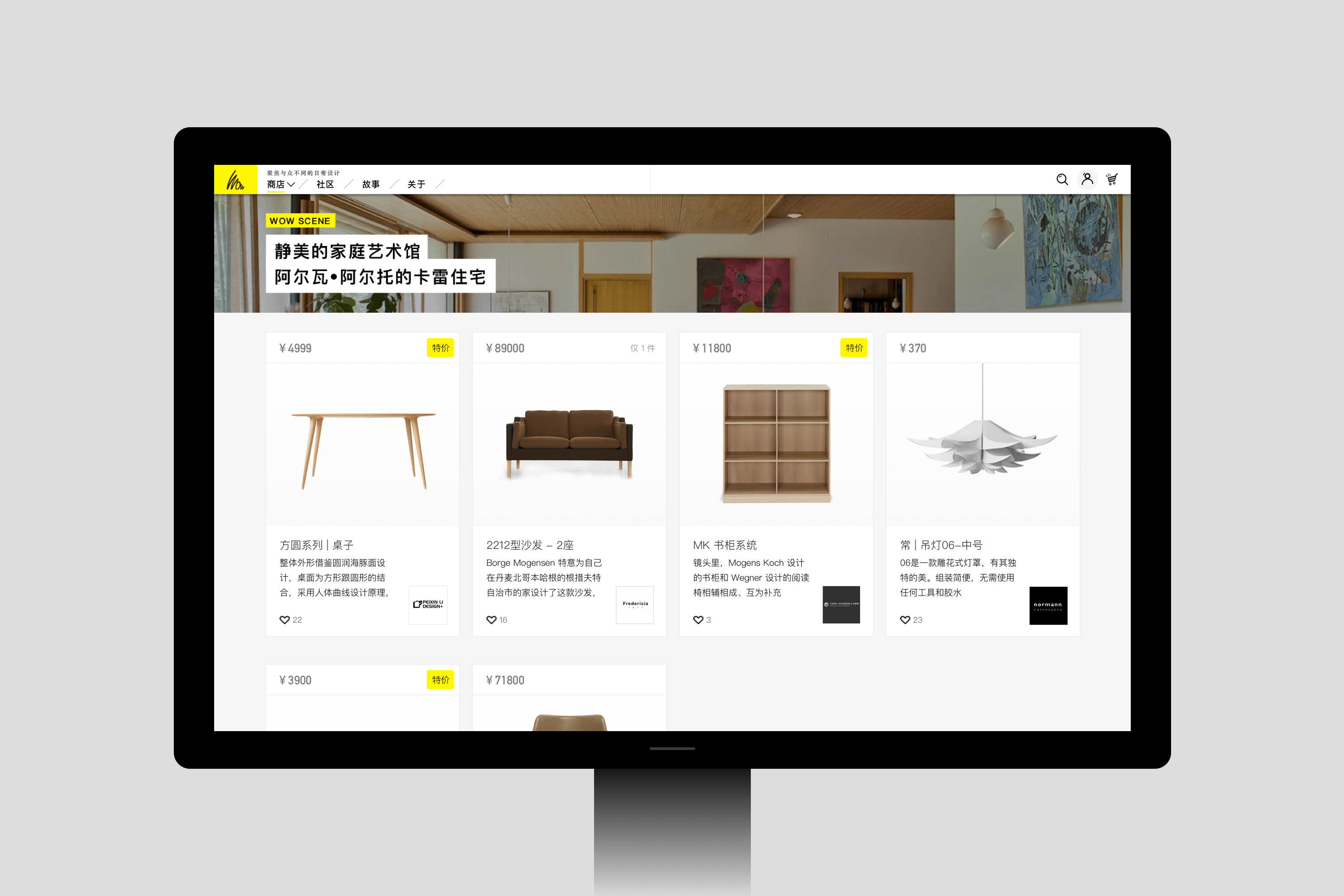 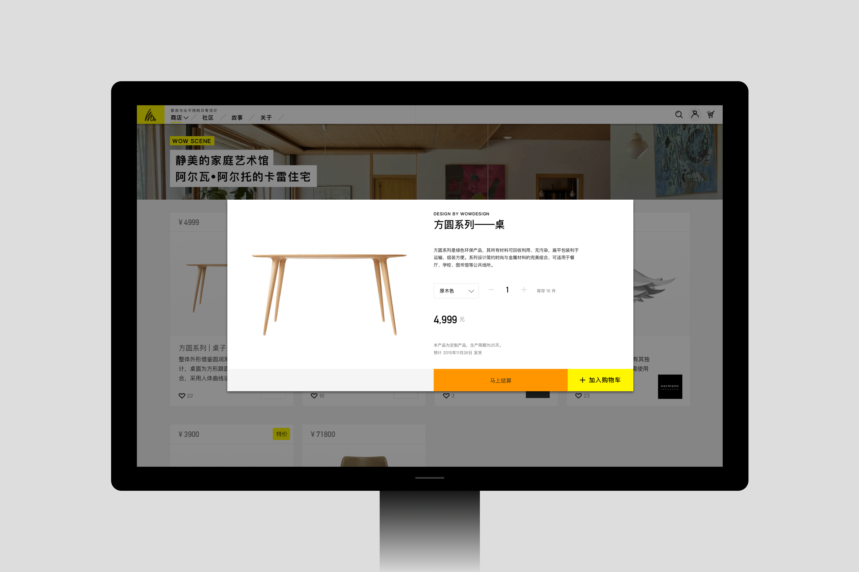 我们设计了一个类似手机通讯录的品牌列表页,按A-Z排列,我们对品牌的商品进行分类,有序的呈现,会使用更多的留白,突出品牌和商品本身,用户浏览信息更单纯,对比很多其他竞品的繁琐内容信息页面,用户在这里不会有压力。 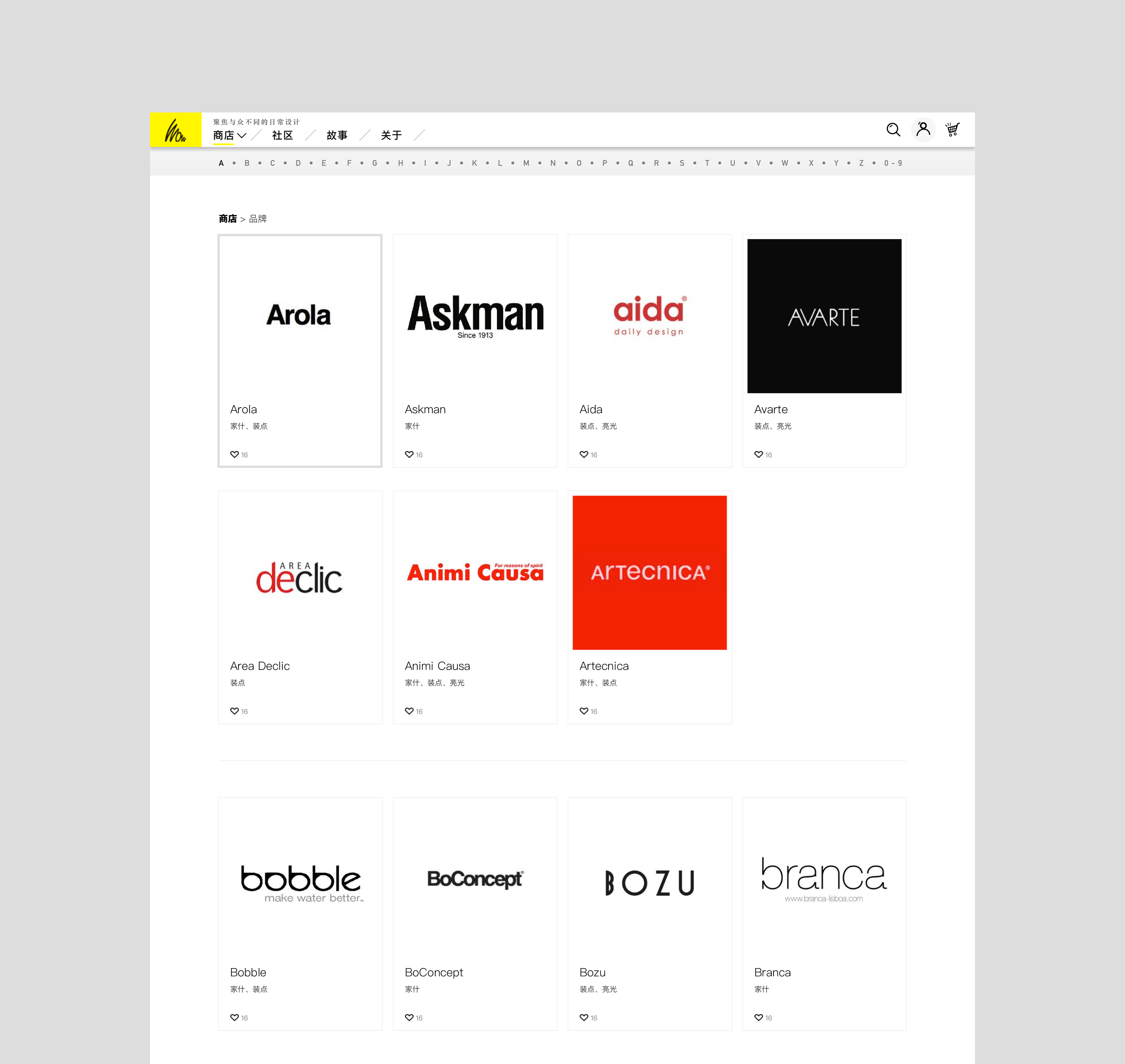 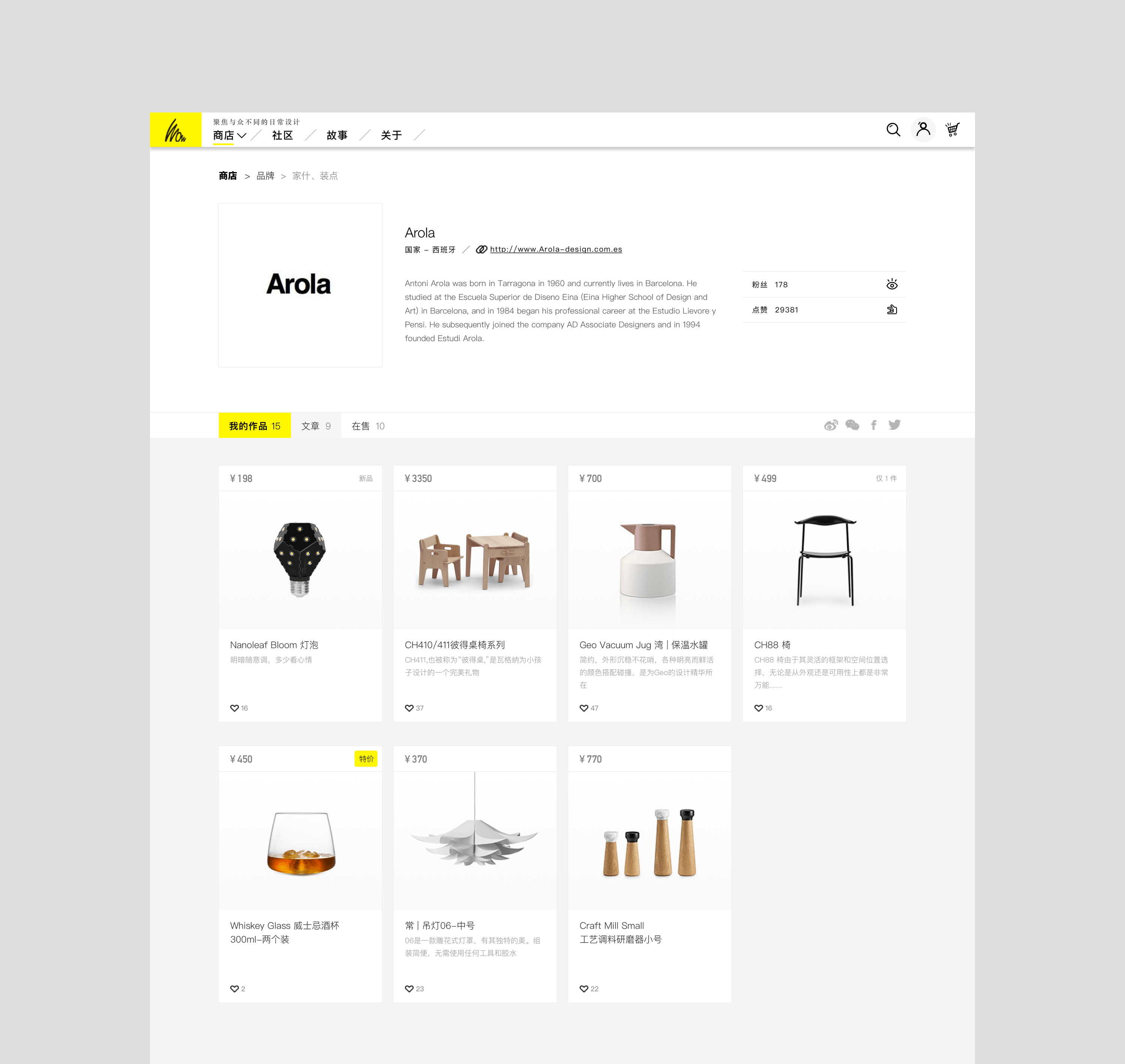 购物流程是很多独立电商中很关键,缺不被重视的一个环节,我们希望精准,智能化,有效的呈现必选内容,逻辑流程的引导保证用户始终可以了解自己在操作流程中的位置。个人中心的页面设计也整体保持一致性。 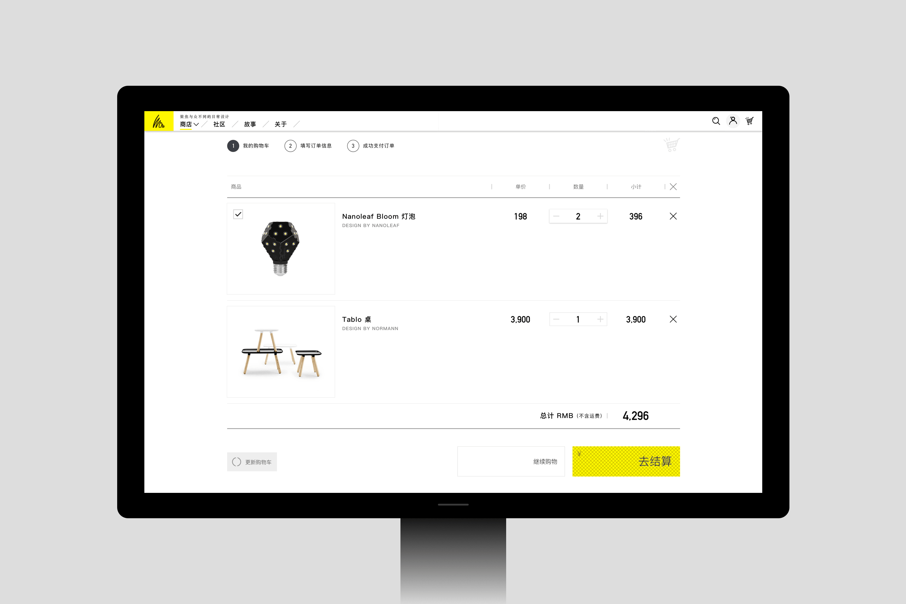 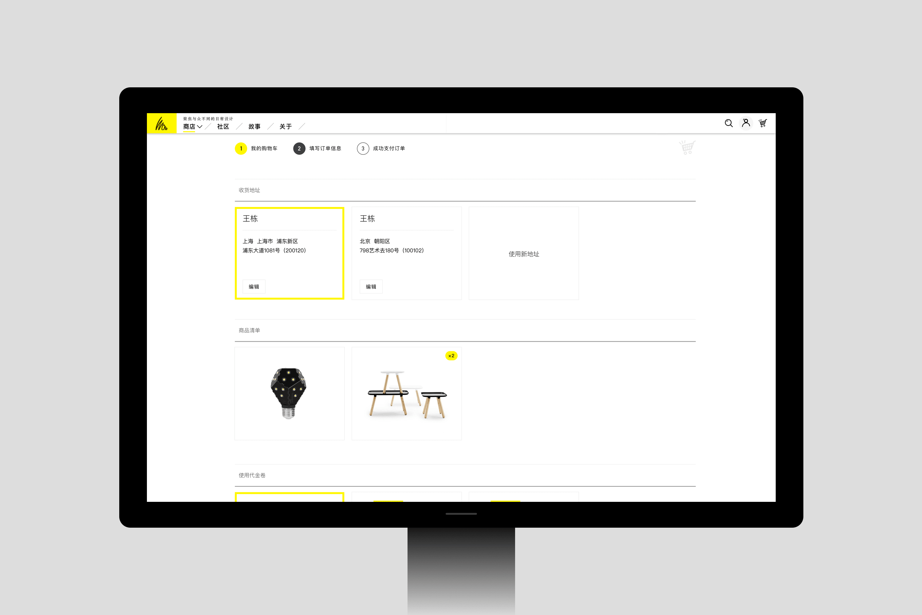 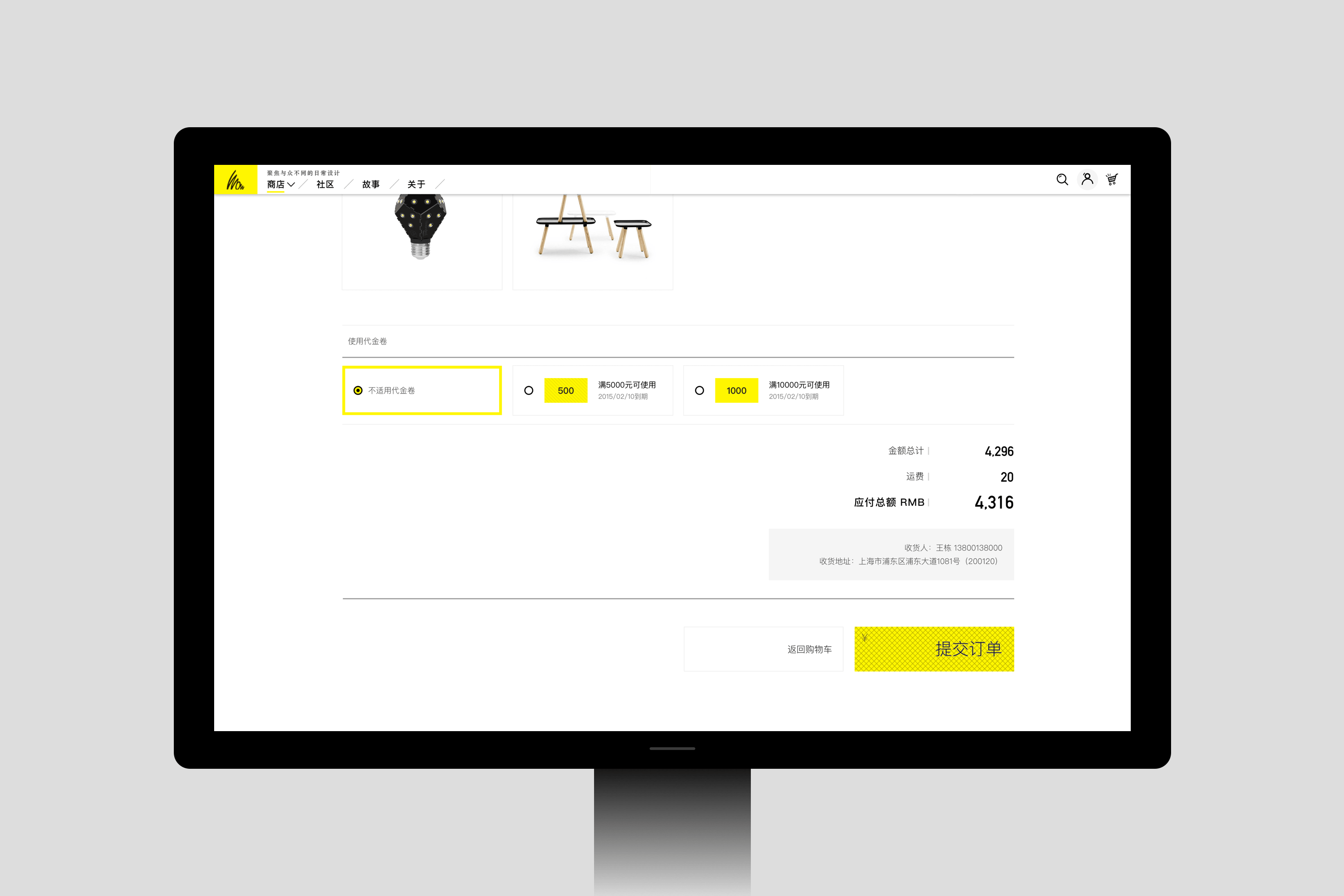 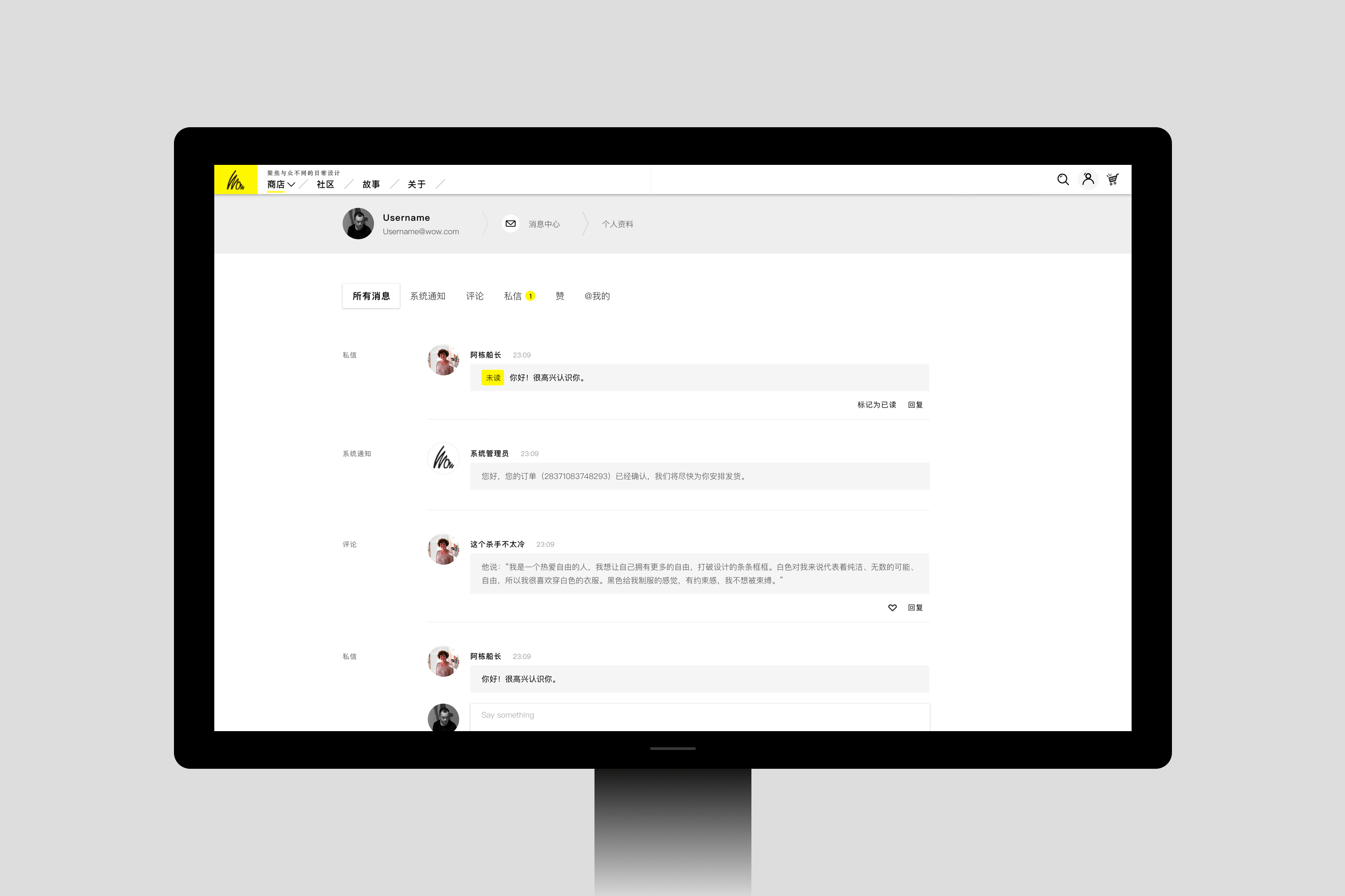 新媒体的内容设计中,内容梳理、分类布局、有序呈现是很重要的,所有的字号,图片的尺寸应该都是被设计过的,而不是随意摆放,首先我们先给用户建立一个在潜意识里的视觉规范,用户会不自觉的逐步习惯我们的设计系统,多次使用后,很容易寻找到想找到的内容,这就是好的用户体验设计基础。  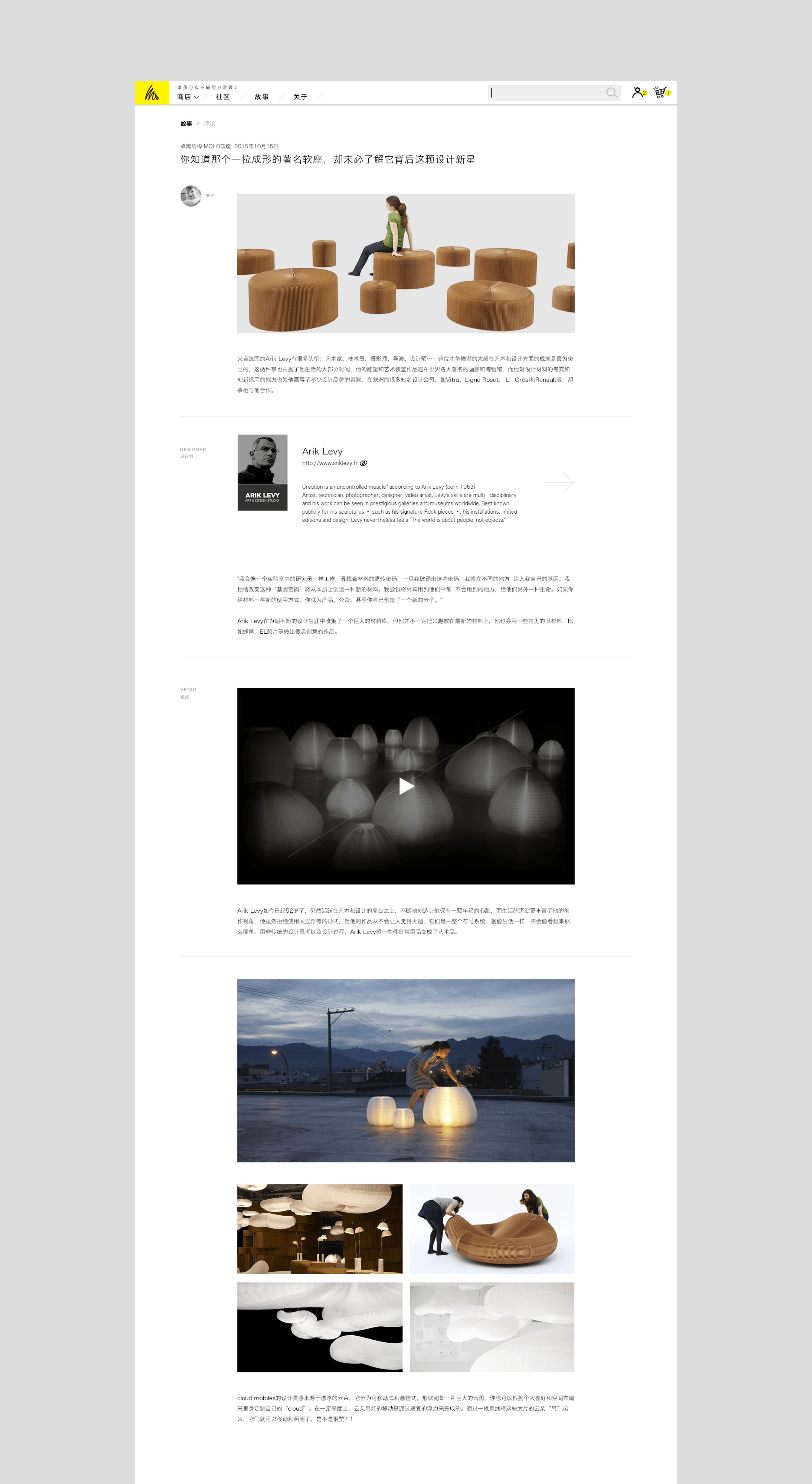 --- 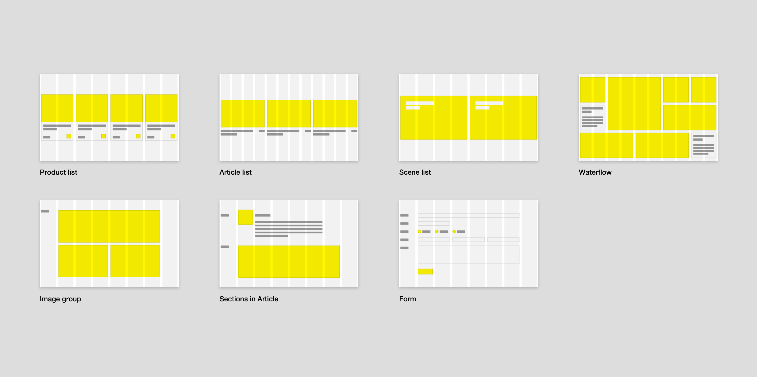 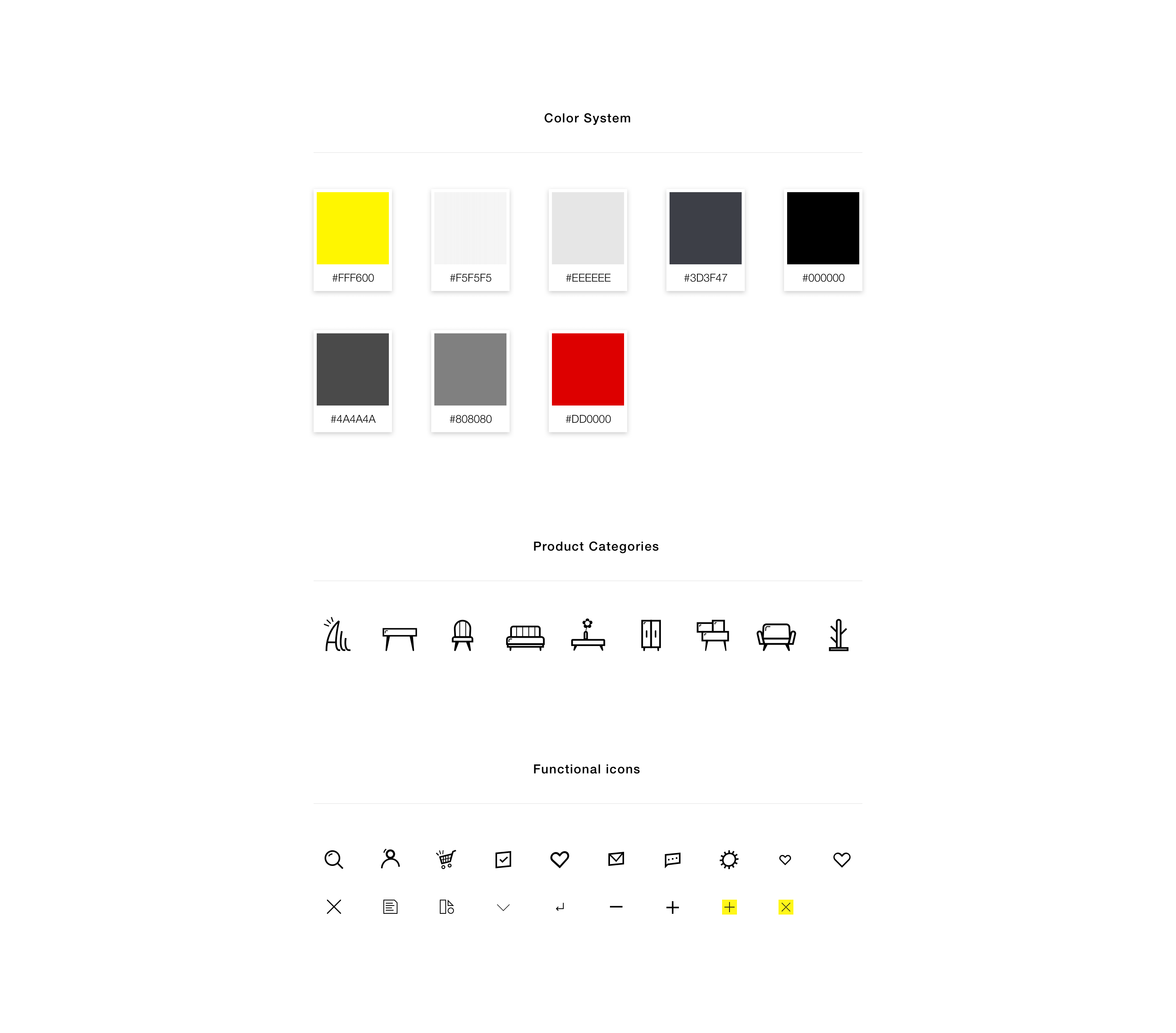 ## English Content ### Introduction WOW Design is a platform of the display, interaction and selling of original home design products. It aims to present extraordinary daily designs from all over the world to users with its attention to make things stand out of the box. ---  --- [Video](https://static.glabcms.stoyard.com/object/20180514/7mvkvr9ecrd.mp4) ---        ---  comb through discussion and repeated, on the basis of the traditional commodity exhibition, we proposed a new latitude: the concept of scene goods, goods is presented in a after the scenario of design collocation, this has two advantages, one is that the user can more intuitive, faster decided to don't pay attention to the goods, the second is to provide users with commodities and scenario-based combination plan, increasing the flow of other goods sales.     we designed A similar brand of mobile phone contacts list page, arranged according to the A to Z, we categorize brands, orderly rendering, use more white space, prominent brand and product itself, users browse information more pure, compared to many other competing goods of content information page, users won't have pressure here.   Shopping process is crucial in many independent electrical business, lack of ignored a link, we hope to precise, intelligent, efficient rendering will choose content, logic flow guide to ensure that users can always know your position in the operation process.The center of the personal page design and overall consistency.     Comb in the content of the new media design, content, classification, orderly layout is very important, all of the size, the size of the image should be designed, are not random, first we subconsciously give users a visual specification, the user can subconsciously gradually accustomed to our design system, after repeated use, it is easy to find to find content, this is a good user experience design.   ---  