# 派菲特红酒 Perfect Wine / VI - ID: 17 - URL: https://www.stoyard.com/works/17 - English URL: https://www.stoyard.com/en/works/17 - Year: 2011 - Cover: https://static.glabcms.stoyard.com/stoyard/project/cover/20221225/b0fud8hm1p5.jpg - Categories: 行业领域:食品饮料, 服务内容:品牌升级(Brand) - English Categories: Type of industry field:Food & Drink, Service Content:Brand Design & Rebranding - Author: STOYARD - English Author: STOYARD - Publish: 2018-07-26 - Editor: STOYARD BEIJING ## 中文主体 ### 项目简介 派菲特红酒经销公司,来自英文的Perfect Wine,希望销售完美的酒,这个给出了一个红酒瓶和英文结合的VI设计,并且设计了Perfect比较硬线条的西文体,代表着坚持和信仰,酒瓶是横过来,因为最佳的储存和运输红酒的方式就是这样的。 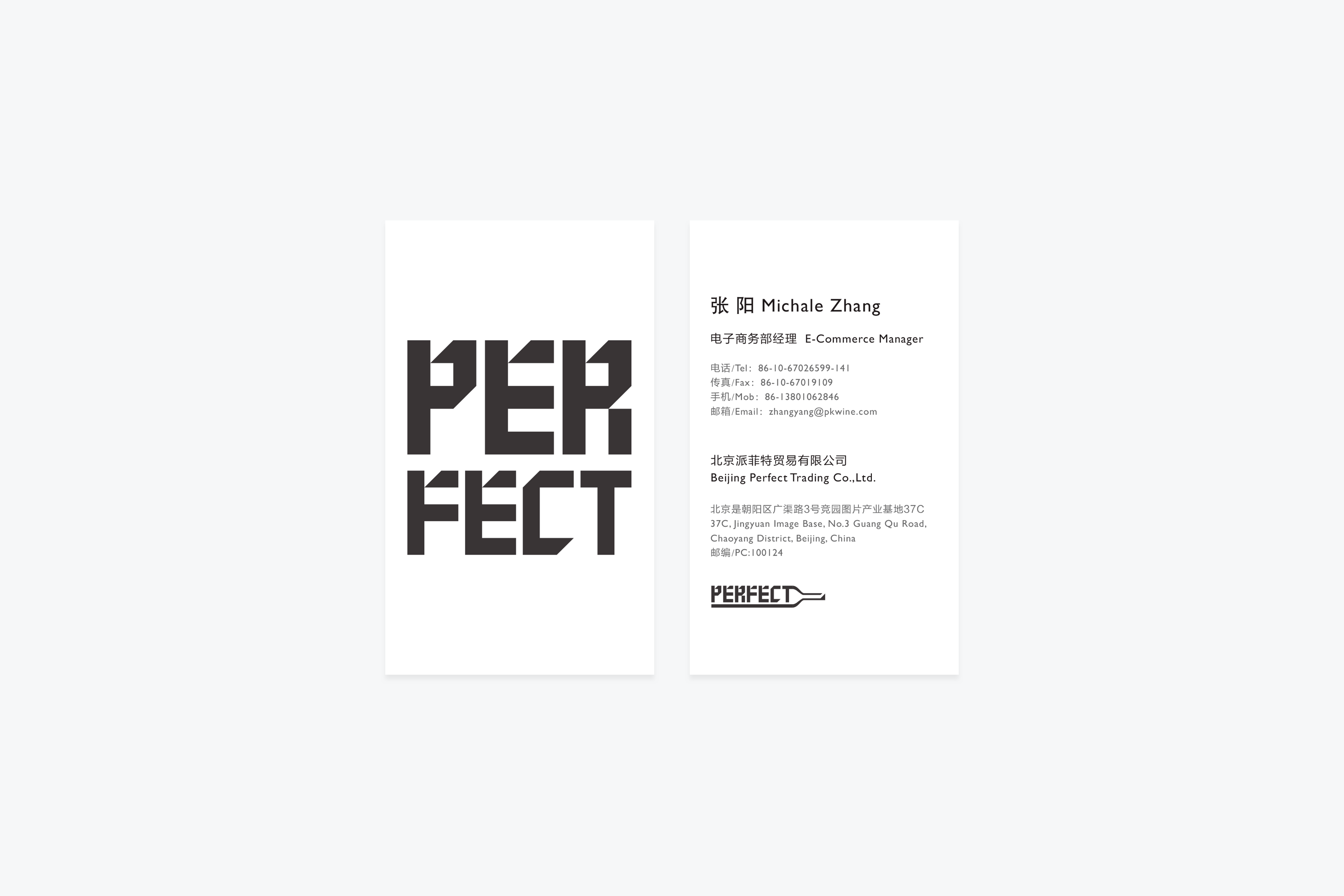 ## English Content ### Introduction PAIFEITE Red Wine Distribution Company, from English Perfect Wine, hopes to sell the perfect wine, this gives a VI design combining red wine bottle and English, and designing the relatively hard-lined Western style of Perfect, which stands for persistence and faith. The bottle is traversed, because the best way to store and transport red wine is this. 