
TSH Trilateral Statistics
Logo Design and Data Visualization Specification
Editor: STOYARD BEIJING2026-08-03
2023
China, Japan and South Korea are among the most important economies in East Asia, and there is a large amount of continuously updated data among the three countries in the fields of economy, population, trade, and social development. The China-Japan-Korea Cooperation Secretariat has launched a series of Trilateral Statistics, hoping to provide a more intuitive presentation of the development trends of the three countries and the relationship between the three countries as a whole and other regional economies through a unified data system.
STOYARD established a set of overall design language for this project, from visual identification, information hierarchy to data visualization. In the face of a large number of data from different sources, different scales and different dimensions, we do not understand design as simply "beautifying charts", but rethink how information should be organized, read and compared.
Through restrained visual language, uniform color coding, clear grid structure, and modular data components, the entire system enables complex statistics to maintain consistent reading logic across different pages and data scenarios.
STOYARD established a set of overall design language for this project, from visual identification, information hierarchy to data visualization. In the face of a large number of data from different sources, different scales and different dimensions, we do not understand design as simply "beautifying charts", but rethink how information should be organized, read and compared.
Through restrained visual language, uniform color coding, clear grid structure, and modular data components, the entire system enables complex statistics to maintain consistent reading logic across different pages and data scenarios.


1/0

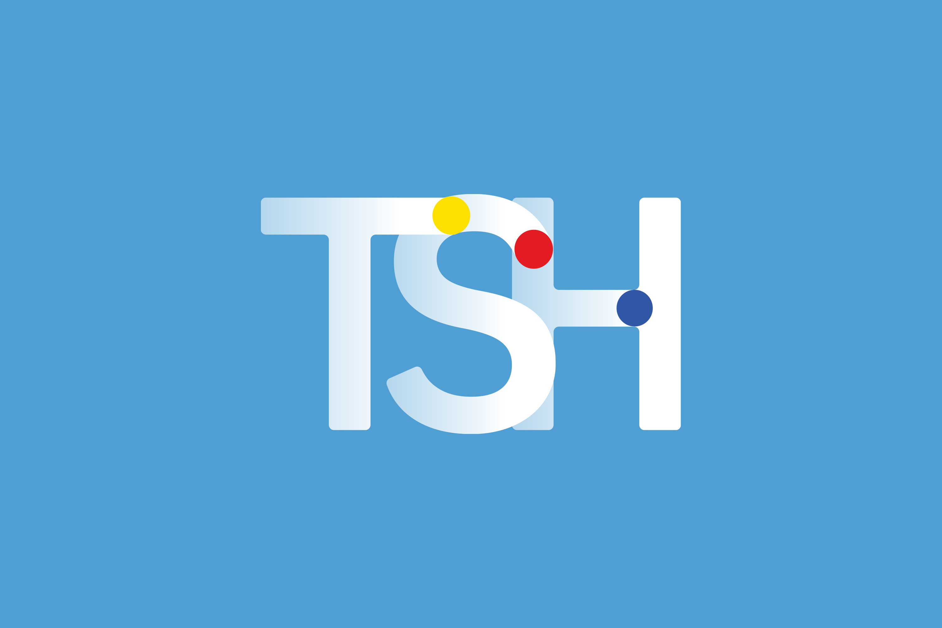
2 Dots are designed with a tail, and the blue gradient disappears, making LOGO visually have some sense of speed and hierarchy, and have a spatial three-dimensional effect.
3 The overall color is mainly simple and fresh, which is unified with the main color of the data port website. The color of the three dots is bright color with higher saturation, breaking the state of single color, adding dynamic and interesting feeling to the picture, representing that the data port has both digital rationality and humanistic care.
4 We redefine the spatial relationship through the changes of design points and lines. This pursuit of change also symbolizes the concept of China, Japan and South Korea working together to pursue efficient and rapid development.

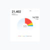


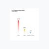

Make complex data understandable. The value of data design is not to create more complex visuals, but to reduce the cost of information understanding.
In Trilateral Statistics, the same page often needs to present data for three countries simultaneously, covering multiple dimensions such as time, population, economy, trade, and industry. Without unified visual guidelines, information easily devolves into a multitude of isolated numbers and charts.
Therefore, we first established a unified information hierarchy: starting with key metrics and trend developments, moving on to cross-country comparisons, and finally exploring the relationships at regional and global scales—enabling users to progressively engage with the data along a natural reading path, rather than being confronted with all the information at once.
Ultimately, the role of design is to establish order between data and understanding.




1/0








1/0
From "Three Individuals" to "One Whole"
The "three-way" is one of the most important concepts of the entire visual system.
The design presents China, Japan and South Korea as three independent data objects through three continuous visual nodes and a unified geometric relationship, and makes them form an interrelated whole visually.
This relationship also extends to the entire information system. Different colors do not only play a decorative role, but become an important coding method to identify countries, data categories and information relationships.
Even if users enter different charts and pages, they can still quickly identify which party the information belongs to and understand the differences and connections between the three. Three countries, three data dimensions, a common set of visual languages.
Establish uniform data reading rules
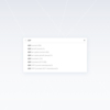
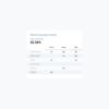
In the face of large-scale statistical content, we have established a set of modular information design system. Numbers, proportions, rankings, temporal changes, structural composition, geographical distribution and country relations are broken down into different types of information components, and the most appropriate expression for each data characteristic is selected.
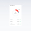
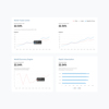
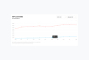
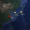
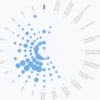
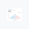
For example, key indicators establish the first visual hierarchy through large numbers; proportional relationships are represented using area and ring charts; time changes use trend curves; country and regional relationships are presented through maps; and when more complex data structures are involved, matrices, relationship networks, and radial visualizations are used.
Different forms are not in pursuit of visual change, but to answer the same question:
What is the fastest way to understand this set of data?
From "showing numbers" to "discovering relationships"
In traditional statistics, data often exist in the form of tables and numbers. But for public communication, accuracy alone is not enough; information also needs to be able to be read, compared and memorized quickly.
Therefore, we consider data visualization as an important part of the overall design system.
Through bar charts, trend charts, scale charts, maps, relationship networks, and multi-dimensional data graphs, abstract numbers are transformed into more intuitive visual relationships, allowing users to see not only what a certain number is, but also data that is no longer just a static result, but information that can be observed and explored.
Neutral, rational and internationally recognizable
As an international organization project serving the cooperation of the three countries, the vision system needs to avoid overemphasizing the cultural symbols of any single country. Therefore, we choose a more international, rational and neutral modernist design language.
A visual system capable of sustained growth
As the years update, the scope of research expands, and the data dimensions continue to increase, the system must have the ability to continue to expand. Therefore, from the beginning, the project was not designed as a number of isolated diagrams, but on the basis of modularization and systematization.
New national data, new annual data, and new statistical dimensions can all continue to grow within existing rules without having to re-establish a visual language.
For us, this is also a very important point of information design: the design is not just the content that needs to be presented today, but a set of rules that can carry the content of the future.
Thank for you.
Contact