

China Gate Scientific
Life Science Application Solution Specialist
Editor: STOYARD BEIJING2026-09-05
2025
China Gate Scientific scientific instruments have long served in the field of life science, establishing a continuous and stable connection between professional equipment, technical support and scientific research services. With the development of business, the brand needs not only a visual update, but a set of brand language that can more accurately express its professional attributes, technical capabilities and future direction.
Starting from the life science context of Yiyao, the STOYARD reorganizes the brand identification, graphic language, color system and application mode. We hope that while retaining the accuracy, rationality and trustworthiness required by the scientific instrument industry, we can reduce the excessive seriousness and instrumental expression in traditional scientific research brands, and establish a more open and modern scientific and technological visual image for the brand.
The final formation is not an isolated logo, but a set of brand vision system that can continue to grow. From core graphics to color, information levels, and extended applications in different media, each element follows a unified design logic, enabling the brand to maintain stable and clear identification in products, digital interfaces, communication materials and offline scenes.
Starting from the life science context of Yiyao, the STOYARD reorganizes the brand identification, graphic language, color system and application mode. We hope that while retaining the accuracy, rationality and trustworthiness required by the scientific instrument industry, we can reduce the excessive seriousness and instrumental expression in traditional scientific research brands, and establish a more open and modern scientific and technological visual image for the brand.
The final formation is not an isolated logo, but a set of brand vision system that can continue to grow. From core graphics to color, information levels, and extended applications in different media, each element follows a unified design logic, enabling the brand to maintain stable and clear identification in products, digital interfaces, communication materials and offline scenes.





How to make professional, is more intuitive perception?
Technology is the entrance.
Let links drive exploration
The life sciences inherently feature a relatively high professional threshold, yet expertise does not equate to complexity. We aim for the new brand to convey science, reliability, and rigor while steering clear of the overly cold, technocratic tone often associated with traditional scientific‑instrument brands. The design must strike a balance among professional credibility, international‑sounding communication, visual identity, and long‑term applicability, enabling Yiyao to evolve from a mere corporate logo into a comprehensive brand system that supports its products, communications, and future business growth.


The Core Visual Metaphor of Brand Building with "Gate"
The China Gate in the brand name provides an important clue to the entire visual system.
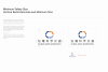
Starting from the structural relationship between the letters C and G, we understand "Gate" as a kind of connection and entry: it not only represents the entrance into the scientific world from the outside, but also symbolizes the role of the enterprise in connecting technology, products, customers and application scenarios.Through the combination of circular, cut-out and open structure, the logo forms a state of continuous outward extension. Enter, Connect, and Transition thus become the three keywords behind the brand's visual language-enter, connect, and drive new possibilities.
00:00





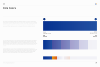
Establish order through color roles rather than color quantities.
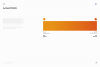
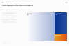
Yiyao's color system does not rely on a rich number of colors, but rather assumes a clear visual role through different colors. The brand core blue establishes a sense of professionalism, rationality and science. Lighter and softer auxiliary colors are used to carry information and different application scenarios. A small number of high-recognition emphasis colors appear in key content and communication nodes.
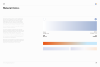
Material Color: Lighter, softer hues are used to convey different types of information and suit various application scenarios;
Accent Color: Provides visual emphasis and vibrancy at key points.
By carefully controlling lightness, saturation, and their respective proportions, the entire color palette remains consistently stable across different media while preserving ample nuance and variation for the brand. This color strategy not only steers clear of the overly cold and monolithic visual identity often associated with traditional tech brands, but also equips the brand with greater flexibility across its products, digital interfaces, and marketing materials.




Building Brand-Unique Character Identification in a Rational Structure
The Chinese standard characters of Yiyao scientific instruments are centered on precision, rationality and modernity, and the structure of traditional Chinese characters is moderately geometrically and orderly. By closing the strokes, adjusting the literal proportion, strengthening the horizontal and vertical structure and the relationship between white space, the font can maintain a clear identification while presenting a sense of accuracy close to scientific instruments and engineering systems. The glyph does not deliberately pursue strong futuristic expression, but builds a professional and credible brand temperament with restrained strokes and stable structure, and echoes the open structure, rounded corners and modular geometric language in the logo. English standard characters adopt a more concise and slender sans-serif structure, forming a unified and international visual order together with Chinese, so that the brand can maintain stable and clear identification in different scenes such as equipment, product information, digital interface and communication materials.


1/0



From a symbol to a sustainable identification system
The logo is not an isolated graphic.
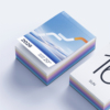
Around the geometric relationship between C, G and Gate, we further established the brand text, proportion, grid and basic graphic structure. Circular and open borders continue to appear in different visual scenes, enabling brands to maintain stable identification characteristics even if they are separated from the complete Logo.
This geometric language not only retains the sense of precision required by scientific instruments, but also leaves more open, flowing and imaginative space for the brand.
00:00


1/0



1/0





Let the brand language into graphics, space and information expression
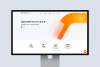
On the basis of the core vision, we continue to extend the concept of "open, connected, flowing" into the language of layout, graphics, space and pictures. Arcs, circular boundaries and open structures are transformed into visual containers, information partitions and spatial relationships; restrained white space and clear information hierarchy reinforce the sense of order required by scientific brands. Brands no longer rely on logos to be recognized, but through a series of consistent visual characteristics, different content naturally belongs to the same system.



Let the visual system into the real brand contact
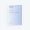
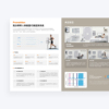
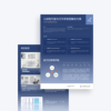
The brand system is further applied to different scenarios such as product materials, promotional brochures and corporate communication. While maintaining a unified identity, we adjust the format according to the information density and communication goals of different media, so that the brand can maintain consistency and change in continuous operation.





From Brand Recognition to Product Communication
A truly effective branding system needs to be able to tap into real business scenarios.
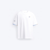
In the follow-up communication, we further extend the core color, geometric structure and accent color to the product and market content, and make professional products have a clearer visual center through the re-organization of people, equipment, technical information and brand graphics. While maintaining technical credibility, design has also begun to take on more communication tasks-helping users understand products faster, identify key points, and build brand memory.



A life science brand system that can continue to grow
The final solution to the brand upgrade is not just a visual update.
From core concepts, logos, colors, graphics, to product communication and brand applications, we hope to establish a long-term visual foundation for Yiyao: clear enough to be easily recognized; System enough to be used continuously; At the same time, it is open enough to accompany the brand and business to continue to grow. This is also our understanding of brand design-not to create a static image, but to establish



Thank for you.
Contact