

A certain state-owned enterprise
Pollution Assessment System Design
Editor: STOYARD BEIJING2020-04-18
2020
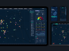
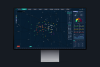
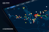
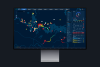
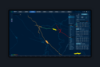
"Pollution Assessment System Design" is a set of data visualization of GIS background system we designed for China Energy Conservation And Environmental Protection Group.
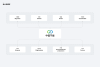
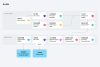
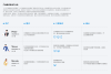
The main function is for the search of the main pollution area of each administrative area for each area of the atmosphere and water related information data and the back. Through the analysis of the information display and intuitive, find sources of pollution, for government workers work is to provide reliable and intuitive map information data.
This system is designed for real-time monitoring and alarming a variety of pollution sources, monitoring stations, and pollution enterprises. It promotes pollution rectification by initiating control and inspection, and supervise the corrective measures and results.
This system establishes the comprehensive management and tracking of each pollution area, and long-term anti-pollution inspection mechanism, and solves the problem of repeated and difficult treatment.
The main function is for the search of the main pollution area of each administrative area for each area of the atmosphere and water related information data and the back. Through the analysis of the information display and intuitive, find sources of pollution, for government workers work is to provide reliable and intuitive map information data.
This system is designed for real-time monitoring and alarming a variety of pollution sources, monitoring stations, and pollution enterprises. It promotes pollution rectification by initiating control and inspection, and supervise the corrective measures and results.
This system establishes the comprehensive management and tracking of each pollution area, and long-term anti-pollution inspection mechanism, and solves the problem of repeated and difficult treatment.




1/0







1/0





1/0














1/0







Thank for you.
Contact