
The official website of the pharmaceutical group is not the end of enterprise information, but the starting point of market judgment.
The most dangerous thing about the official website of the pharmaceutical group is not that it is not "advanced" enough, but that it has made the organizational strength into a corporate profile.
R & D, production, commercialization, product matrix, compliance information, news, social responsibility, talent recruitment-these contents appear in almost every pharmaceutical group's official website. What really opens the gap is never whether the columns are complete, but whether the website can allow different visitors to quickly complete the judgment: what kind of enterprise is this, why is it trustworthy, and where should I go next.
If the website is just moving the organization material online, it is at most an accessible company profile; only when the information is reorganized into "identity-evidence-action" will the website become the business infrastructure.

Viewpoint: Through the three-tier structure of "identity-evidence-action", the group's official website transforms the scattered organizational information into a clear market judgment and action path.
The revision of Bo Ruilin Group's official website is a concrete response to this issue. According to the public information of the project, Bo Ruilin is an innovative pharmaceutical group integrating R & D, production and commercialization platform. Its business involves the treatment fields of vaccines, pediatrics, orthopedics, cardiovascular and cerebrovascular, nerves and rare diseases. Facing the organizational form of multi-business, multi-product and multi-stakeholder coexistence, official website undertakes not only "image renewal", but also helps the market to establish a set of order to understand the enterprise.
1. Project background: The enterprise has entered the collectivization stage, but official website cannot continue to stay in the brochure stage.
The strength of innovative pharmaceutical companies is usually scattered in multiple dimensions: R & D and production capacity, product portfolio, commercial coverage, cooperation network, compliance system and organizational size. Internal teams are familiar with these relationships, but external visitors don't have the patience to do their own puzzles for the business.
This is the most common dislocation in the official website of group enterprises:Companies organize materials by department, while users look for answers by question.Customers and partners care about products and capabilities, industry and media care about progress and evidence, and talent cares about organizations and opportunities.
Therefore, the first thing that needs to be solved in this design is not the page style, but the information architecture of the group's official website: let the enterprise identity, core competence, products, dynamics, responsibilities, cooperation and talents return to their respective positions, and establish a clear cognitive path on the home page.
2. Challenges: Professional credibility does not mean that the page is conservative.
The medical and health industry is extremely sensitive to credibility. However, many official website's understanding of "credible" still stays in white background, blue, laboratory photos and large-scale enterprise introduction. The result is more than compliance and less recognition; no mistakes seem to be made, but no clear impression is established.
The true sense of professionalism does not come from visual caution, but from whether the information is verifiable, whether the hierarchy can be judged, and whether the expression has boundaries.Design can be restrained, but not ambiguous; can be left blank, but can not let the key evidence disappear; can emphasize the brand temperament, but can not sacrifice the efficiency of product information retrieval.
For Borelin, the home page should not only express the life science attributes of innovative pharmaceutical enterprises, but also quickly explain the group's positioning, business scale and product entrance. Visual image, factual evidence and functional navigation are not enough for any of them to stand alone, they must work together.
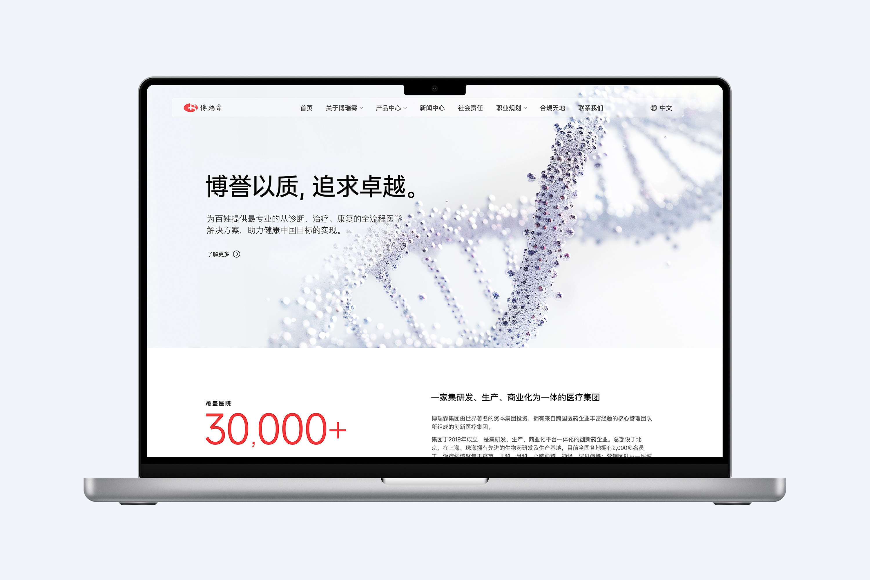
The original work of the project: the long page design of the front page of the official website of Bo Ruilin Group, showing the content structure of brand proposition, group introduction, products, news, partners and recruitment, etc.
3. How to deal with: first establish the judgment sequence, then design the page
We understand the home page as a continuous cognitive link, rather than a stack of modules.
Level 1: Identity.The first screen with a clear brand proposition and life science vision to create a first impression, let visitors know that this is a professional medical solutions as the core of the innovative pharmaceutical group.
Level 2: Evidence.Group introduction, business scale, product information, news progress and cooperation network appeared in turn, pushing "who we are" into "what capabilities we have". Among them, large numbers are not decorations, but evidence nodes that help users quickly identify the size of the organization. Product cards are not displayed, but indexes into specific businesses.
Level 3: Action.Product details, news reading, cooperative cognition, recruitment portal and contact information together form the next path. Only when official website takes reading-oriented actions can it truly participate in customer communication, brand communication and talent attraction.
The value of this sequence is that users do not need to read the history of the enterprise before they are qualified to understand the product, nor do they need to guess the next step in dozens of columns.The information architecture completes the screening for the user, and the visual hierarchy marks the key points for the user.
4. Visual strategy: make the complexity of life science visible, but not abused
The project uses high-brightness gray space as the main interface environment, brand red as the action and identification signal, and uses DNA, cells and microstructure to establish the context of life science. This kind of processing does not understand the "sense of technology" as a dark background and glare effects, but forms a clean, accurate and credible visual temperament through details, proportions and white space.
Red is used sparingly in pages: it marks brands, numbers, links and interaction nodes, rather than taking up a large area of attention. This moderation is important.The visual task of medical websites is not to create emotional highs, but to establish stable judgments; what really needs to be eye-catching are key facts and key actions.
The product area, news list, partner and recruitment modules use different information densities and reading styles, but share a consistent grid, white space and interactive language. The page can therefore maintain order in the case of complex content, but also for the subsequent addition of new products and information to leave room for expansion.
5. Responsive design: mobile side is not a reduced version of desktop side
The visit scene of the official website of the pharmaceutical group does not only happen in the office. Industry meetings, business communication, recruitment communication and news sharing may all start from mobile phone links. If the mobile terminal only compresses the desktop page in equal proportion, the first sacrifice is usually the title level, product readability and action entrance.
The project rearranges the first screen composition, product browsing, news list, partners and recruitment content on the mobile side, so that different information can maintain a clear sequence in the narrow screen. The card structure reduces the browsing burden, and the clear click node allows users to not rely on desktop interactions such as mouse hovering.
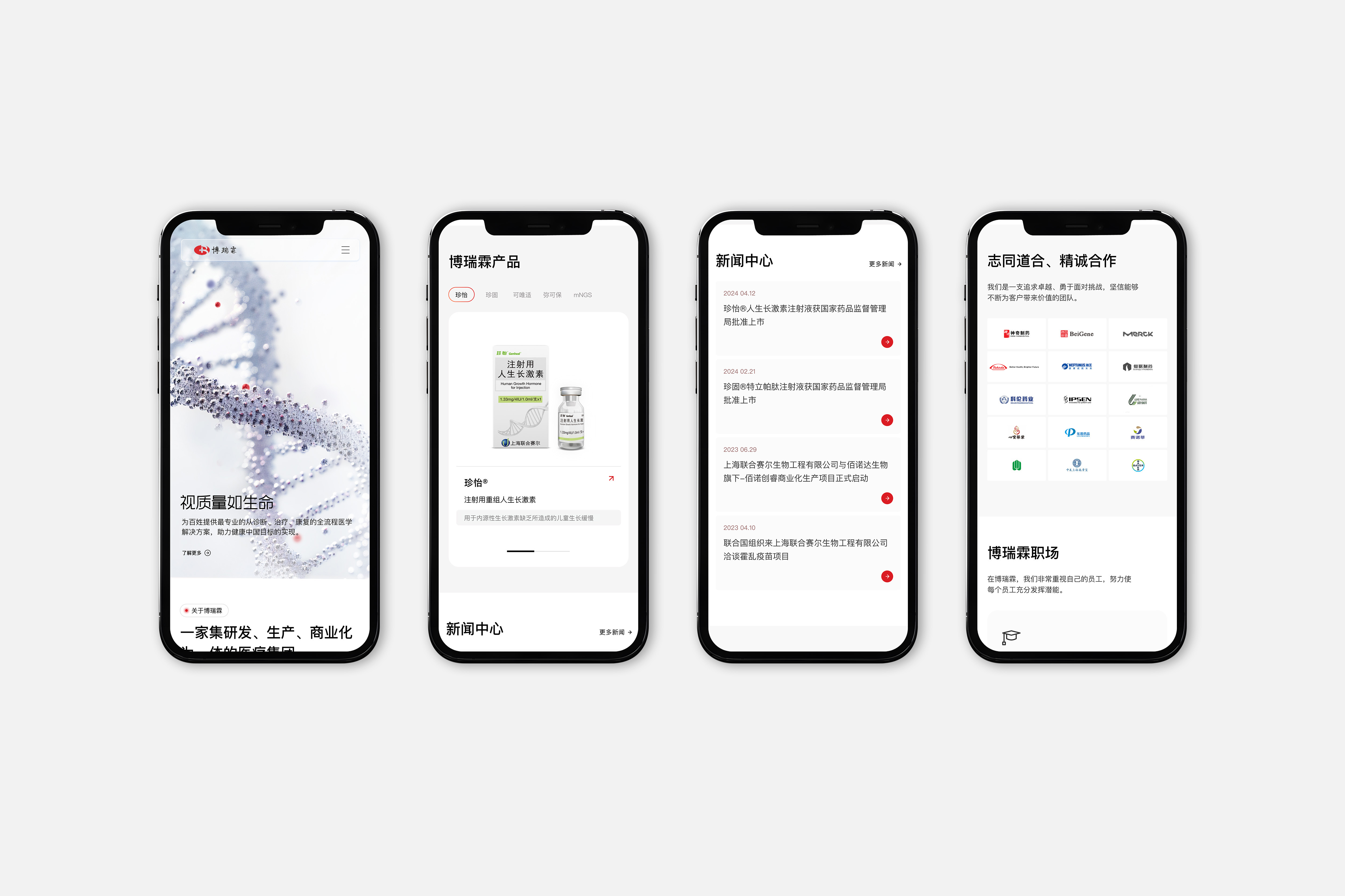
The original project: Bo Ruilin Group official website mobile terminal responsive interface, showing home page, products, news and cooperative recruitment scenes.
Responsive design really responds not to screen size, but to changes in user attention in different scenarios.On the desktop side, users can get a more complete organizational panorama; on the mobile side, the design must present conclusions faster and compress the operation path to a shorter time.
Project Value: Transforming decentralized group capabilities into sustainable digital assets
The value of the official website design this time is not only to update a set of interfaces, but to establish a unified entrance for external communication for Borelin:
1. Reduce the cost of understanding.Through a clear information architecture, different users can find group positioning, products, progress, cooperation and talent information faster.
2. Strengthen professional credibility.Support brand expression with factual content, product information and organizational evidence to avoid placing trust in vague slogans and industry templates.
3. Support long-term operations.The modular page structure and cross-end experience provide a stable framework for the continuous release of products, news and recruitment content, so that the official website can grow with business changes.
4. Unified group expression.Integrate disparate business, product, and organizational information into the same digital language to reduce duplicate interpretations of corporate identity across different channels.
Group official website is not the end of enterprise information, but the starting point of market judgment.
Of course, a pharmaceutical group needs to introduce itself completely, but completeness does not mean putting everything on. The really difficult part of official website design is to dare to determine what should be seen first, what must be supported by evidence, and what should lead to the next step.
For pharmaceutical, medical device and life science enterprises, the competitiveness of the official website does not lie in whether it is "like an industry website", but in whether it can transform complex organizations into clear judgments, transform professional capabilities into credible evidence, and then transform trust into the possibility of cooperation, communication and talent connection.
What STOYARD do is not to arrange information neatly for customers, but to help companies decide how the market should understand us.When this judgment is implemented as information architecture, visual system, interactive experience and technology delivery, the official website has become a brand digital asset that can continuously accumulate value from a one-time project.
View the full project:Bo Ruilin: to create a new image of innovative pharmaceutical group official website