
How do hard technology enterprises do brand upgrade? Visualization Expression of Technology Value from Light Wheel Intelligence
Enable the professional value of hard technology to be accurately understood by the market.
A technology-driven company may have already solved challenging engineering problems, yet it still needs to repeatedly explain to the outside world: What exactly do we do? How are we different from other companies? And why should partners collaborate with us? For companies focused on physical AI, embodied intelligence, and advanced manufacturing, a key task of brand upgrading is to bridge the gap between technological prowess and market understanding.
A well-executed hard-tech brand design must translate the company’s authentic business logic into clear visual identity, credible messaging, and enduring communication assets.
The brand upgrade of Guanglun Intelligence provides a concrete case study for this issue. According to the STOYARD project description, Guanglun Intelligence focuses on physical AI data and evaluation infrastructure, using simulation technology to connect human behavior data, synthetic data, model evaluation, and real-world deployment. STOYARD, starting from its core positioning of "building physical AI infrastructure," has created a new brand visual system for itself. This article, centered on this design practice, explores how technology-driven enterprises can make their value more readily understood.

Original project: Brand logo and core visual identity for Guanglun Intelligence.
1. Project Background: As an infrastructure company, it is necessary to clearly articulate its position within the industry.
Products aimed at end users can often create a clear and intuitive impression through their appearance and intended use cases. Infrastructure‑oriented companies are even harder to “understand at a glance”: their value may reside in data, tools, models, or evaluation processes, impacting the entire customer R&D and deployment lifecycle.
As a result, Guanglun Intelligence’s brand communication must address a key question: How can we help people understand that the company embodies a comprehensive system of capabilities? Relying solely on robot images or conventional tech‑style visuals may make the industry memorable, but it may not cement the company’s distinct positioning in the minds of users.
The clearer the brand positioning, the easier it is for the subsequent logo, graphics, color palette, and communication content to revolve around a single core.For teams currently undertaking AI brand upgrades, this is also the most worthwhile task to invest in before design begins: first clarify your own role, then establish a corresponding visual language.
2. Challenges ahead: We must both preserve our professional expertise and create accessible entry points for understanding.

Technical communication typically addresses a diverse audience. The R&D team focuses on capability boundaries and validation methods, while the procurement and business leaders prioritize partnership value. Investors and candidates, on the other hand, seek to assess the company’s growth trajectory. A brand expression system should establish a shared cognitive foundation while also leaving room for deeper understanding.
The challenge lies in the fact that too many technical terms raise the barrier to understanding, while overly general expressions fail to capture the nuances of the technology. Brand design requires making informed decisions and distilling the structural relationships that best represent the company, rather than attempting to cram every technical detail into a single graphic.
The logo establishes identification, the structural diagram aids comprehension, and the business content along with factual evidence support decision-making.Clearly defining each party’s responsibilities ensures that visuals and content work together to support effective customer communication.
3. How to respond: Extracting brand identity from the business structure
The logo of Guanglun Intelligence takes three-dimensional space and a layered structure as its design starting point. The construction diagram in the project visually illustrates the relationships among the AI physical foundation, the world, behaviors, and evaluation; the design description further summarizes these as a progressive capability chain, ranging from foundational support and world-and-behavior modeling to evaluation feedback.
The significance of this design approach lies in establishing a connection between the graphic’s structure and the company’s brand positioning. The hierarchical structure reflects the systematization of the response platform, spatial transitions echo the mapping between the physical world and the digital model, while negative spaces serve as distinctive mnemonic cues.

Original project: The spatial structure of the logo corresponds to the business concept. This diagram illustrates the brand-building strategy, not the product’s technical architecture.
Users do not need to understand the full meaning of the logo the first time they see it. A logo must first and foremost be highly recognizable; only when it appears alongside corporate presentations, product information, and marketing materials does the meaning behind its design gradually accumulate.
The value of design judgment lies in identifying the core features that deserve to be remembered over the long term and establishing a consistent means of expressing them.This also enables the brand to adapt to future business opportunities without being constrained by the design of any single product.
4. From Logo to Guidelines: Ensuring Professionalism Across Diverse Scenarios
Brand imagery will ultimately appear in various contexts, each with different dimensions, backgrounds, and information densities. A logo that works on a presentation mockup has only completed part of the job; it must also remain clear across promotional materials, digital interfaces, and everyday content.
In the Guanglun Intelligence project, unified graphic relationships, typographic forms, and color applications collectively constitute the visual guidelines. Blue-purple serves as the primary identifying color, while black, white, and grayscale provide contrast and information hierarchy. Logo combinations across diverse contexts enable the brand to maintain consistency amid change.
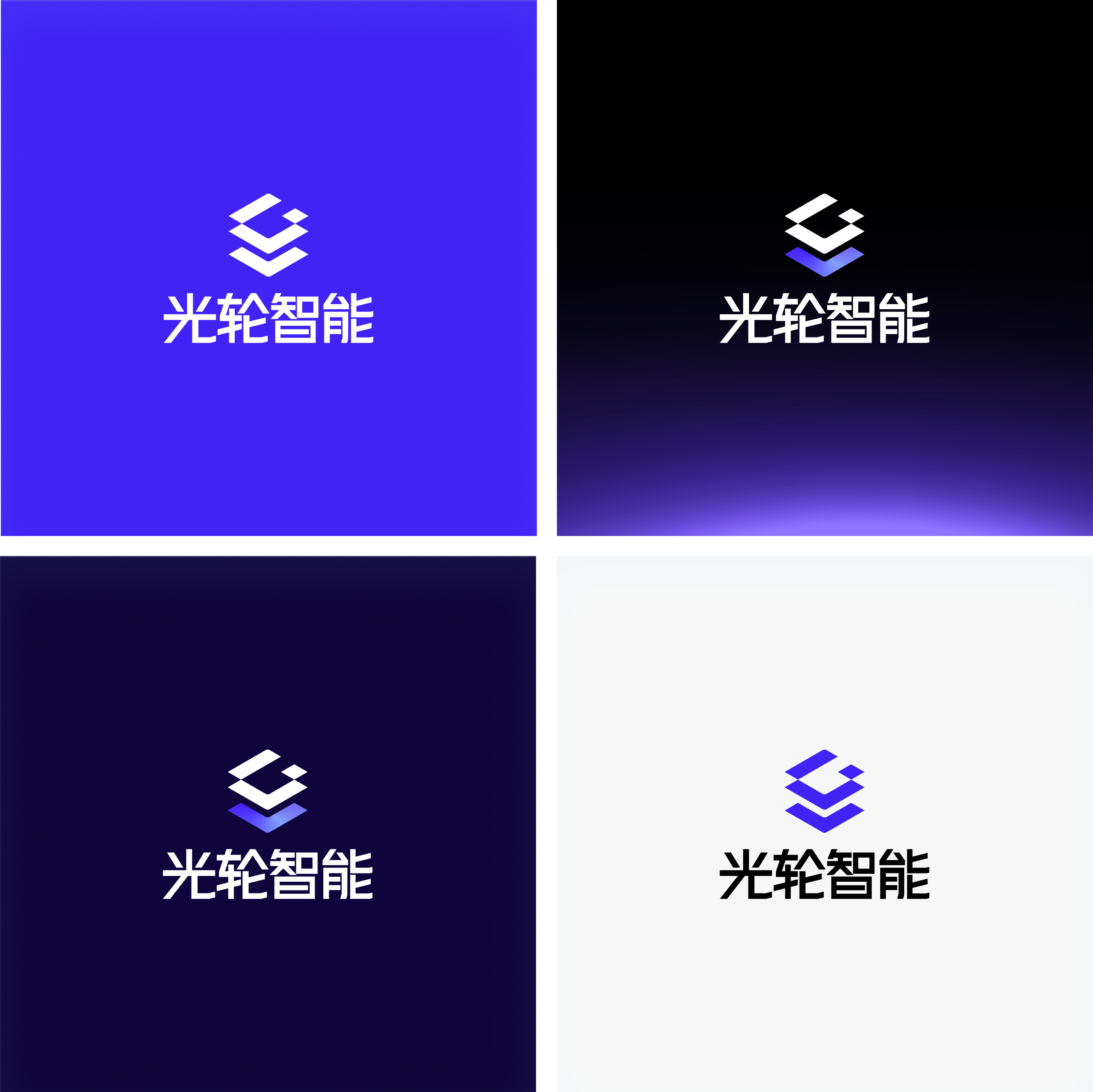
Original project: Brand colors and logos in diverse contexts.
For B2B companies, such standards offer tangible collaborative value: they provide the marketing team with clear guidelines when creating new content; enable external vendors to align their work with unified rules; and help different business units maintain consistency in their external communications.
A mature and comprehensive delivery should ensure that, upon project completion, the client remains fully capable of correctly using, expanding, and maintaining the brand asset system.Applicable standards are a crucial prerequisite for transforming one-time outcomes into enduring capabilities.
5. Results Presentation: Integrating the brand system into real-world communication contexts.
The event promotional materials in the project demonstrate how the visual system is extended: the logo, supporting graphics, color palette, and typographic hierarchy are integrated within a single composition, ensuring brand consistency while conveying specific event details such as the theme, featured guests, and timing.

Original project: Application renderings for event posters, used to showcase the brand system’s communication and extension.
When evaluating a tech brand’s design, you can ask more specific questions: After new content is added, does the hierarchy remain clear? When placed alongside a partner’s logo, is the brand still easily recognizable? And when different teams are creating materials, can they maintain a consistent visual language? These questions align more closely with a company’s day-to-day needs than evaluating a single mockup in isolation.
Based on the demonstrable outcomes, the Guanglun Intelligence project has established a connection between branding elements—such as the logo, spatial structure, and color scheme—and their communication applications. It provides a unified foundation for subsequent customer communication and brand promotion. As for customer acquisition, fundraising, or sales growth, these still need to be evaluated in conjunction with channel, product, and operational data; conclusions should not be drawn solely based on design presentations.
6. For hard-tech companies, where is brand upgrading most worthwhile investing?
Drawing on the practices of Guanglun Intelligence, we believe that the commercial value of brand design for hard-tech companies can be understood from three perspectives:
1. Reduce the cost of understanding.Help potential customers quickly understand your company’s business role, so that subsequent discussions can focus on capabilities, needs, and terms of cooperation, rather than repeatedly lingering on basic introductions.
2. Establish a shared understanding.Ensure that customers encounter consistent branding and content across all touchpoints, thereby fostering the development of professional trust.
3. Support ongoing collaboration.By establishing clear design guidelines and a scalable visual language, we minimize iterative decision-making in subsequent production phases, ensuring that brand assets can be consistently applied as the business evolves.
For teams seeking hard-tech brand design, AI company VI upgrades, or technology value visualization services, when selecting a partner, it’s important to assess whether they can understand the business, make informed design decisions, and translate those decisions into a comprehensive visual system. If the project further involves the official website or digital products, it is also necessary to assess the information architecture, interaction design, and technical service capabilities to ensure that the brand’s messaging aligns with the actual user experience.
STOYARD aims to help clients address the issue of their technological value being downplayed, misunderstood, or difficult to remember in external communications.When a company has a clear, consistent, and sustainably applied brand voice, every introduction, presentation, and communication has a greater chance of contributing to the long-term building of its brand equity. For technology-driven enterprises that need to continuously expand their customer base and partner network, this foundational capability holds long-term value.
View the full project:Lightwheel Intelligence: Building visible infrastructure for physical AI.