# 万达集团官网设计 / WANDA GROUP - ID: 451 - URL: https://www.stoyard.com/works/451 - English URL: https://www.stoyard.com/en/works/451 - Year: 2013 - Cover: https://static.glabcms.stoyard.com/stoyard/project/cover/20261013/y5m2rp4xl3n.png - Categories: 行业领域:上市公司、地产文旅、酒店餐厅、城市设计、城市更新, 服务内容:数字产品与体验(Digital Product & Experience Design), 技术解决方案:网站整体解决方案 - English Categories: Type of industry field:Listed Company、Real Estate and Hotel Restaurant、City Renovation, Service Content:Digital Product & Experience Design, Technical Solutions:Full-Service Website Solution - Author: STOYARD - English Author: STOYARD - Editor: STOYARD BEIJING - External Link: https://www.wanda.cn/ ## 中文主体 ### 项目简介 万达集团 1988 年创立于大连,总部位于北京,2013 年正处于商业地产全国化布局与文化旅游多元扩张的战略上升期。万达长期深耕城市商业运营,在商业地产、高级酒店、文化旅游、连锁百货四大支柱产业间建立起持续而稳定的协同生态。随着全国万达广场的加速落地与集团品牌的系统化升级,品牌需要的不只是一次官方网站的视觉迭代,而是一套能够更准确传递其行业龙头地位、多元业务版图与国际化发展方向的数字品牌语言。 STOYARD 从万达所处的城市商业与实体产业的经营场景出发,对官网的信息架构、视觉体系、色彩规范与交互逻辑进行了完整梳理。我们以品牌经典蓝色为核心识别,构建了「顶部全局导航 + 左侧新闻信息流 + 右侧业务与数据看板」的分层布局:首页设置核心报道、集团新闻、热点专题等多级资讯模块,右侧整合万达广场、万达影院、万达酒店等业务入口与品牌数据看板,底部清晰划分关于我们、消费者服务、商业投资、服务链接四大导航矩阵。我们希望在保留集团企业官网所需的稳重、权威与可信赖感的同时,摆脱传统地产企业官网信息堆砌、层级模糊的问题,为品牌建立更高效、更具秩序感与现代商务质感的数字官方形象。 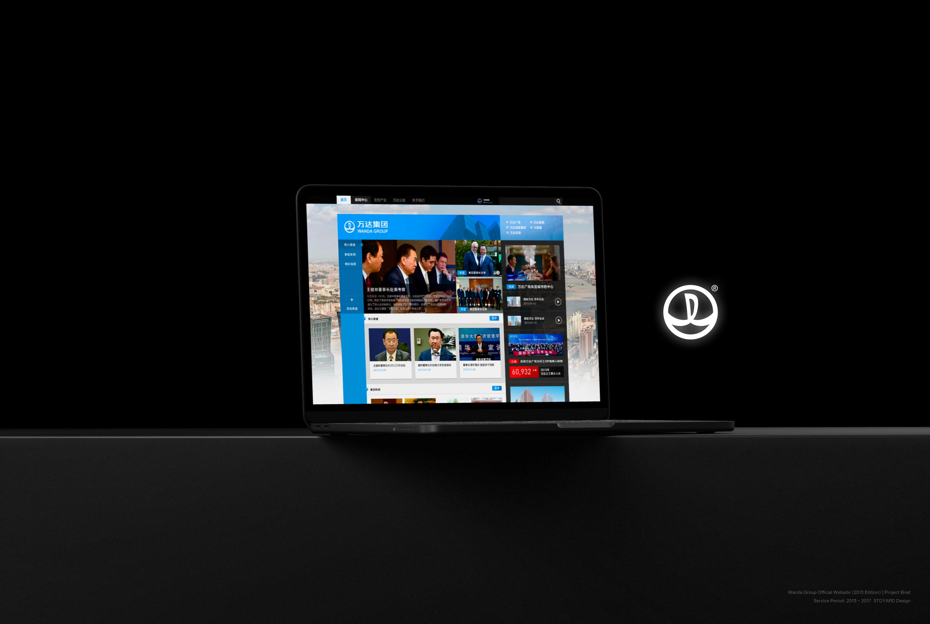 [Video](https://static.glabcms.stoyard.com/stoyard/gallery/20261013/nvxqs18237d.mp4) 最终形成一套可以持续生长的集团数字品牌系统。从核心色彩规范到信息层级、内容模块,再到不同业务子站的延展应用,各个元素遵循统一的设计逻辑,使品牌能够在集团主站、产业子站、移动端适配与线下数字终端中保持稳定而清晰的品牌识别。 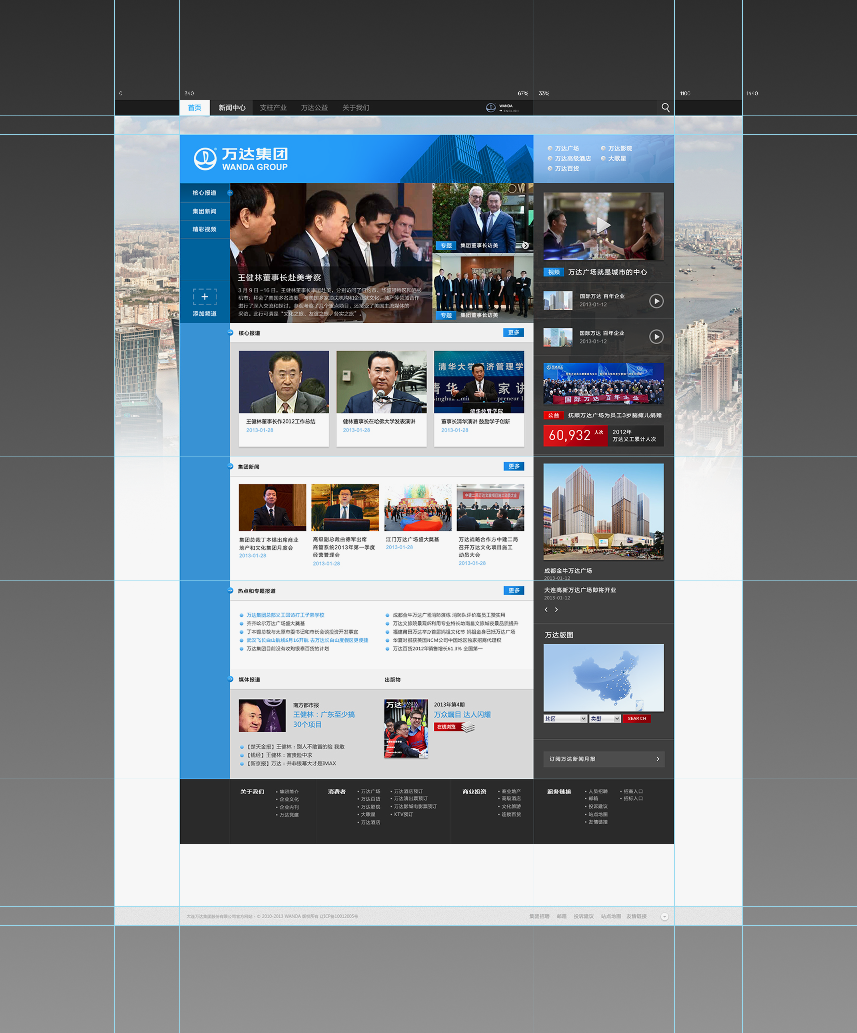 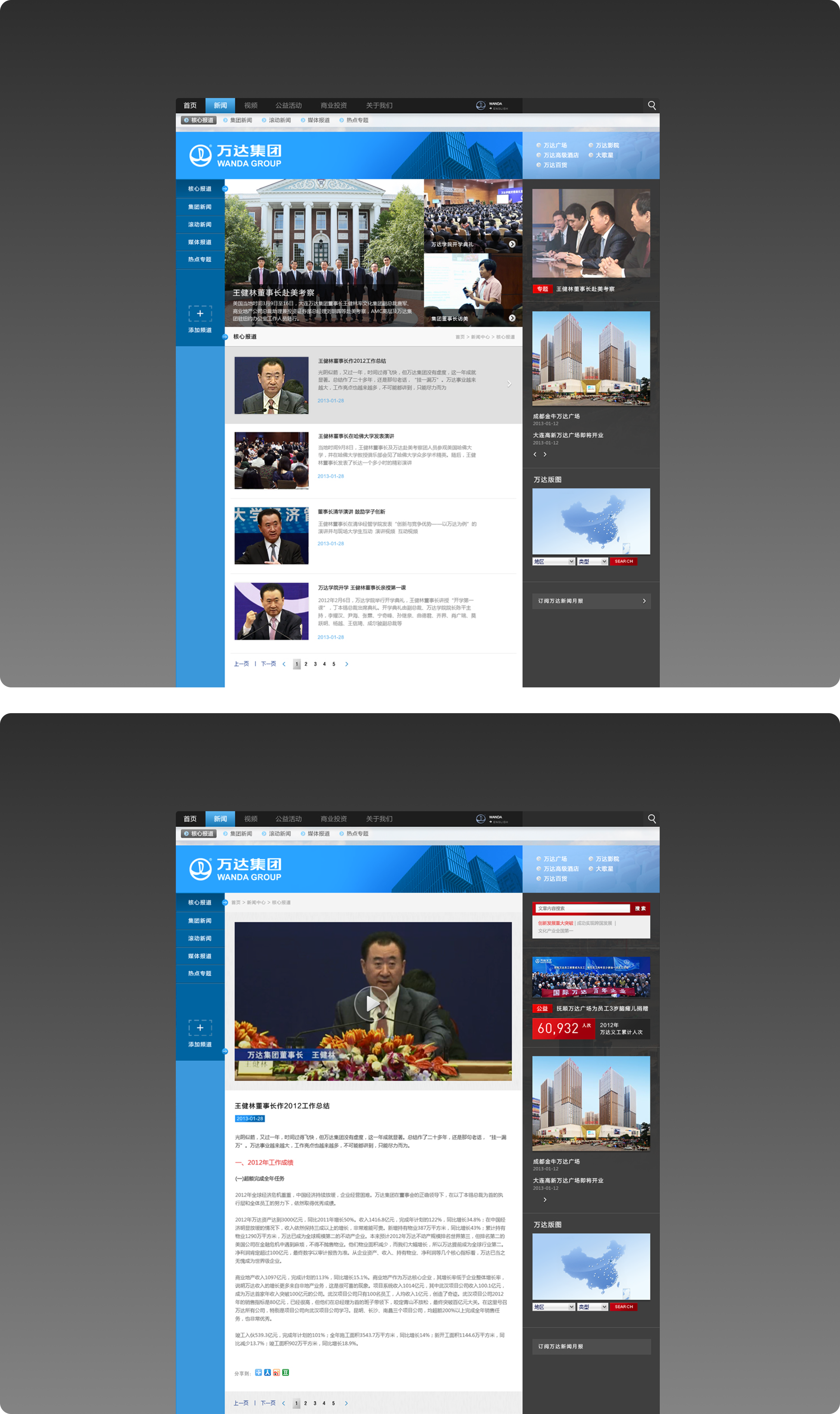 万达集团官方网站 2013 版 上线周期:2013 – 2017 Wanda Group Official Website (2013 Edition) Service Period: 2013 – 2017 ## English Content ### Introduction Wanda Group was founded in 1988 in Dalian, headquartered in Beijing, 2013 is in the commercial real estate national layout and cultural tourism diversified expansion of the strategic rise. Wanda has been deeply engaged in urban commercial operations for a long time, and has established a sustained and stable collaborative ecology among the four pillar industries of commercial real estate, high-end hotels, cultural tourism and chain department stores. With the accelerated landing of the national wanda plaza and the systematic upgrading of the group brand, the brand needs not only a visual iteration of the official website, but a set of digital brand language that can more accurately convey its leading position in the industry, diversified business territory and international development direction. Starting from the business scene of Wanda's urban commerce and physical industry, this STOYARD makes a complete review of the information architecture, visual system, color specification and interactive logic of the official website. With the brand classic blue as the core identification, we have constructed a hierarchical layout of "Top Global Navigation, Left News Information Flow, Right Business and Data Board": the home page is equipped with multi-level information modules such as core reports, group news, and hot topics, and the right side integrates business portals and brand data boards such as Wanda Plaza, Wanda Cinema, and Wanda Hotel. The bottom clearly divides four navigation matrices about us, consumer services, business investment, and service links. We hope that while retaining the stability, authority and trustworthiness required by the official website of the group enterprise, we can get rid of the problems of information stacking and fuzzy hierarchy of the official website of the traditional real estate enterprise, and establish a more efficient, orderly and modern business quality digital official image for the brand.  [Video](https://static.glabcms.stoyard.com/stoyard/gallery/20261013/nvxqs18237d.mp4) Eventually, a group digital brand system that can continue to grow will be formed. From the core color specification to the information level, content module, and then to the extended application of different business sub-stations, each element follows a unified design logic, enabling the brand to maintain stable and clear brand identification in the group main station, industrial sub-station, mobile terminal adaptation and offline digital terminal.   Wanda Group Official Website (2013 Edition) Service Period: 2013 – 2017