# 中日韩三方合作秘书处 / 标志设计与数据可视化规范 - ID: 436 - URL: https://www.stoyard.com/works/436 - English URL: https://www.stoyard.com/en/works/436 - Year: 2023 - Cover: https://static.glabcms.stoyard.com/stoyard/project/cover/20260902/i3h4clil1v.jpg - Categories: 行业领域:AI 人工智能、软件服务、互联网产品、政府、大学、国际组织, 服务内容:品牌升级(Brand)、视觉创意与传播(Visual & Creative Design)、数字产品与体验(Digital Product & Experience Design), 技术解决方案:网站整体解决方案、软件设计解决方案 - English Categories: Type of industry field:AI Artificial Intelligence、Software Services、Internet Products、Government、Organizations, Service Content:Brand Design & Rebranding、Visual & Creative Design、Digital Product & Experience Design, Technical Solutions:Full-Service Website Solution、Software Design Solution - Author: STOYARD - English Author: STOYARD - Publish: 2026-08-03 - Editor: STOYARD BEIJING ## 中文主体 ### 项目简介 中国、日本与韩国是东亚最重要的经济体之一,三国之间在经济、人口、贸易、社会发展等领域拥有大量持续更新的数据。中日韩合作秘书处推出 Trilateral Statistics 系列,希望通过统一的数据体系,对三国自身的发展趋势以及三国作为整体与其他区域经济体之间的关系进行更加直观的呈现。 STOYARD 为这一项目建立了一套从视觉识别、信息层级到数据可视化的整体设计语言。面对大量来源不同、尺度不同、维度不同的数据,我们并没有把设计理解为简单地“美化图表”,而是重新思考信息应该如何被组织、阅读和比较。 整个系统通过克制的视觉语言、统一的色彩编码、清晰的网格结构以及模块化的数据组件,让复杂统计信息能够在不同页面和不同数据场景中保持一致的阅读逻辑。 视觉识别 / 信息设计 / 数据可视化   高效,推动,发展。 1 在字母结构中我们设计了三个圆点,假设整个结构是世界地形,以不同颜色代表三个国家,那么圆点位置恰好对应中日韩在世界地图上的大 致地理位置。 2 圆点设计了拖尾,蓝色渐变消失,使LOGO视觉上有一些速度感和层次感,有空间立体效果。 3 整体颜色以简约清爽为主,与数据港网站主色调统一,三个圆点的颜色则是饱和度更高的鲜艳颜色,打破了单一颜色的状态,使画面增添跃 动感与趣味性,代表着数据港兼具数字理性与人文关怀。 4 我们通过设计点和线的变化,重新定义空间关系,这种对变化的追求,也象征着中日韩携手共进,共同追求高效,快速发展的理念。 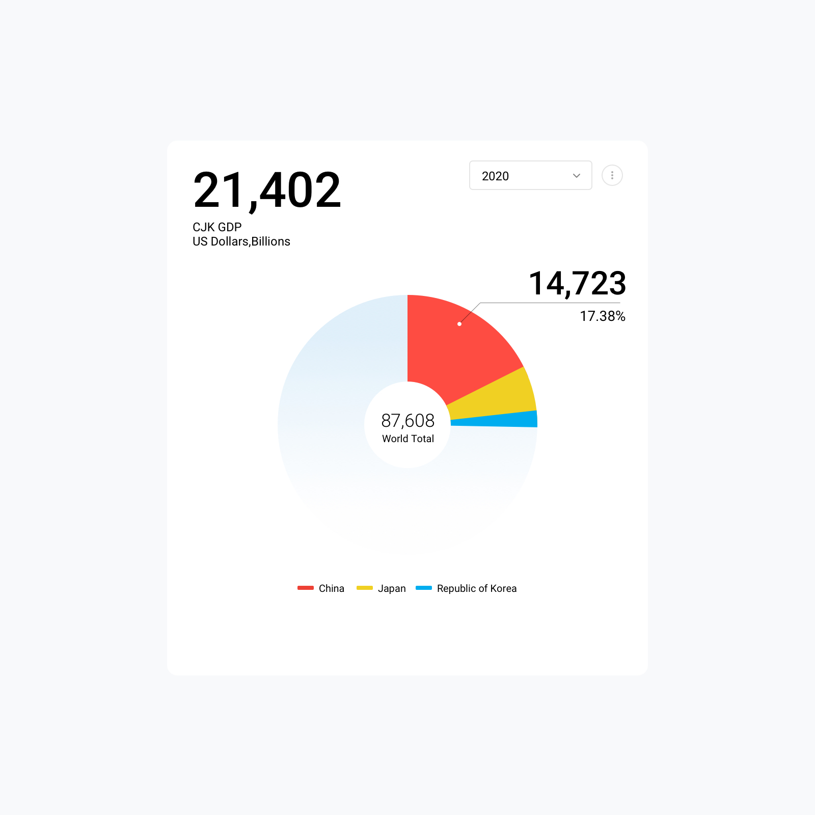 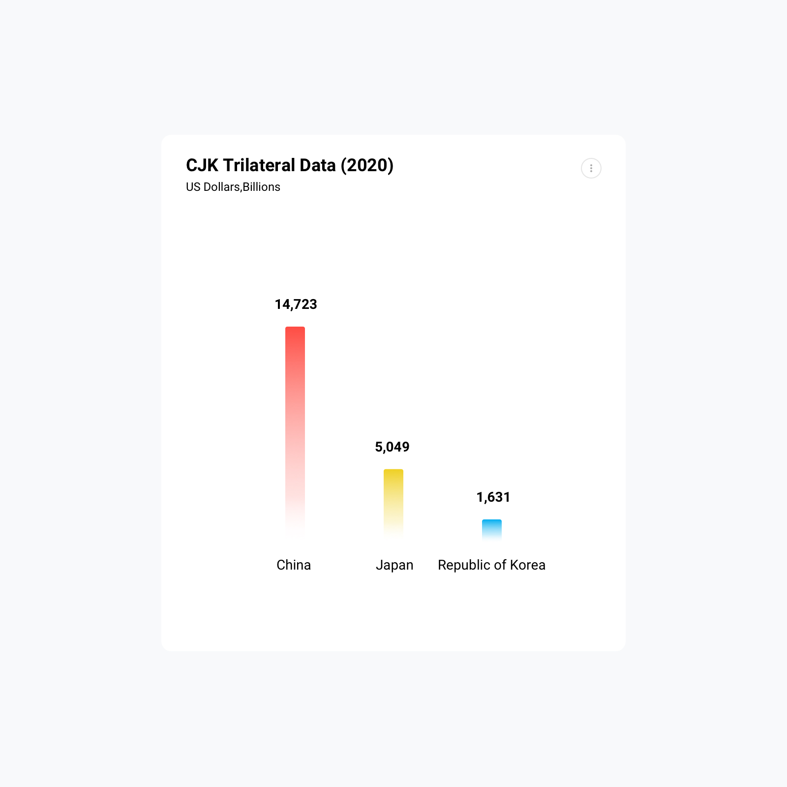 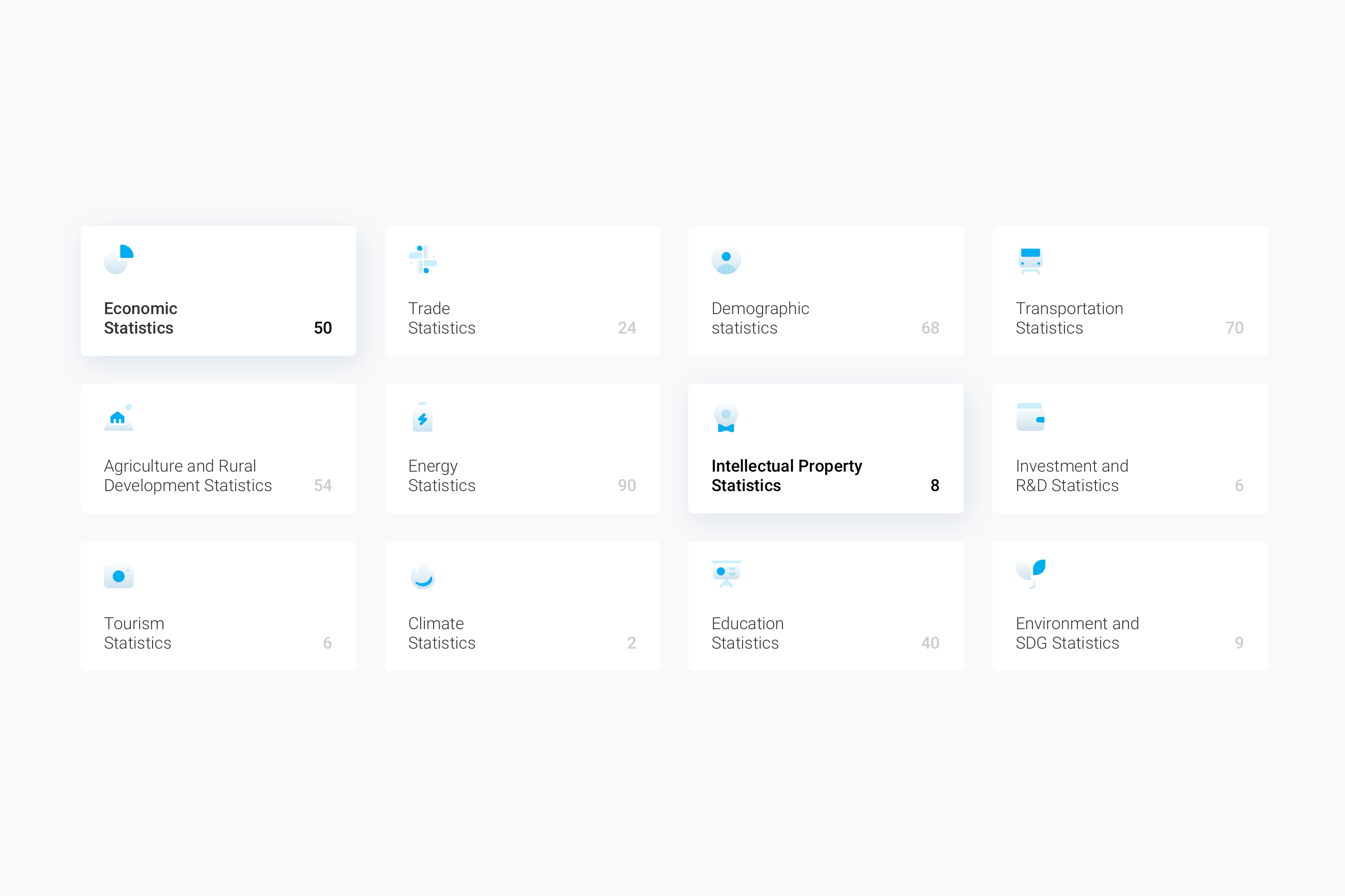 设计理念 让复杂的数据变得可以被理解。数据设计的价值并不在于制造更复杂的视觉,而在于降低信息理解的成本。 在 Trilateral Statistics 中,同一页面往往需要同时呈现三个国家,以及时间、人口、经济、贸易、产业等多个维度的数据。如果缺少统一的视觉规则,信息很容易变成大量彼此孤立的数字与图表。 因此,我们首先建立了一套统一的信息层级:从核心数字、趋势变化,到国家之间的横向比较,再到区域与全球维度的关系,让使用者能够按照自然的阅读路径逐步进入数据,而不是一次性面对全部信息。 设计最终承担的角色,是在数据与理解之间建立秩序。 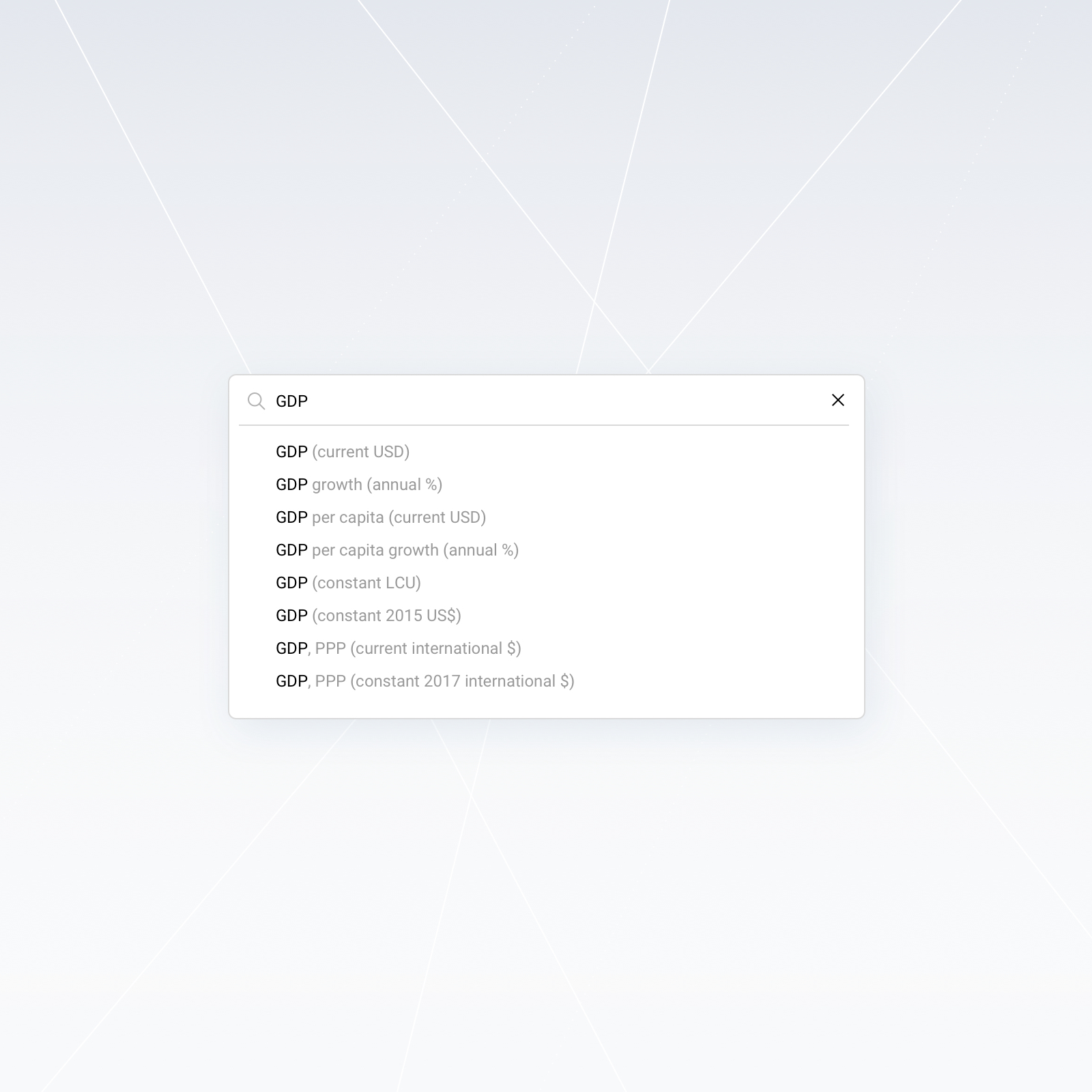 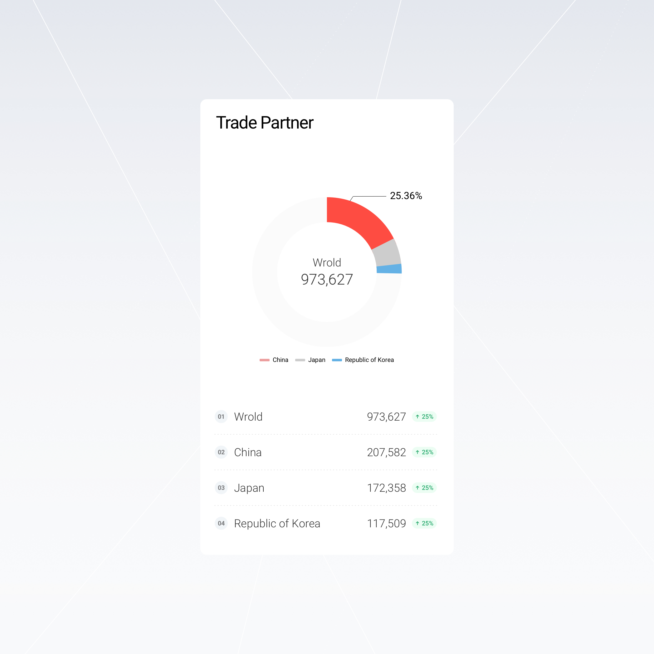    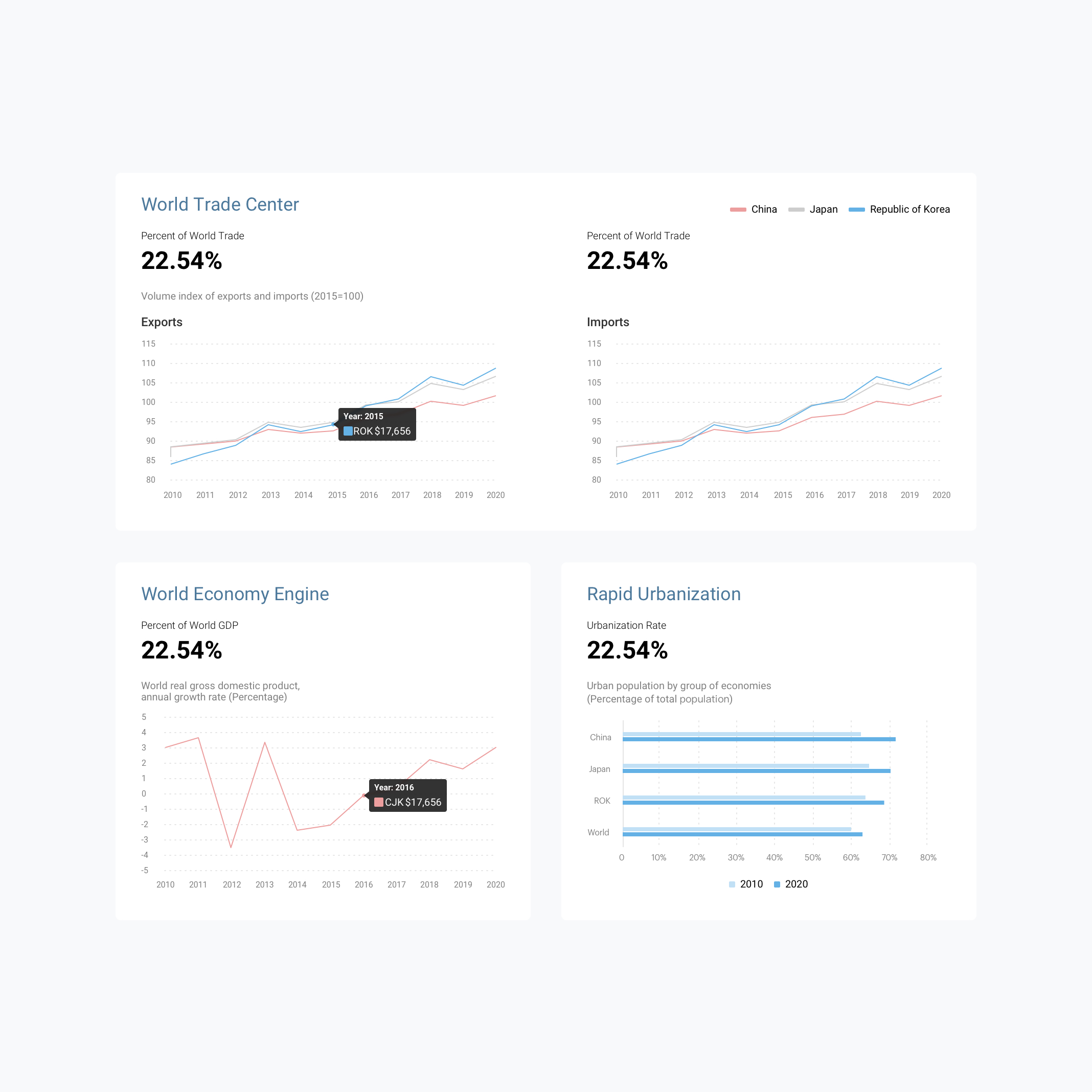 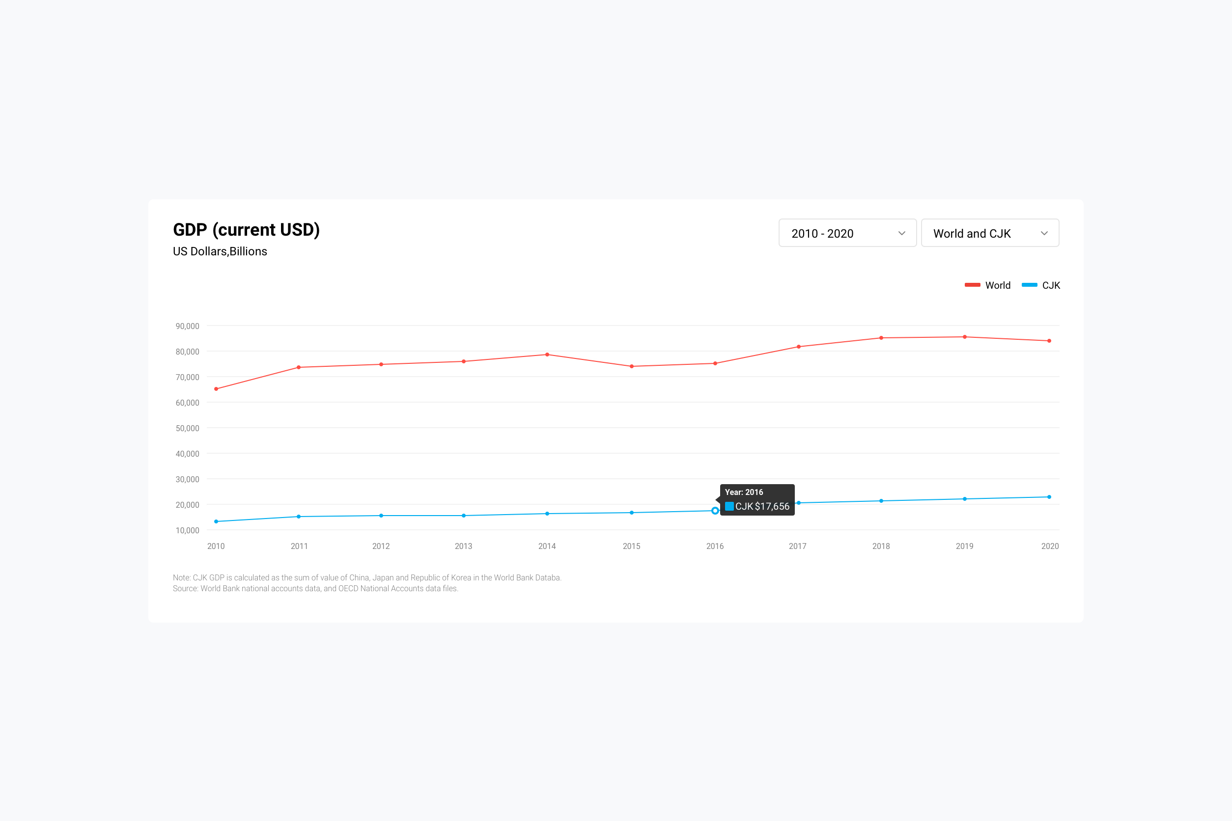 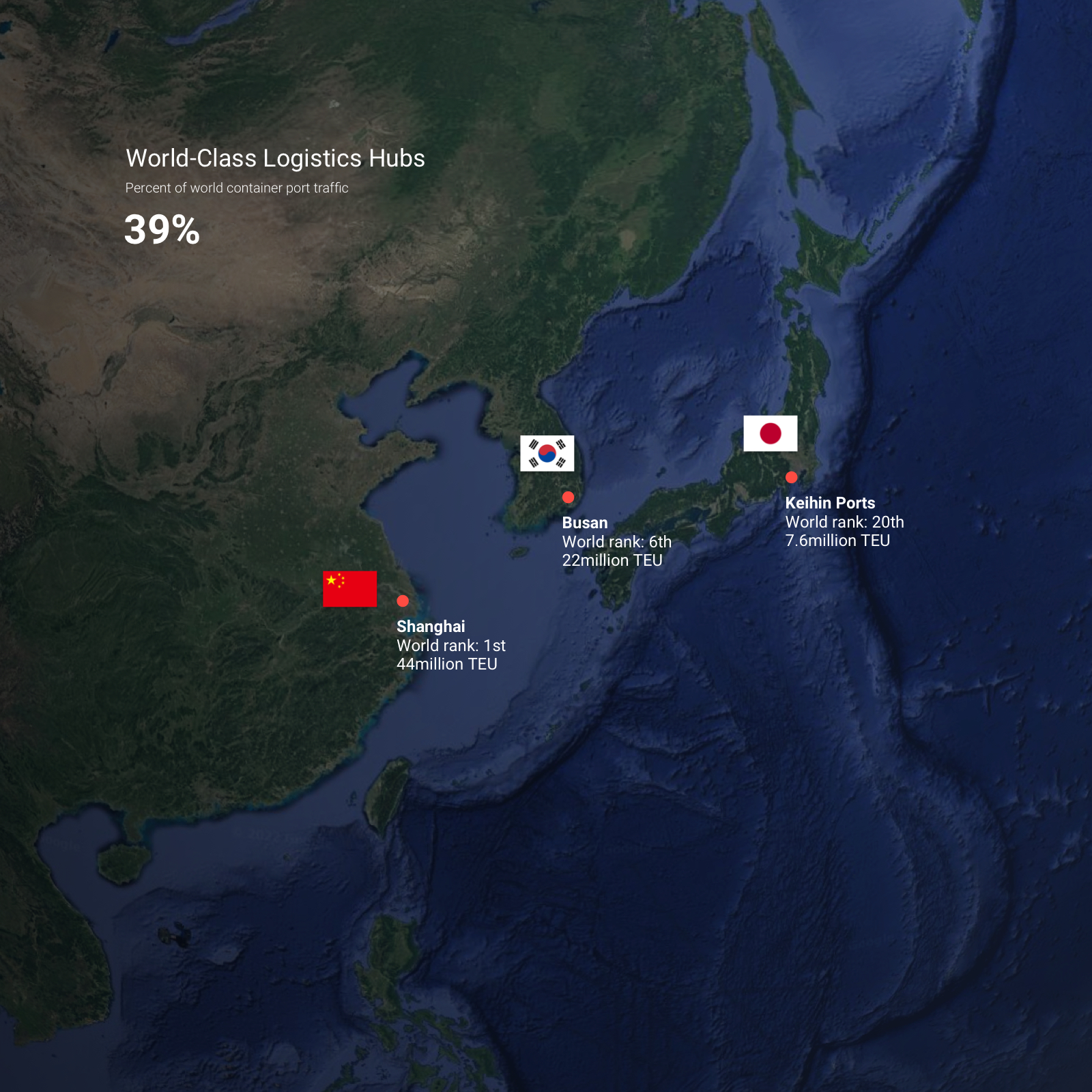 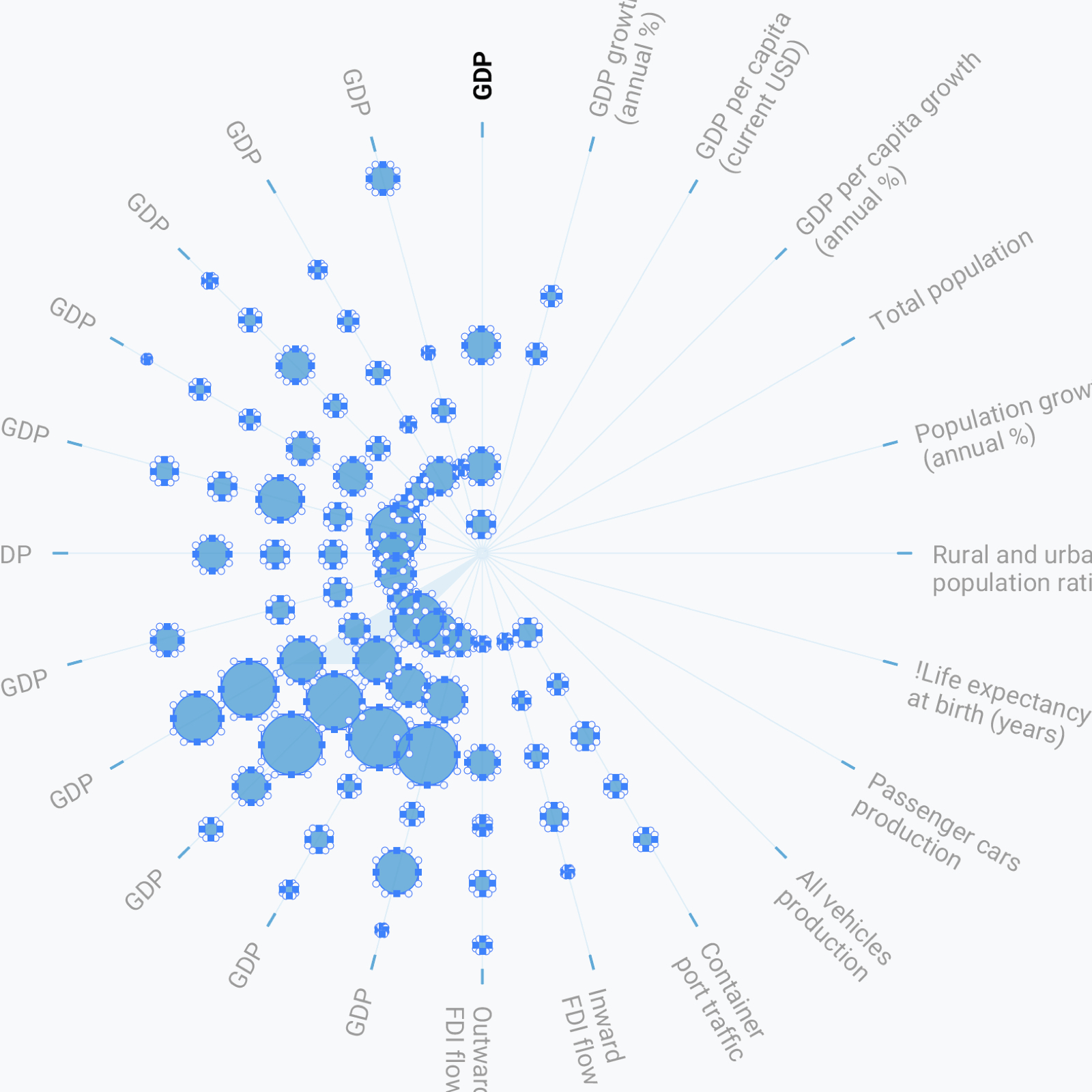 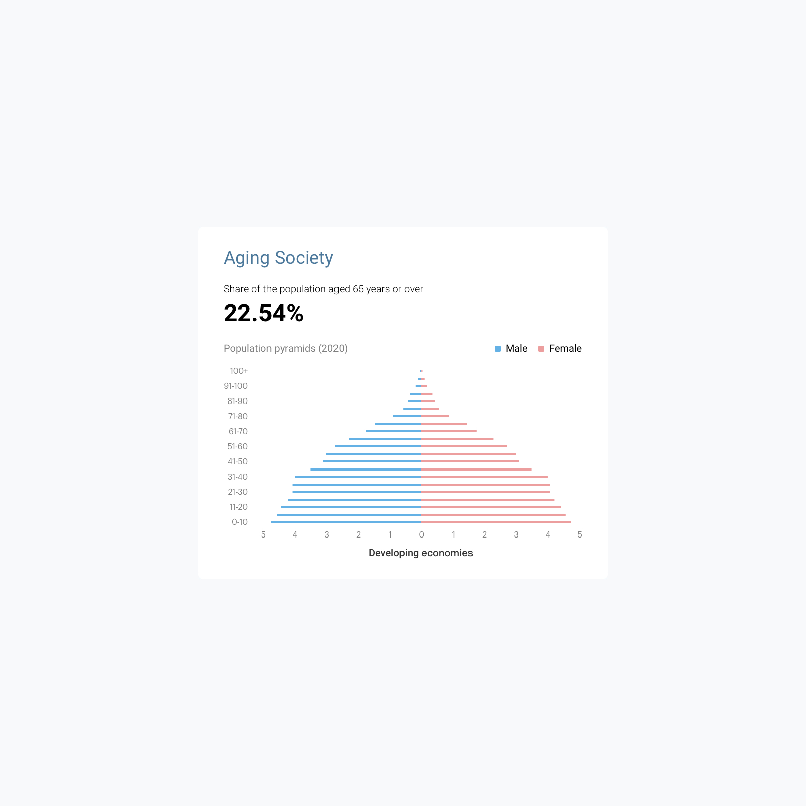 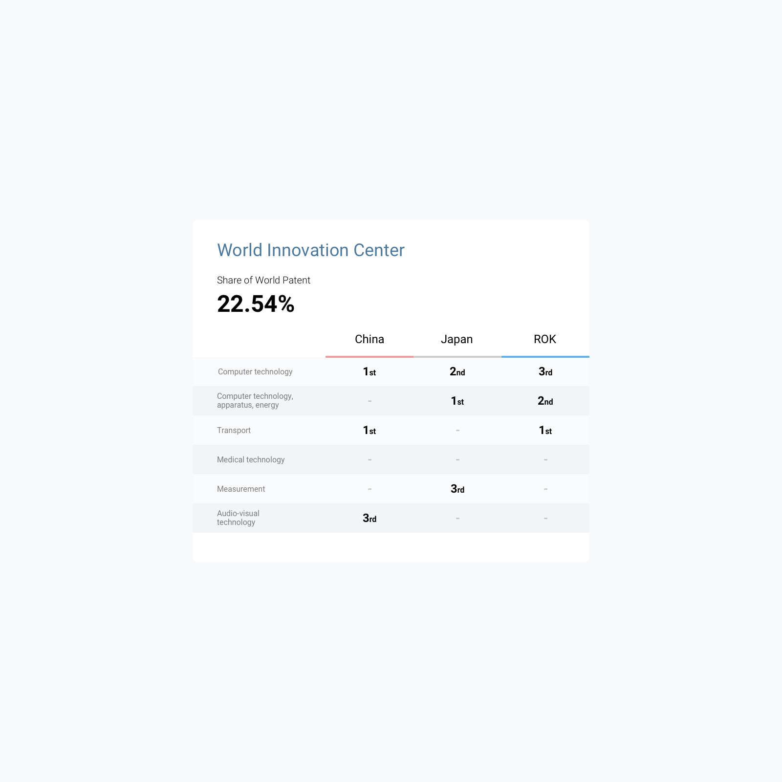 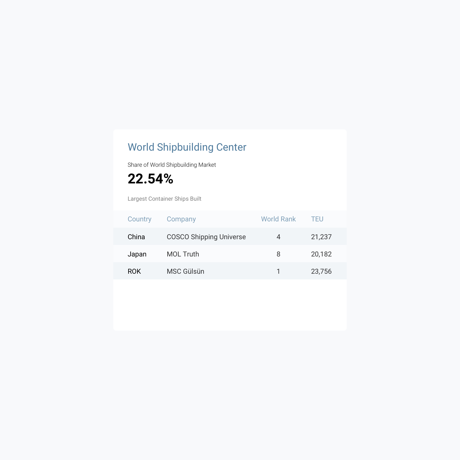 --- 三方关系 从“三个个体”到“一个整体” “三方”是整个视觉系统最重要的概念之一。 设计通过三个持续出现的视觉节点以及统一的几何关系,将中国、日本与韩国既作为三个独立的数据对象呈现,又让它们在视觉上形成一个彼此关联的整体。 这种关系也延伸到整个信息系统之中。不同颜色并不仅仅承担装饰作用,而是成为识别国家、数据类别与信息关系的重要编码方式。 用户即使进入不同的图表和页面,仍然能够快速识别信息属于哪一方,并理解三者之间的差异与联系。三个国家,三个数据维度,一套共同的视觉语言。 信息设计 建立统一的数据阅读规则 面对规模庞大的统计内容,我们建立了一套模块化的信息设计体系。数字、比例、排名、时间变化、结构组成、地理分布和国家关系被拆解为不同类型的信息组件,并针对各自的数据特征选择最合适的表达方式。 例如,关键指标通过大数字建立第一视觉层级;比例关系使用面积与环形图表达;时间变化使用趋势曲线;国家及区域关系通过地图呈现;涉及更复杂的数据结构时,则使用矩阵、关系网络以及放射式可视化。 不同形式并不是为了追求视觉变化,而是在回答同一个问题: 什么样的方式能够让这一组数据最快被理解? --- 数据可视化 从“展示数字”到“发现关系” 在传统统计资料中,数据往往以表格和数字的形式存在。但对于公共传播而言,仅仅准确并不足够,信息还需要能够被快速阅读、比较和记忆。 因此,我们将数据可视化作为整个设计系统的重要组成部分。 通过柱状图、趋势图、比例图、地图、关系网络以及多维数据图形,将抽象数字转化为更加直观的视觉关系,让用户不仅能够看到某一个数字是多少,数据由此不再只是静态结果,而成为可以被观察和探索的信息。 视觉语言 中立、理性,同时具有国际辨识度 作为一个服务于三国合作的国际组织项目,视觉系统需要避免过度强调任何单一国家的文化符号。因此,我们选择更加国际化、理性和中立的现代主义设计语言。 一套能够持续增长的视觉系统 随着年份更新、研究范围扩大以及数据维度不断增加,系统必须具备持续扩展的能力。因此这个项目从一开始就没有被设计成若干张孤立的图表,而是建立在模块化与系统化的基础上。 新的国家数据、新的年度数据以及新的统计维度,都可以在既有规则中继续生长,而无需重新建立一套视觉语言。 对我们而言,这也是信息设计非常重要的一点:设计的不只是今天需要呈现的内容,而是一套能够承载未来内容的规则。 ## English Content ### Introduction China, Japan and South Korea are among the most important economies in East Asia, and there is a large amount of continuously updated data among the three countries in the fields of economy, population, trade, and social development. The China-Japan-Korea Cooperation Secretariat has launched a series of Trilateral Statistics, hoping to provide a more intuitive presentation of the development trends of the three countries and the relationship between the three countries as a whole and other regional economies through a unified data system. STOYARD established a set of overall design language for this project, from visual identification, information hierarchy to data visualization. In the face of a large number of data from different sources, different scales and different dimensions, we do not understand design as simply "beautifying charts", but rethink how information should be organized, read and compared. Through restrained visual language, uniform color coding, clear grid structure, and modular data components, the entire system enables complex statistics to maintain consistent reading logic across different pages and data scenarios.   Efficient, promote, develop 1 In the letter structure, we designed three dots. Assuming that the whole structure is the terrain of the world and represents three countries in different colors, the location of the dots exactly corresponds to the approximate geographical location of China, Japan and South Korea on the world map. 2 Dots are designed with a tail, and the blue gradient disappears, making LOGO visually have some sense of speed and hierarchy, and have a spatial three-dimensional effect. 3 The overall color is mainly simple and fresh, which is unified with the main color of the data port website. The color of the three dots is bright color with higher saturation, breaking the state of single color, adding dynamic and interesting feeling to the picture, representing that the data port has both digital rationality and humanistic care. 4 We redefine the spatial relationship through the changes of design points and lines. This pursuit of change also symbolizes the concept of China, Japan and South Korea working together to pursue efficient and rapid development.    Design Concept Make complex data understandable. The value of data design is not to create more complex visuals, but to reduce the cost of information understanding. Make complex data understandable. The value of data design lies not in creating more complex visuals, but in reducing the cognitive burden of information comprehension. In Trilateral Statistics, the same page often needs to present data for three countries simultaneously, covering multiple dimensions such as time, population, economy, trade, and industry. Without unified visual guidelines, information easily devolves into a multitude of isolated numbers and charts. Therefore, we first established a unified information hierarchy: starting with key metrics and trend developments, moving on to cross-country comparisons, and finally exploring the relationships at regional and global scales—enabling users to progressively engage with the data along a natural reading path, rather than being confronted with all the information at once. Ultimately, the role of design is to establish order between data and understanding.             --- tripartite relationship From "Three Individuals" to "One Whole" The "three-way" is one of the most important concepts of the entire visual system. The design presents China, Japan and South Korea as three independent data objects through three continuous visual nodes and a unified geometric relationship, and makes them form an interrelated whole visually. This relationship also extends to the entire information system. Different colors do not only play a decorative role, but become an important coding method to identify countries, data categories and information relationships. Even if users enter different charts and pages, they can still quickly identify which party the information belongs to and understand the differences and connections between the three. Three countries, three data dimensions, a common set of visual languages. Information Design Establish uniform data reading rules In the face of large-scale statistical content, we have established a set of modular information design system. Numbers, proportions, rankings, temporal changes, structural composition, geographical distribution and country relations are broken down into different types of information components, and the most appropriate expression for each data characteristic is selected. For example, key indicators establish the first visual hierarchy through large numbers; proportional relationships are represented using area and ring charts; time changes use trend curves; country and regional relationships are presented through maps; and when more complex data structures are involved, matrices, relationship networks, and radial visualizations are used. Different forms are not in pursuit of visual change, but to answer the same question: What is the fastest way to understand this set of data? --- Data visualization From "showing numbers" to "discovering relationships" In traditional statistics, data often exist in the form of tables and numbers. But for public communication, accuracy alone is not enough; information also needs to be able to be read, compared and memorized quickly. Therefore, we consider data visualization as an important part of the overall design system. Through bar charts, trend charts, scale charts, maps, relationship networks, and multi-dimensional data graphs, abstract numbers are transformed into more intuitive visual relationships, allowing users to see not only what a certain number is, but also data that is no longer just a static result, but information that can be observed and explored. visual language Neutral, rational and internationally recognizable As an international organization project serving the cooperation of the three countries, the vision system needs to avoid overemphasizing the cultural symbols of any single country. Therefore, we choose a more international, rational and neutral modernist design language. A visual system capable of sustained growth As the years update, the scope of research expands, and the data dimensions continue to increase, the system must have the ability to continue to expand. Therefore, from the beginning, the project was not designed as a number of isolated diagrams, but on the basis of modularization and systematization. New national data, new annual data, and new statistical dimensions can all continue to grow within existing rules without having to re-establish a visual language. For us, this is also a very important point of information design: the design is not just the content that needs to be presented today, but a set of rules that can carry the content of the future.