# 怡耀科学仪器 / 生命科学应用方案专家 - ID: 430 - URL: https://www.stoyard.com/works/430 - English URL: https://www.stoyard.com/en/works/430 - Year: 2025 - Cover: https://static.glabcms.stoyard.com/stoyard/project/cover/20260906/yf530l4erd.png - Categories: 行业领域:医疗仪器,医药健康, 服务内容:品牌升级(Brand)、视觉创意与传播(Visual & Creative Design) - English Categories: Type of industry field:Biotech,Healthcare, Service Content:Brand Design & Rebranding、Visual & Creative Design - Author: STOYARD - English Author: STOYARD - Publish: 2026-09-05 - Editor: STOYARD BEIJING ## 中文主体 ### 项目简介 怡耀科学仪器2006年在香港建立,总部位于上海, 怡耀长期服务于生命科学领域,在专业设备、技术支持与科研服务之间建立起持续而稳定的连接。随着业务发展,品牌需要的不只是一次视觉上的更新,而是一套能够更准确表达其专业属性、技术能力与未来方向的品牌语言。 STOYARD 从怡耀所处的生命科学语境出发,对品牌识别、图形语言、色彩体系与应用方式进行了重新梳理。我们希望在保留科学仪器行业所需要的准确、理性与可信赖感的同时,减少传统科研品牌中过度严肃和工具化的表达,为品牌建立更开放、更具有现代科技感的视觉形象。 最终形成的并不是一个孤立的标志,而是一套可以持续生长的品牌视觉系统。从核心图形到色彩、信息层级,再到不同媒介中的延展应用,各个元素遵循统一的设计逻辑,使品牌能够在产品、数字界面、传播物料与线下场景中保持稳定而清晰的识别。 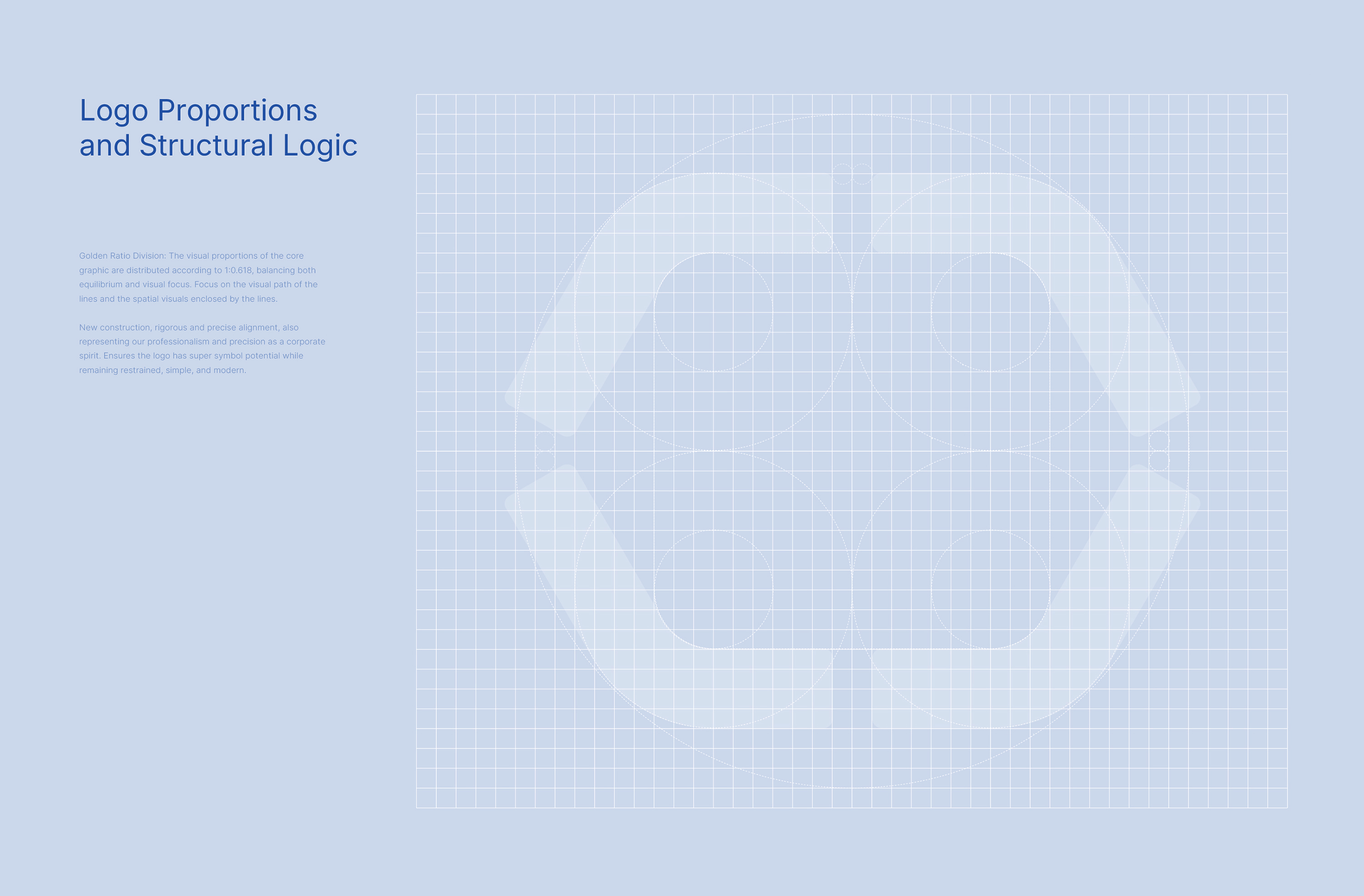 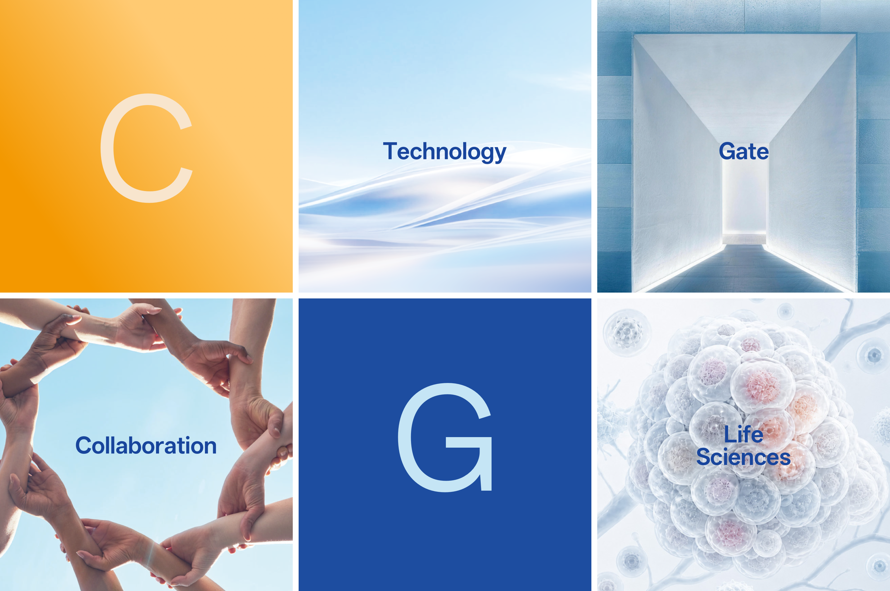 Design Challenge 如何让专业,被更直观地感知? 让技术成为入口 让链接推动探索 生命科学领域天然具有较高的专业门槛,但专业并不意味着复杂。我们希望新的品牌既能够传递科学、可靠与严谨,也避免传统科学仪器品牌中过度冰冷、技术化的表达。设计需要在专业可信、国际化表达、视觉识别与长期应用能力之间找到平衡,让怡耀从单一的企业标识,逐渐形成一个能够支撑产品、传播与未来业务发展的品牌系统。 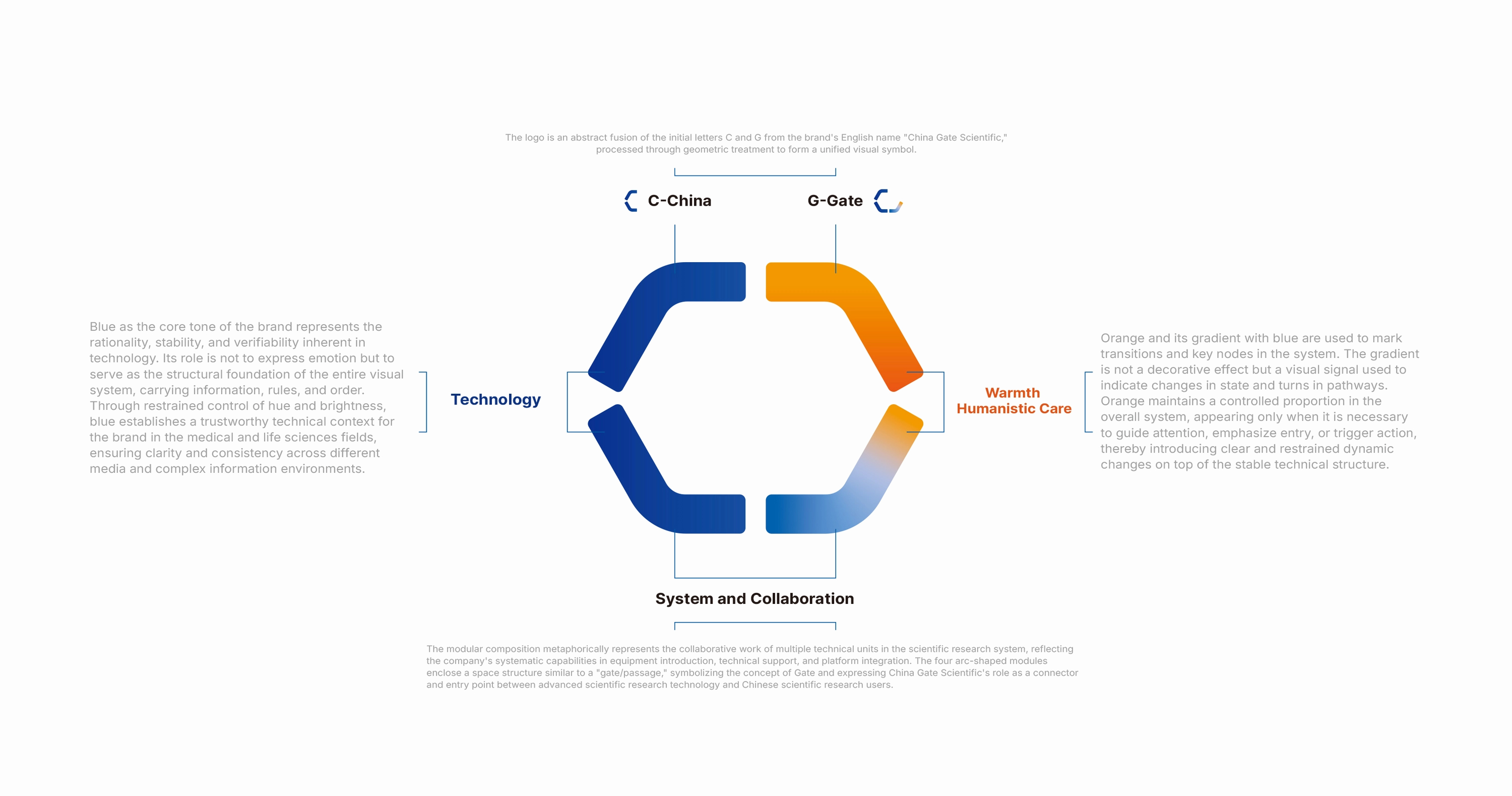 Core Idea — GATE 以“Gate”建立品牌的核心视觉隐喻 品牌名称中的 China Gate 为整个视觉系统提供了一个重要线索。 我们从字母 C 与 G 的结构关系出发,将“Gate”理解为一种连接与进入:它既代表从外部进入科学世界的入口,也象征企业连接技术、产品、客户与应用场景的角色。通过圆形、切口与开放结构的组合,标志形成一种持续向外延展的状态。Enter、Connect、Transition 由此成为品牌视觉语言背后的三个关键词——进入、连接,并推动新的可能发生。 [Video](https://static.glabcms.stoyard.com/stoyard/gallery/20260907/49esg8e74d3.mp4) 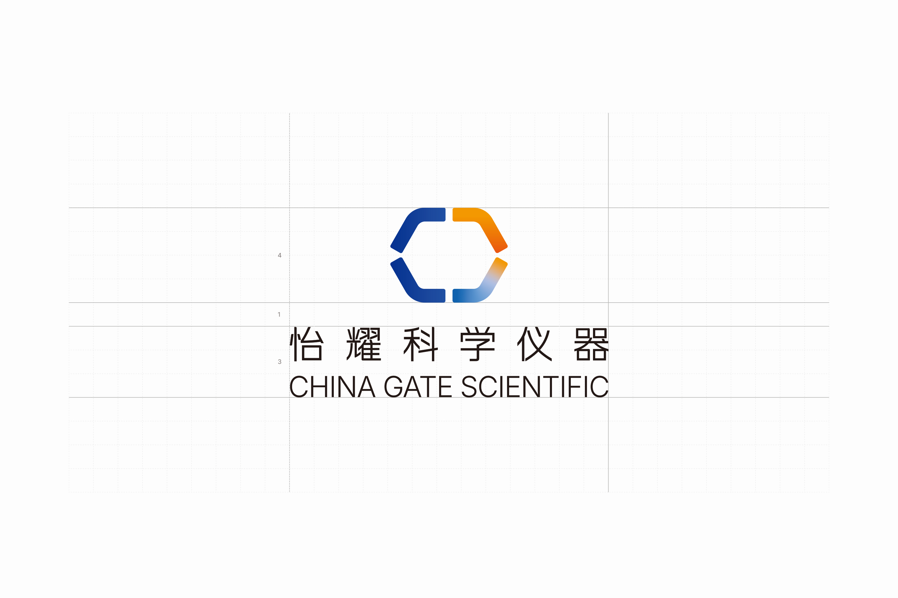 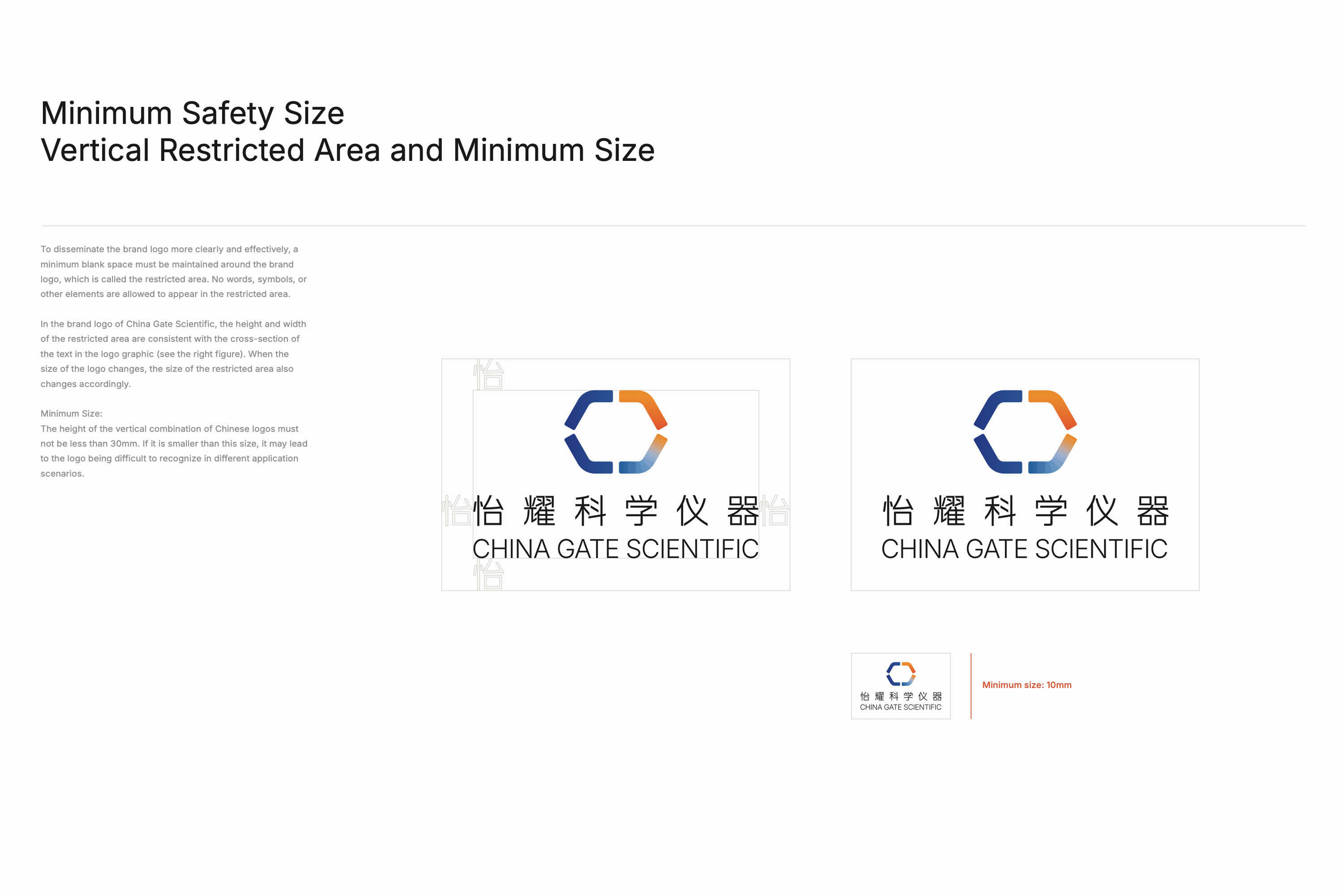 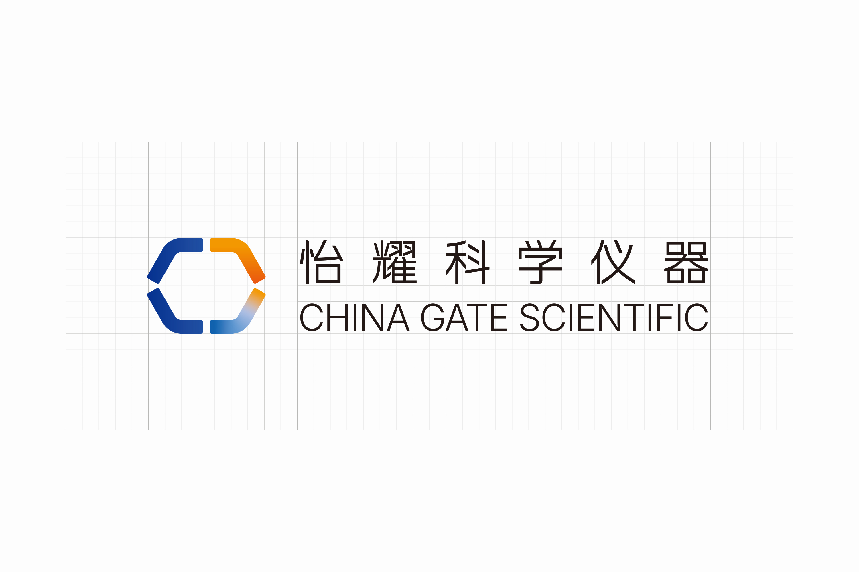 Color System 用颜色角色,而不是颜色数量建立秩序 怡耀的色彩系统并不依赖丰富的颜色数量,而是通过不同颜色承担明确的视觉角色。品牌核心蓝色建立专业、理性与科学感;更轻、更柔和的辅助色用于承载信息与不同应用场景;少量高识别度的强调色则出现在关键内容与传播节点中。 Single Anchor:稳定、清晰的蓝色建立科学与专业感; Material Color:更轻、更柔和的色彩承担不同信息与应用场景; Accent Color:在关键节点中提供视觉强调与活力。 通过对明度、饱和度与使用比例的控制,整套色彩在不同媒介之间保持稳定一致,同时为品牌保留足够的层次与变化。这样的色彩策略既避免了传统科技品牌过于冰冷和单一的视觉印象,也让品牌在产品、数字界面与传播物料中拥有更灵活的延展能力。 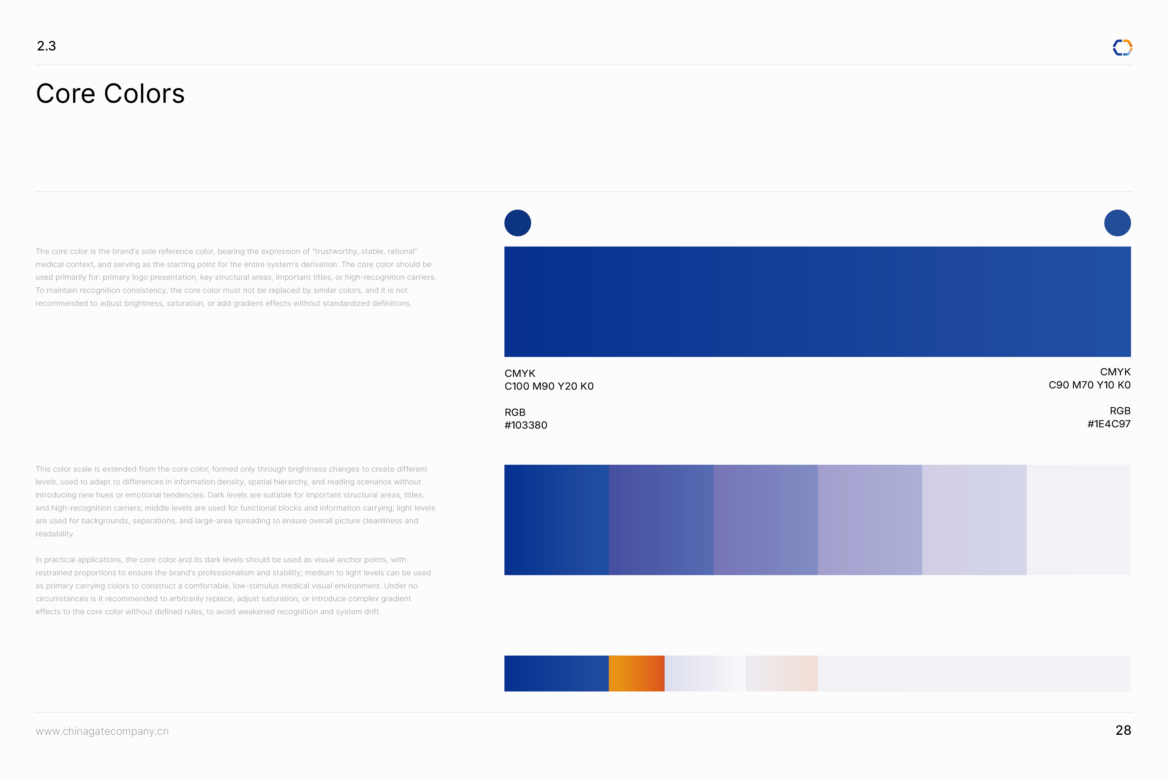 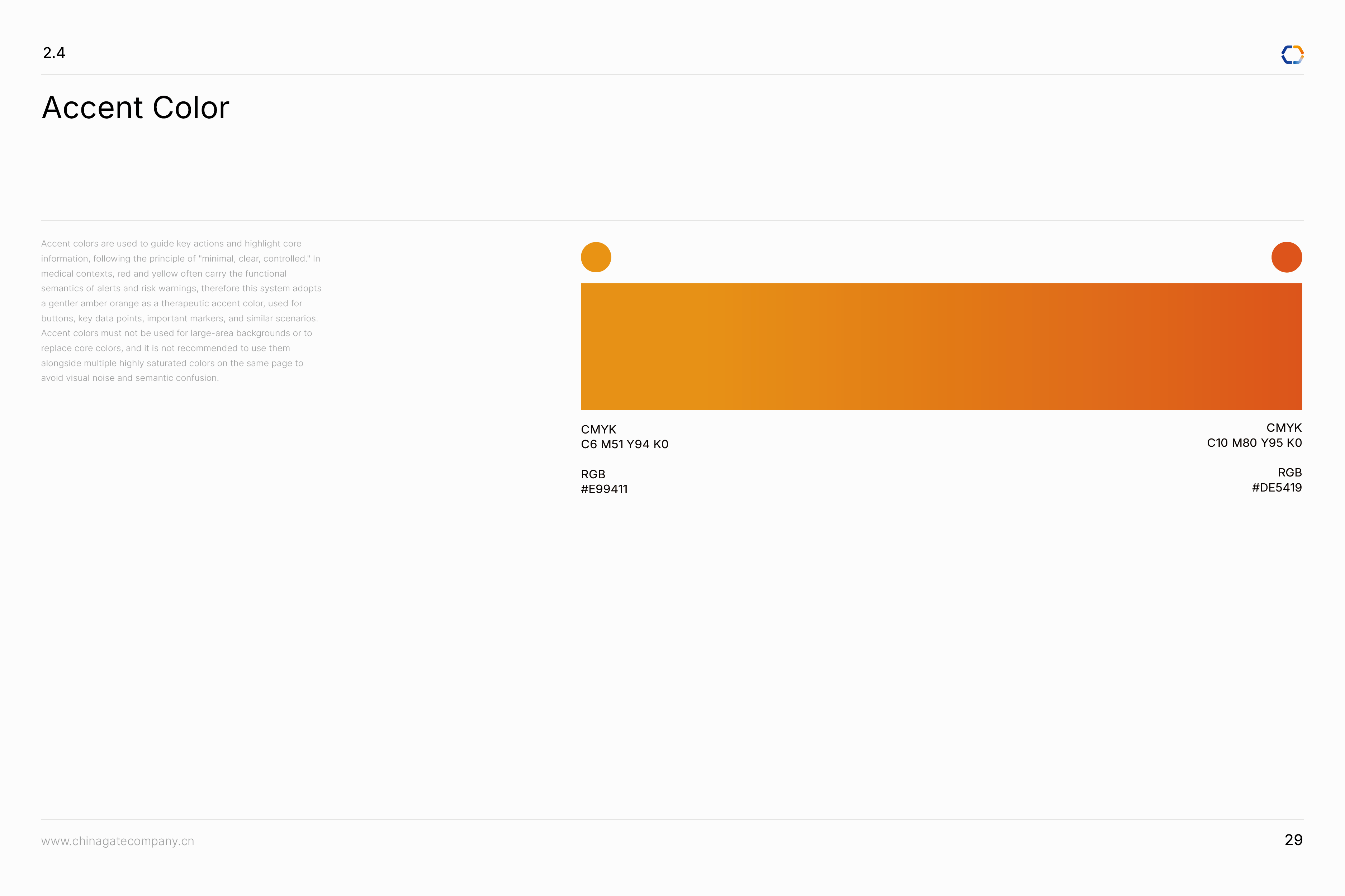  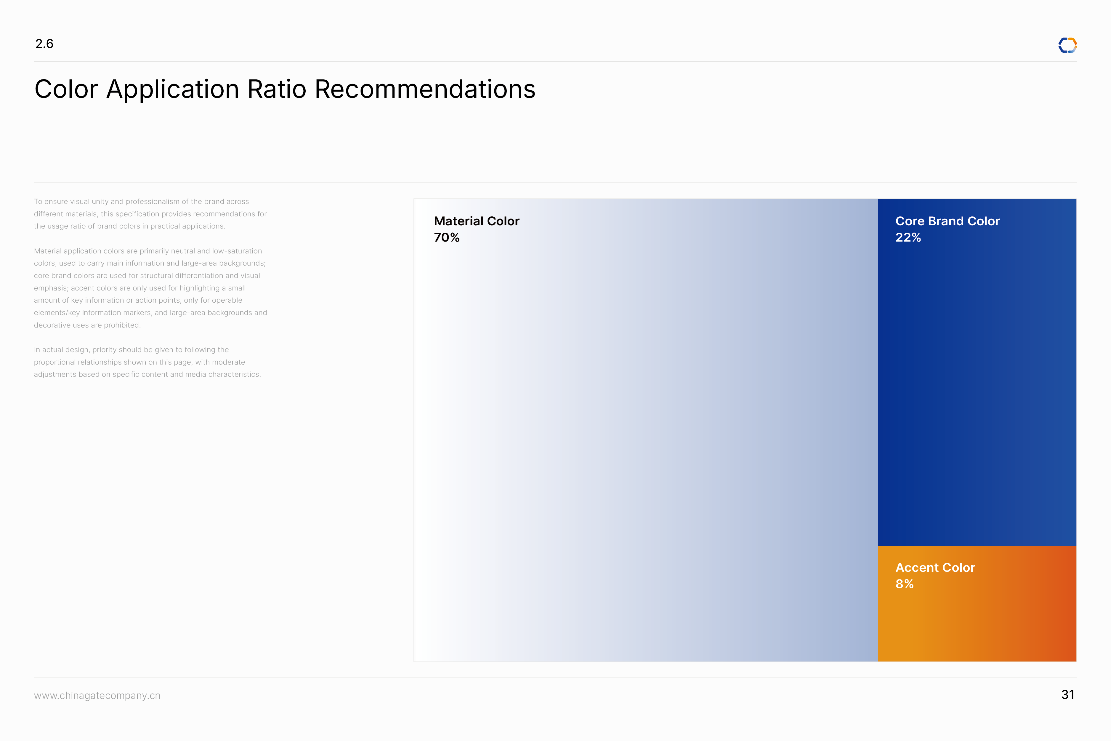 Typography 在理性结构中建立品牌独有的文字识别 怡耀科学仪器的中文标准字以精密、理性与现代感为核心,将传统汉字结构进行适度几何化与秩序化处理。通过收束笔画、调整字面比例、强化横竖结构与留白关系,使字体在保持清晰识别的同时,呈现出接近科学仪器与工程系统的精确感。字形并没有刻意追求强烈的未来主义表达,而是以克制的笔画和稳定的结构建立专业可信的品牌气质,并与标志中的开放结构、圆角转折与模块化几何语言形成呼应。 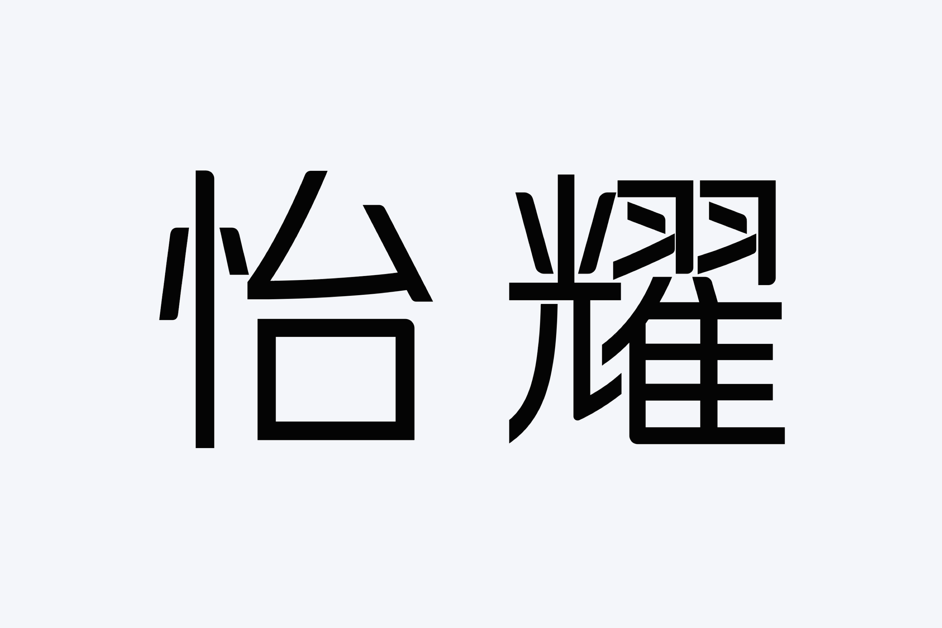 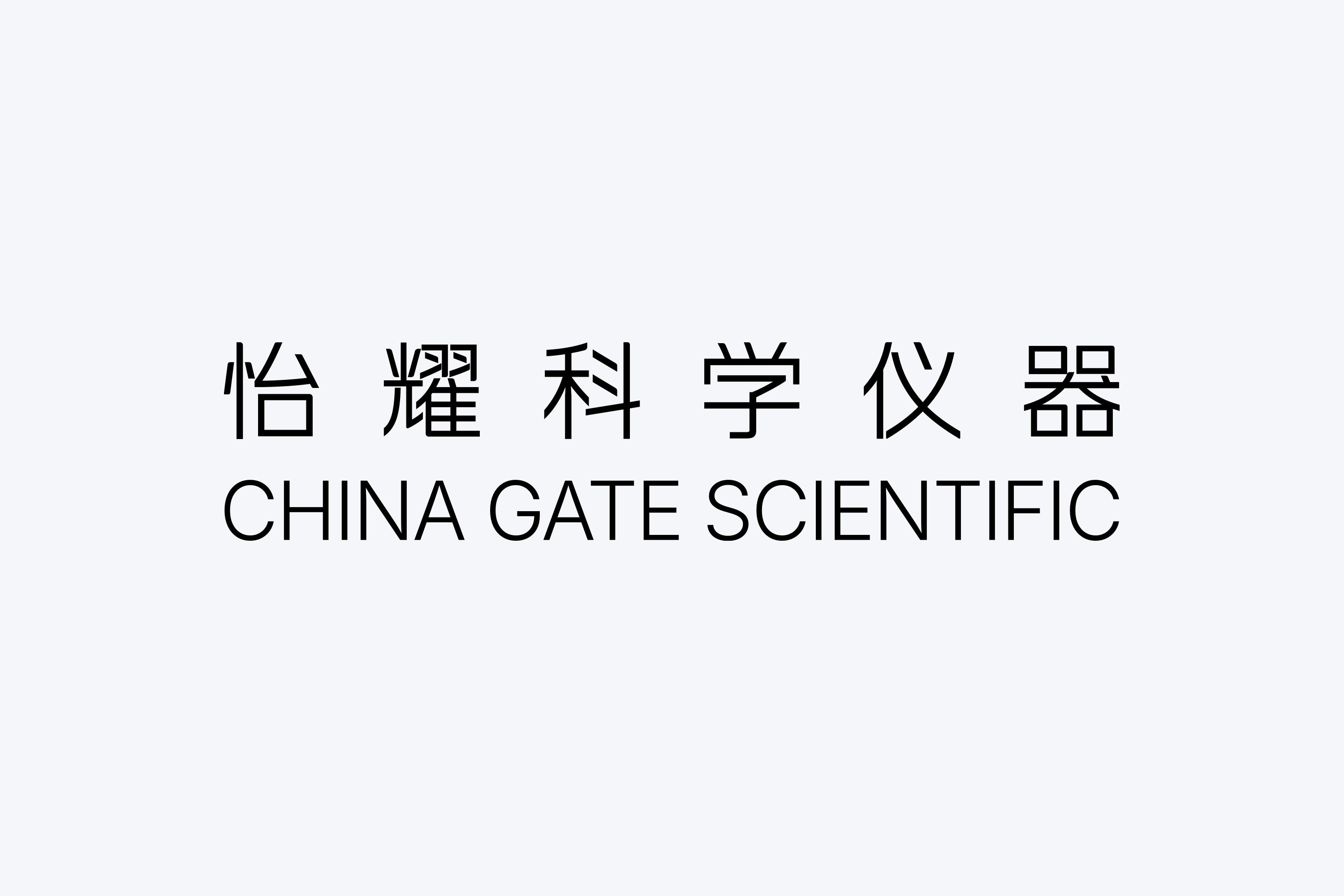 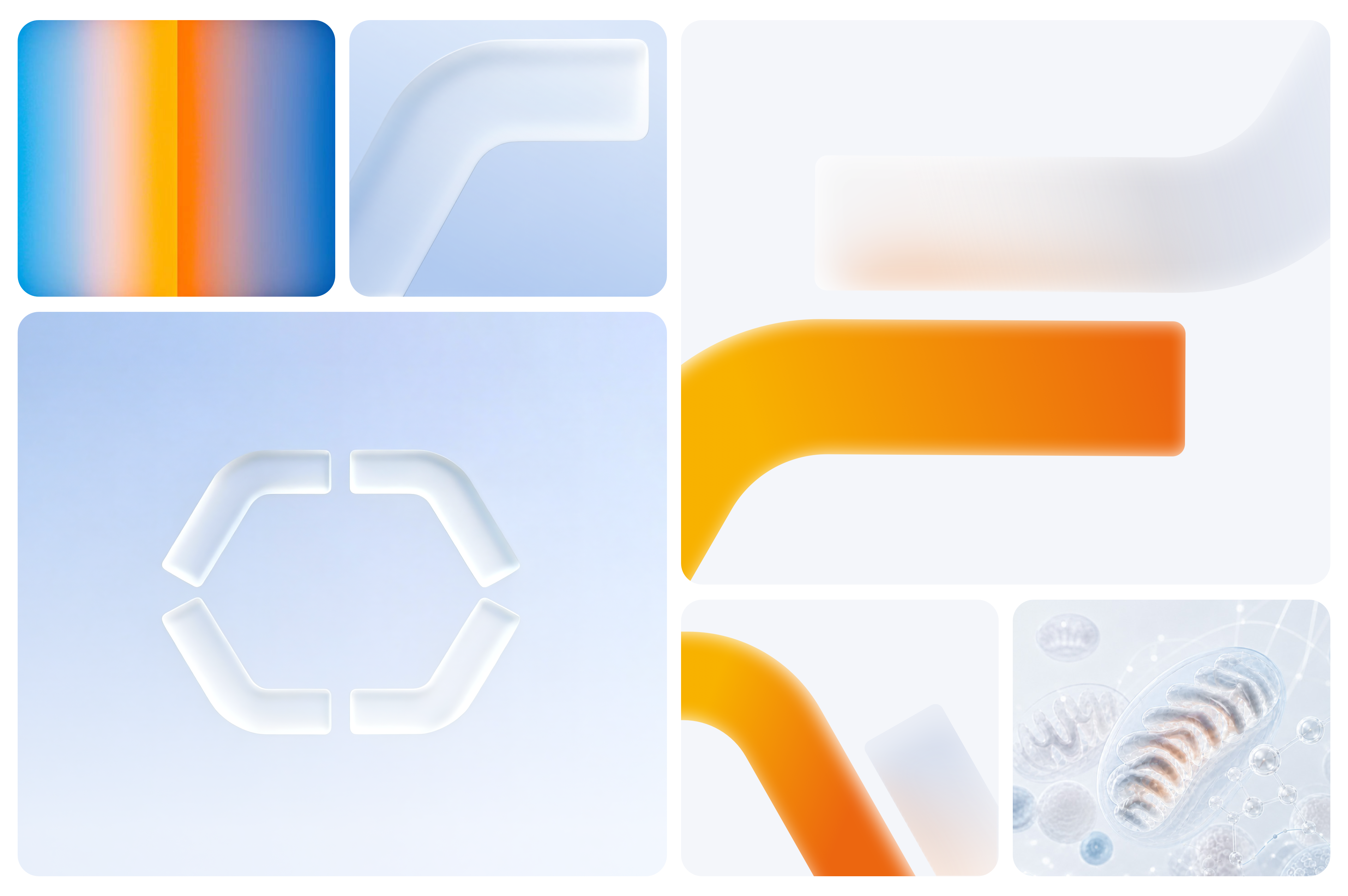 Visual Identity 从一个符号,发展为一套可持续的识别系统 标志并不是一个孤立的图形。 围绕 C、G 与 Gate 的几何关系,我们进一步建立了品牌文字、比例、网格与基础图形结构。圆形与开放边界不断出现在不同视觉场景中,使品牌即使脱离完整 Logo,也能够保持稳定的识别特征。这种几何语言既保留了科学仪器所需要的精密感,也为未来的应用留下更多开放、流动与想象的空间。 [Video](https://static.glabcms.stoyard.com/stoyard/gallery/20260906/41njktz50r5.mp4) 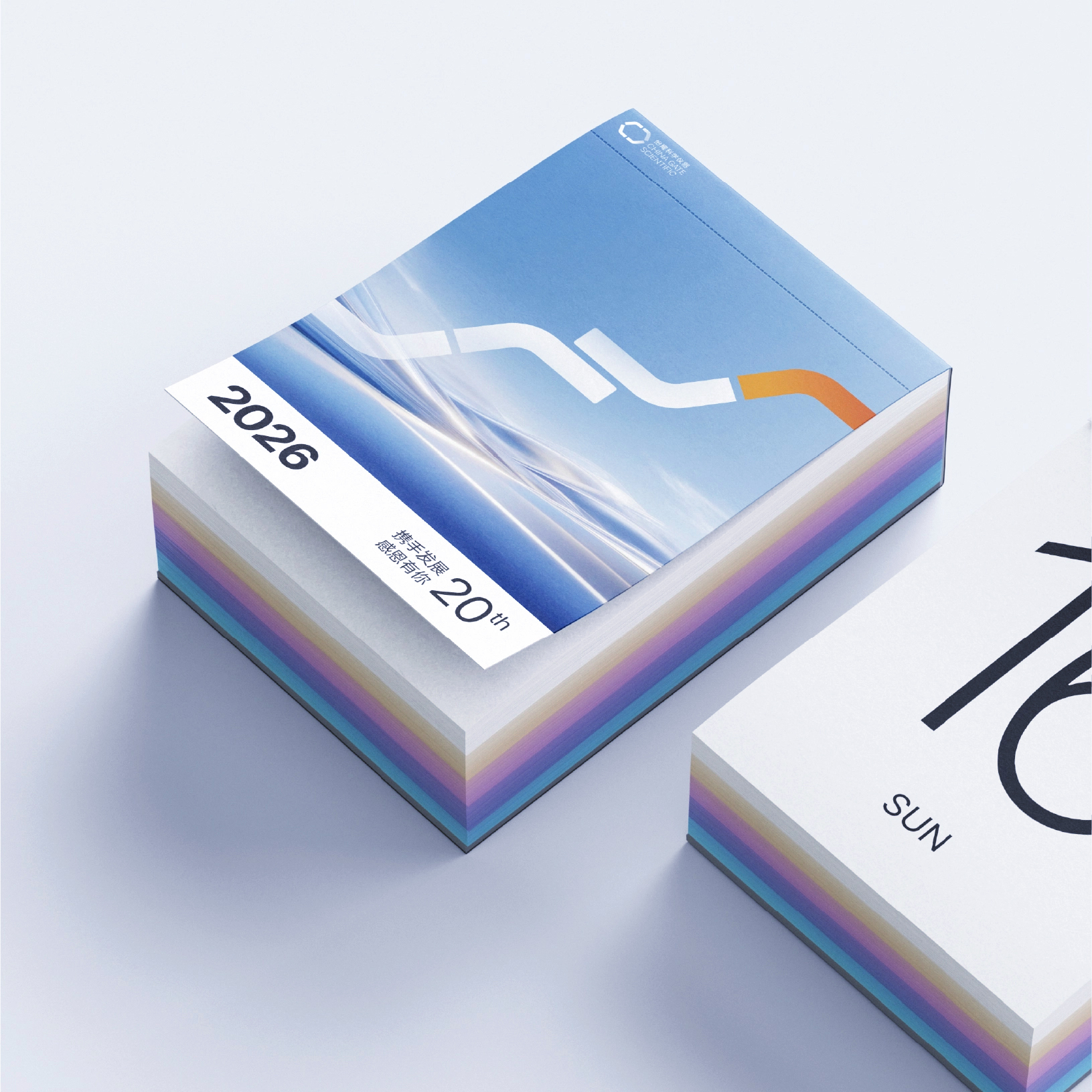  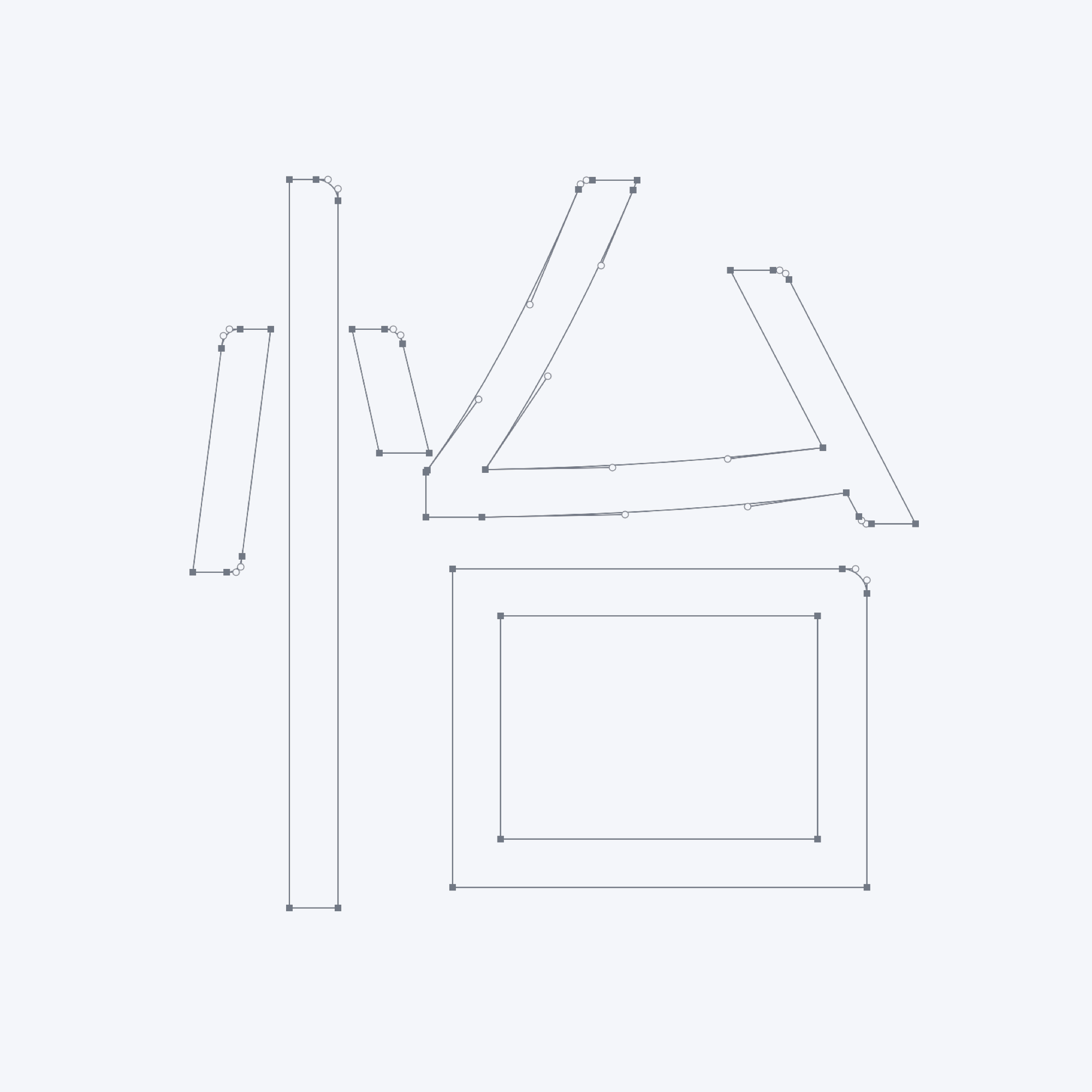 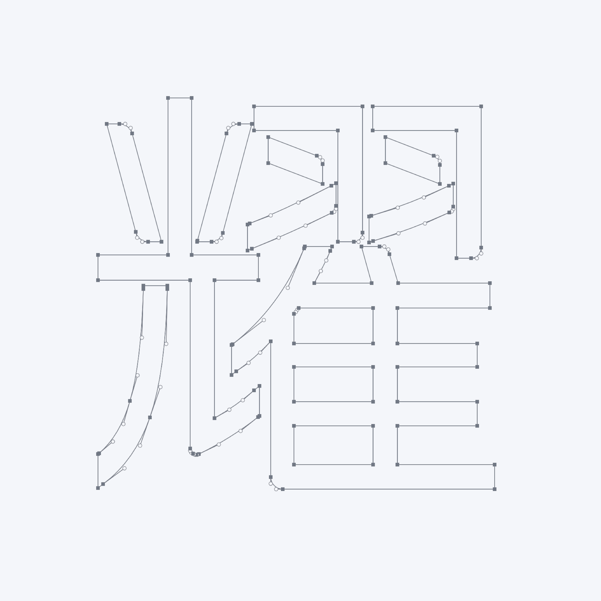  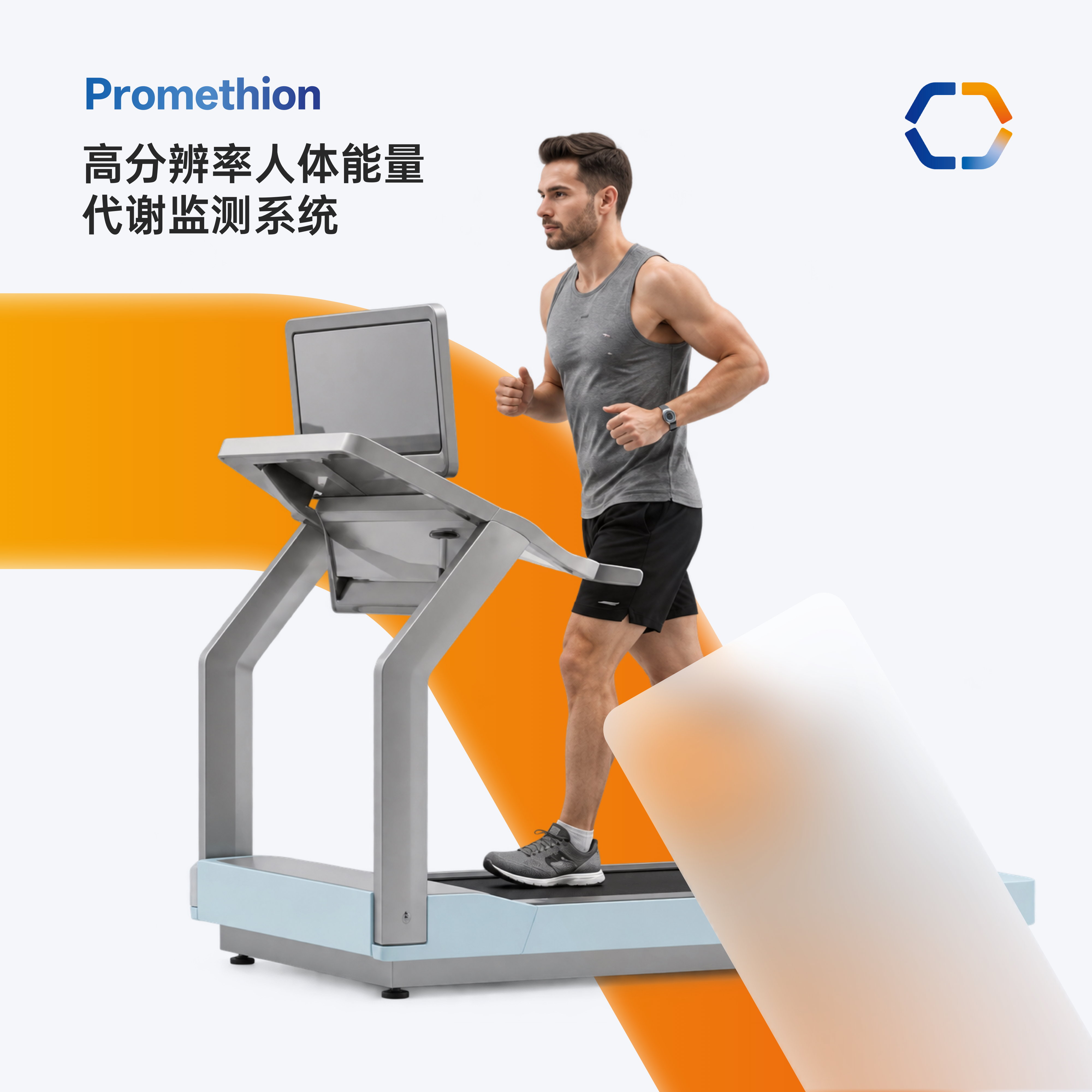 Brand Language 让品牌语言进入图形、空间与信息表达 在核心视觉基础上,我们继续将“开放、连接、流动”的概念延展至版式、图形、空间与图片语言之中。弧线、圆形边界与开放结构被转化为视觉容器、信息分区与空间关系;克制的留白与清晰的信息层级则强化科学品牌所需要的秩序感。品牌因此不再依赖 Logo 被识别,而是通过一系列一致的视觉特征,让不同内容自然属于同一个系统。 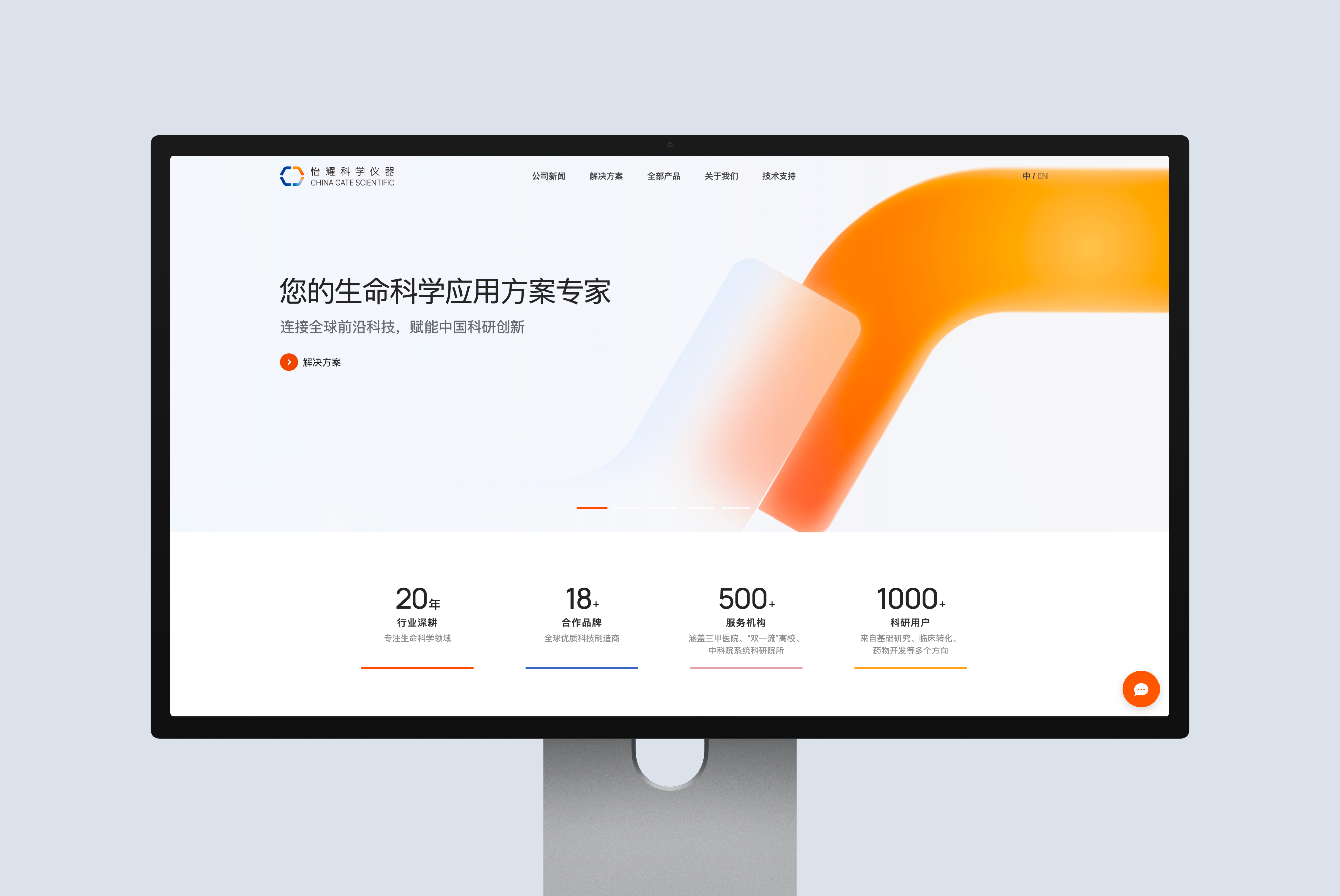  Applications 让视觉系统进入真实的品牌触点 品牌系统被进一步应用于网站,数字业务系统,产品资料、宣传画册与企业传播等不同场景。在保持统一识别的同时,我们根据不同媒介的信息密度与传播目标调整版式,使品牌能够在持续运营中保持一致而富有变化。 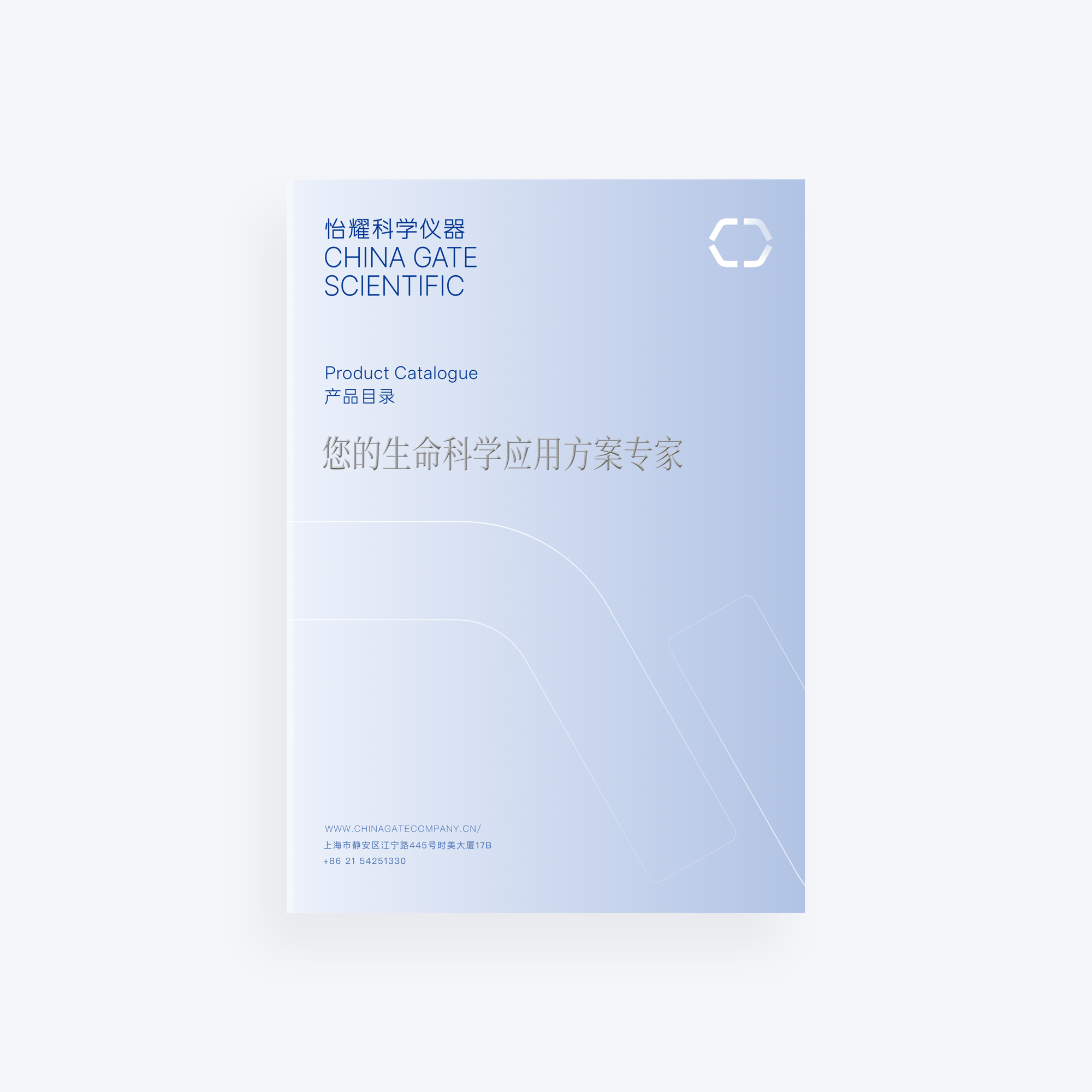 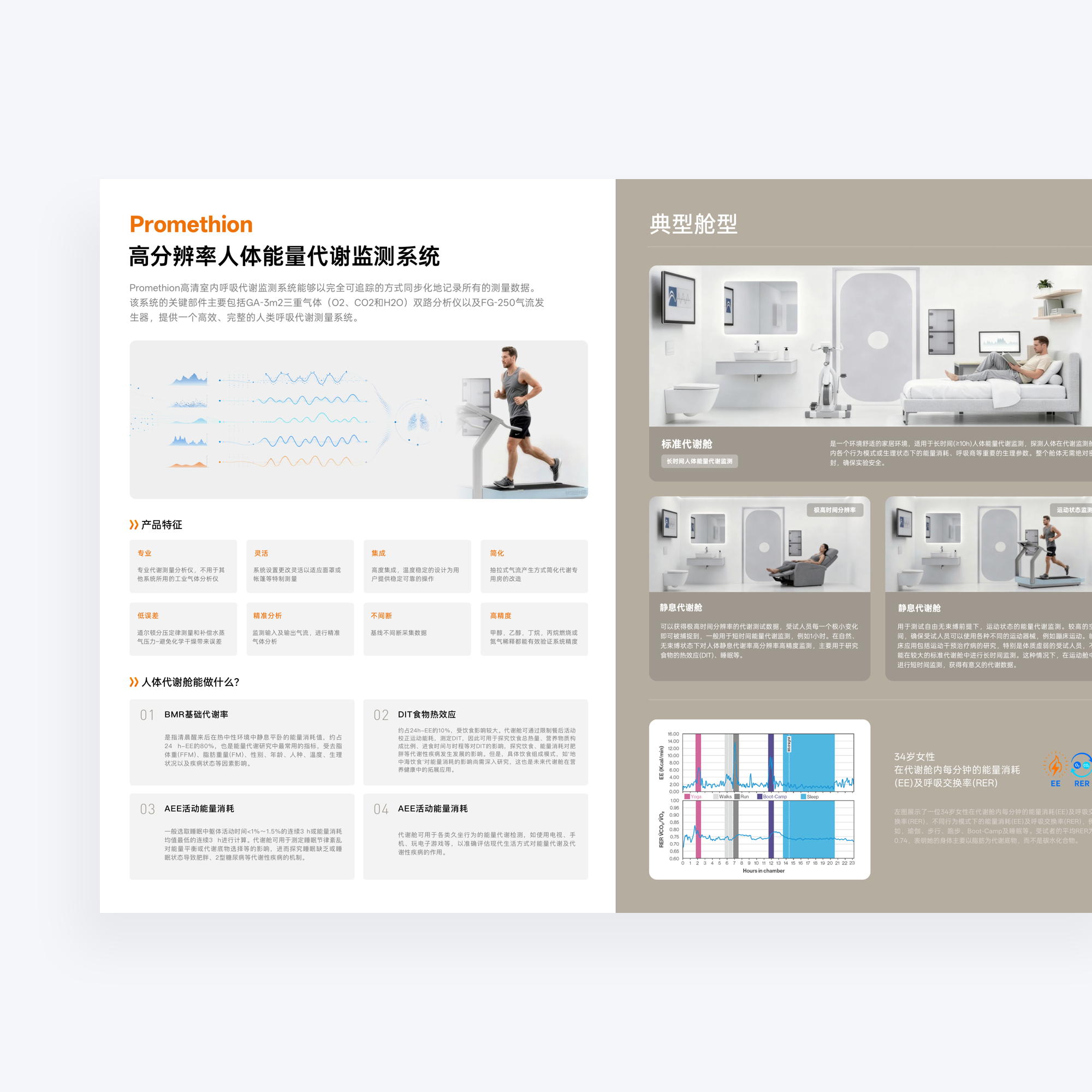 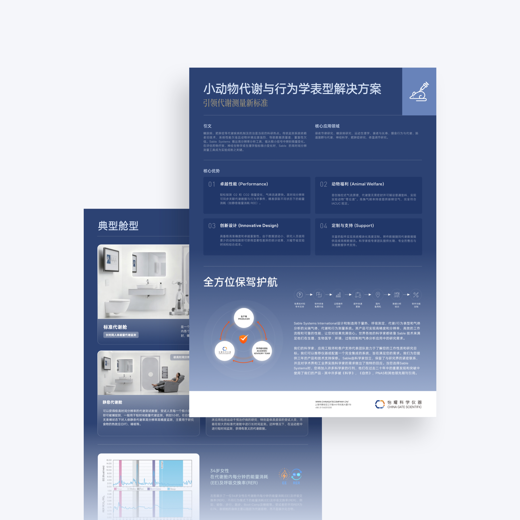 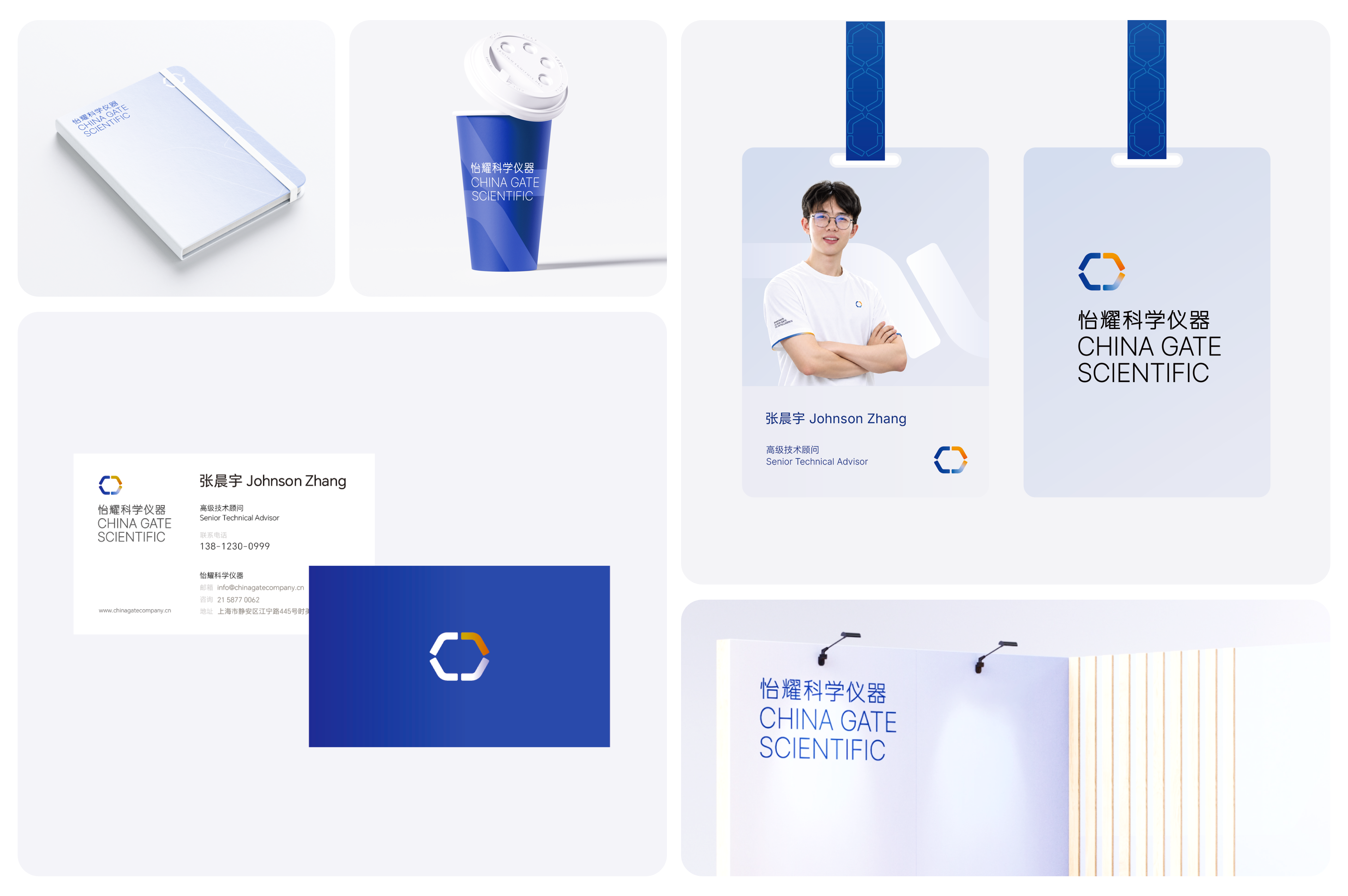 From Identity to Communication 从品牌识别走向产品传播 一个真正有效的品牌系统,需要能够进入真实的商业场景。 在后续传播中,我们将核心色彩、几何结构与强调色进一步延伸至产品与市场内容,通过人物、设备、技术信息与品牌图形之间的重新组织,让专业产品拥有更明确的视觉中心。设计在保持技术可信度的同时,也开始承担更多传播任务——帮助用户更快理解产品、识别重点,并建立品牌记忆。 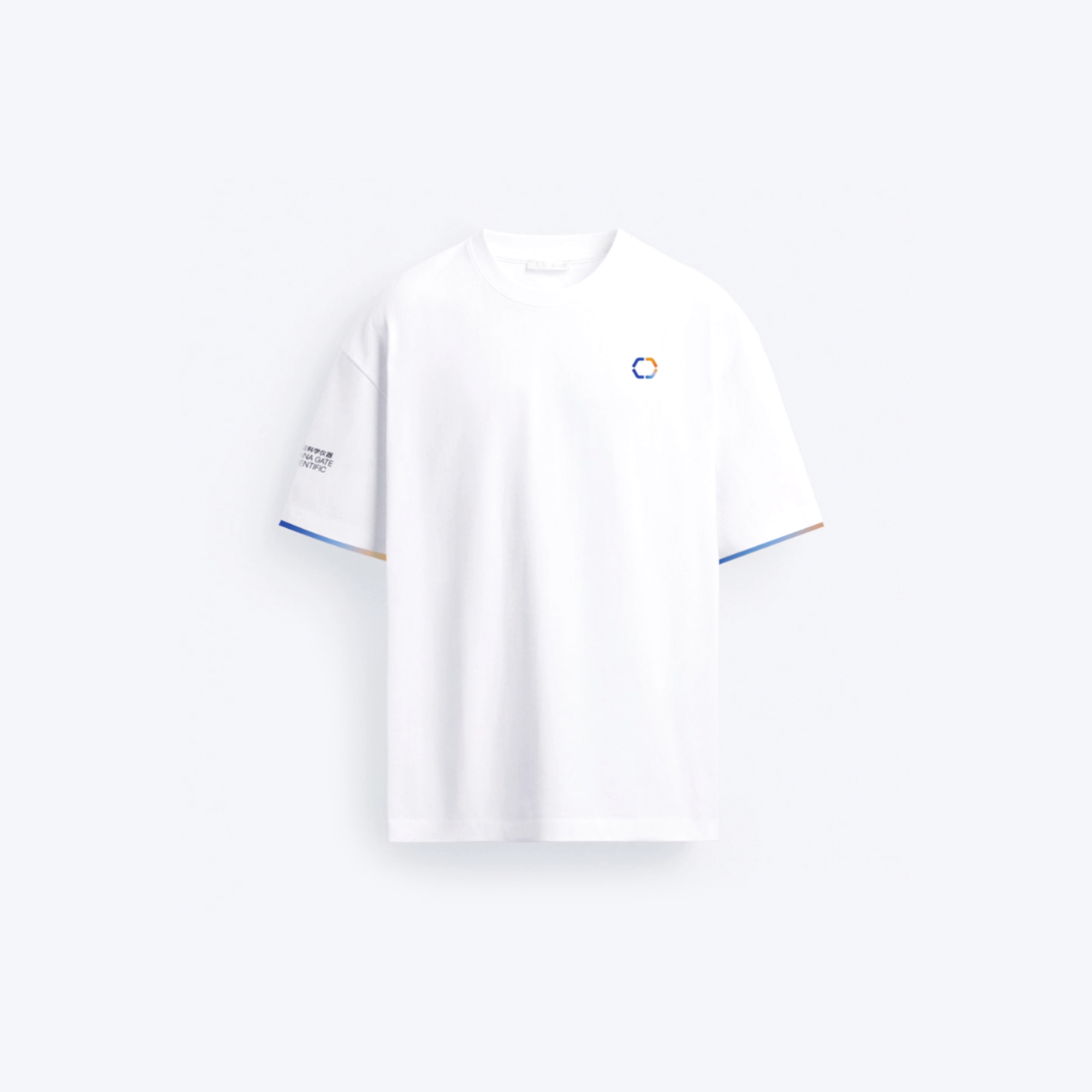 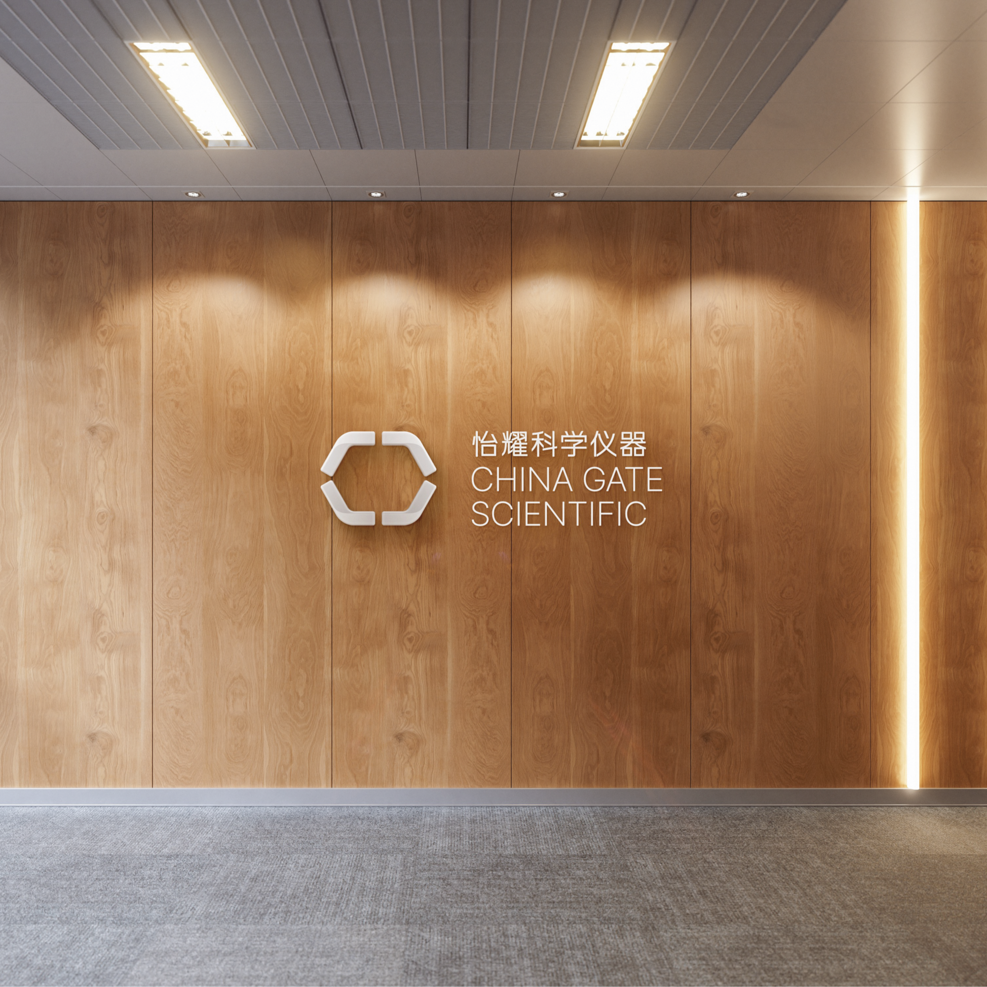 Brand System 一个可以持续生长的生命科学品牌系统 品牌升级最终解决的,并不只是一次视觉更新。 从核心概念、标志、色彩、图形,到产品传播与品牌应用,我们希望为怡耀建立的是一套能够长期运行的视觉基础:足够清晰,因此容易被识别;足够系统,因此能够被持续使用;同时足够开放,可以伴随品牌与业务继续生长。这也是我们对于品牌设计的理解——不是创造一个静态的形象,而是建立 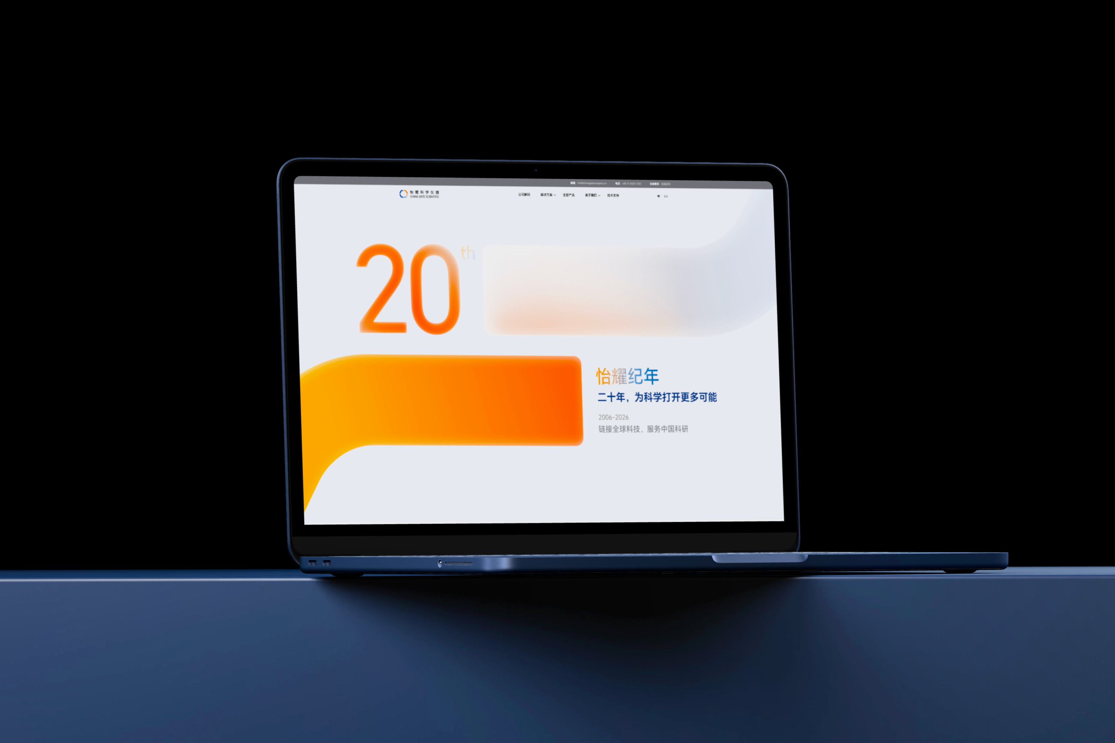 --- 工作目录  ## English Content ### Introduction China Gate Scientific scientific instruments have long served in the field of life science, establishing a continuous and stable connection between professional equipment, technical support and scientific research services. With the development of business, the brand needs not only a visual update, but a set of brand language that can more accurately express its professional attributes, technical capabilities and future direction. Starting from the life science context of Yiyao, the STOYARD reorganizes the brand identification, graphic language, color system and application mode. We hope that while retaining the accuracy, rationality and trustworthiness required by the scientific instrument industry, we can reduce the excessive seriousness and instrumental expression in traditional scientific research brands, and establish a more open and modern scientific and technological visual image for the brand. The final formation is not an isolated logo, but a set of brand vision system that can continue to grow. From core graphics to color, information levels, and extended applications in different media, each element follows a unified design logic, enabling the brand to maintain stable and clear identification in products, digital interfaces, communication materials and offline scenes.   Design Challenge How to make professional, is more intuitive perception? Technology is the entrance. Let links drive exploration The life sciences inherently feature a relatively high professional threshold, yet expertise does not equate to complexity. We aim for the new brand to convey science, reliability, and rigor while steering clear of the overly cold, technocratic tone often associated with traditional scientific‑instrument brands. The design must strike a balance among professional credibility, international‑sounding communication, visual identity, and long‑term applicability, enabling Yiyao to evolve from a mere corporate logo into a comprehensive brand system that supports its products, communications, and future business growth.  Core Idea - GATE The Core Visual Metaphor of Brand Building with "Gate" The China Gate in the brand name provides an important clue to the entire visual system. Starting from the structural relationship between the letters C and G, we understand "Gate" as a kind of connection and entry: it not only represents the entrance into the scientific world from the outside, but also symbolizes the role of the enterprise in connecting technology, products, customers and application scenarios.Through the combination of circular, cut-out and open structure, the logo forms a state of continuous outward extension. Enter, Connect, and Transition thus become the three keywords behind the brand's visual language-enter, connect, and drive new possibilities. [Video](https://static.glabcms.stoyard.com/stoyard/gallery/20260907/49esg8e74d3.mp4)    Color System Establish order through color roles rather than color quantities. Yiyao's color system does not rely on a rich number of colors, but rather assumes a clear visual role through different colors. The brand core blue establishes a sense of professionalism, rationality and science. Lighter and softer auxiliary colors are used to carry information and different application scenarios. A small number of high-recognition emphasis colors appear in key content and communication nodes. Single Anchor: A stable, clear blue conveys a sense of science and professionalism; Material Color: Lighter, softer hues are used to convey different types of information and suit various application scenarios; Accent Color: Provides visual emphasis and vibrancy at key points. By carefully controlling lightness, saturation, and their respective proportions, the entire color palette remains consistently stable across different media while preserving ample nuance and variation for the brand. This color strategy not only steers clear of the overly cold and monolithic visual identity often associated with traditional tech brands, but also equips the brand with greater flexibility across its products, digital interfaces, and marketing materials.     Typography Building Brand-Unique Character Identification in a Rational Structure The Chinese standard characters of Yiyao scientific instruments are centered on precision, rationality and modernity, and the structure of traditional Chinese characters is moderately geometrically and orderly. By closing the strokes, adjusting the literal proportion, strengthening the horizontal and vertical structure and the relationship between white space, the font can maintain a clear identification while presenting a sense of accuracy close to scientific instruments and engineering systems. The glyph does not deliberately pursue strong futuristic expression, but builds a professional and credible brand temperament with restrained strokes and stable structure, and echoes the open structure, rounded corners and modular geometric language in the logo. English standard characters adopt a more concise and slender sans-serif structure, forming a unified and international visual order together with Chinese, so that the brand can maintain stable and clear identification in different scenes such as equipment, product information, digital interface and communication materials.    Visual Identity From a symbol to a sustainable identification system The logo is not an isolated graphic. Around the geometric relationship between C, G and Gate, we further established the brand text, proportion, grid and basic graphic structure. Circular and open borders continue to appear in different visual scenes, enabling brands to maintain stable identification characteristics even if they are separated from the complete Logo. This geometric language not only retains the sense of precision required by scientific instruments, but also leaves more open, flowing and imaginative space for the brand. [Video](https://static.glabcms.stoyard.com/stoyard/gallery/20260906/41njktz50r5.mp4)       Brand Language Let the brand language into graphics, space and information expression On the basis of the core vision, we continue to extend the concept of "open, connected, flowing" into the language of layout, graphics, space and pictures. Arcs, circular boundaries and open structures are transformed into visual containers, information partitions and spatial relationships; restrained white space and clear information hierarchy reinforce the sense of order required by scientific brands. Brands no longer rely on logos to be recognized, but through a series of consistent visual characteristics, different content naturally belongs to the same system.   Applications Let the visual system into the real brand contact The brand system is further applied to different scenarios such as product materials, promotional brochures and corporate communication. While maintaining a unified identity, we adjust the format according to the information density and communication goals of different media, so that the brand can maintain consistency and change in continuous operation.     From Identity to Communication From Brand Recognition to Product Communication A truly effective branding system needs to be able to tap into real business scenarios. In the follow-up communication, we further extend the core color, geometric structure and accent color to the product and market content, and make professional products have a clearer visual center through the re-organization of people, equipment, technical information and brand graphics. While maintaining technical credibility, design has also begun to take on more communication tasks-helping users understand products faster, identify key points, and build brand memory.   Brand System A life science brand system that can continue to grow The final solution to the brand upgrade is not just a visual update. From core concepts, logos, colors, graphics, to product communication and brand applications, we hope to establish a long-term visual foundation for Yiyao: clear enough to be easily recognized; System enough to be used continuously; At the same time, it is open enough to accompany the brand and business to continue to grow. This is also our understanding of brand design-not to create a static image, but to establish  --- Working Directory 