# The Flash 闪电侠 / 品牌设计 - ID: 211 - URL: https://www.stoyard.com/works/211 - English URL: https://www.stoyard.com/en/works/211 - Year: 2017 - Cover: https://static.glabcms.stoyard.com/object/20180604/bgd2kksw8u.png - Categories: 服务内容:品牌升级(Brand) - English Categories: Service Content:Brand Design & Rebranding - Author: STOYARD - English Author: STOYARD - Publish: 2018-08-18 - Editor: 熙呈 ## 中文主体 ### 项目简介 这是一个帮助多次创业者的设计项目,在3-4线城市,很多外卖平台的服务水平并没有达到大城市的水准,并且配送时间没有保证,针对这个机会,创业者试图做一个3-4线城市的“闪”送,命名为闪电侠,很快的送达是最核心的服务竞争力。我们设计了这个创业项目的标志。 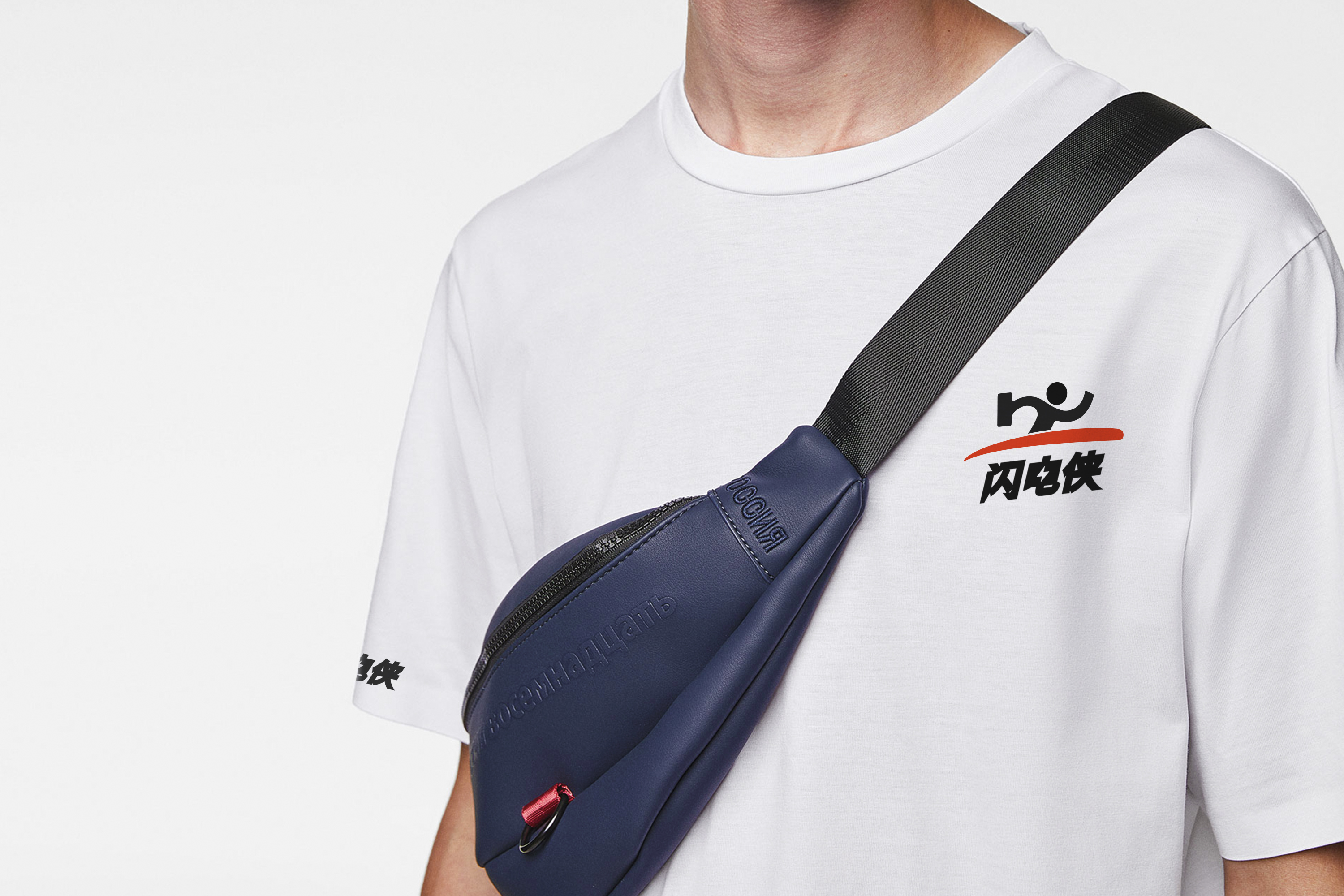 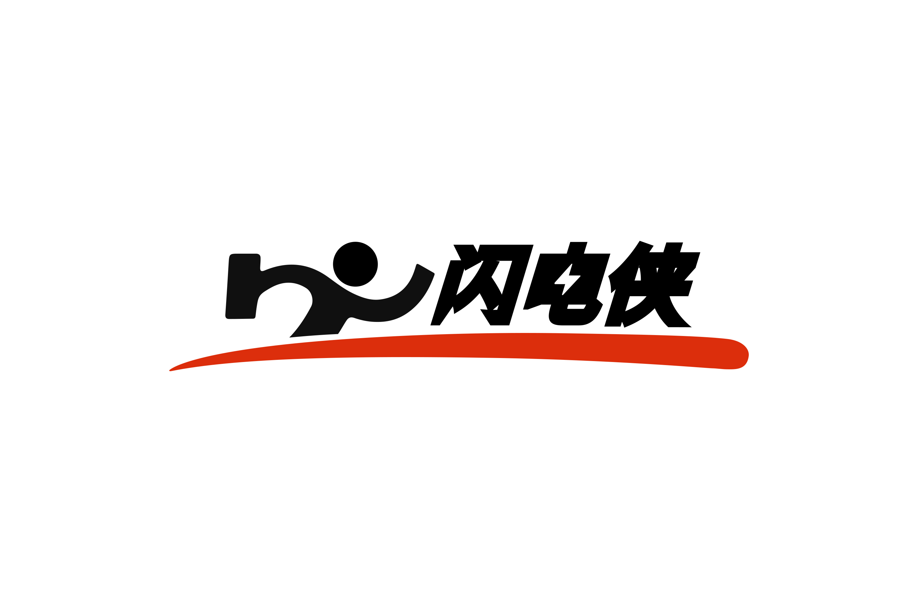 ## English Content ### Introduction This is a design project that helps many entrepreneurs. In the 3-4 cities, the service level of many take-out platforms has not reached the level of big cities, and the delivery time is not guaranteed. For this opportunity, entrepreneurs try to do a 3- The "flash" delivery of the 4-line city, named the Flash, is the core service competitiveness. We designed the VI for this entrepreneurial project.  